How to Design With Pantone’s Color of the Year
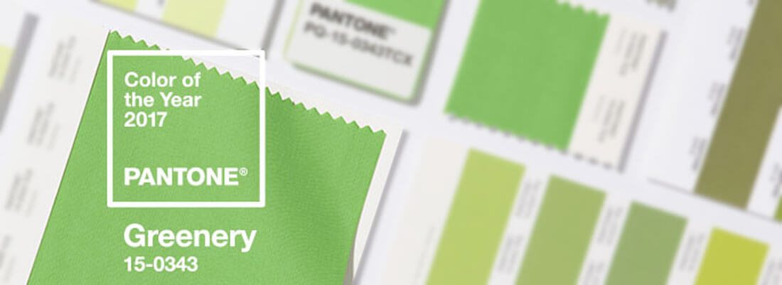
Drumroll, please. It’s the design geek Grammy’s. Pantone recently named its color of the year – 15-0343, more commonly known as Greenery.
The natural hue is bright, clean and fresh. Pantone says the zesty yellow-green shade “evokes the first days of spring when nature’s greens revive, restore and renew. Illustrative of flourishing foliage and the lushness of the great outdoors, the fortifying attributes of Greenery signals consumers to take a deep breath, oxygenate and reinvigorate.”
How can you use this design trend in upcoming projects? This year Pantone made it easy with a “new neutral” that’s relatively easy to use. Here are a few ways to do it.
Greenery
The color of the year often reflect the times we live in and colors that represent those feelings. Just look back to last year, when Pantone chose a pair of hues – rose quartz and serenity – as colors of the year.
The company, which is known as a color authority in graphic design, fashion and interior design, has been picking a color of the year since 2000. Greenish hues are somewhat popular with Emerald (17-5641) in 2013, Turquoise (15-5519) in 2010 and Blue Turquoise (15-5217) in 2005. This year’s pick is the most natural of all the colors, which in past years have leaned toward the more bold, vibrant end of the spectrum.
Here’s how Pantone referenced Greenery:
Greenery is nature’s neutral. The more submerged people are in modern life, the greater their innate craving to immerse themselves in the physical beauty and inherent unity of the natural world. This shift is reflected by the proliferation of all things expressive of Greenery in daily lives through urban planning, architecture, lifestyle and design choices globally. A constant on the periphery, Greenery is now being pulled to the forefront – it is an omnipresent hue around the world.
A life-affirming shade, Greenery is also emblematic of the pursuit of personal passions and vitality.
Greens are symbolic of nature, growth, harmony, freshness, environmentalism, money or finance, ambition, safety, fertility and energy. (It can also be the color of jealousy or envy.)
The nice thing about Greenery is it is highly usable. The color blends into existing palettes and is a “new neutral,” meaning it can be used as a background or fade-away color with ease.
Incorporate Greenery into existing projects as an accent color or in nature photography. (The hue is reminiscent of new leaves on trees in the spring.) When developing new palettes, Greenery can make a great primary color in a palette or work in secondary applications. That’s the great thing about this year’s top color selection: It is so easy to use!
Color Swatches
- Pantone: 15-0343
- RGB: 136 R, 176 G, 75 B
- CMYK: 51 C, 9 M, 88 Y, 0 K
- HEX/HTML: 88B04B
Pantone made Adobe files available for download using Greenery.
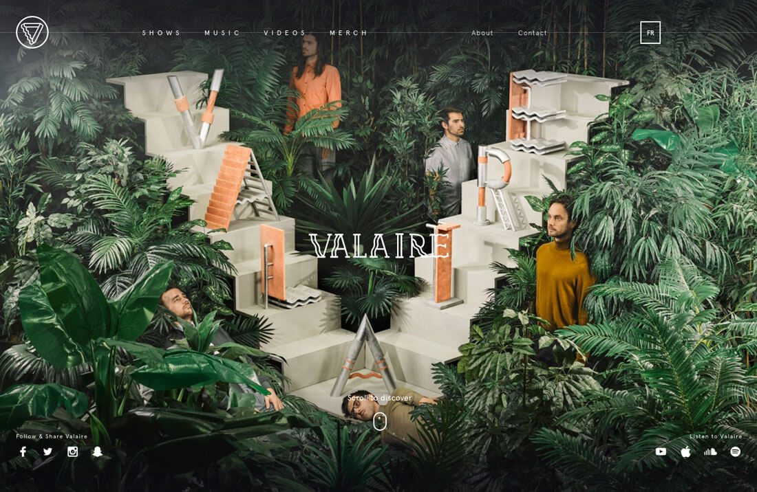
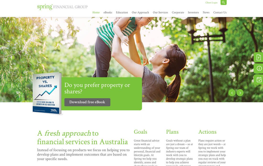
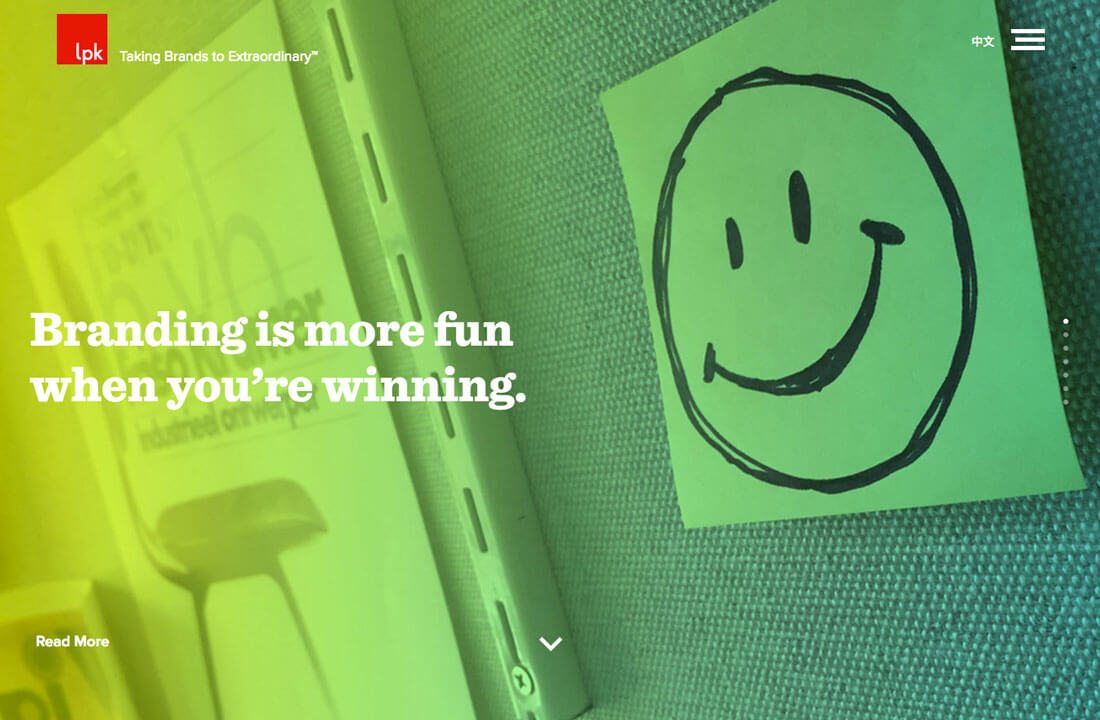
Go Big With Green
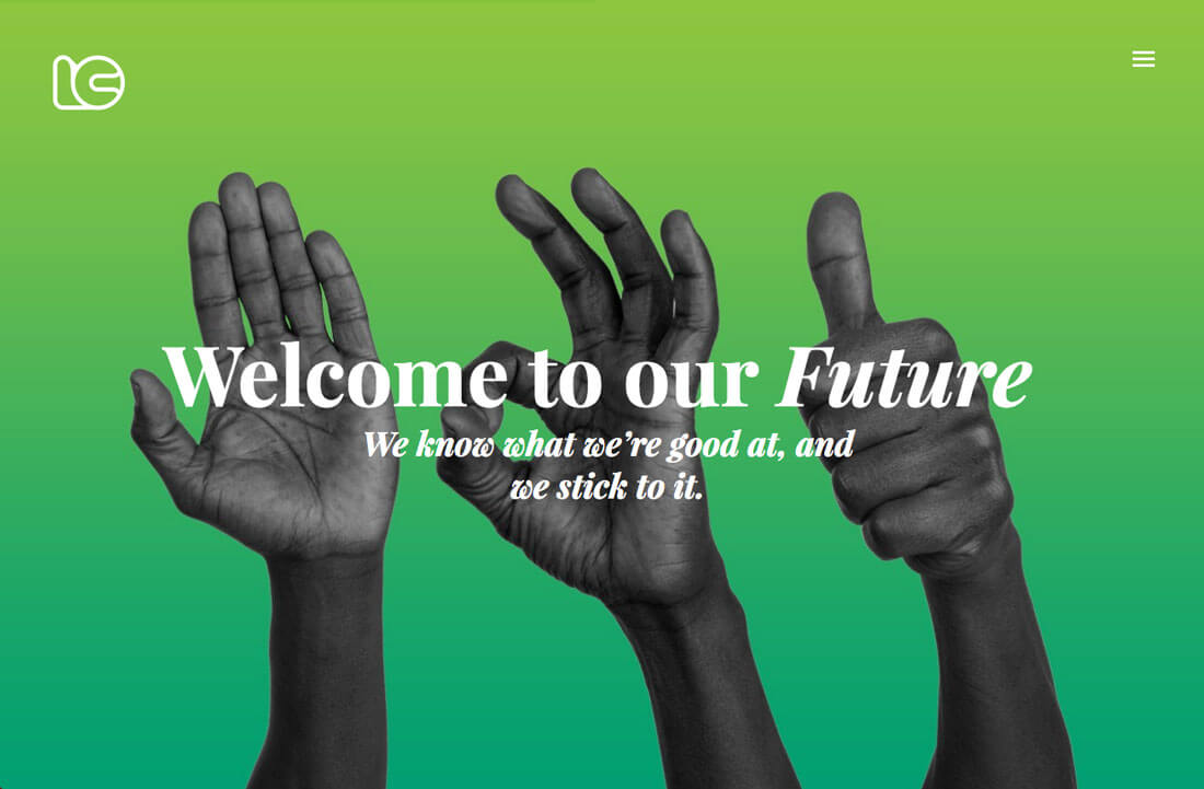
Green is a fun and engaging color, making it an easy choice if you really want to go big with it in your palette. From bold background patterns, solids or gradients to photos that really show off greens, many website and print designs can feature green with ease.
Depending on your exact color choice, text overlays tend to be somewhat easy to accomplish if you stick to black or white. The color is also easy to create an entire palette around. Greens – and this green in particular – have a pretty neutral vibe, making it easy to add other colors to the palette.
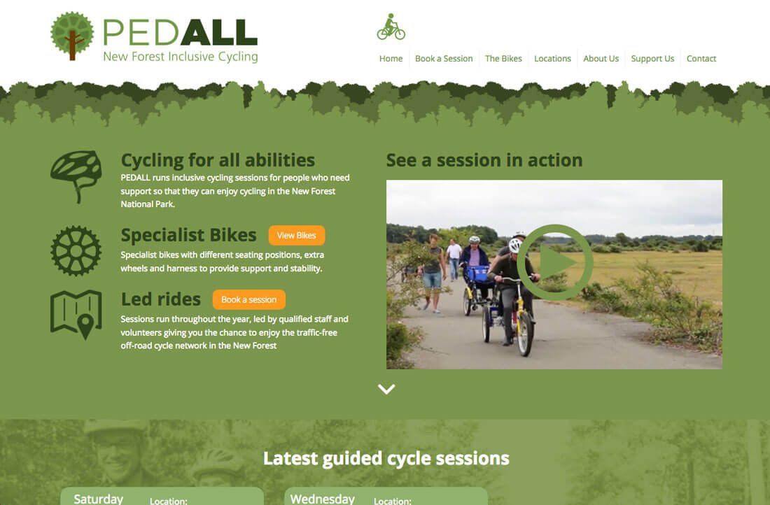
Greenery is also a great color if you are thinking about a brand identity update. You’ll see that many of the examples in this collection feature green in the logo and branding. It can be used in a number of ways. Just remember to keep the color associations in mind when it comes to green. Do they match the tone you are trying to set for the project?
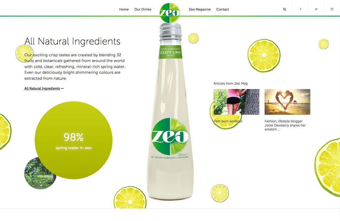
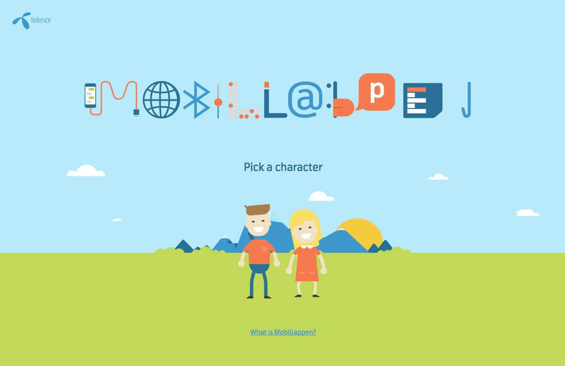
Greenery Accents
One of the best things uses for this color of the year choice, as opposed to some in past years, is that it is an absolutely wonderful accent color choice. It’s just bright enough that it can help buttons pop off a background – light or dark – and is an engaging call to action trigger.
Pair that with color associations – think energy and money – and you can design a buy now or shopping cart that drives users through the sales funnel to the cart to buy items in an online shop.
Greenery as an accent color can work in a monotone palette as well as against complementary color pairs. It could also be an interesting option in a minimal or black and white project (and something totally different from all the reds and yellows that are somewhat overused in these designs).
Mix It Up

Before you get stuck on the idea that you must use the exact Pantone match to create this trend, stop. The best thing about color trends is that you can take the idea and make adjustments to make it your own.
Tints, tones and shade of Greenery can provide interesting twists on design projects. Play with the mix even more for a more blue or yellow green. The key if you want to use the trend is to work in the idea behind it. Pantone called it “a life-affirming shade;” create color variations with that in mind and your design will still be perfectly on-trend.
Incorporate Other Trends
The great thing about a more neutral color choice is that it won’t overwhelm the design, making it easier for you to use it in concert with other design trends. From animation and illustrations to big gradients or oversized typography and image sliders, Greenery is a match.
The color is also quite reminiscent of other color trends that have dominated the year with a focus on some of the muted neons from Material Design. Consider using Greenery with other bold options to create cards or tactile layers that users can almost reach out and touch.
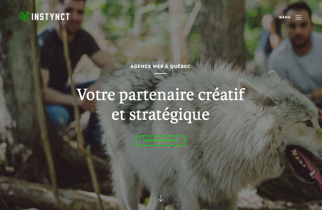
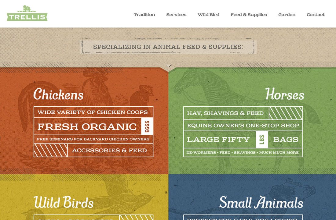
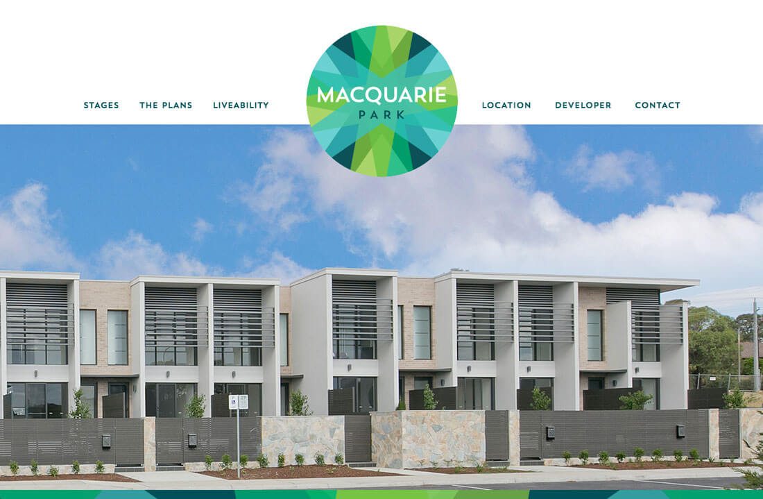
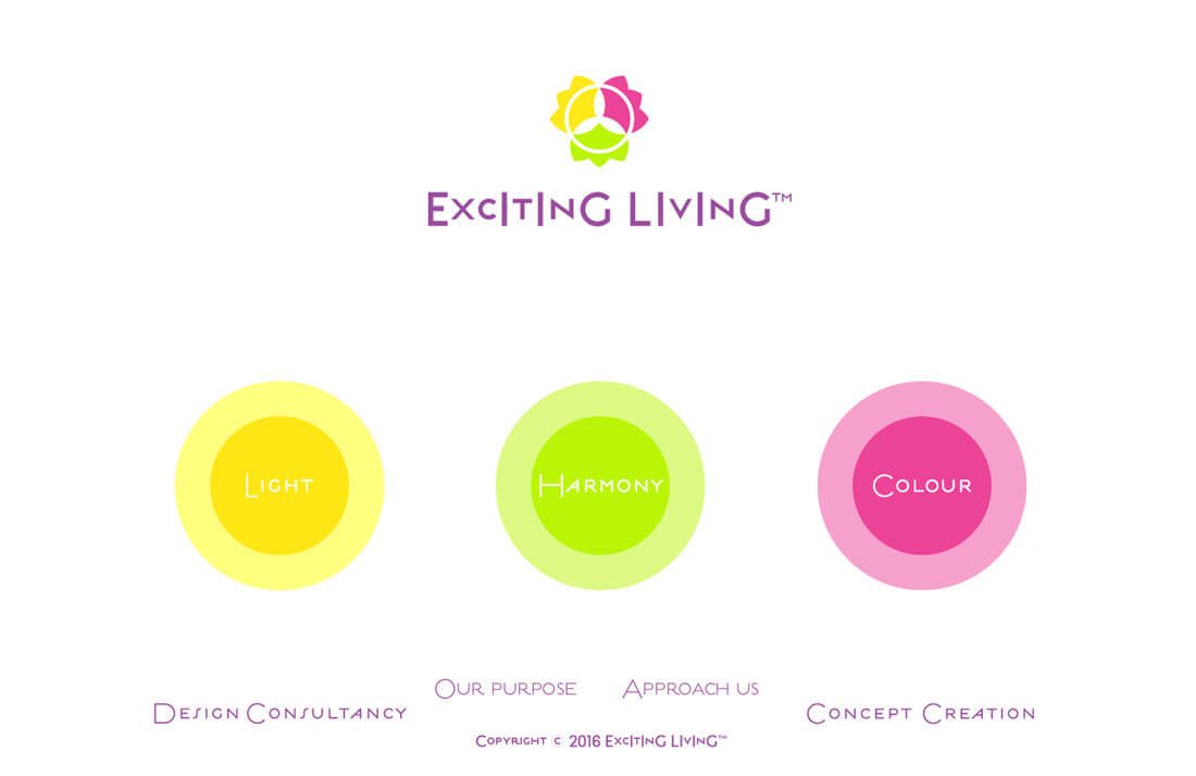
Inspiration from the Design Shack Gallery
The Design Shack gallery is packed with examples – and you can search by color – to see what others are doing with these colors. Here are a few projects to help you think about how you might use pinks and blues.
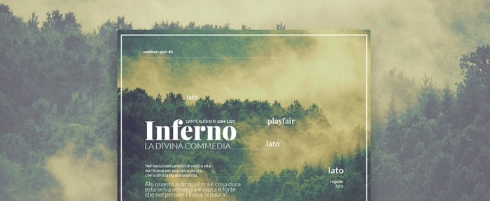
Alessandro Giammaria
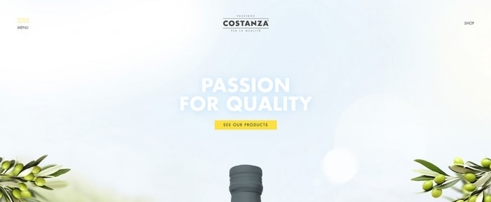
Costanza
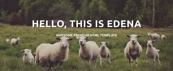
Edena
Green in a Box

3i Infocom

Conclusion
Here at Design Shack, we are pretty partial to Pantone’s Color of the Year selection this year. Just look at our logo and color palette. See a resemblance?
We hope you can find ways to incorporate this green hue into your projects as well. Experiment, have fun and feel free to share those projects with us on Twitter at @designshack and @carriecousins.