How to Create a Disruptive Design (So It Will Get Seen)
If you really want to create a design that will make people look, it has to be disruptive.
While “disruptive” can be a bit of a hackneyed catchphrase, it is also at the core of what you do when you create something new. The goal is to get people to stop, look, and interact.
Disruption works because it is different from the norm. This can include anything from being at the forefront of a new trend to designing with an interesting font, color palette, or design pattern.
This description from Layla Acaroglu explains it perfectly: “Design is about creating something that adds to or iterates on the existing, and disruption is about creating a disturbance with the intent of changing a system. When combined, the practice of Disruptive Design is to create intentional interventions into a pre-existing system with the specific objective to leverage a different outcome, and more importantly, an outcome that is likely to create positive social change.”
Now how can you do it? We have a few ideas (and examples) for you.
Go Big with Details
When you turn details into a larger piece of art to conceptualize a design scheme, the result can be amazing. (It can also fall amazingly flat, so be careful here.)
Detail images disrupt because we are so accustomed to giant hero photos or videos on almost every website design. Something smaller makes you stop and think, even if it is a subconscious wondering as to why something was done that way.
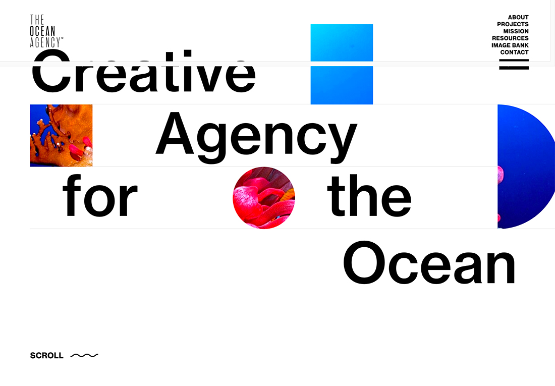
The Ocean Agency does exactly this with a great paired animation (you’ll have to click through the example to see that). The small detail ocean images tie the theme together well, but what might be more interesting is how the header seems to break into the hero area.
The latter technique is something you really don’t see much of and it encourages scrolling because you want to see what happens and how it works. It’s surprisingly smooth and makes you think about all the other ways you could keep pushing this design idea forward.
Create Unexpected Interactivity
There are some websites that you land on and just know there’s an interactive element, others are a little more subtle. The less obvious option happens without a giant call to action or button on the screen.
More, smaller elements don’t typically signal an interactive component, but it can be a good entry point because the different type of design will cause users to pause. That moment might be just enough to draw them into a gamified or more interactive pattern.
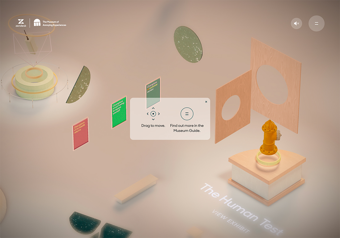
That’s just what The Museum of Annoying Experiences is banking on. At first glance, this complete design might seem a bit annoying on its own with lots of small, seemingly unconnected elements. The design pattern is odd and unfamiliar.
The colors are kind of dull and uninteresting.
But it is just weird enough that you want to know more. The name is interesting and the on-screen controls are hard to ignore. The disruption is in the element of difference, much like the previous example. Without a huge, singular image or headline, you have to stop and think about how to proceed.
Use Subtle Effects
There are those obnoxious disruptions – auto-playing sound, video loops that won’t stop, or panic-inducing animation speeds – and then there are subtle disruptions that signal that something is just a little bit different.
Because subtle disruptions are often a milder version of something that’s not generally accepted as a best practice, this can be one of the most difficult types of disruptive design patterns to pull off.
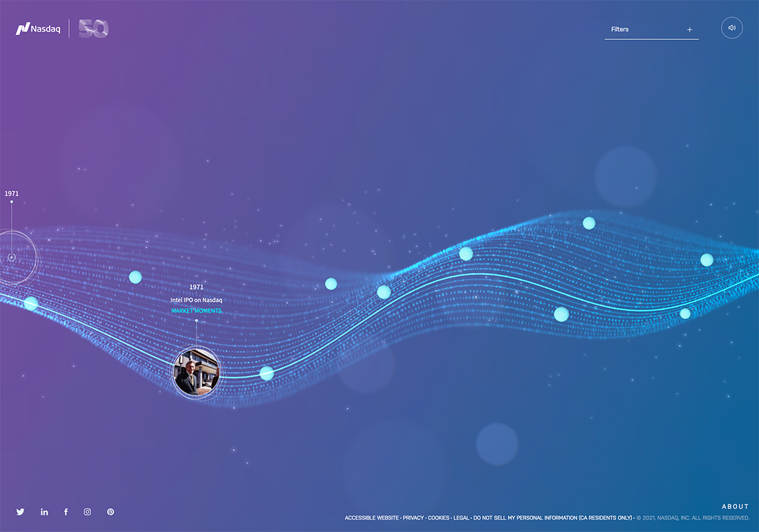
Here, Nasdaq does it seamlessly. With a soft flowing animation and soothing music, users are drawn into the serene background. The color-changing gradient and moving dots pique interest just enough to help pull the interactive elements into play.
Fun bonus: When you navigate to another tab, the music pauses so it doesn’t get in the way of the rest of your web browsing experience. That’s a neat disruptive technique all of its own!
Some “The Same Thing” In Another Way
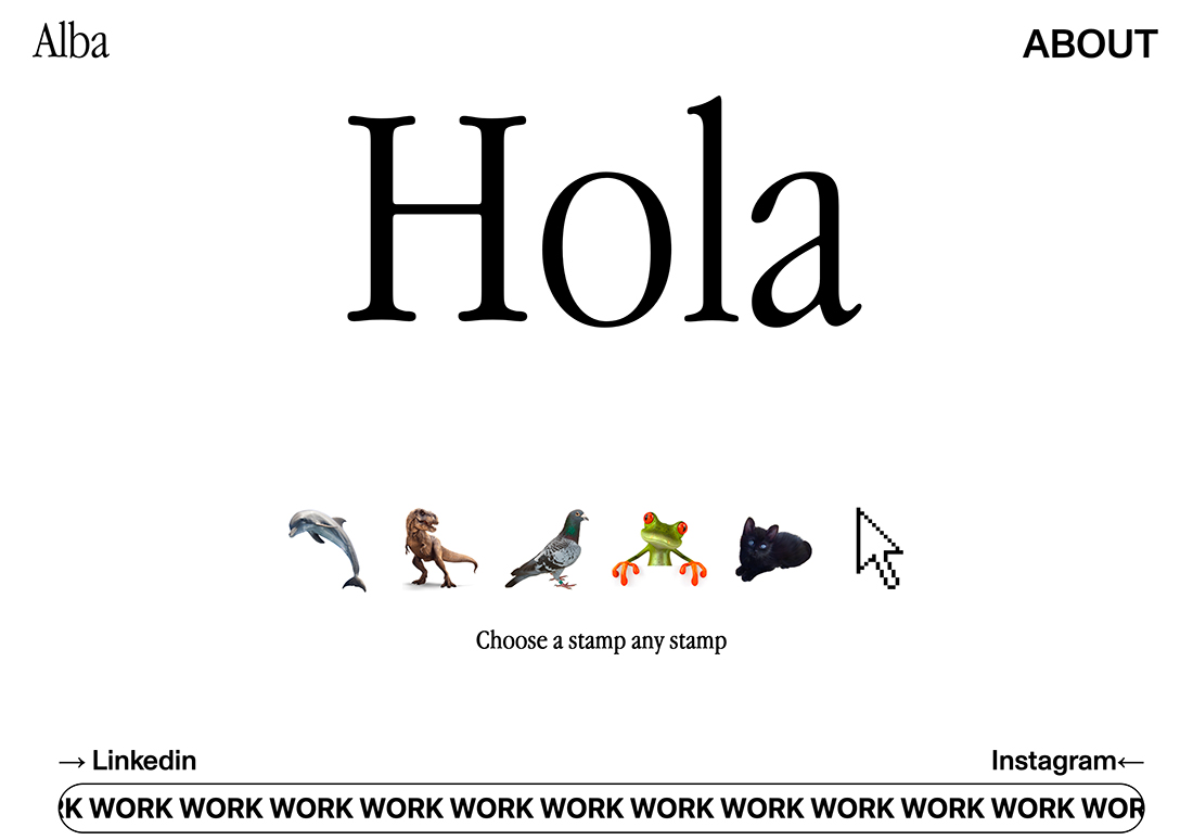
Almost every designer has a personal portfolio website. A lot of those websites start with a big headline – often the designer’s name or a simple welcome message – and links to their work and contact information.
Disrupting this model of sameness is almost anything else.
What makes it work is that users still know they have landed on a portfolio website design and how to find the work and contact information. (And it has to be well-designed.) Pretty much everything else about the design is up for grabs.
The portfolio website example above checks all of the boxes. It’s different and interactive. The design is simple and clean. If you miss the link to the designer’s work … well, how would you?
Make sure to click through the work links though. The presentation is equally interesting and provides a nice way to see the portfolio elements. The only real challenge here might be how much clicking you have to do to get around the site, but that’s pretty common with portfolios anyway.
Provide Something Useful
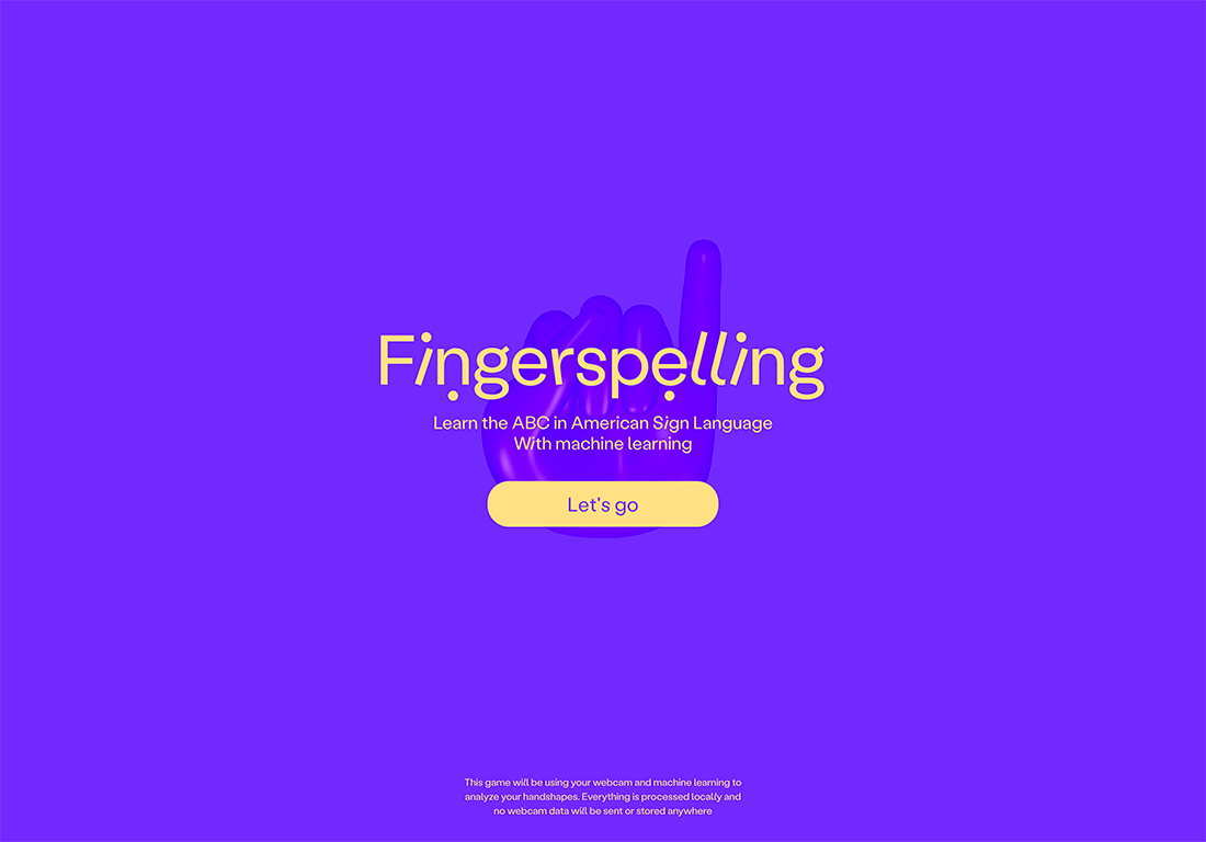
Sometimes disruption is showing someone something that they don’t know, but are glad they came in contact with. It’s part teaching and part just providing something useful.
This concept and method of disruptive design can be a little hard to explain because mostly you know it when you see it.
Fingerspelling does just this. It uses your webcam and machine learning to help you learn the alphabet in American Sign Language. It’s practical, useful, interesting, and highly interactive.
Break Traditional Patterns
Design disruption happens any time you break from visual norms.
This includes everything from typography styles to user flows and patterns to the way images are displayed. The disruption happens in the microsecond when a person’s brain goes “wait… that’s not exactly right” but they still understand it.
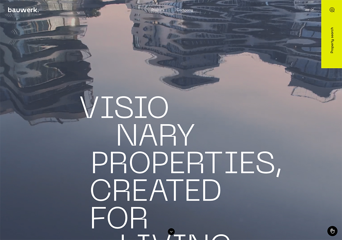
This is precisely what happens with the Bauwerk design. There are a few things happening to disrupt but focus on the text in the example above.
- The typeface is a little funkier than you might expect with interesting strokes and divots
- Long words, such as “visionary,” break without hyphenation or explanation
- You have to scroll to see the complete headline
- Some of the words almost disappear into the video background and then pop back due to color contrast
There’s a lot happening. None of it in the “normal” way. But from a user perspective, it’s not too much to comprehend, which makes the disruption a welcome visual pattern.
Conclusion
Disruptive design might bring a lot of things to your mind when you think about it, but at the end of the day, truly disruptive design is anything that makes you stop, think, and engage with what’s on the screen.
The design or browsing experience has disrupted the constant clicking through so that you pay attention to messaging or what’s on the screen. Shouldn’t that be the goal with any website design?