How to Make Color Overlays Work in Your Design
Color is an important part of almost any design. Whether you are a fan of bright, bold hues or prefer a more minimalist black and white, how you use color can have a great impact on the overall design.
One way to use color to make a statement is with a design that incorporates a color overlay. This means that you cover an image or video with a semi-transparent colored box. The effect can add meaning to an image, bring attention to a design and help you make most of limited art choices.
Today, we’re going to look at a variety of color overlays to serve as a bit of inspiration for creating your own.
Try a Gradient
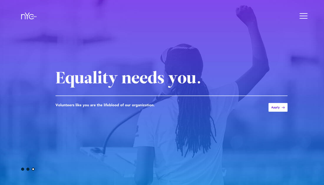
What’s particularly nice about a gradient is that you can work with a couple of colors –think about your branding here – or use a single color to create focus. Bright pairings can help draw users into the design and give images some spark.
Much of this trend can be linked back to Spotify, which started using gradient and duotone overlays to highlight playlists. The color gave new life to images that users were used to seeing (press photos of musicians).
This is a concept that’s easy for you to replicate as well.
- Pick a photo.
- Create a gradient with brand colors.
- Have fun!
Solid Colors Set a Tone
A solid color overlay can be just as striking as a gradient pattern, but often has more of a distinct meaning that can be associated with color choice. Consider a sepia overlay, for example. It immediately stirs feelings of old times and history.
The same can be said of selecting a trendy color choice. By using one of the bright, saturated colors associated with flat or material design, you can evoke feelings of modernism or high-fashion.
When using a single color as an overlay, think about the degree of saturation and transparency of the color. These elements can add meaning as well. Heavier color combinations – less transparent and more saturation – put more focus on the color itself than the image behind it. Lighter, more subtle combinations put more focus on the image.
Consider Dark or Light
You don’t always have to use a color per se to create an overlay. Sometimes it can be black, white or gray. Using these tints and tones can really change the mood of a project.
As you would likely expect, darker overlays create a moodier environment. Lighter overlays are associated with fun. Another contribution factor when it comes to these feelings and black and white is the image itself. How does it work with the tint or tone? Do the image and color and messaging work together?
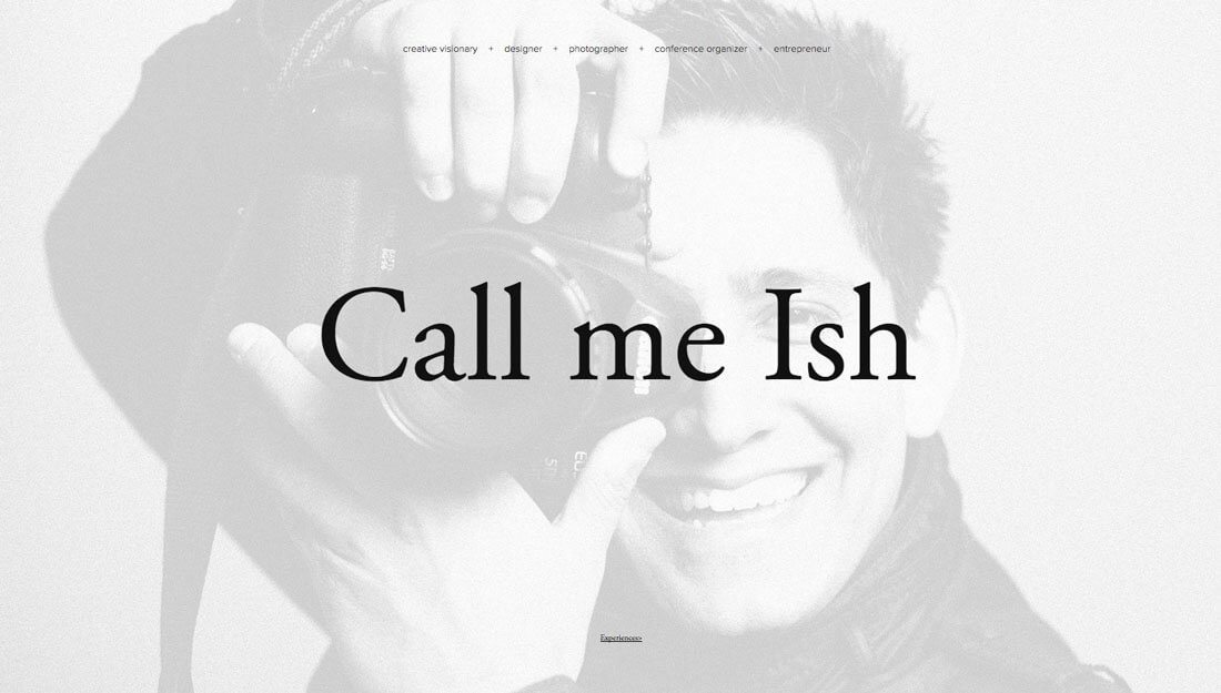
Call me Ish (above) uses a white overlay to help bring focus to the words on the screen on top of a black and white photo. But notice the expression on the photographer’s face: He is smiling in a wide grin. The color and photo combination are inviting and make you want to interact with the photographer, and possibly even hire him for a job.
Opt for High-Contrast Images

When planning for an image overlay in a design project, the composition of the photo (or video) is important. A bland image will leave you with a bland color overlay result. You’ll get the best results if you start with a photo with a lot of contrast with dark and light spaces in the image.
If your image does not have enough contrast, consider adding contrast in photo editing software or picking another image. Otherwise, the image effect might fall flat.
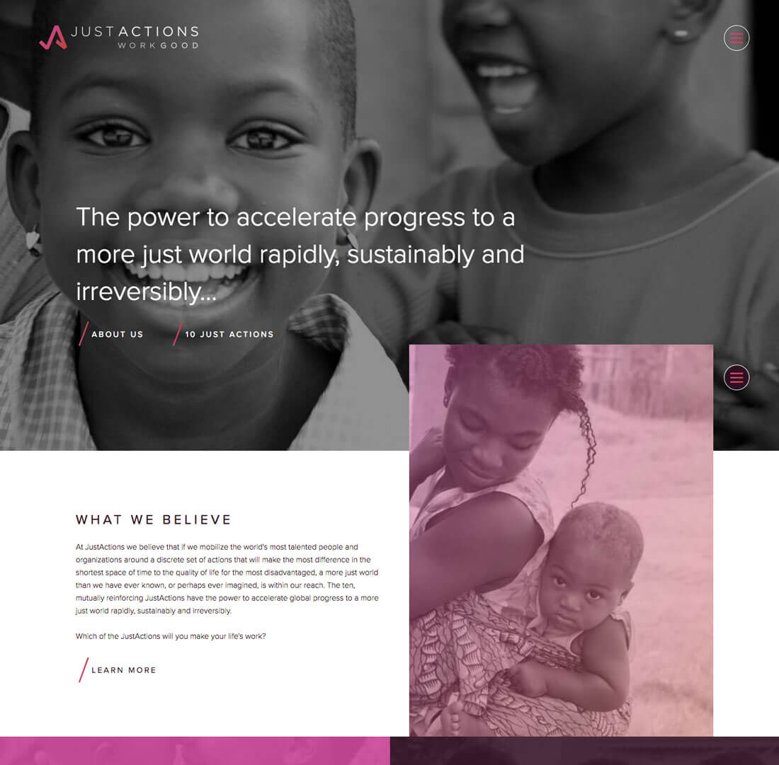
There’s another trick to achieving this effect is to start with a black and white photo. Particularly for beginners, it can be easier to see and enhance contrast in a black and white image. Just Actions provides a great example of a black and white image next to images with color overlay. (Plus, it is a cool effect to pair images with no color and brightly colored contrast.)
Images Should Look Natural (Or Not)
When it comes to working with color overlays you have two options:
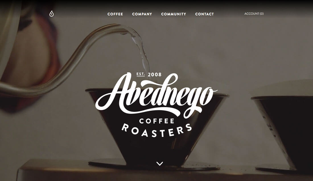
- Images should still look natural. Color and lighting and shadows should appear in a natural location. The overlay is somewhat subtle, such as Abednego Coffee (above).
- Images look completely altered. There’s no guessing that a color overlay has been used (such as most of the examples in this article).
There’s not really a middle ground here. If images don’t fall into one of these “extremes,” users might think too hard about color choices and not concentrate on the content of the site. You don’t want to distract with a color overlay technique; it should enhance the design.
Try an Overlay Accent
While the preceding examples have shown ways to use a color overlay for large images, such as hero header-style options, that’s not the only way to make the most of this technique. Color overlay effects can work quite well as accents, too.
The two examples above show different ways of accomplishing this effectively.
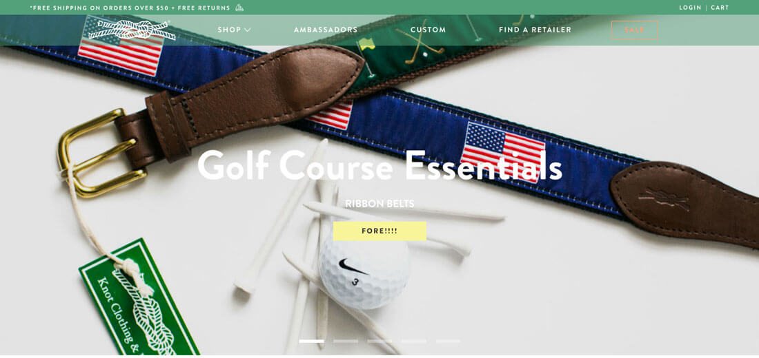
Knot Clothing (top) uses a bright green navigation bar with transparency. It’s further highlighted by the solid stroke above it. The effect helps maintain the brand’s color palette throughout the design while showcasing items in a variety of other colors. The effect is simple, helps the page look a little softer than if the navigation were inside a solid color and draws the eye down the page and through the design.
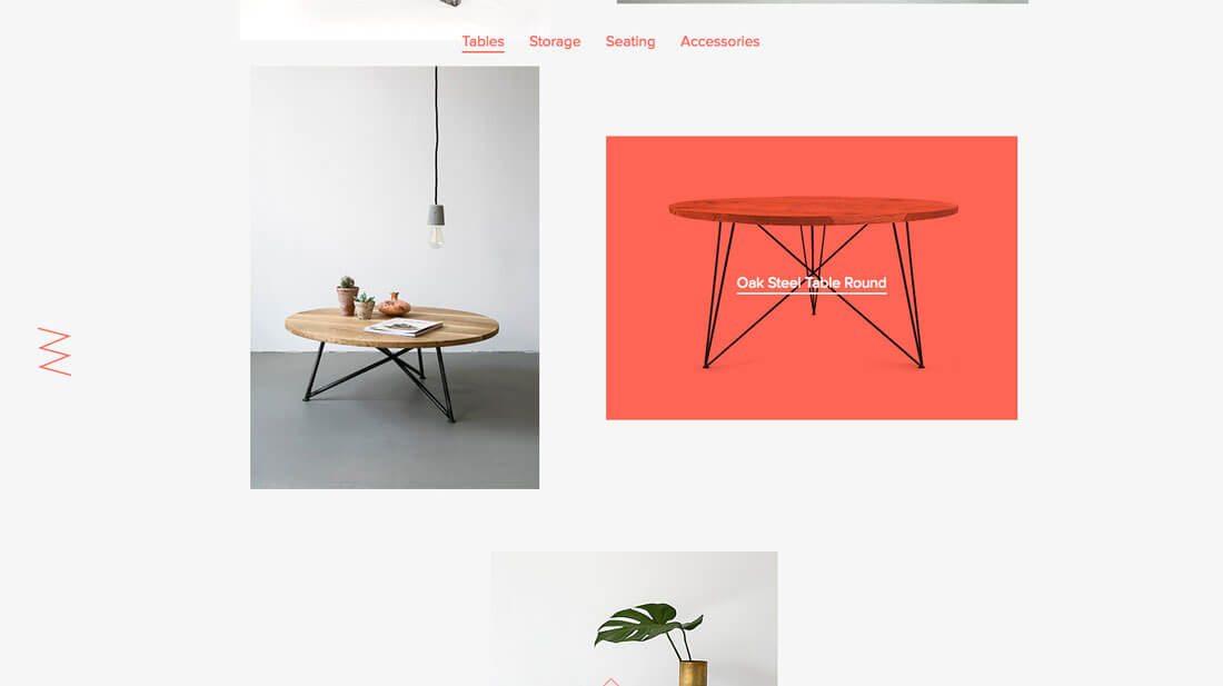
Nuts and Woods takes another approach. The design uses a color overlay as a hover effect to tell you more about specific items on the website. Any element that gets a red overlay is also a clickable element. What’s notable about this design is that the color overlay serves as a visual cue to users, telling them exactly what they want to know and providing a path to links throughout the content.
Conclusion
Using a color overlay is one of those techniques that does not work all the time. Most designers find that they can only get away with it for one or two projects before it seems overdone. (That’s where an accent overlay might be a better option.)
As with any design technique, make sure to apply it in the right context. You should never use a color overlay just because you’ve been inspired by another project; save the idea and use it for just the right design.