How to Use Stock Photos That Don’t Suck
It happens to all of us at some point: you have been tasked with a design project that just does not have any art. That’s when the idea of using stock images creeps into your mind. But you have to use them in a way that, frankly, doesn’t suck.
The good news is that you can use stock images in projects without looking cheesy or fake. There are a lot of good places to find great stock images that you can use in a number of ways. Your mission is to make sure they integrate with your final design and don’t suck.
Use Photos in Context
Using any photo just to have a photo in your project is the top issue when it comes to stock imagery. To find a good image that fits the context of the content, plan to spend some time and do some digging.
And be ready to get creative. Stock photos don’t have to perfectly match the content, looser association can work if you plan the images and text to fit. Too many business projects end up with the stock photo of two men shaking hands because it is easy. But most of the time it just plain sucks.
Think harder. Dig deeper. Find a photo with visual interest. Images should draw users, not just provide a bit of color on the canvas.
Using a site like Shutterstock with a wide breadth of images, and a modern, authentic library can really help. You can start your free trial today, and get your first ten downloads for free!
Avoid Faces, Especially Those that Don’t Match the Action

When was the last time you smiled while moving boxes? Then why would you use a stock photo that shows this type of action? (Yes, it is a commonly found stock image.)
Faces can be distracting when it comes to stock images much of the time. Stock photos often portray a world where everything is full of smiles and laughs, even scenes where this is totally incongruous. Go back to the moving concept: How about an image of hands lifting a box instead.
The other issue that happens with faces is that the same few faces often appear in a lot of stock photography. So that same smiling woman on a site for a bakery with a plate of cupcakes, might also appear on the website for a bank in a business suit and even wearing goggles to show off swimming gear. (See where the problem comes in?) This overuse faces can make your project appear disingenuine, despite your best intentions.
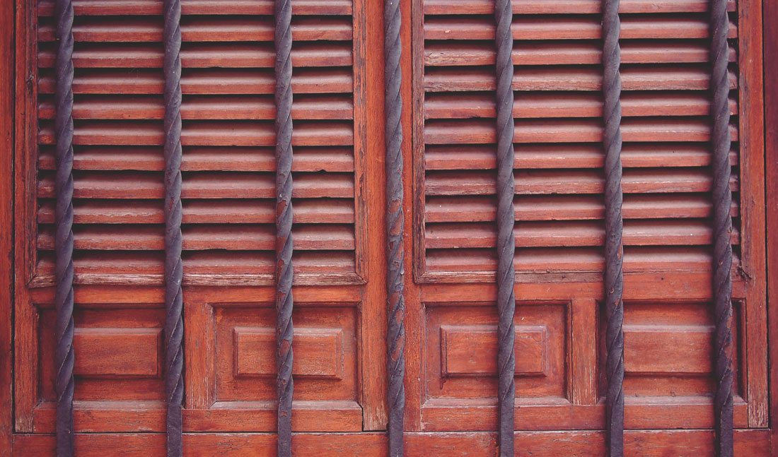
Crop it Tight and Focus on Details
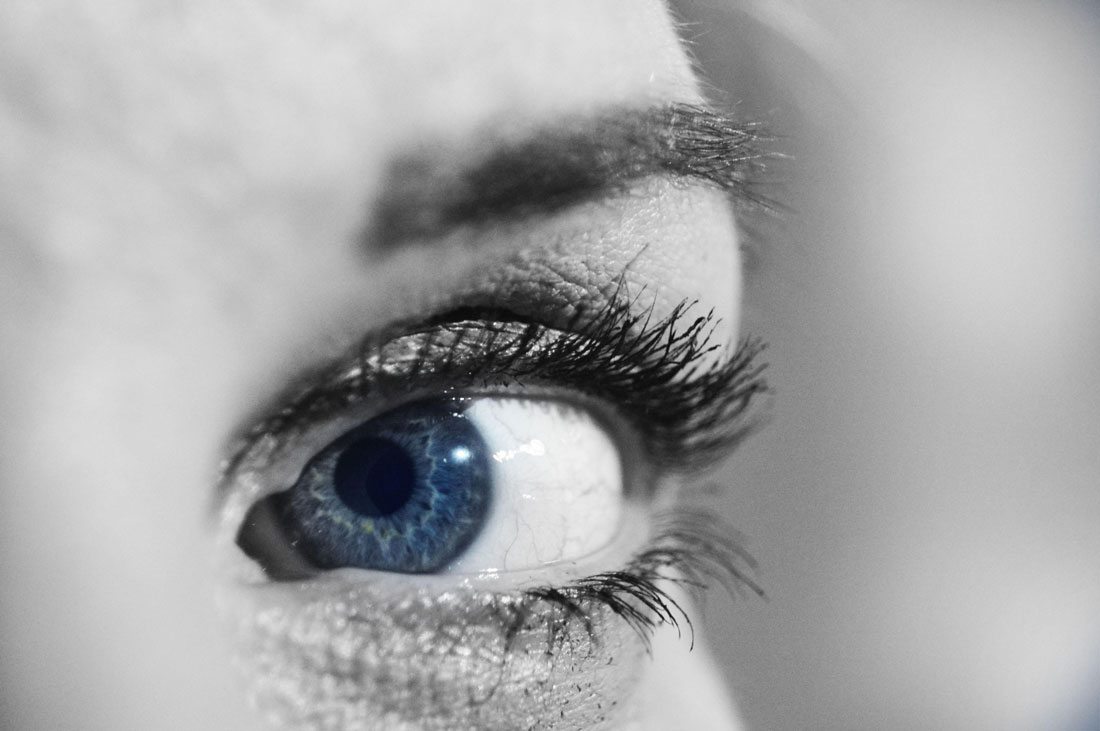
Just because you downloaded a photo from a stock site, does not mean you must use the photo just like it was downloaded. (Check the license to be sure.) Crop it.
There are many times that a full stock image might not sure the needs of the project, but a detail from it could be perfect. Just make sure to download an image with plenty of size and resolution to work after the crop and go for it.
You can also consider an edit. Maybe there’s a specific part of the stock image that really speaks to your project but the background does not work. Consider a blur or fade or other effect to bring focus to the part of the photo that fits into your design concept.
Customize Stock Photos
Repeat after me: A stock photo should never stand alone.
If you don’t have an actual plan for how to use stock photography in the design framework, it’s not going to work. Stock photos are not a substitute for a well-planned design project. They are just one tool that can help you create a complete design.
Current trends, such as hero headers and full-screen sliders, have made it easier to add stock photos to the mix in a jiffy. It just takes a great image and a bit of stellar copy to pull it all together.
Brainstorm ways to use stock photos with your imagery. Design mockups are one example of how many website and app developers do this to show off their products every day. The stock image is the mockup of a computer screen or phone, then the designer inserts an image of a digital product in the mockup. Now, take it a step further and place this on a background stock image. It sounds easier than it is, but can be a great way to experiment and use different images.
Stock photos don’t have to be the dominant image for your project. There are just as many ways to use small stock photos to accent visuals that you created in-house. The key thing to think about with stock images is how to make them feel like part of the overall design plan and integrate seamlessly with content. (When you are finished, it should be near impossible to tell your in-house art from the stock art.)
Stay Away from Stock Image Clichés
Please, please, please don’t fall into any of these stock image clichés.
- Business handshake
- Call center employee wearing a headset
- Group of business people in suits
- Fake financial graph or chart
- ”Moody” computers and desktops
- Person on no background pointing at something
- Words on a keyboard
- Bizarre facial expressions
- The “too sexy” person doing something
- People doing things unnaturally (person running through a field in a suit)
- Overly happy families
- Words on road signs that don’t belong
- Clip art
If you want to get a good giggle at some of the truly bad stock images out there, spend a few minutes with Awkward Stock Photos or sing along with “The Clichéd Stock Photo Song.” And for goodness sake, please don’t use any of the images featured.
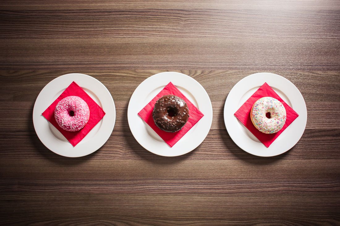
Opt for Simplicity and Space

While it is probably best to avoid the “person on a white background” stock image, photos with plenty of open space can be a good option. This provides a location for text or other information in the design.
Use stock images with simple scenes as well. While there are some beautiful images out there, simple images make your life easier. Look for images with a single element or basic action that is easy to understand. Think of it like this: If you want to represent football, an image of a helmet or ball on the field is easier to understand than an image with play diagrams drawn on top.
Hold Out for High Quality

The only thing worse than a bad stock photo is a poor-quality stock photo. Invest in high-quality, high-resolution images.
Think about how stock images are going to be used – online, print, large format. Buy (download) the biggest and largest-quality photo you can ever imagine needing. You can always scale it down, but it’s impossible to scale up without a loss of quality.
Quality is more than just resolution. A quality photograph also includes defined composition (it’s not just a snapshot), lighting and editing.
10 Stock Photo Sites to Try
There are plenty of places to find stock photography. There seem to be just as many license and payment structures. So before you use anything, make sure you are in compliance with the terms. Read them closely.
Here are 10 places that are producing some great stock photography — some free, some paid — but all with good catalogs of high-quality images.
- Unsplash
- Gratisography
- Bigstock
- Stokpic
- Shutterstock
- MorgueFile
- Death to the Stock Photo
- Picjumbo
- Adobe Stock
- Magdeleine
Conclusion
It is possible to produce some pretty awesome work using stock photos, thanks to some great photographers making their work available. Remember to start thinking about stock images at the beginning of the project; they will not be any good if you just download and toss them into the design as an afterthought.
There are plenty of stock image options out there. Good luck finding the perfect images for all of your projects.
(Note: Every image in this post is a stock photo.)