5 Tips for Mixing Photos & Illustrations in a Single Design
Ready to take a design risk? Try mixing photos and illustrations in the same design project. A hand drawn element can add whimsy and interest to a design that includes photography. Conversely, a photo can make a more lighthearted illustrated design seem more real or important.
This technique can be a little difficult to imagine until you see a few examples of how it can work beautifully. Today’s we’re looking at this trend and providing tips and examples to help you develop creative ways to come up with a design of your own.
1. Use Illustrations as UI Accents
You might incorporate illustrated elements into the design all time and don’t even really think about it. Many user interface elements are often illustrated in some way. They aren’t necessarily in that hand-drawn style but have a less tactile and more “web button” look.
Kick that up a notch if you want to try a hand drawn effect. Or consider using a sketch as an accent mark.
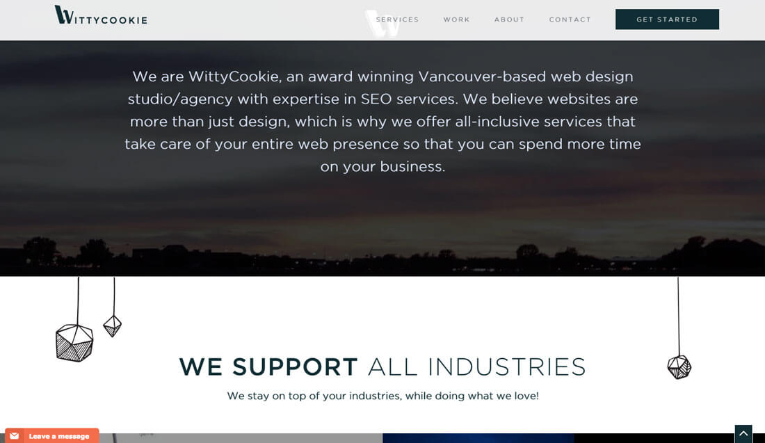
WittyCookie, above, uses a mix of illustrations and a hero-style video to bring users into the design. The homepage (not shown) features an illustration. What’s nice is the element of whimsy here. Hand-drawn elements “hang” from the video. The result make the site feel less like a sales pitch to work with the agency and more like you would have fun together.
The concept is interesting and not overpowering. And the best part? It’s a fun way to create visual interest when you don’t have a nice catalog of images or video to work with.
2. Illustrate First
If an illustration is your first instinct when it comes to a project, draw that outline first. Sketch out the illustrated parts and see where the design goes before you add photo or video elements.
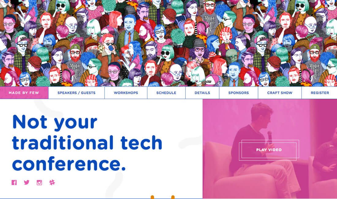
That’s the path taken by the Made by Few Conference, above. The intricate illustrations throughout the design are impressive and include a level of detail that any designer can appreciate. Right below the hero image is a loop video with scenes from the conference. What this small, but real element does, is show that this is a live event. Pair that with the amazing imagery and you just want to register to see what it is all about. The conference atmosphere looks fun and hip thanks to the illustration video pair.
There’s another route when thinking about starting with an illustration as well. Draw an amazing background image for the design. This is a fun way to get exactly what you want in a background without scouring premade imagery.
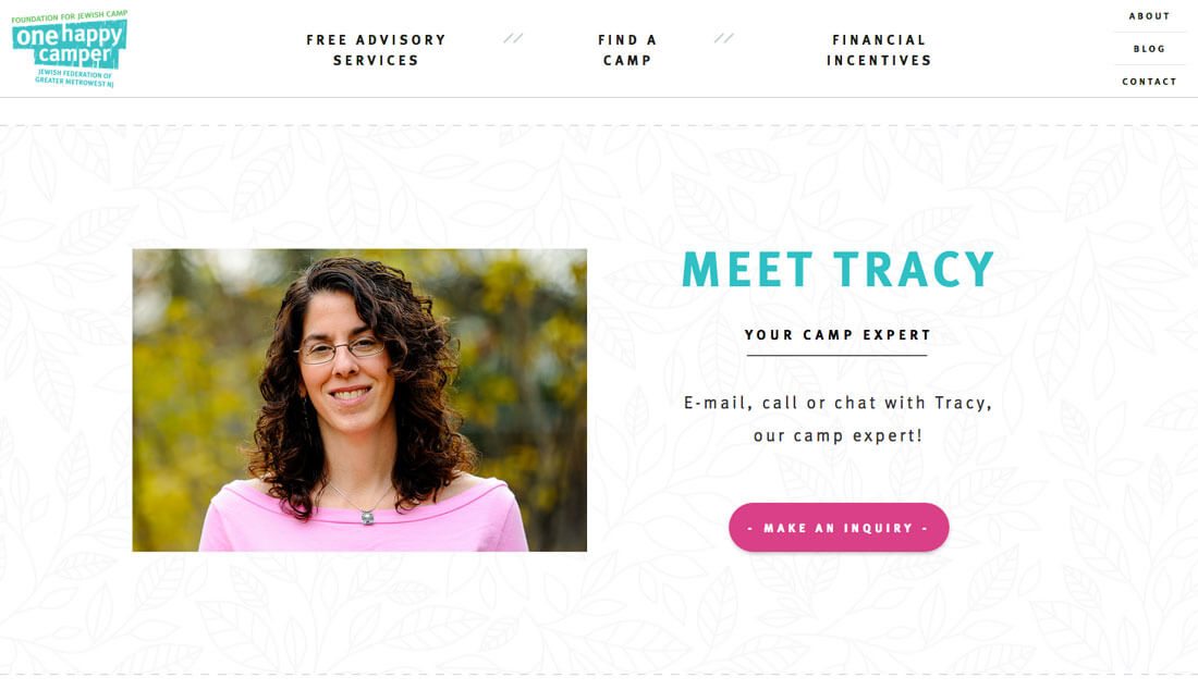
One Happy Camper, above, does this in an interesting way with a mix of illustrated background panels, plain white backgrounds and even black and white photo backgrounds. The changes in background effectively signal a content change and new information for users exploring this kids’ camp.
3. Use Illustrations Like Typography
When you don’t have a lot of great imagery to work with, mix in illustrations in the same way you might play with typography. Although the concept sounds odd, think about it for a minute: A neat illustration can add emphasis to a video or photo. It can highlight what you want users to know.
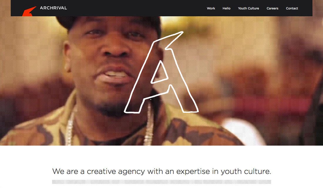
Achrival, above, does this in an interesting way. The illustrated, “dancing” A serves as the agency’s logo and draws more attention to the short video loop. Without it, you might just pass by the images without stopping. But it is just different enough to draw you in in very much the same way a powerful headline would.
4. Consider Illustrated Animations
Whether illustrations are hand- or computer-drawn, they provide a great opportunity to incorporate simple animation. From navigational tools to fun divots that engage users, an animated illustration can be informational, unexpected and fun.
Don’t want to go overboard with animations. Keep them simple and purposeful. Every animation should have a goal for the user – a link, a directional cue or a surprise that keeps them interested.
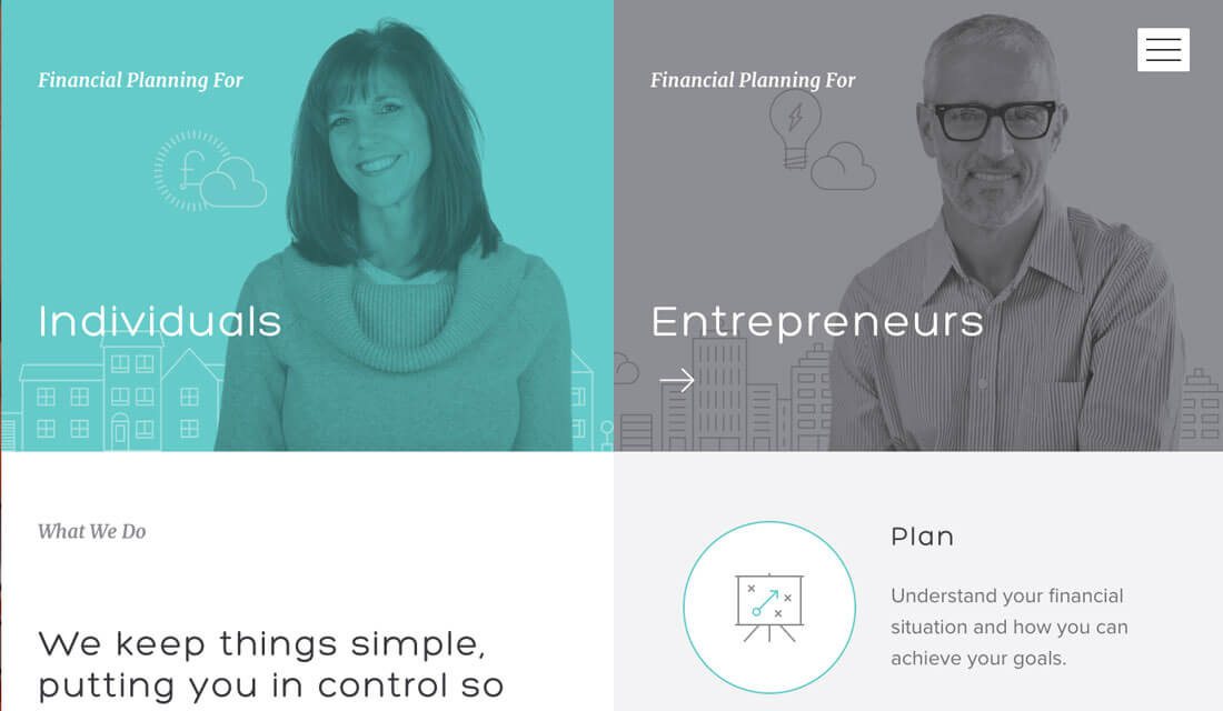
You might not expect this treatment from a financial planning group, but Taylor Made, above, uses a mix of illustrated animation and photography beautifully. The illustrated parts of the images made financial planning seem a little less intimidating and help guide users through click paths.
The illustrations also fill in color where the website falls short on other imagery and the end result is a cohesive design that fun, engaging and easy to use.
5. Tell a Story
When it comes to mixing real and illustrated images, the best combinations effectively tell a story. The visual match the mood of the content and feel like part of the brand’s identity.
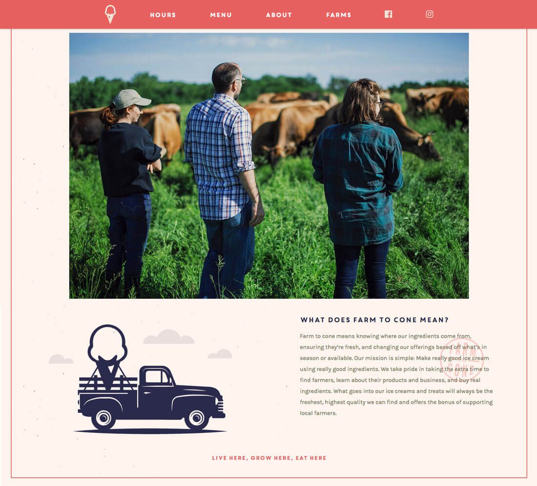
Using this technique can work for one-off applications, but is often integrated with a more complete branding strategy. Look at Cone Flower Creamery, above. The logo is illustrated. The website design uses a mostly illustrated story to set the right mood and encourage users to keep learning about the brand. And just when you want to see more, there’s a picture to fill in the blanks. The design is incredibly simple and focuses on the story itself, not the techniques used to create it.
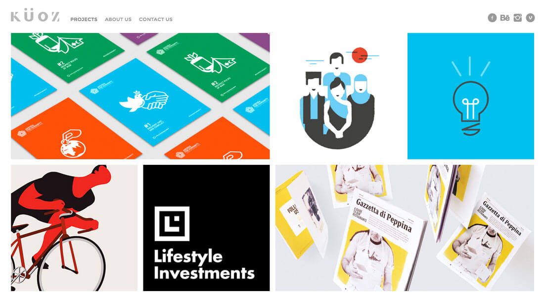
On the other end of the spectrum is Kuoz, a portfolio site, with a mix of images and illustrations. Similarly, the mix helps tell a story of who and what Kuoz is while showcasing projects. Look closely at the groupings for insight into why this design works without feeling overwhelming or cluttered. Images and illustrations are linked by similar color schemes so that every placement feels intentional and harmonious.
That really is the key to mixing images and illustrations: They need to look intentional. They need to appear in harmony. They should never look like a bunch of elements stuck on a page.
Conclusion
Are your brave enough to take on this design trend? While the technique can look amazing, it is intimidating and might be hard to sell to a client.
Bring some examples of work that uses the effects well to help show others what you can do. Sketch some of the illustrations in advance to help further sell the design concept. And remember to tell a story that engages the user!