Tips for Creating a Modern Monochrome Color Palette
A monochrome color scheme isn’t always the first idea that comes to mind when starting a new design project. But single-color design projects can have a lot of impact and give the opportunity to branch out and try some new techniques.
Monochromatic projects, which consist of a color palette with just one color, can be striking because they aren’t as commonly seen as projects with more color variances. This alone can make your project stand out.
Pick a Base Color

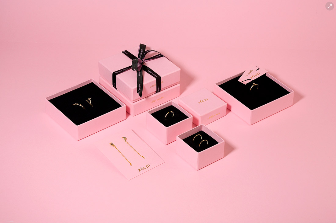
The toughest part of beginning a monochromatic color design is picking the color to use. With only one color option, what’s the best choice?
Think about the mood you want to set. Select a color that fits that messaging.
- Red: Love, passion
- Blue: Harmony, trust
- Green: Hope, nature
- Yellow: Fun, energy
- Pink: Romance, femininity
- Purple: Faith, fantasy
Then think about your brand. Is there a color from your brand logo or palette that would be a appropriate color choice?
Finally, consider saturation. Will the monochromatic palette be bold with bright, fully-saturated hues or more subdued and pastel? Will it be a combination of both? Depending on the color choice, there are plenty of options to think about when playing with color.
Use Tints, Tones and Shades Wisely
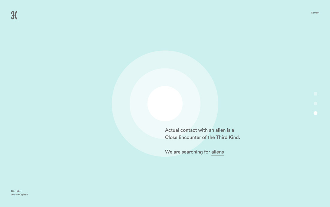
For a monochromatic color scheme to work, you need color variances. You’ll use tints. Tones and shades to create multiple color versions. (You can almost think of each as an additional color to work with.)
- Tints: The base color with white added to make it lighter
- Tones: The base color with gray added to make it richer, but less saturated
- Shades: The base color with black added to make it darker
Just as you would with a palette that contains multiple colors, use the base color plus tints, tones and shades with purpose. Choose a role for each color variant and stick to it throughout the design. You may actually find that you have more “colors” than a standard palette and that’s OK.
You do want to ensure that color variations have enough contrast from one step to the next so that color changes are visible and obvious to users.
You can do this with a color progression of elements in the design. Use colors that get darker to lighter in a series of elements, such as a pricing table. Each new item uses a different color value. Creating a scale of sorts gives you a point of reference to see if the color options are working or if color values need more work.
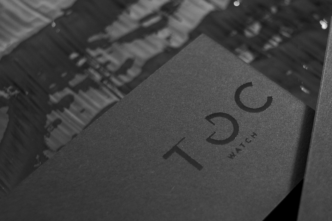
Some of the most fun monochromatic effects come with printed projects. Techniques such as foiling or UV can be beautiful on cardstock or brochures, such as Icon and TOC (above). The extra layer of texture adds a finesse and professional polish to monochromatic designs.
Make It Work With Other Elements


The toughest part about using a monochromatic design is pulling different elements together in a way that keeps the eye moving across the design. With fewer color variances this can be a little more difficult.
Use a monochrome palette with black and what text and other elements to establish flow and contrast. Using simple elements with monochrome can keep the design from getting too busy.
- Use a color overlay: Maintain the integrity of your color by converting images to black and white before adding the overlay to stay true to your palette
- Use a bold typeface: Consider typefaces with thicker strokes than you might normally use to help “lift” them off single color backgrounds
- Use shadows and other visual cues: Some elements need an extra layer of definition, such as a drop shadow to create separation between elements
- Use illustrations: For a modern look, pair monochrome color with illustrated elements (It’s an easy way to maintain the palette as well)
- Match colors and imagery: If you are using full color photos or video in a monochromatic palette, match colors in the images to those in the design, such as Cuberto (above)
Go Bold With a Trendy Color
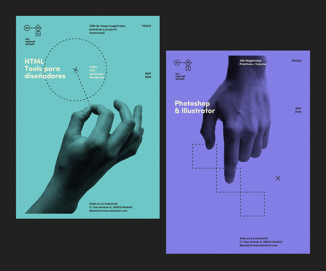
Some of the trendiest colors are the bright hues associated with Material Design. It has been a year of bold color options and monochromatic designs are no exception.
It takes little more than a fun, bright to establish the theme and mood of a project and show that you are “with it.” Popular options include pinks, oranges and lime green.
What’s nice about a bright monochromatic color palette is that there is plenty of room to play with tints, tones and shades. The colors have a lot of room to give, so you can create a great range of hues with ease.
If you opt from something really trendy, make sure to keep an eye on your design and if color trends start to shift, replace your mono color scheme with something else. Another option? Go with a seasonal color choice for a monochromatic design – blue for winter or orange for fall. This provides a way to feel trendy and timely and gives you a reason to mix it up every now and then.
Go Dark for A Modern Monochrome

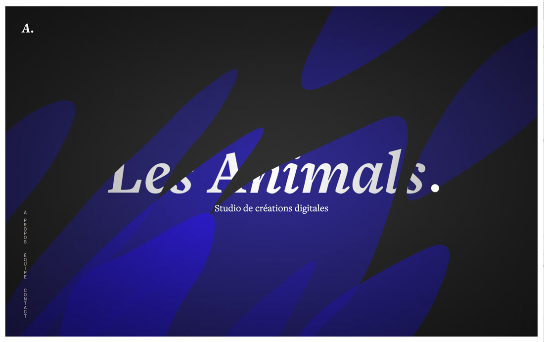
Not all monochromatic palettes feature a “color.” Many are dark palettes that use rich blacks and grays (or blues that are almost black).
These dark color schemes are interesting and have a distinct feel. They can also be difficult to create because there’s not a lot of room to play with color distinctions.
A dark palette does have a sleek and modern feel to it. They work best for designs without a lot of content though or as a “cover” page above the scroll of a website or the front of a booklet or brochure. You almost always have to pair a dark monochrome with something lighter to ensure content can be read with ease.
Try Almost Monochromatic

Break the rules of monochrome color palettes by adding a second accent color to the design. We’ll call this “almost monochromatic.”
Almost chromatic solves many of the problems you encounter with a monochrome design, including how to create easy to see call-to-action elements.
Pick a second color – probably from the opposite side of the color wheel for maximum contrast – and use it for important elements that you need users to see and interact with. Pick a color that is easy to use with text so button microcopy is easy to read.
Conclusion
A monochromatic color palette can be a lot of fun. They are both timeless and trendy.
The most modern monochromatic projects use color in a way to direct the user through the design. It’s more than just accents and looking nice; color has function.
The toughest part about this design style is that it can get flat over time for users who have seen it a lot. Many designers will use monochrome in certain areas of a design and go back to full color in other places. Others will use multiple monochromes – such as a new color for each page – to keep the design engaging.