10 Most Impressive Product Label Designs of All Time
As the retail industry continues to grow, businesses need to find new ways to make their products stand out. There are countless products that come and go from the shelves. And any design could end up looking stale when everything else looks the same.
How do you earn a place in the consumer’s mind? It’s a combination of diligent market research, professional design, and a strong dose of inspiration. Or simply put, hire a label and sticker printing company to get the job done.
Are these designs the most impressive product labels of all time? It’s really a matter of opinion. But they all stand out in their own way, following many of the best practices in design. They’re all products available on the market today.
Delivering a clear message without writing much is an art. There’s a number of elements that successful stickers have in common to convey a strong message. Elements like bold typeface, simple images rather than complex ones, and novel ideas to trigger memories. The followings are only 10 of those amazing examples.
1. Marmite
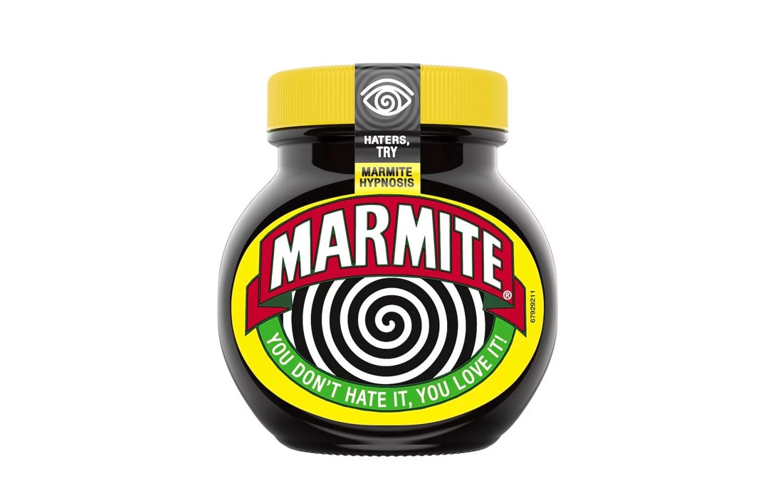
Bold and polarising – just like its contents. Marmite has always stood strongly on its own as a unique product. From the bold typeface to the deep black, red and yellow coloring – it has all the elements of a successful label.
The addition of hypnosis on the new jar, makes it inescapably appealing to the human eye. It’s a novel way to get attention, regardless of whether it will convert the haters or not! Take note of the label shape too.
2. Meat Lust
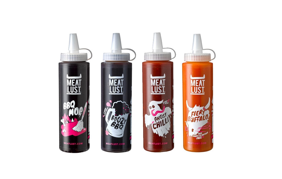
A design to grab the attention of any sauce lover. A sauce bottle has to tell a story to your imagination with few words. It has to be tantalizing. The Meat Lust range does an excellent job of persuading sauce lovers to try something different to the mainstream brands, in a market that’s heavily saturated.
3. Disaronno
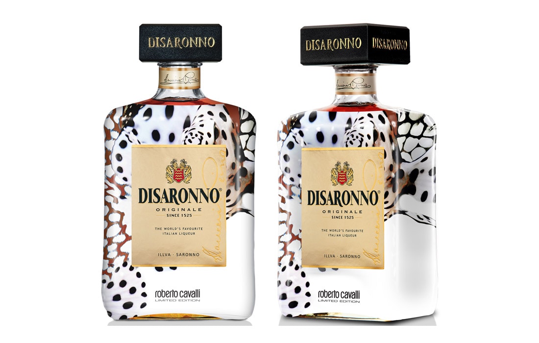
The Robert Cavalli limited-edition Disaronno has all the makings of an impressive label. Its bold and understated design gives an air of sophistication, which satisfies the purpose of the label. Spirits have long been marketed as a more sophisticated choice of alcohol. The bottle is wearing a Robert Cavalli inspired design, with captivating angles that make you stop to take a look.
4. Original Source
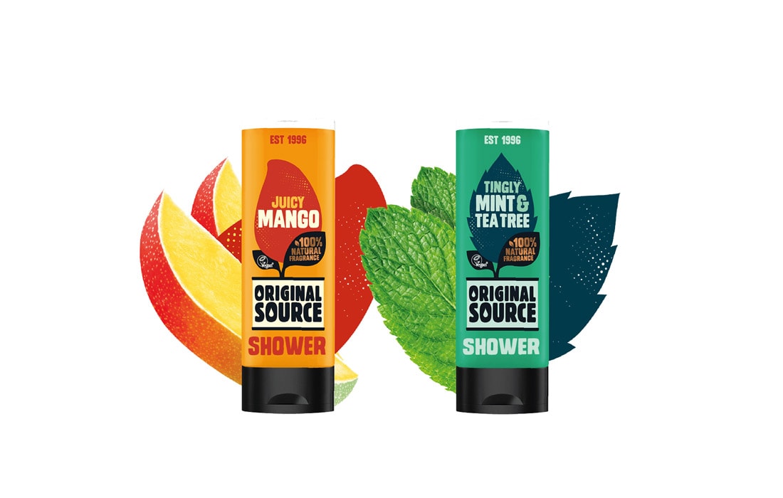
Shower gels and soaps are all about appealing to the senses. Original Source put that above all else in their design. The label is transparent so you can see the opaque color inside, with the words “juicy mango” in big, bold typeface. Looks delicious, and that’s the point – you can taste and smell it. Note the font sizes and colors which are used to highlight the most important text.
5. Cowboy Poet
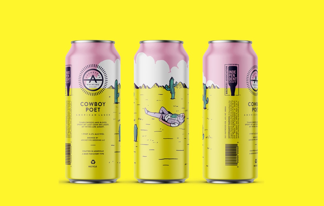
One interesting point about beer labels in recent years is the colorful designs. Unlike conventional beer labels, they seem to appeal more to the artistic taste of the consumer. In part, it’s due to the explosion of craft beer sales. Design has become everything in the craft beer world, where brewers have to make their mark.
Love it or hate it, some of the designs are superb. This one by Cowboy poet is far from the most audacious design in this industry. Instead, they make use of colors, more than busy lines and psychedelic designs. That earns the lager a place in this list.
6. Sixpence Stout
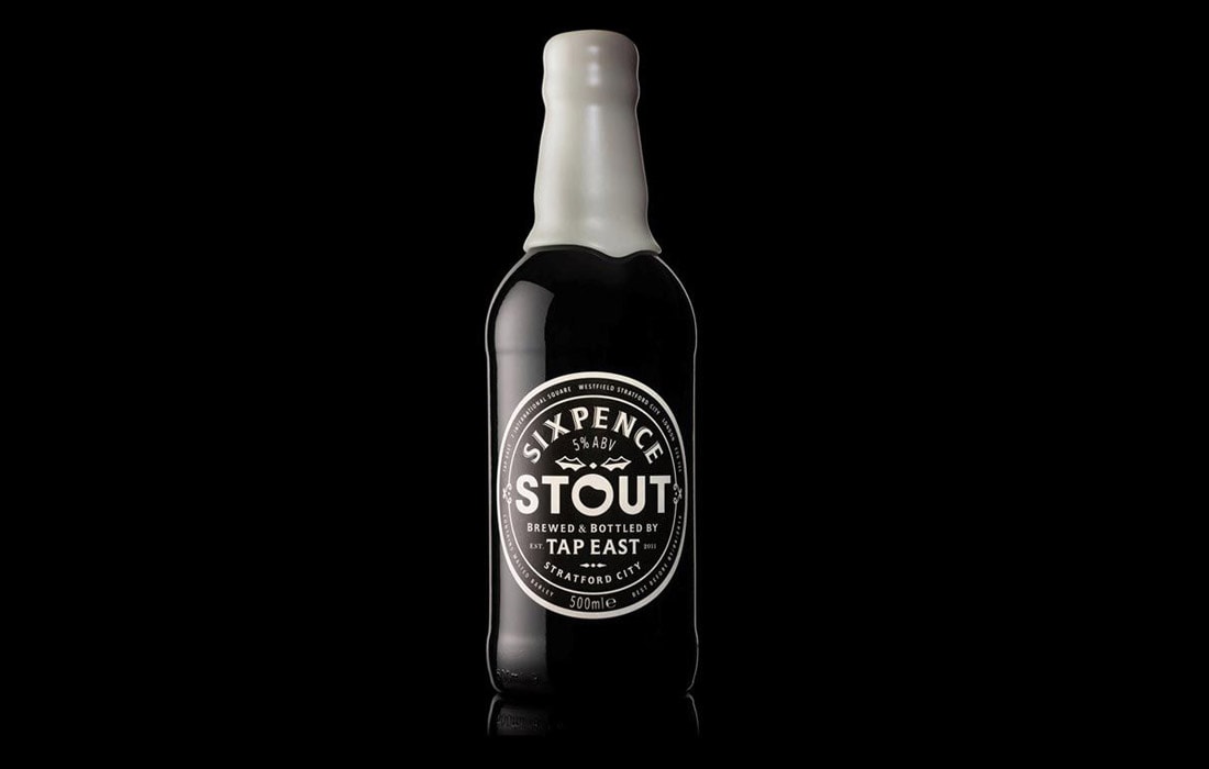
The opposite of psychedelic and colorful. Black and white. Sometimes that’s all you need to make a statement. After all, that’s the color of what’s inside. Midday studios, the designers of this Christmas edition bottle, make the most of their black & white palette. The addition of a white wax top is a clever touch that reminds you of that all-important foam head.
7. Bottlegreen Cordial
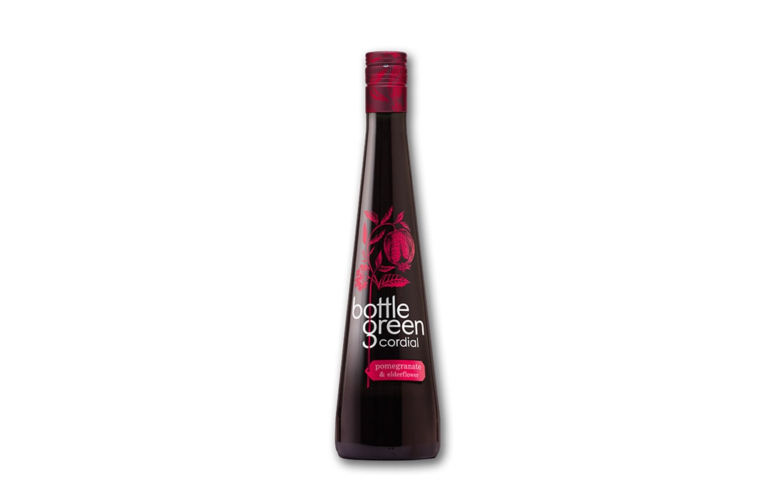
Premium products need to be clearly positioned as better than the rest. Bottlegreen cordial stands out with a simple yet elegant design, in stark contrast with the fanciful fonts of other premium cordials like Belvoir. It conveys a crisp, light, and refreshing image.
8. Scotts Brewing Co
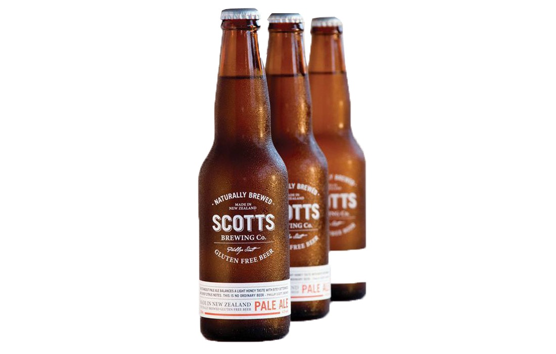
Design by Penny Dombroski, Scotts Brewing Co’s use of transparency and careful typography sizing, make for a design that looks minimal, all while having a wordy review wrapped around the bottom of the bottle. Although it’s simple, you can tell a lot of thought and revision went into the design. It’s the perfect example of why it’s important to get a professional label design, and not settle with the first thing you like the look of.
9. Innocent Smoothie
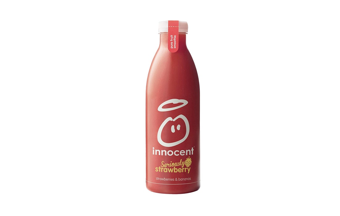
A good product label can often depend on the strength of your brand image. Innocent is a brand known throughout the UK. Their logo is easy to remember and the brand name is simple. The logo is two circles – simple, yet you know what it is. The label is minimal and mostly transparent so you can see the delicious smoothie inside. An impressive product label tantalizes your senses at first glance, so this is one worthy of the list.
10. Pure NZ
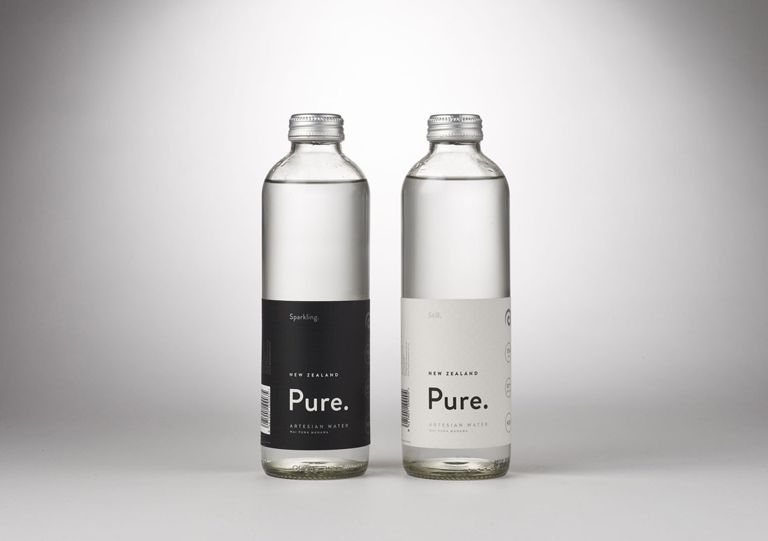
Crafted by Design by Supply, Pure NZ’s water bottle label uses a minimal design to send a message about what’s inside. Simple, refreshing hydration in all its purest form. It’s the simplicity of the design that makes it look like it’s better than your average bottle of water. The reality is, it’s probably not much different.
What Do All Good Labels Have in Common?
They appeal to your senses; remind you of what’s inside. Triggering memories is a powerful way to get attention.
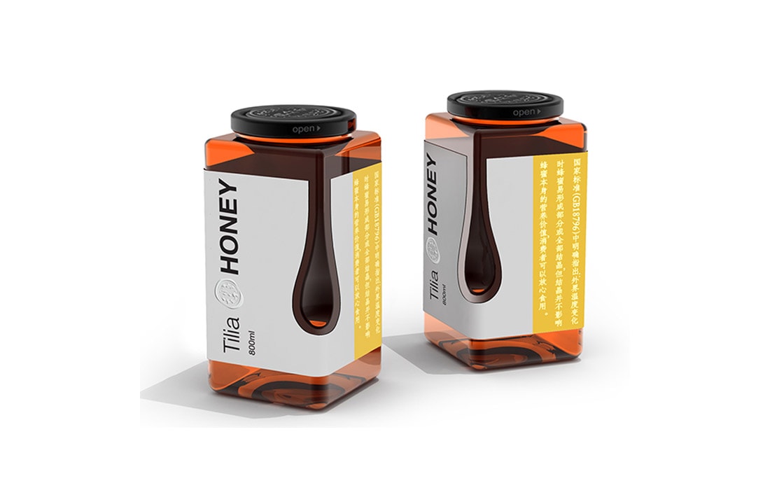
Think about honey. Many memories associated with honey are of pouring and dripping. What better way to trigger that memory than with a subtle hint to that effect? Designed by Igor Solovyov, this label design features a honey drop cut out from the label, and it definitely deserves an honorable mention in our list.
A few effective words and a clever design are all you need for a superb product label. But many of the best designs also break the rules and go for something different and unexpected. Even if you follow every rule of the book, you might want to consider breaking one or two rules for label printing, if every other jar on the shelf looks the same.
Top Tips for Making an Impressive Product Label
Use the label to make a statement about your product.
Think About the Main Appeal of Your Product
Is it the taste or smell of what’s inside? Something like a smoothie already has a bold and tantalizing color without the need for an overbearing label. In such a case, you might want to keep the label mostly transparent or minimal like the Innocent smoothie.
Use Few Words (on the Front)
We get it, you’re proud of your product. You should be. But there’s a time and place for detailed text, and it isn’t on the front.
Some products have too much writing on the front. And sometimes it’s just an overzealous description of what’s inside. That precious space could have been used to grab someone’s attention and appeal to their senses. Instead, there’s no salient point to bring in attention from consumers, so it mostly gets ignored. A few words and strong design can say so much more…
Choose a Readable Font
This is one to think about in tandem with the scarcity of space on the front of your product. There are products out there with a weird mish-mash of fonts, and it doesn’t look pretty. The most important words on your product label should be the most readable.
Use a Simple but Effective Image
If you’re using imagery, it should only be as complex as it needs to be to get a message across. Look to the Innocent smoothie or Original Source as a prime example. There are no highly detailed fruit images, just simplicity.
Use Your Best Instincts
As mentioned earlier, not all industries work the same. You may find certain trends in one area that doesn’t exist in another.
Craft beers are a good example of an industry where a lot of conventional wisdom went out of the window. Nowadays, people don’t know what they’re looking for, so art has become a strong way to appeal to consumers in the craft beer market.
If you’re going for a busier design, like those seen in craft beers, pick a palette of popping colors and keep the design clean and crisp. Look at your competitors and think about how you can grab a slice of this crowded market.
Conclusion
With the good and bad of product labels demystified, you’ll know what to look for if you’re developing your own products. Behind each impressive product label is a story. It could start with the brand or the appeal of the product. But an impressive product label is rarely done and dusted overnight. It’s a journey from start to finish. From the concept to the mass production and labeling. Armed with inspirational products and useful tips, that journey will start in the right place.