Neon Colors in Web Design: The Do’s and Don’ts
Neon colors are tough to use without clashing with the rest of your design. They work great for signs and lights in real-world applications, but can present major issues in web design, unless carefully implemented.
Today, we’re going to look at ways to effectively use neon colors in your design work, with a list of do’s and don’ts to help you make the most of bold, bright color choices. You’ll be a neon ninja in no time, weaving it through your design work!
Do Use Lime Green
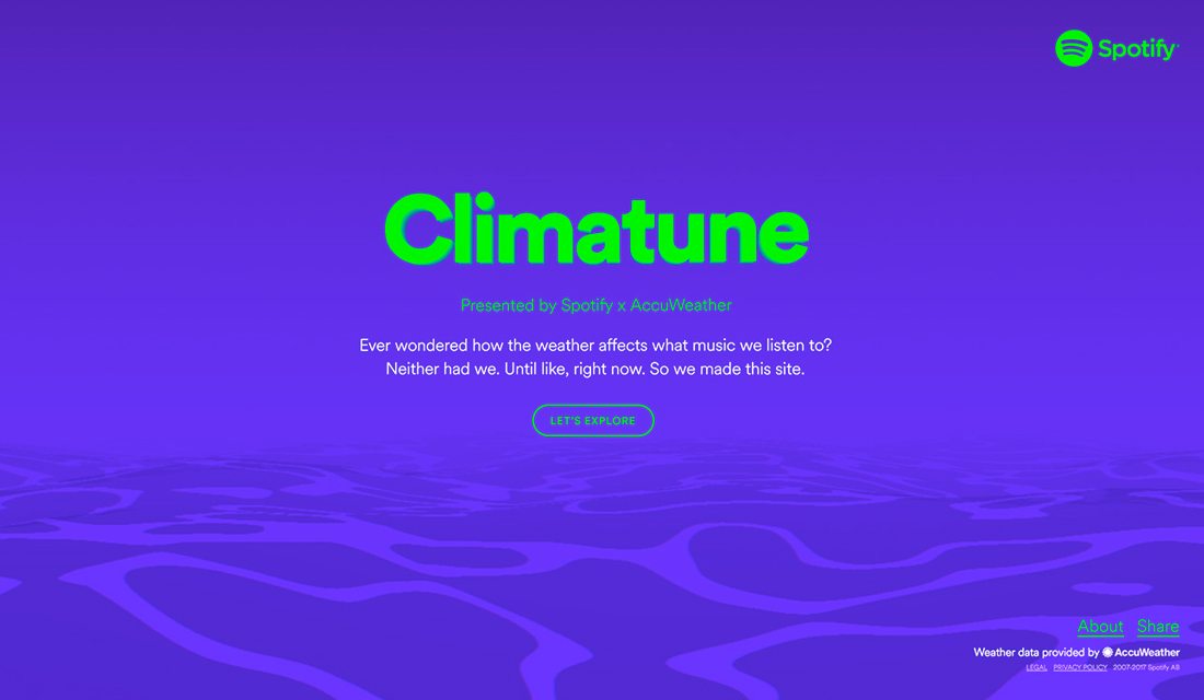
“Lime is the new neutral.” I don’t know if this is really true or not, but a wedding planner friend swears by it. She swears that is the “it” color to add to almost any palette.
When it comes to neons, it is definitely true. Lime, neon greens on a dark background create instant impact. The color is fun, engaging and draws users into the design. It’s an easy way to add a pop of neon without overpowering the entire design. (One of the big struggles with neons in web design is they seem to move and can be jarring for users.)
Don’t Use a Neon Rainbow
While some bright colors can work together to create an overall color scheme, neons aren’t the answer. Most neon colors have similar color values in terms of brightness and saturation and will all look similar on a screen. This can cause major concerns in terms of contrast and readability.
Do Make a Bold Color Statement
Go big with a full-screen neon. It’s not something users come across frequently and for a design with little else to compete for screen space, a neon color can provide plenty of impact.
Just be careful to keep everything else on the screen to a minimum. Opt for black text and as few other elements as possible.
Don’t Use Neon on a White Background
Neon colors and white don’t mix. The light from a screen shows through white and many neon colors in the same way, making neon elements almost unreadable on white background most of the time. Avoid it.
Do Incorporate Neons from Branding
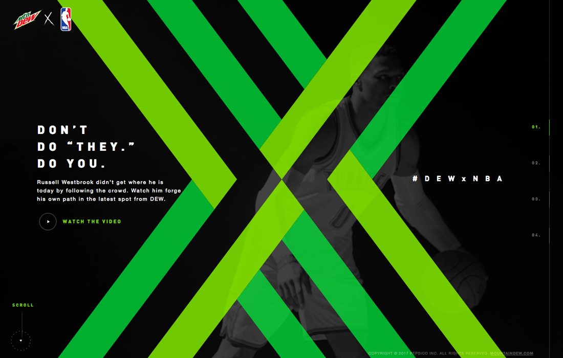
Some brand use a neon color scheme; don’t stray away from who you are to make creating a web design easier. The visual presence should be just as bold with neons online.
If a neon color is part of your brand identity, such as Mountain Dew (above), don’t shy away from it. Embrace the color with a design that pushes it to the forefront. The visual differentiation will help set the design apart from other websites.
Don’t Combine with Other Effects
A neon color is a pretty striking design technique in itself. Don’t go overboard by cluttering it with other effects. You’re likely to end up with something that will totally overwhelm – and turn off – users.
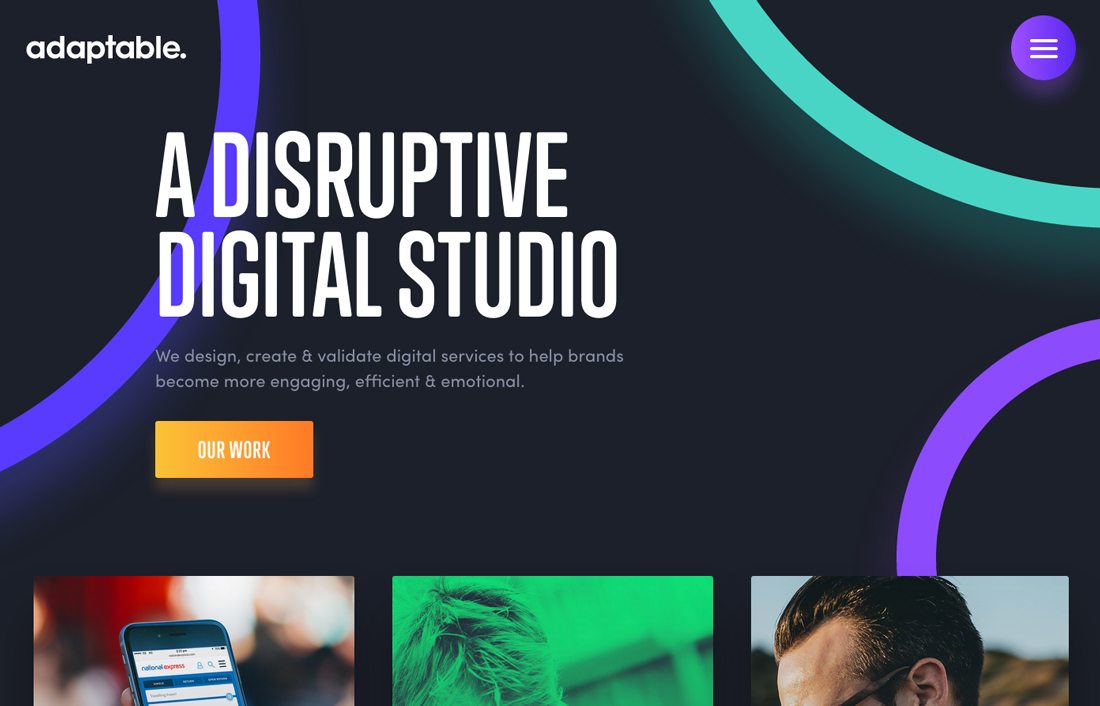
Do Use Neon Accents
Neon lines, marks, buttons and other accents can help draw the eye to specific elements. Include neon hues inside of other elements to create a point of emphasis or use splashes of neon color to draw the eye from one part of the design to another.
Remember, neons work best where there is a lot of contrast between the neon element and the background. Therefore, neons are often most effective on black backgrounds.
Don’t Use Neon Text
Most of the time neon text present a readability challenge. It can work on occasion with a bold display typeface, but should generally be avoided.
Do Make Colors “Glow”
The idea behind a neon is that the color is designed for light to pass through it, such as neon signage. Create a realistic neon effect so that neon accents seem to glow with the same light and tactile characteristics as a physical neon structure.
The balance is not to go too crazy with glowing effects because they can get gaudy in a hurry. A simple glow, though, can bring the neon element to life in a more realistic way.
Another option for creating “glow” could be to use a simple animation that enhances the color in a slow pulsing motion. This ebb of neon light can help draw attention while creating a realistic effect.
Don’t Use Clashing Color Palettes
Neon colors don’t mix well with others. Most designs featuring neons don’t use other colors, and stick to black and white. This is because the contrast between a bright neon and a more typical palette can be off-putting and feel strange and disjointed to the user.
Do Use Neon Imagery
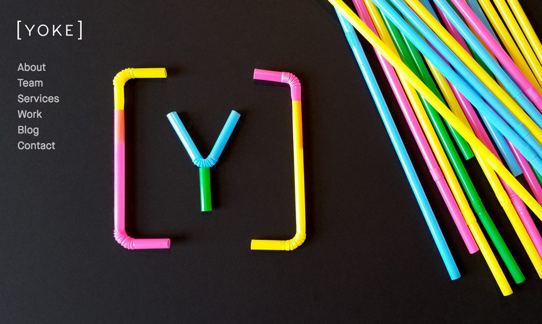
Neons are just for elements that you create in the design. Imagery containing neon elements can add a fun spark to the design as well.
True neon elements, such as lighting, can be tough to capture in photos. Opt for images that contain almost neon elements – Yoke (above) uses a beautiful combination of colored straws – to create that same feeling.
Keep the imagery simple and user the same concepts of space and contrast (you need plenty of both) that you would if creating a neon element in the design.
Don’t Set an Inappropriate Mood
Neon colors are generally fun, playful and a bit eccentric. Be careful not to establish the wrong mood by using them with content that doesn’t have the same feeling. While using neon colors can add visual interest, it is not to be used for every type of project.
Do Adjust Color Mixes

Make your own neon! Adjust saturation and brightness to create your own custom neon styles. Start with brand colors for a funky concept or just mess around with some hues that appeal to you.
And don’t feel trapped in the it-has-to-be-perfectly-neon space. Play around with almost-neon options that are bright and interesting, but maybe a little less in-your-face. Neon colors don’t just include green, yellow or pink. Neon options can come from pretty much any color with amped up brightness.
Don’t Force It
Neon colors should not be forced. If you start down the path of using neons and it isn’t working, abandon the idea. It’s not for every project and neon color does not appeal to everyone’s design taste.
Do Use Background Neons
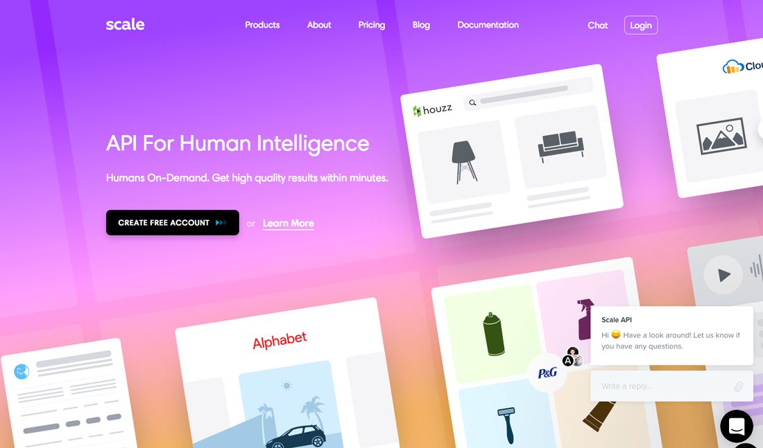
Try neon colors for a bold, bright background aesthetic that can bring somewhat bland content to life. A neon background can help “lift” other elements off the screen and provide a fun space for layering, such as the technique from Scale (above).
When designing a neon background, consider colors that have a little more depth and a little less brightness so that color doesn’t overwhelm other design elements.
Conclusion
Modern neon designs don’t have an 80s vibe, although many of the design evolved from it. Opt for neons that work in minimal design frameworks, highlight key content and have bold messaging for a modern feel.
Neon color can be a lot of fun, but the content and messaging should match. Save this technique for just the right project and you’ll be happier with the outcome.