New Logos for the Marlins, Orioles and Jays: Did They Get Better or Worse?
With a new year always comes new branding attempts. Organizations want a fresh face to signal progress and ongoing evolution and branding is the vehicle that designers use to achieve this goal.
As we all know quite well, this is a risky venture with large entities. If it goes well, your customers (or fans in this case) love you for it. If it doesn’t, you’re setting yourself up for plenty of public ridicule. Today we’re going to venture into the world of sports and check out three new Major League Baseball team logo designs. Which teams are updating their look for the new year? Were they successful or is the result a surefire embarrassment? Read on to find out!
The Florida Marlins Become the Miami Marlins
The Florida Marlins are a relatively young team in the MLB and were only established in 1993 (by comparison, the Cardinals date back to before 1900). In that time, their logo hasn’t gone through too many iterations. The one most of us are familiar with is shown below.
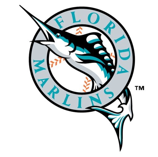
There’s a lot to like about this logo. It’s instantly recognizable and unique while maintaining that good old sports icon feel. It says everything it needs to in a nice compact icon: you’ve got the team name, the obvious mascot and even a baseball.
From a style perspective, there’s some simple, hard edge vector shading on the fish, but nothing over the top. The fish is depicted flying upwards in a classic pose, as if its shooting out of the water.
Overall, I love this logo. It’s a perfect mix of new and old world styles and has held up extremely well over time. It neither looks old and dated nor like a poor attempt to be modern through pursuit of a brief fad or cliche style.
New Stadium, New Name, New Logo
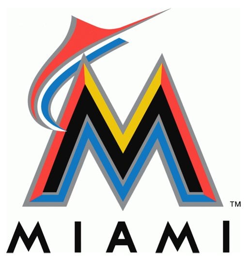
The Marlins have decided that it’s time for a change. They’re getting a new stadium and to go with it, a new team name and identity. They’re now the Miami Marlins and will play in Marlins Park in Little Havana, Miami, Florida under new manager Ozzie Guillén. Here’s the updated logo and team color scheme:
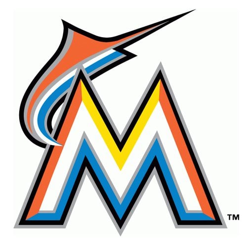
Don’t worry, if you think this is bad, check out the alternate version (home and away jersey versions perhaps?). I think the white is even worse:
I have to say, this is one of the ugliest brand updates that I’ve seen in a long time. The rainbow of colors melded into a faux bevel effect on the “M” and plastered next to their new bad modern art interpretation of a Marlin is just mindblowingly bad.
The trend in logo design is currently a drastic reduction of the over the top design styles of the early 2000s (we’ll see this in the Jays logo coming up), so I can appreciate what they were trying to do here, but the execution is a flat out slaughtering of their identity. It’s funny that this looks more like a 1990s design than the Marlins logo that’s actually from the 1990s!
Admittedly, I’m being purely subjective here. The fact that I think it’s ugly doesn’t make it a bad logo. However, if you can structure a sound defense for the visual choices made here, I’d love to hear it, because I simply can’t think of a single redeeming quality.
The Baltimore Orioles Get Friendly
The Baltimore Orioles were born in 1954 when the St. Louis Browns (St. Louis had two teams at the time, the Browns and the Cardinals) moved to Baltimore and took up the name of the official state bird of Maryland. The Orioles logo that we’re familiar with today only dates back to 2009:

The logo evolution here is an important part of the story. SportsLogos.net has a nice timeline depicting how the logo changed from its original inception in 1954.
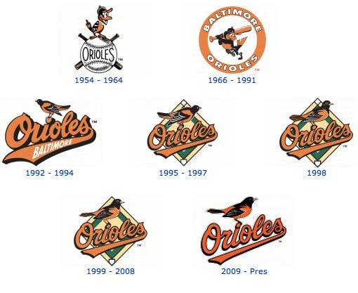
As you can see, though the bird started out fairly cartoon like, the 90s brought many attempts to refine him into something more realistic. The Official Orioles Website outlines a closer look at how the “Orioles Bird” has changed throughout the years. This source notes that from 1966-89, each Oriole player wore the “cartoon bird” on his cap:

As we’ll see next, this was a major influence on the newest round of design.
Bye Bye Realistic Birdie
To celebrate the 20th Anniversary Season of Oriole Park at Camden Yards, the Orioles have brought back the old cartoon bird on their helmets and caps. He gets a slight update, but the core character is very much the same as the old bird from the sixties.

I think the new cartoon bird does a great job of mixing together the best parts of both of the previous attempts. The 1966 version above looks a little chubby and has some sloppy curves. The 1975 version slimmed him out but took the friendly, relaxed face perhaps a little too far into ecstatic and hyper. Some of the shapes in the ’75 version needed work as well, such as the hat and confusing outer mouth line.

The 2012 version addresses all of these issues and puts the bird at a much better weight somewhere between the anemic ’75 version and the rotund ’66 version. His open beak is still a little difficult to figure out if you over think it, but it’s definitely an improvement from the previous version. I particularly like the new hat shape and the better branding with the “O’s” text.
Some will likely hate the new bird but I can easily go along with the direction they’ve chosen. This brings the team mascot back to its roots and makes it something that both old and new fans can more readily identify with. Rather than a cold, non-human icon, this is a friendly character that greets you with a big smile.
The Toronto Blue Jays Go Back to The Beginning
The Toronto Blue Jays date back to 1977 and are currently the only non-U.S. team in the MLB (the Expos are now the Washington Nationals). The original team logo was a lot like the Marlins logo: circular in nature with a baseball in the background and the team mascot in the foreground.
You have to love that rounded inline type and proud to be Canadian appeal. This logo is perfectly 70s in every way. Over the years, there were a few major evolutions eventually leading to the 2004 logo (hat tip again to SportsLogos.net for the timeline).
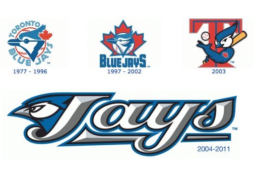
Too Football?
This was no doubt cool in 2004, but the style definitely reflects a brief trend that didn’t hold out in the long term, especially in baseball. In fact, the heavily bevelled text and mean bird head make this logo look straight out of the NFL in the early 2000s. Though similar, baseball and football logos typically remain fairly separate in style, with baseball drifting more towards classic appeal and heavy script while football takes the intense, tough and always changing trendy look.
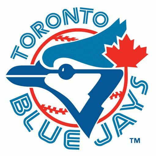
Back to ’77
Fans of the old logo will be thrilled when they see the newest iteration, which is very much a return to the 1977 look:

The name of the game here is pointy. The designers obviously started with the old logo and streamlined all the curves, both in the text as well as the bird. Notice that the inline text is used with more reserve here (a good call for any potentially difficult to read typeface), only “Blue Jays” uses this treatment while “Toronto” is written in a non-inline version of the same typeface. Also, the leaf has been moved off of the centerline of the baseball, a nice touch that makes each item more distinct.

For my money, this is the best logo update on the list. The Jays had come way off the mark with their branding, resulting in a bulky, ugly logo that while only a few years old, was badly showing its age. The new logo works because it once again says “baseball” and has a visual appeal that will hold up much better in the years to come. The key here is that it doesn’t necessarily jump on a bandwagon but instead uses a simple, easily-identifiable aesthetic that does justice to the team legacy.
What Do You Think?
The Blue Jays and the Marlins share a similar trajectory, we just don’t see the whole picture yet. In the Jays we see a team that took a bad turn with a really poor attempt to modernize their logo. This was ultimately answered with a drastic call back to the good old days. The Marlins are at the opposite point of their story, they’re at the beginning of their horrible attempt at a modern feel. This new branding is so bad that I suspect we’ll be seeing a revival some time in the next few years that brings the brand back to its roots. Let’s hope those poor Marlins fans don’t have to live with that logo on their gear for long.
The Orioles never really took that horrible turn because they never went overboard with cliché trends. Their logo has gone through a fairly nice evolution process with each step being logical and even attractive. The newest iteration is no doubt their boldest as it represents a very noticeable attempt to retro up the brand. Is this their bad move? Will this logo look horrible in a few years? Or is the retro strategy a good play that fans will love?
Leave a comment below and let us know about your thoughts on all three logo updates above. What do you think of the colorful new Marlins logo? Are you a fan of the realistic Oriole or do you prefer the cereal box like cartoon character? With the Blue Jays, do you think the big step back was actually a step forward or are they just following another lame trend?