When the Photo Doesn’t Fit the Space: Tips and Tricks for Making It Work
You’ve been there a thousand times, staring at a big empty canvas that simply doesn’t seem to work with the photo that the client has provided. Perhaps you have a vertical space and a horizontal photo (or vice versa), or maybe the image is simply too small to resize without unacceptable quality loss. What now?
Today we’ll go over some tricks of the trade and teach you how to cope with images that don’t fit where you need them to. The next time you run into a problem, you’ll be ready!
Our Example Image
This is definitely one of the trickier situations out there. Vertical spaces are super hard to fill when the provided image is horizontal. You toss in the latter and the former seems to go for miles, how are you going to fill all that space?
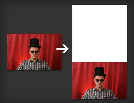
image source: Kate Fisher (photo 1, photo 2, photo 3)
The first step here is to find the subject of your image. Which part do you really want to focus on? Are there any parts that are not important? With this information in mind you can proceed to building an attack plan.
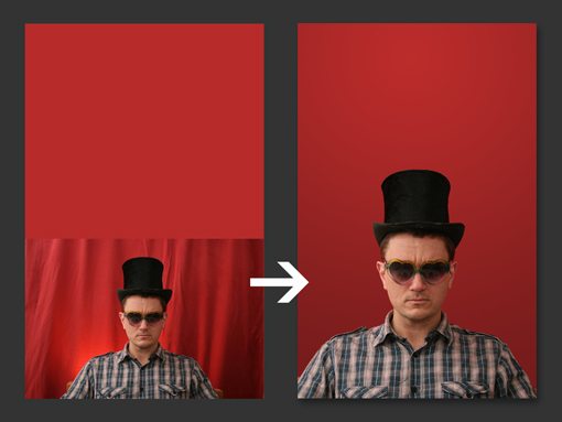
Find a Better Crop
If your subject is localized towards the center of the image, as in the case of this photo, you’re home free. All you have to do is crop the image differently so that it fills the space:
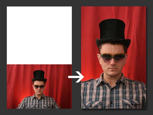
This is by far the easiest solution available. However, it’s not always going to be an option. For instance, I was working a very similar photo for a project the other day which contained four people occupying the entire horizontal space of the photo. This left no room for clever crops and I had to move onto cloning.
Clone Extra Background
Another trick that I would go to right away is cloning the background to extend the horizontal image into a vertical image. Unfortunately, this can be a troublesome approach. It works great with a fairly simple background, for example if our mad hatter above were on a solid or only slightly textured background.
However, in a case like this one where the background is somewhat complex, a curtain with fairly organic (non-uniform) folds and wrinkles, cloning extra texture can take a lot of time. If you really know your way around the cloning tool though you can pull it off. I spent about five or six minutes on the example below, cloning some extra texture on to fill the canvas.
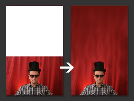
As you can see, the cloning is really spotty and ugly. Another ten minutes of blurring, cloning and painting though and I’m inching towards a more realistic result:

Cloning large areas is all about time, patience and incremental improvement. Given an hour or more I could really bring this to a good place. Sometimes you’ll have this kind of time to spend on a photo, other times you’ll be rushing to meet a deadline. More importantly, it’ll often be the case when your photo simply doesn’t work with this method. In this case you’ll have to come up with some other ideas.
Remove the Background
Rather than mess with the cloning, you could simply remove the subject from the background. Depending on your skill level with selections, this could be easier or more difficult than our previous attempt. Fortunately, the selection tools in Photoshop have become quite extraordinary and make this job much simpler than it used to be.
Two minutes with the Quick Selection Tool and Refine Edge and I’ve got myself a decent selection on Mr. Hat.
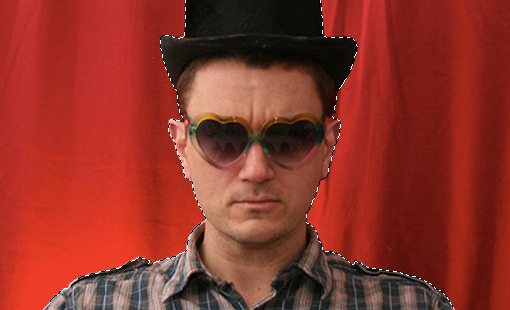
From here I pulled out the background and added in something similar. The result isn’t as natural as working with the original background, but it’s an acceptable quick fix nonetheless. Note that when a subject is photographed, the natural background colors actually bleed and reflect through quite a bit, making it easiest to choose a new background that’s fairly similar. Otherwise you could run into some serious haloing issues.
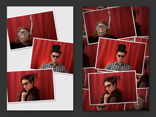
Use More Pictures
Sometimes you have not one but several images to choose from. Your initial thought might be that you need to choose one good image to feature, but why not use several if you’re having trouble filling the space?
When you open up this door, all kinds of possibilities come to light. Suddenly, you’re limited only by your imagination and can surely think of a million different attractive ways to fill the canvas.
Repeat the Same Image
You might think you’re out of luck on the previous tip if you’ve only got one image to work with, but you can actually still use many of the same ideas, you simply have to be a little more creative and repeat the same image in a logically intentional manner.
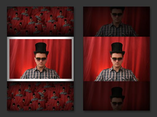
Here are two examples where I’ve simply featured one instance of the image more prominently than its clones. This helps bring a clear focus to the composition despite the repetition.
Embrace Whitespace
All of the examples above share a fundamentally flawed assumption: the idea that you have to fill the available space. In many cases, there’s absolutely no reason for you to spend hours racking your brain to create a full bleed image. Instead, embrace empty space and use it as a design element.
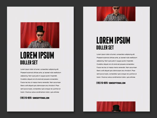
Here the heavy use of whitespace provides balance to the layout and gives the entire piece a light, minimal feel.
Use a Type Mask
A containment device for the image will help you use the space creatively. This can be something as complex as a custom vector graphic or as simple as some type. Place your photo layer on top of the type and then create a clipping mask (Command-Option-G) and it will automatically conform to the space:
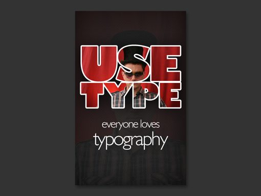
This technique can be tricky. If you really want a lot of your image to be visible, you’ll need to use bold type and create an arrangement with lots of surface area. Otherwise the image can get lost and the effect isn’t as successful.
Conclusion
Hopefully, this post has given you quite a few tricks to try the next time you’re stuck with an image that doesn’t fit well with the available space. Obviously, every case will be unique, but you can still approach the problem with logical steps in mind that ultimately lead you to a creative solution.
Leave a comment below and tell us about your tricks and tips for dealing with images that don’t fit the space. Have you tried any of the techniques above? Which is your favorite?