Stunning Examples of White Space… That Aren’t White at All
When you think of white space in web design, examples such as Apple or Google are probably the first ones that come to mind. While these companies do a great job of using white space in their designs, there are plenty of other ways to make the most of space.. even if it isn’t always white.!
White space is an important part of your design plan. Here, we’re going to look at the importance of space as a design tool and five examples of websites that are making great use of white space (that isn’t white at all).
White Space 101
White space refers to any part of the design that is left untouched by design elements. This includes the space between graphics or images, between lines of text, and margins and gutters. The open space inside design elements, such as the “hidden” arrow inside the FedEx logo is called negative space, although it has become rather commonplace to interchange the terminology.
White space is important because it plays a major role in contributing to the overall readability and organization of a design.
- Makes text easier for users to scan.
- Helps create natural grouping of similar elements.
- Prioritizes elements in the design, such as calls to action, search or navigation.
- Creates a feeling of harmony and sophistication.
- Establishes balance and visual hierarchy.
- Helps make heavy blocks of text easier to digest (and more likely to be read)
- Guides users through the design in a logical manner.
Space Doesn’t Have To Be “White”
There’s this myth about white space that needs debunking: White space does not have to be white.
White space can be a solid color, or a blurred background or even a bit of movement. The common factor is that the space is just that… space. It doesn’t contain another content or design element. If the user looked past it or away from it, no information would be lost.
The threshold is that all white space actually could be white, but the designer has chosen to create the visual in another way while still using the principles of space.
White space can appear in any part of the design and should serve as a tool to enhance usability from the top of the page to the bottom and throughout secondary pages. A good design pattern will use white space consistently to help make the visuals easier for users to digest.
Example 1: U+Design
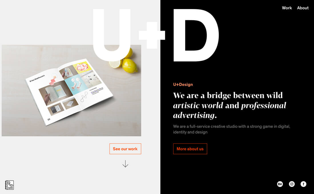
U+Design literally reverses out the concept of white space with plenty of openness on a black canvas for text elements. Images live in a lighter space, which creates a yin and yang effect, and while none of the space is technically white, it is all white space.
Space is used equally well below the scroll with plenty of room for elements and an almost moving pattern of space and design elements that encourages scrolling.
If you are looking for a lesson in how to create readable text, take a look at this design. While multiple text styles and color are used, everything is readable and text placement and size provides a good hierarchical framework.
Example 2: Emark

Emark uses cutouts and geometric patterns to create white space and add visual interest to images and text. The space is a mix of white and color with shapes and lines helping to provide visual flow.
The design also uses color blocks against a white background that include plenty of white space. The bright color and space combination creates distinctive text containers that double as highly clickable calls to action. Because of colored white space, users know that each of these blocks is designed to click.
The entire design uses magnified white space around text elements with plenty of padding and line spacing to enhance readability as well. (This is one of those trends that we are likely to see even more of as mobile text spacing concepts start to trickle into even more desktop-based website designs.)
Example 3: Joke de Winter
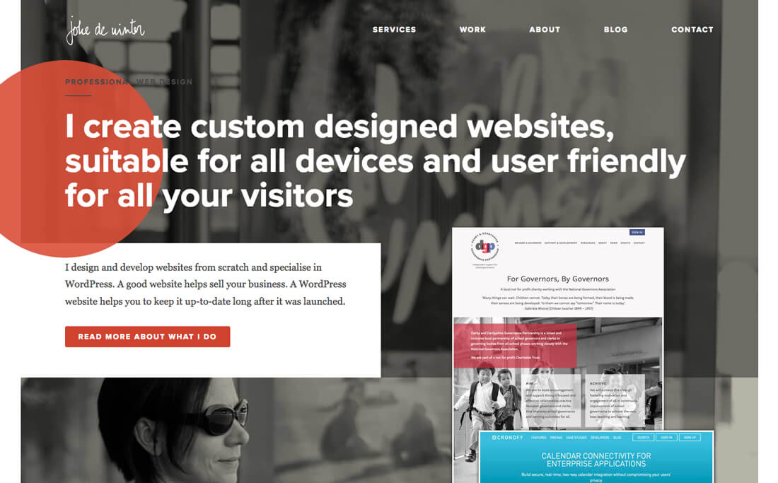
Joke de Winter uses a blurred black and white photo as a template for white space in the background of his website. The look is a modern, layered design that has a distinct feel and easy flow.
Below the scroll even more white space is used around text elements with oversized margins to put emphasis on specific text elements. The white space in the design alternates between white and gray and like the previous example, includes more spacing than we often see between lines f text.
Throughout the design, all of the margins have an asymmetrical style with plenty of space. The off-balance “balance” is harmonious and visually interesting.
Example 4: Astronauts Wanted
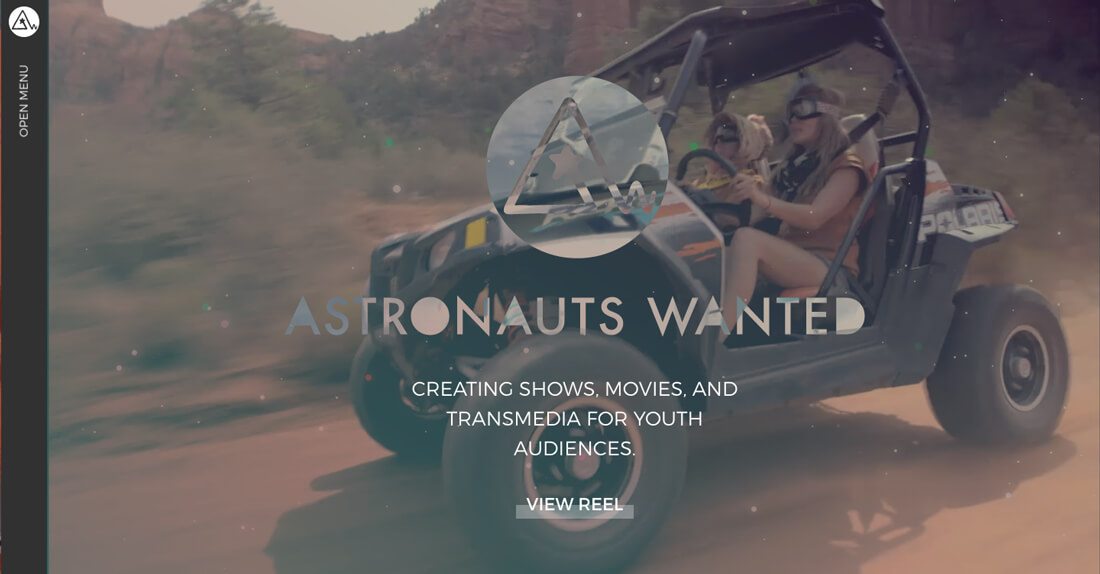
The fast-paced action of Astronauts Wanted might not be what first comes to mind when thinking about white space. But the logo, text and elements on top of the video work in just that way. The important above-the-scroll information is easy to read and see despite the action in the background. It’s centered with plenty of room on either side and all the way around. (And the logo made with negative space helps bring attention to the overall effect.)
The same concept is used below the scroll with text blocks on top of still images. The space is beautifully designed and the only actual white-colored element in the design is the text itself.
Example 5: Le Farfalle
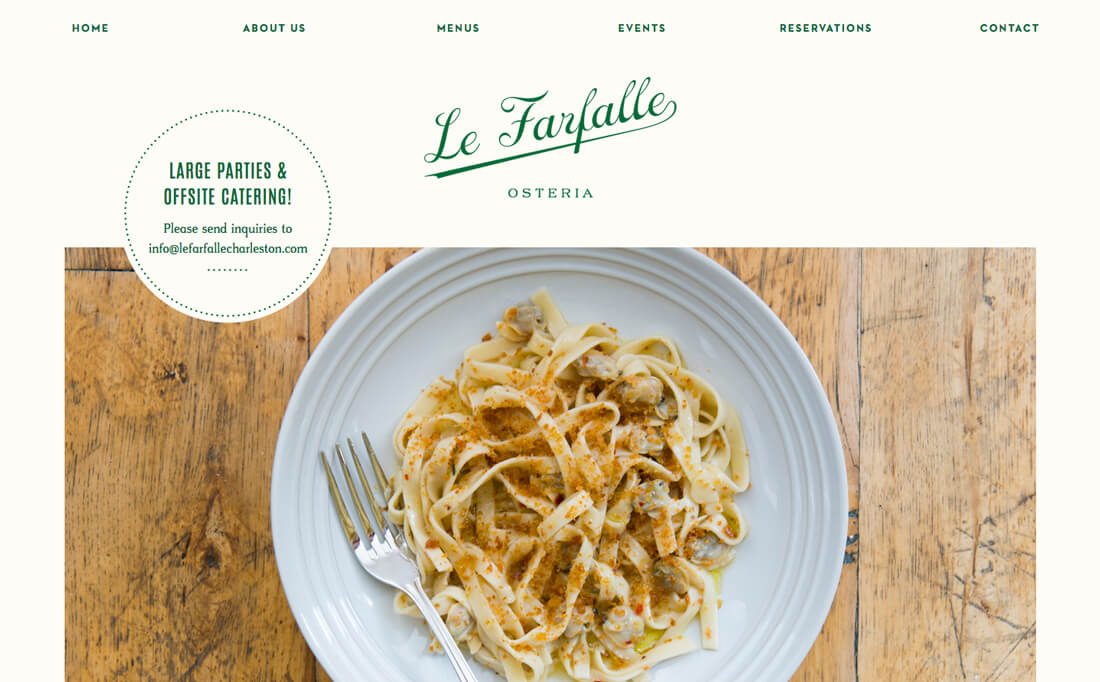
Le Farfalle uses a simple cutout in the hero image such as one of the previous examples, but the most impressive use of space appears as you scroll with large alternating spaces for images balanced with oversized white spaces containing text.
This style makes it easy for users to move from image to text and back and then down the page through all of the content. What could be a heavy design becomes lightweight and easy to read.
In addition, the design uses wide margins and padding so that every element really has room to stand on its own. This use of space creates a sophisticated aesthetic that matches the vibe of the restaurant.
Conclusion
Today’s takeaway – white space does not have to be white. Don’t let yourself fall into that trap. You have some examples of ways to use space with color and images and video as a place to jumpstart your creativity.
Now it is your turn to showcase some examples of white space.