How to Use Synergy to Take Your Designs to the Next Level
“Synergy” – In business this is a term that has been so often abused that it has become a meaningless buzzword. Some of you may cringe just at the sound of it.
However, in design synergy is a powerful weapon that, when wielded properly, can make your designs much more interesting and creative. What is synergy? Where can we find some solid examples of synergy in design? How can you use synergy in your work? Read on to find out.
What Is Synergy?
If I look up the word synergy on my Mac, here’s what I get:
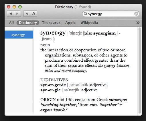
According to this definition, synergy is “the interaction or cooperation of two or more organizations, substances, or other agents to produce a combined effect greater than the sum of their separate effects.”
The key principle here that I want to focus on is the latter part of the definition. The idea that an object can be greater than the sum of its parts is counterintuitive. It presents a logical thought problem that tells us that one plus one can equal three.
If you present this problem to any typical educated and intelligent individual, they’ll tell you without a doubt that one and one together will always be two. However, if you present the same problem to a designer like me, you’re likely to get an answer like the one below:
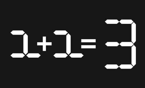
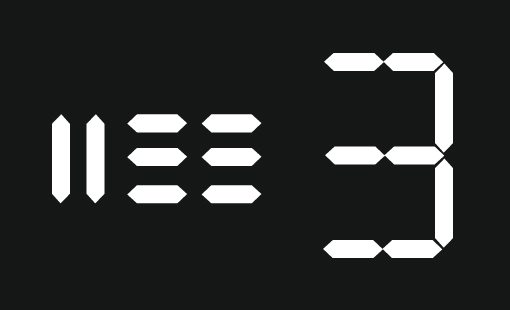
It’s a dirty trick isn’t it? I turned the existential problem of two objects actually being three objects into a simple visual puzzle. I made two ones out of basic pieces and then reassembled the same pieces to represent a three. Looking at it a different way, I made eight shapes combine to equal one symbol:
The child inside of you that learned to strictly abide by the principles of fairness is screaming “you cheated!” but the creative person inside you has to admit that it was a clever solution.
The trick that I used was visual synergy. On a basic level, every design you create uses synergy. You take separate elements and place them together into a cohesive whole. However, sometimes you can wield those individual pieces so well that the whole is a particularly impressive example of creativity and holism.
Synergy in Logo Design
One of the most popular places that I see really excellent examples of visual synergy is in logo design. Logo designers are often tasked with using very basic elements to tell a story or communicate a concept. Backed into this tight corner they impressively manage to come up with a lot from a little.
For instance, designer Nastya Dovgal was given the name “Advance Inform” to work with; fairly vague as far as company names go. According to Nastya, this company is “engaged in the work of Land Management – topografichno-geodetic, mapping, research, work on the surveying of lands, the administrative division of lands, etc.”
She started with some basic triangles:
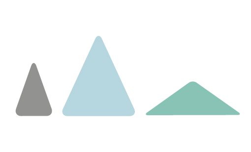
Separate, these don’t look like much. However, when placed together the result utilizes synergy to paint a much more impressive picture.
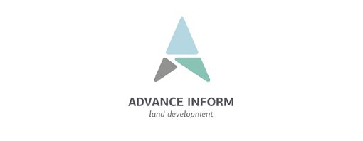
Suddenly, these three triangles are telling us a lot. We see a clear arrow shape. This communicates the concept of “advance” from the company name. The shape of the arrow reminds us of something we’d see on a compass or map, which ties into the purpose of the company.
However, we’re still not done. The power of synergy takes the logo one step further when you realize that the triangles also clearly form an “A” shape, which reflects the initial letter in the company name.

This is a heck of a lot to accomplish with three simple triangles! This is the beauty of synergy. It makes a design come together and work, often better than you would’ve even thought possible.
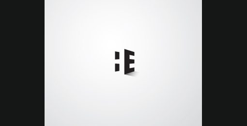
Negative Space Tricks
All of the talk you see of using negative space in logo designs ties back into synergy as well. Here two simple skewed rectangles become an “H” only when combined with the “E”.
Synergy In Web Design and Multimedia
Tricks with visual synergy are easy to find in logo design galleries, but with web design it’s a bit more complex. As I stated above, every design uses synergy to a degree so it’s not easy to find and identify examples that clearly stand out as those who combine their parts particularly well to equal a whole that is something more than you’d expect.
One awesome example that comes to mind is The Wilderness Downtown, a Google Chrome experiment that combines the music of Arcade Fire and the power of HTML5.
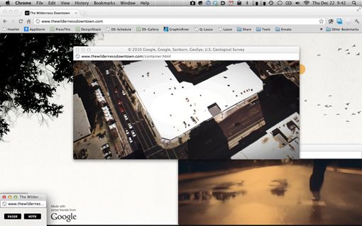
This unique experience integrates Google Map satellite and Street View data with live action video, vector motion graphics music, and an automated browser window opening, positioning and closing process to create something completely original that is truly much more than the sum of its pieces.
All of these technologies gel together into this almost sci-fi like event where you feel like you’re actually in the video. A cloaked, faceless person that you can project yourself upon is shown running down a street, your street as it turns out. Your house and neighborhood take center stage as both the visual and auditory sensations play with your emotions and sense of reality.
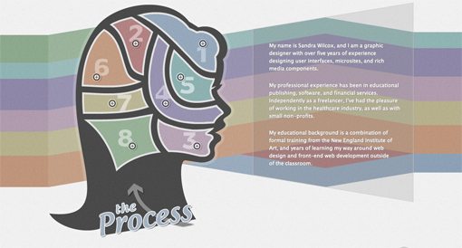
This is synergy wielded powerfully and impressively. It doesn’t always have to be so complicated though, sometimes it can be as simple as an image:
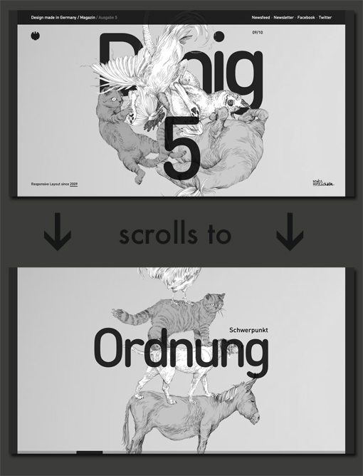
Or perhaps its something that leverages interesting web technology such as a parallax effect, media queries or scrolling tricks. For example, the following site uses two different background images to tell a funny little story as you scroll down the page.
Conclusion
“Synergy” is a fairly abstract term when it comes to design. There’s no single use of synergy that can adequately describe the concept in its entirety. Instead it’s a mindset and an approach that can help make your designs seem more clever, integrated, and engaging.
Synergy is what you make of it. As you approach your next design project, consider the examples in this post and let them inspire you to question how you can push yourself towards more interesting techniques that make your end product more effective.