The Designer’s Guide to Visual Punctuation
Punctuation is more than just periods and exclamation points. In terms of design, punctuation can be anything that causes a reader or user to stop or pause. It can happen while reading text or as the eye moves from one element to another. These bits of visual punctuation are everywhere and are vital parts of any design concept.
The key elements of visual punctuation include common readable punctuation marks as well as space, lines, rules, icons and color.
What is Visual Punctuation?
Visual punctuation comes in two primary forms – marks that cause you to stop in the process of reading or elements that create a pause when looking from one object to another. Both types of punctuation are equally important, and while contextual punctuation is fairly known and common, not everyone often thinks about other visual cues.
Visual punctuation is important because it can keep people looking at a design engaged and prevents fatigue when reading or looking at a design. Natural pauses are part of human nature and by designing them, you create stops that occur when and where you want them. The helps add context and visual flow.
It also makes your design easier for a user/reader to digest. When the “work” is done for them, viewing a design can be easier and require less effort or thought. (And we all know that in today’s busy world, making things easier for those looking at our designs is better.)
In a nutshell, visual punctuation is anything that the designer uses to separate, group or emphasize elements, photos or words within a design. Intentional or not, visual punctuation will cause someone to stop and look at a certain part of the canvas.
Readable (Text) Punctuation
The most commonly-known type of punctuation is … well … actual punctuation. All of the marks that appear in text that cause you to stop while reading are considered punctuation.
Common symbols include the period, question mark, exclamation point, asterisk, em dash, semicolon, brackets, parentheses, ellipsis, quotation marks, colon, hyphen, apostrophe and the comma. The marks can be used in the context of writing or forming sentences, but are often used for visual purposes as well.
Sometimes these characters will be used as part of a logo or in the art of a design to convey meaning or emphasis. Because of their common nature and often well-understood meanings, these symbols are easy to use in a variety of ways.
Space
The use of space as a form of visual punctuation also comes from text and writing. Space is used to not the start of a new paragraph in a block of text, or even the start of a new chapter in a book. Space can function in a way that is distinct like a period or in a more flowing manner such as an em dash.
Space is also used to create visual starts and stops and create a direction for your eyes to travel. The amount of space used between elements can represent how close or far apart they are in relationship to the other content. Space can also create room for you to focus on multiple elements independently.
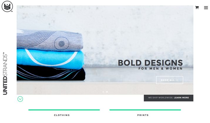
Look at the image above from United Strands. There is a great deal of space between the stack of shirts and the simple text. The space gives the user time to look at each item and digest it on its own and then as a unit. Space serves as a reminder to slow down and as a way to connect the elements on the screen.
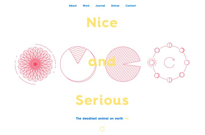
Space brings about a different result in the Nice and Serious page above. Because of consistent spacing between four similar, but different, items in the red circles, you naturally group the elements as a single image. The space between each element is rather tight and consistent from one item to the next, making them “feel” like a single element.
Lines and Rules
Lines are rules create distinct separation between objects. (You can also accomplish the same effect with boxing elements.) The line delineates where one thing ends and another begins; it is much like a period at the end of each sentence in a paragraph.
Lines are often used in conjunction with space, but that is not always the case. Lines that are close together or lack spacing can contribute to a feeling of tightness or can sometimes link items across that separation.
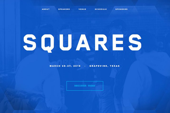
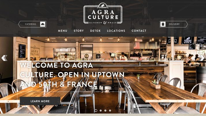
In the examples above, lines are used in two ways. On the Square page, multiple lines are used to form an imaginary, or “ghost” button. Lines set the clickable part of the page apart from the rest. On the Agra Culture Kitchen & Press page, lines are used in two ways: To keep the eye moving from element to element and to bring attention to specific content of importance, such as the logo, main text and call for action button on the homepage.
Icons and Design Elements
While the use of icons and other elements (and user interface tools for digital projects) are the result of function, they also provide design direction. These tools tell users where to go in the design, how to interact with the content and help shape the overall actions a user will take when interacting with a specific item.
In print projects, for example, Facebook and Twitter logos are often used to tell users that companies have pages they can like or follow. Icons rather than longer or more difficult URLs are becoming the norm. These same icons are often used in digital projects as a clickable link to these sites or that take users to sharing options within these social media sites.
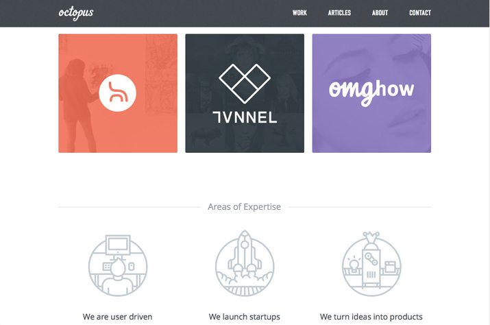
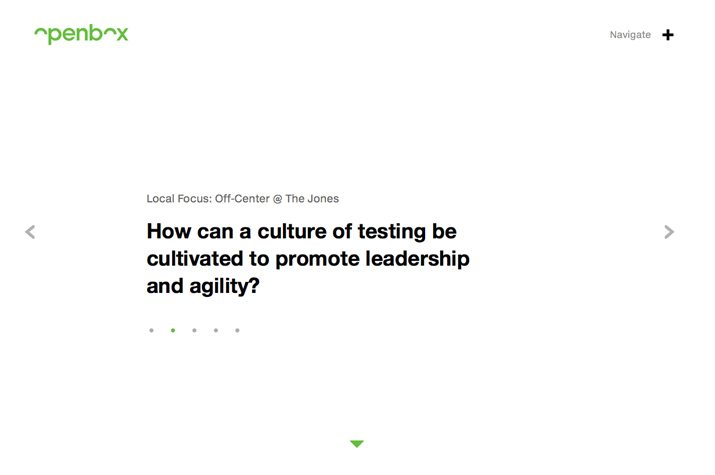
Icons and design elements can have other use as well. They serve as visual divots in the storytelling process and can be used to entice readers through text or from one item to the next on the canvas. (Think of them almost like commas, which allow you to pause, but not stop moving along the path.) Octopus, for example, uses large icons as links in the colored boxes and as visual navigation elements in the bullet points below. Openbox uses icons in a similar way, varying designs of triangles to help users move through the content on the site. (The + or x, depending on orientation, does the same thing.) Another element of note here are the dots below the main text, which act as a rule and navigation tool.
Color

Color can add a fun flair when you are looking to create separation of elements in the design. And there are plenty of ways to accomplish it. From color versus black and white to sharp contrasts to thematic color scheming or color panels, using varying hues is an easy way to bring attention to specific parts of the design in interesting ways.
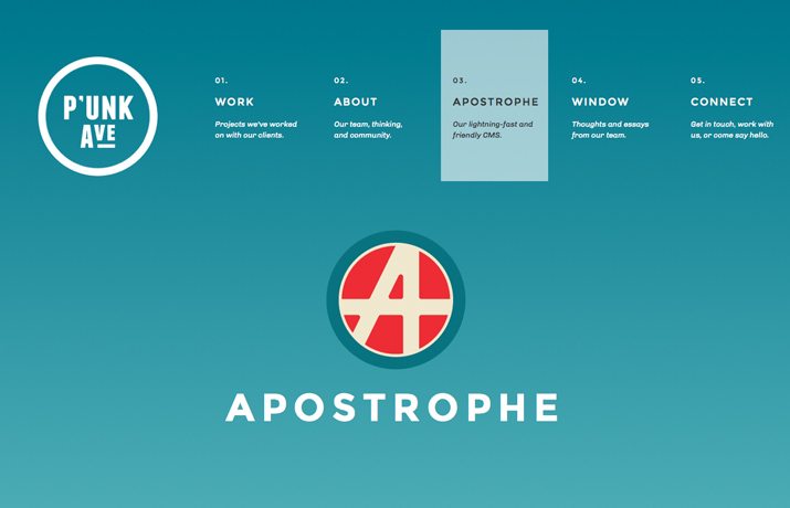
The examples above show two sharply different ways to use color to create pause. On the P’unk Ave page, a bright red icon is swimming in space against a single-color background. It garners immediate visual impact and connection. (Consider it an exclamation point of sorts.)
The South Australia page uses color in a quite different way. Each different content section (and coordinating screen in the parallax framework) use a different color screen. This helps you know what section you are reading and what other content is to come. These visual “semicolons” give you time to finish one thought while moving to the next.
Conclusion
Visual punctuation is everywhere. It might not be as obvious at first as the small characters of the same name in text, but it is just as important. Visual punctuation helps create flow, direction and prevents reader (and user) fatigue.
It helps create harmony and visual harmony. The bigger question is not whether you use it, but if you think about it in the design process. Do you visual punctuation marks just happen, or do you plan them out? We’d love know more about your design process in the comments.