The Evolution of Flat Design: Muted Colors
Today, we’re taking flat design to the next level. Not every project works with some of the bold, bright color choices that are commonly connected to flat design.
So don’t get stuck using them. Kick up your flat design scheme a notch with a more muted color palette. The subtle change can help give your site a trendy overhaul and help it stand out in the flat design crowd. Here we’re going to pick apart a few websites that are using this style exceptionally well to help you create a site using flat design and a muted color palette.
Muted Color Primer
You’ve probably seen variations of the flat colors palette thousands of times, and sometimes these colors just don’t fit the design aesthetic you are going for. Even when everything else about flat design appeals to it.
That’s when muted color options can work wonderfully. Using a muted color palette with a flat aesthetic is classic, polished and just different enough to make it stand out from all the other flat projects out there.
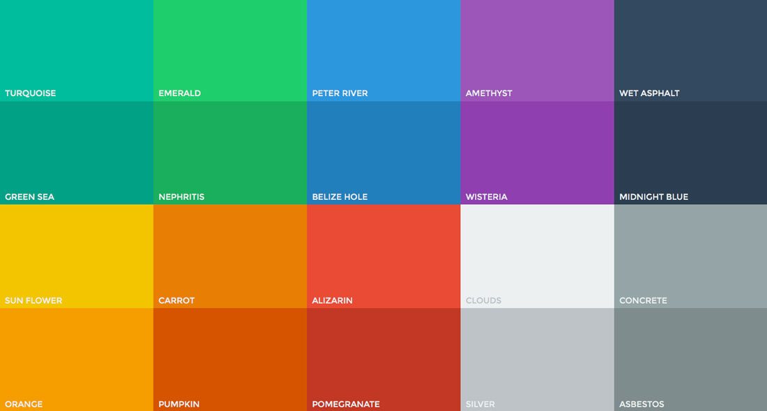
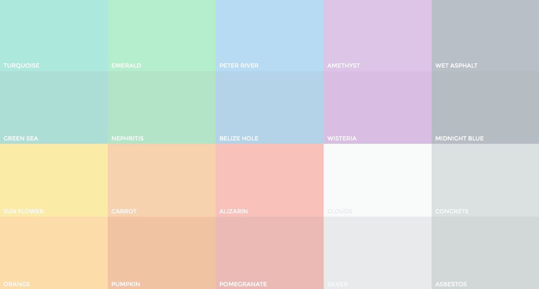
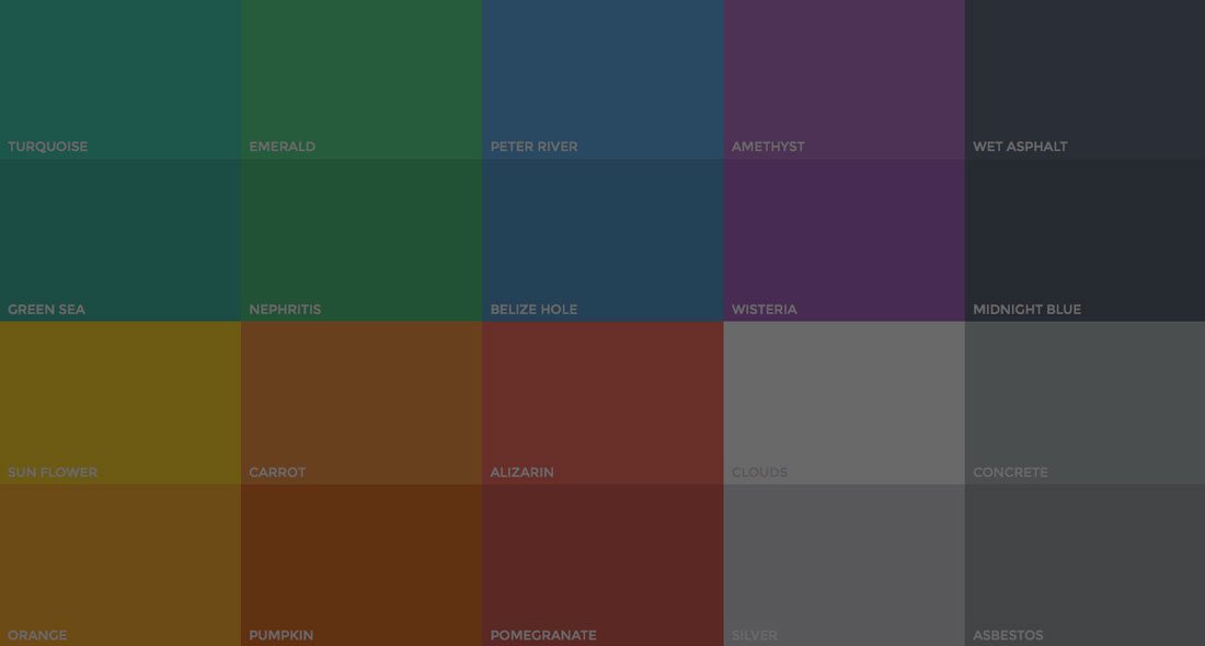
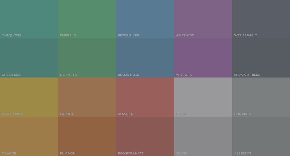
But what is a muted color palette? For purposes of this conversation it is any highly saturated hue (such as those from Flat UI Colors) and adding a tint, tone or shade to make it less bright and more subdued. The result is often a softer, calmer color that can be easier to work with and match to the overall design.
You can see from the images below how the same colors from Flat UI Colors can look different with changes to the white or black used with them. And, quite simply, that is what a muted color palette is all about. The rest of the design aesthetic can follow as closely (or loosely) to the principles of flat design as you like.
Tints
Tints are created when you add white to a color to lighten it. This color is often significantly lighter than the original color and is usually referred to as a pastel. Tints can range for almost white to just a few touches lighter than a fully saturated color. They often have a lighter, softer feel and create a more soothing aesthetic than bolder, brighter options.
Tints work well with photos and are popular on sites with illustrations. These lighter colors often fall away from the main aesthetic and are best suited for design purposes when other content, such as images or words, really needs to be the focal point.
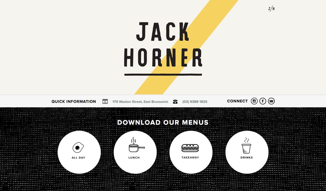
Jack Horner uses tinted colors throughout the side design to contrast sharply with black accents. The yellow on the homepage is so light it might be hard to see if not for the brighter accent. The site also uses a tinted green for calls to action and important information throughout the design to keep users engaged.
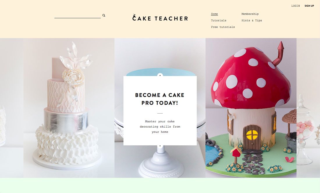
Cake Teacher uses a similar pale yellow and green color palette but with different tinting. Yellows are a little brighter and greens are a little lighter than the colors in the Jack Horner site. The subtle tinted palette helps users focus on the cake photos in the middle of the screen, particularly those with brighter color options. The contrast of light and bright helps create a center of focus for the design.
Shades
Shades are colors the result with the addition of black. This will make a color darker and appear heavier to the eye. The range for adding black is anything from almost black with a hint of color to just a touch darker than the original hue.
Shades can work well in certain types of environments, often when used with less black. Projects that are really dark and include a lot of black can result in concerns about readability if not executed exceptionally well. One thing that many people incorrectly assume is that shades have to look black, but when evolving a color from traditional flat design schemes, in particular, this is not the case at all.
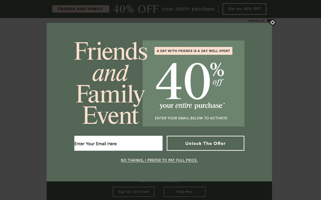
The sale pop-up for retailer Ann Taylor uses a combination of shades for a simple green promo that is easy to read and appealing to look at. The aesthetic uses plenty of flat concepts and trendy elements such as ghost buttons and bold typography, but the shaded hues are anything but “traditionally” flat. Combined with the yellow text (thanks to a tone), the muted flat palette is striking and modern.
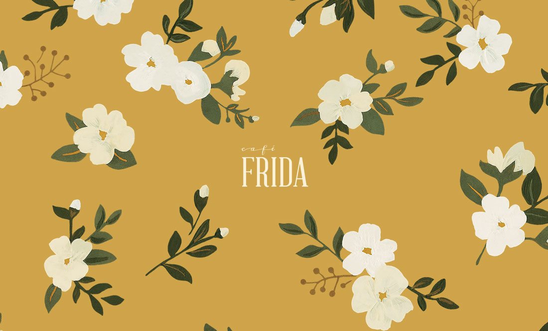
Café Frida uses a set of colors that is not at all common. The shaded yellows, greens, and even whites create a vintage feel. The colors are strong, yet not overpowering. They are engaging but not quite exciting. The combination sets the scene for the café, which is executed well through the scroll of the homepage.
Tones
Tones are created by combining white and black with a color to make it appear softer. Most colors are actually created using tones. They are complex colors that have an almost universal appeal because they pull from multiple parts of the color spectrum. It is this subtle quality that make tones the No. 1 choice of designers and artists for most projects.
Tones work in almost any design aesthetic because of their pleasing nature.
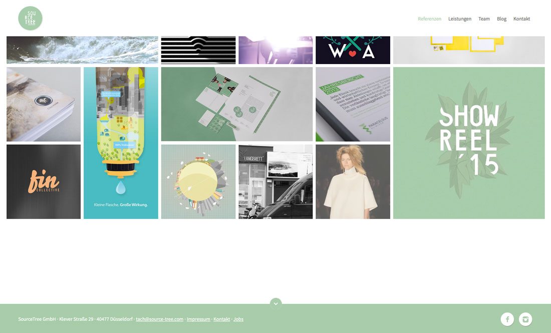
Source Tree uses a pale, almost soothing, green throughout the site. It is combined with other flashes of toned color as well for the other projects showcased. What’s nice about this color is that the toning gives the site a welcoming feel. Just imagine how different this site would look if it were to use Emerald from the flat palette above in all the places where the toned color is used. The color almost gives room to the smaller boxes and animated elements, something that would not happen with as much visual ease if the color were significantly brighter.
The institute for Faith, Work and Economics uses combinations of complex color tones to move users from the main image down the page to the call to action. The dark blue and yellowish combination is easy to read, thanks to high contrast, and visually interesting because the colors are your standard blue and yellow pairing. The colors are used throughout the design to help establish focus throughout the design and lead users to actions and clicks all over the website.
Conclusion
When you are branching out from some of the more traditional colors of flat design, you don’t have to pick one of the color techniques above. You can combines tints, shades and tones to create something that’s absolutely engaging and different.
The real lesson in these simple case studies is this: Don’t get caught up having to use a trend “by the book.” Break away with a different kind of technique to make the trend and usage yours. These examples show just how wonderful changing only the color palette can be, while still working on designs that are flat in nature.