The Science Behind Color and Emotion
Color resonates with people in different ways. We all have a favorite color or color that we use more during specific periods of life. But the color you use in a design project can say a lot about the work itself. That’s a scientific fact.
The science behind our emotional connections to color is a complicated one. But it is becoming more clear through anecdotal knowledge and scientific experimentation. Here are five hypotheses and a fifth-grade level experiment you can try to help us better design with color and understand its emotional impact.
We Might Be Hardwired for Certain Hues
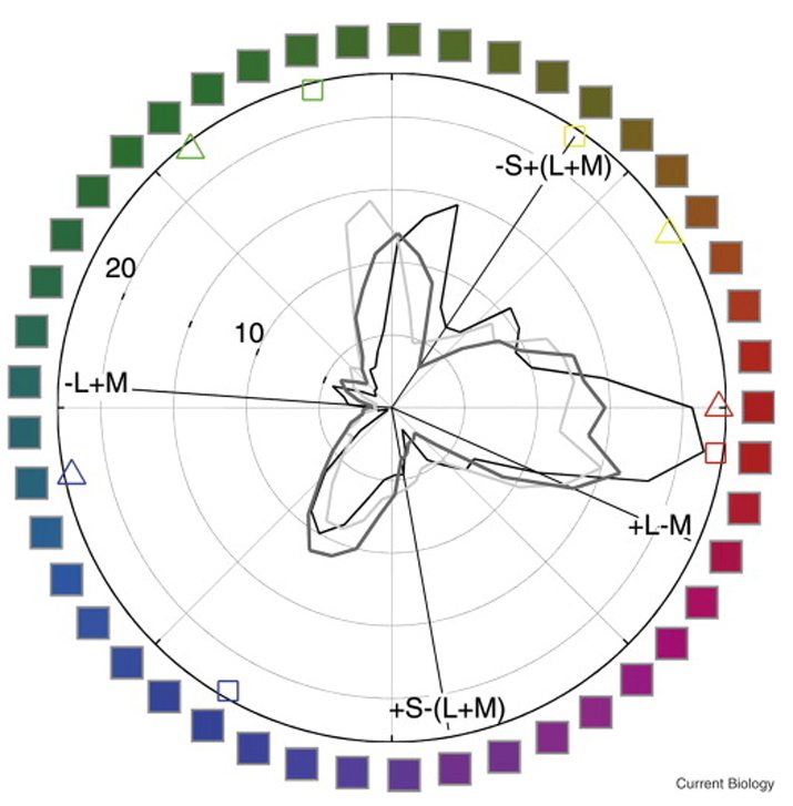
Is it possible that our brains are wired to like (or dislike) certain colors? It all relates to emotion responses when we see color. A study by Wellesley College researchers Stoughton and Bevil Conway links neural processes to color.
Conway, who is also an artist, is using his research to determine how the brain processes color and impacts our feelings about it. “I think it’s a very powerful system,” Conway said in an interview with Co.Design, “and it’s completely underexploited.”
The study further relates some of the things we already know – color context changes based on other colors in the field of vision and that emotion is a big factor when thinking about color.
The study found that “globs” in the brains of monkeys reacted differently to colored stimuli, and reacted based on color. The brain was most triggered by specific colors (red, then green, then blue) and colors with the most saturation. What this tells us is that these colors immediately impact a user and draw attention.
This work has significant implications for the creative community. “To the extent that anyone would find it informative to know how the nervous system works, and through that would gain an appreciation for these phenomena, I think artists and designers could benefit,” Conway said in the Co.Design interview. “This provides them with another lens through which to consider what they’re doing when they make those kinds of choices.”
Color Impacts Cognitive Performance
Can color impact your ability to create? According to a study by researchers at the University of British Columbia, red can focus and help make a person’s work more accurate while blue can spur creativity.
While this on its face is fascinating, the results are harder for designer to use. The study really only looked at the colors red and blue. (Six hundred people participated in visual tests with words and images against red, blue or neutral backgrounds.)
But it does reinforce some of what we historically know about the colors. Red is a color of stimulation, while blue is more relaxing and calming. Could that have something to do with it?
It’s also important to consider context. Looking at words and images in an isolated environment can be different that when you are trying to connect a user to a brand, website or package. What this study does tell us is that color is important and even more so is the context used with that hue.
Red Means No

While we are thinking about the color red, do you ever think about its almost universal meaning? Across cultures it often represents “no.” A study by researchers at Dartmouth College found that is common emotional association to red may be innate.
A study involving monkeys found that the animals avoided humans who wore red (versus green or blue). “We – primates and then humans – are very visual,” neuroscientist Jerald Kralik said about the experiment. He further explained that color provides cues for everything from what is ok to eat to determining how others feel in different situations. “We start to see that color may have a deeper and wider-ranging influence on us than we have previously thought.”
This study provides a useful bit for designers – color can have impacts that even users don’t understand. Common associations (such as red meaning to stop or halt) should be taken into consideration.
Color Impacts Intuition
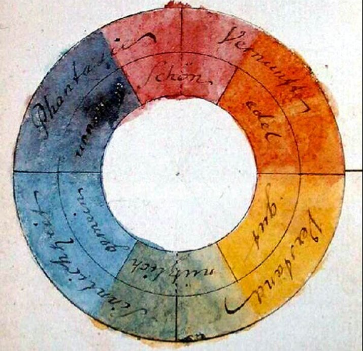
The research into color is not a new phenomenon. It can be traced to works that are hundreds of years old. One of the most relevant today remains “Theory of Colours” by Johann Wolfgang von Goethe, which was first published in 1810.
While this was not a “scientific work” per se, it set the course for much of what we know about color and the basis for future research.
Goethe published one of the first color wheels and associated color with more than hue; he also showed psychological impact. His theory about how color impacts our emotions and thoughts is still widely-used and applies to how we think about color.
The book is a great read for anyone with an interest in color theory. Here are some of Goethe’s color specific highlights:
- Red: “The effect of this colour is as peculiar as its nature. It conveys an impression of gravity and dignity, and at the same time of grace and attractiveness. … History relates many instances of the jealousy of sovereigns with regard to the quality of red. Surrounding accompaniments of this colour have always a grave and magnificent effect.”
- Yellow: “In its highest purity it always carries with it the nature of brightness, and has a serene, gay, softly exciting character. … State is agreeable and gladdening, and in its utmost power is serene and noble, it is, on the other hand, extremely liable to contamination.”
- Blue: “As a hue it is powerful — but it is on the negative side, and in its highest purity is, as it were, a stimulating negation. Its appearance, then, is a kind of contradiction between excitement and repose. … As the upper sky and distant mountains appear blue, so a blue surface seems to retire from us.”
- Green: “If the two elementary colours {yellow and blue} are mixed in perfect equality so that neither predominates, the eye and the mind repose on the result of this junction as upon a simple colour. The beholder has neither the wish nor the power to imagine a state beyond it.”
Logo Color Affects Consumer Habits
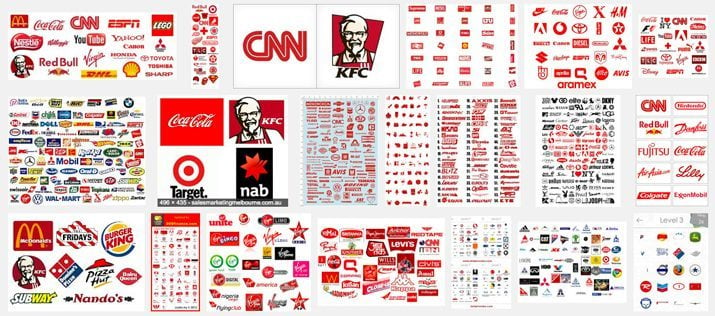
“The specific colors used in a company’s logo have a significant impact on how that logo, and the brand as a whole, is viewed by consumers,” according to a study conducted by researchers at the University of Missouri-Columbia. The study found specific links and ties to colors within logos and how people felt about those brands.
- Blue logos invoked feelings of confidence, success and reliability
- Green logos invoked perceptions of environmental friendliness, toughness, durability, masculinity and sustainability
- Purple logos invoked femininity, glamor and charm
- Pink logos gave the perception of youth, imagination and fashion
- Yellow logos invoked perceptions of fun and modernity
- Red logos brought feelings of expertise and self-assurance
The findings change some of the ideas that we associated with specific colors. “Of all the feelings associated with logo colors, the feelings associated with red logos were the most surprising,” Ridgway told Science Daily. “Traditional emotions based on red include aggression and romance, but red logos did not invoke those emotions in study participants. This can probably be attributed to the fact that red is used in logos of many well-established brands such as State Farm, McDonalds and ESPN, so consumers have pre-existing emotions associated with brands using that color.”
The question this study holds for designers is “Can we change the preconceived perception of a color?” And is it a chance worth taking?
Experiment for Designers
Determining how a set of colors will impact users of your design is not complicated. This experiment is adapted from a fifth-grade science project idea and is something you can do in the testing phase of any design project.
- Prepare several versions of the same design with different color schemes.
- Find a set of volunteers to answer questions about the design on different days.
- Ask how the person feels about one design each day, showing a different color each time.
- Compare the results.
Conclusion
Mixing color, science and emotion can be a tricky game. And while science is teaching designers more every day, it’s also opening up more questions about how we see and feel about color.
There are certain colors I still use sparingly in projects and others that I tend to use too much. Personally, I find that I design many times based on my own mood and feelings. (You know those days where you just “feel yellow?”) Regardless, science is a good place to start when asking early questions in the design process: How will users feel about this project and is that the relationship you want to create?
Image Sources: A Guy Taking Pictures and Uwe Hermann.