The Totally Made Up Design Awards for Design Blogs
Once upon a time, designers discovered blogging. This changed everything for many long-time designers like me who now pretend to be writers for a living. The rapid explosion of the design blog industry has brought about an unending flow of articles that essentially use 1,200 words to tell you how you should do your job. The question we’ll answer today is, which blogs actually take their own advice?
To highlight those blogs that feature the best design, we’ll be handing out very prestigious awards in several categories that I made up on the spot. All awards are based solely on visual appeal and give no consideration whatsoever to the actual quality of the blog content. Winners can claim their trophies at any trophy store for a small fee. Let’s get started!
Best Retro Theme: Attack of Design

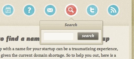
This is one of my favorite blog designs on the list. Sure, it seems awfully close to another site (see below) but it’s still unique enough to stand on its own. The use of texture and overlapping colors is really nice, the layout is super clean and the typography is quite unique for this category.
My favorite aspect of the site is the delicious tooltip dropdowns in the navigation menu. I haven’t ever seen an execution quite like this before and I think Sacha Greif really hit the ball out of the park on these.
Also Ran: The Design Cubicle

The Design Cubicle is just one of the many things that makes me think that Brian Hoff is hands down one of the best designers in the design community. In fact, the only reason he didn’t win this category is because I’ve mentioned Brian too often on Design Shack and simply don’t want him to think I’m some sort of creepy design stalker.
Best Crazy Header: SpoonGraphics

Chris Spooner is no stranger to excellent design. You’ll find him all over the web dishing out advice and art that will consistently make you curse your own lack of talent. The header for the SpoonGraphics blog is just an explosion of illustration and textures and is a great example of the type of work Chris produces regularly.
If you doubt his awesome header creation abilities, check out those for his two other sites below:


As you can see, Chris seems to think that first impressions are very important in design. A solid header graphic tells people a lot about your site and you can bet that they will judge your entire design and sometimes even the quality of your content based on their opinion of that graphic.
It’s definitely not a bad idea to take a page out of the Spooner manual of design and spend a good deal of time crafting a header that you can be proud to display.
Also Ran: ilovecolors

As you can see, ilovecolors is definitely a strong player in the crazy header category. Theirs is dark, grungy, swirly, full of textures and if you look close you can see a subtle, sunny ocean theme. This header has been around for a while but it continues to be one of my favorites.
Best Typography-Driven Design: A Way Back

A Way Back is a really refreshing, no-nonsense blog that you should definitely be following. The design is quite minimal with heavy emphasis on pure, readable typography. The post designs are super clean as well, right down to the comments.
My favorite part is that giant looming “A” that stays perched up in the top right of the page no matter where you go. It’s bold on the homepage and screened back on the post pages; a nice touch!
Also Ran: PoshCSS

PoshCSS is a site that pulls off all the class of A Way Back, and does so with mostly sans-serif fonts. I love the single thin, centered column and simple design of the whole page. Notice the use of heavy contrast for the header and footer as well.
This site is technically not a blog though, it’s really just an aggregator that pulls together various CSS-related posts from around the web.
Best New Design: Echo Enduring

Though I had nothing against the old design, it certainly wasn’t as high class as the new Echo Enduring. I love the generous amounts of whitespace, the big header with an icon-based navigation menu, the blog reel layout and the huge three layer footer. Really great work guys! Be carful about those custom fonts though, they seem to take a really long time to load and I’m not sure why.
Also Ran: Abduzeedo

Abduzeedo has updated its homepage layout a few times recently. I’m a huge fan of everything they design so I enjoy the upgrades thoroughly. However, the ad clutter has really taken over as of late (ads are necessary, clutter isn’t) and it’s getting harder and harder to find the actual homepage content.
Best Footer: CSS Tricks

CSS Tricks could’ve easily been in the previous category because it just rolled out a brand new design. Like most designers, Chris Coyier simply can’t sit still and frequently gives his site a complete visual overhaul.
I wanted to point out one specific aspect of the redesign that I really thought came out nice. At the bottom of the site, Chris created an outgoing link section that is just beautiful. Each of the eight boxes is dim until you hover over one, then it will come to life with color and animations. The screenshot really doesn’t do it justice, be sure to stop by the site to check it out.
Best Post Graphics: A List Apart

A list apart is without a doubt one of the most insightful blogs in the design community. One of my favorite aspects of their simple but attractive design is the little custom illustrations they add to each post. These have a sort of grayscale watercolor feel and a style that’s all their own.
There aren’t a lot of blogs around that would actually take the time to develop a brand image through custom post illustrations so a major hat tip to the List Apart gang and whoever is behind these excellent little pieces of art.
Also Ran: 52 Weeks of UX

Just as with A List Apart, the posts at 52 Weeks of UX all contain a funny little black and white graphic, often a detailed piece of a line art. These seem more like stock than custom but either way they really define the personality of the site in a very identifiable way.
Best Non-Wordpress Blog Design: Christoph Zillgens

For design blogs, WordPress is our bread and butter. We depend on this amazing platform for our livelihood and most of us wouldn’t dream of switching. In fact, WordPress seems to have a near monopoly in the design blog industry, a few personal blogs venture over to Tumblr but most of big sites stick with good old WP.
For this reason I thought it appropriate to give credit to site owners who break the mold and show us that there really is life outside of WordPress. Christoph Zillgens operates an absolutely gorgeous blog that feels like Tumblr at a glance but is actually powered by Textpattern, a powerful and perhaps under-appreciated CMS used by top names like Jon Hicks and Max Voltar.
Conclusion: A Sincere Thank You
All joking aside, the real purpose of this post is to help point our users to other great sites that continually influence Design Shack. We are immensely proud to be in the company of so many stellar sources of content and we can’t thank the sites above enough for their continual contributions to the community. What you guys do keeps us refreshed and makes Design Shack possible.
Now it’s your turn! Leave a comment below and dish out your own artificial design awards to blogs that you couldn’t live without.