Three Quick Design Tricks: Break Out Screenshots, Easy Starbursts and Vector Grunge Textures
Today we have a small collection of completely random but very useful design tricks that you should keep in the back of your mind the next time you need a new idea.
I’ll show you a quick way to make a software screenshot more interesting, how to create awesome vector grunge textures and a super fast way to build a vector starburst.
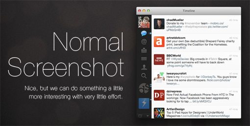
Breakout Screenshot
When you’re designing a website for a web or desktop app, you’ll inevitably end up incorporating a few screenshots into your design, which is great because they make for attractive graphics that are super easy to create. Simply bring up the app on your attractive but minimal desktop, hit a keyboard shortcut, add some text and you’re done!
This is definitely a beautifully simple way to create artwork for a website, but it’s worth the extra effort to put some thought into how you can go further and make the graphic even more interesting.
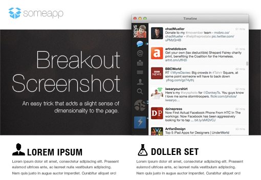
One super simple way to do this is to have the screenshot exceed the boundaries of the background image. This quick and easy trick makes your design seem more alive and layered.
Now, the long and difficult way to perform this trick would be to mask out part of the background on your screenshot, but that’s a real pain. It’s far easier to simply create a transparent PNG of your app window that contains no background, which you can then place over anything you want in Photoshop.
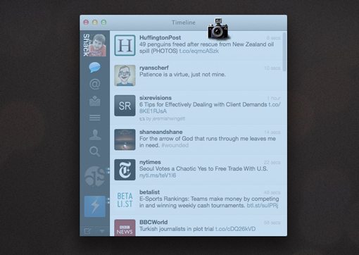
To do this on a Mac, hit Command+Shift+4 to bring up the crosshairs that will let you take a screenshot of a selected area. Then place your cursor over the app window and hit the Space bar. The crosshairs should transform into a camera icon and the window you’re hovering over should be highlighted. Simply click to create a file on your desktop containing that window and its shadow on a transparent background. Windows users can follow these steps for snapping a window screenshot.
Once you’ve taken the screenshot of the window, then grab a background to place it on and open them both in Photoshop.
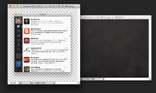
From here, it’s easy to crop the background so that the screenshot peeks out of it. Notice that I took the opposite route on the bottom of the screenshot, which is tucked into the background image.
In The Wild
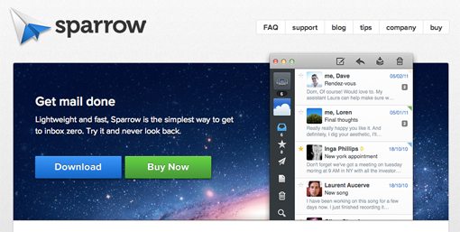
This trick is very common in web design right now and can be seen on any number of desktop software and web app sites. One shining example is the current Sparrow for Mac website.
Easy Illustrator Starburst

I hesitate to teach you this trick simply because I generally hate starbursts in design. However, I will accept that there are in fact some legitimately cool uses for them. More importantly, I know a pretty cool trick for making them that I love to show off.
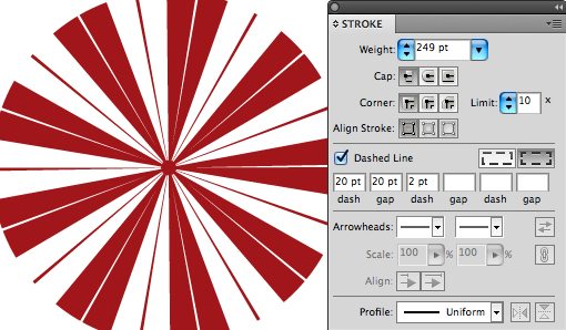
To start, open up Illustrator and draw a circle. Then set the circle’s stroke to a dashed line. The parameters don’t matter too much at this point, just make sure you have something that looks approximately like this:
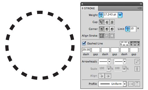
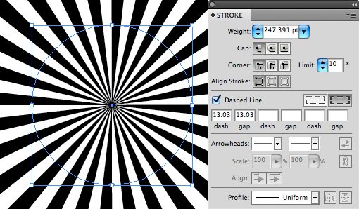
Here comes the fun part. Take the stroke weight on your circle and crank it way beyond anything logical (into the hundreds). Finally, set your first dash and gap values to be identical. The result is a nice perfect starburst.
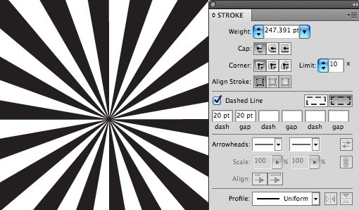
The awesome part is that this trick gives you full control over the width of the lines and gaps. Here’s a slightly tweaked example that’s a little more spread out.
Take it even further and add some random values to some of the other dash and gap spaces. This will start to give you some really creative results, here’s a nice little pattern that reminds me of a peppermint.
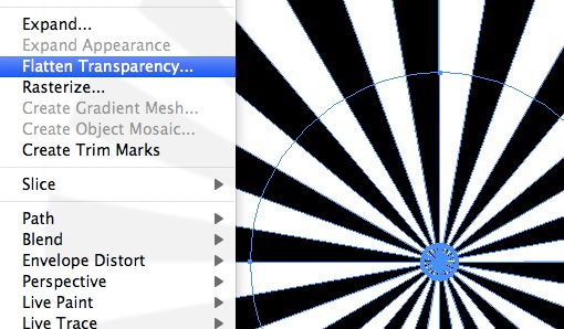
Expand It
Now, working with a funky stroked item like this in the long term will get messy so once you decide on your general shape and patter, I recommend going to Object>Flatten Transparency. This will give you a nice, expanded vector starburst that looks like you built it the hard way (outline stroke gives some weird results). Just be sure to delete the original circle’s stroke to keep things clean.
Grungy Vector Textures
Photographic grunge textures are easy to come by, vector grunge textures, not so much. Fortunately, it’s fairly easy to create the latter through the use of the former.
Let’s start with by hitting up Flickr Creative Commons to find a decent grunge texture. Here is a great one from D. Sharon Pruitt.
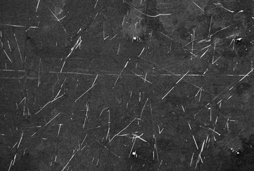
Now, I intentionally picked this one because it contains light scratches on a dark background, which seems like it would be much harder to work with but really isn’t at all.
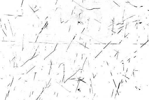
Open up the texture in Photoshop, hit Command+I to inverse the colors and suddenly you’ll have a nice white background with black scratches. Then use a basic Levels adjustment to bring up the whites and down the blacks. The result should look something like this:
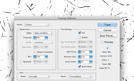
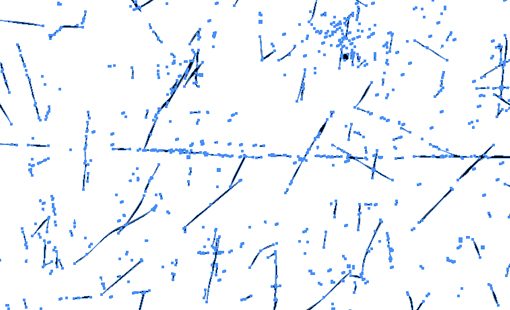
Now save the image out as a JPG and open it up into illustrator. From here, we have some really basic shapes that can be Auto Traced with relative accuracy. Run the Auto Trace command and set your parameters to something like those shown below. One critical step here is to make sure you click the “ignore white” command so that Illustrator only traces the black parts.
From here you simply hit the “Expand” button in the menu bar. This will give you 100% scaleable and easily applicable grunge scratches.
We can combine this trick with the last one and we have an awesome retro piece of vector artwork. Pretty cool!

Conclusion
These quick tip posts are meant to expand your bag of tricks so that you have a larger pool of ideas to pull from on your next design project. I hope you’ve learned a thing or two and have been inspired to come up with your own unique ideas based on the information above.
Leave a comment below and let us know about any techniques you’ve seen around the web but aren’t quite sure how to replicate. We’ll take a look and see if we can help in the next design tricks post.