Three Quick Design Tricks: Sliced Text, Metal Knobs and Curled Stickers
Today we have a small collection of completely random but very useful design tricks that you should keep in the back of your mind the next time you need a new idea.
We’ll be showing you how to slice up some text in Illustrator to give it an edgy feel and how to build a metal slider and a curled sticker in Photoshop.
Quick Design Tricks
It’s time for another dose of great little design tricks to add to your arsenal. These aren’t in-depth tutorials but instead little five minute or less techniques that you can implement in any design that you’re currently working on.
As a designer, it’s important to keep up on inspiration and fresh ideas and these little tricks will allow you to infuse some new elements into your designs without feeling like you’re ripping off someone else’s work.
Feel free to use these tricks completely as they appear but also don’t be afraid to experiment a little and put your own unique spin on each!
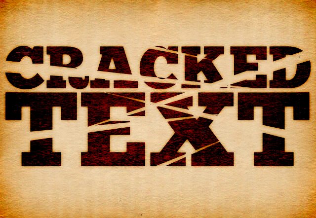
Slice That Text
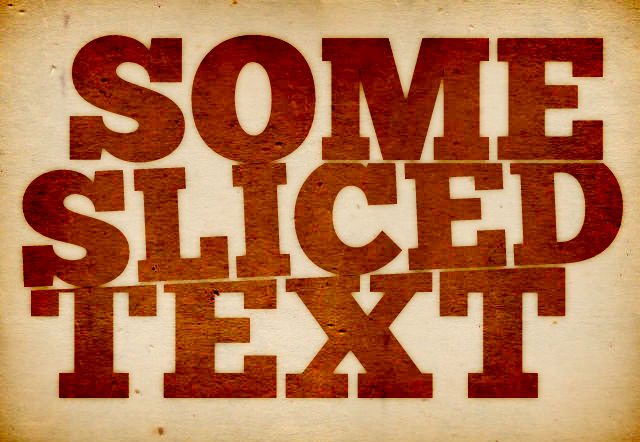
This is a quick and fun effect that adds a bit of dimension and variety to your text. It’s perfect for any edgy or grungy designs you’re working on. Obviously, it’s going to work best with a stacked text formation, but how far you go with it is completely up to you. Crank it to really slice up the text or just add a bit for some visual interest.
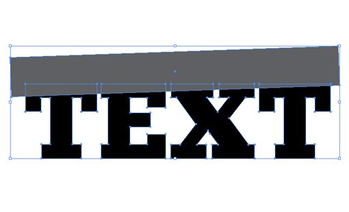
To start off, create some text in Illustrator and convert it to outlines (Command+Shift+O). Next, draw a box, rotate it a bit and position the bottom edge over the text where you want the slice to be.
Next, grab the new Shape Builder Tool (Shift+M) and click/drag across the portions of the letters that overlap the rectangle. This should join them all together as one piece.
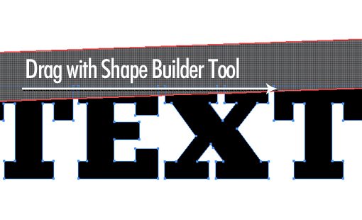
Now select and delete the box and your text should have a nice big chunk missing. From here, simply create another line of text, move it into place and rotate it to match the slant of the slice.
Going Further
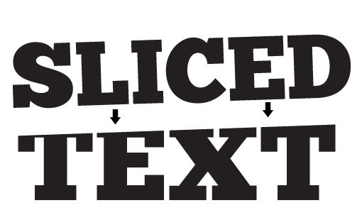
A slight variation of this idea to put the slices through the middle of the text rather than on the top and bottom. You can make it look broken, cracked or sliced by a samurai! Start with some text and overlay a bunch of stretched triangles.
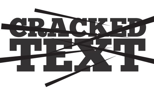
From here you can use the Shape Builder Tool just like before. Then delete the extra shapes and you’re ready to go.
Metal Knob/Slider
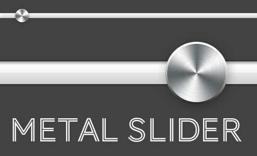
I’ve been seeing a lot of little sliders like this lately in various UI kits around the web and it got me wondering about how to create that round, metallic knob effect.
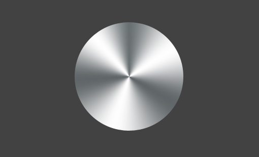
After fiddling around in Photoshop for a few minutes I came up with a solution that’s really easy. First, you obviously want to create a new document and draw a circle.
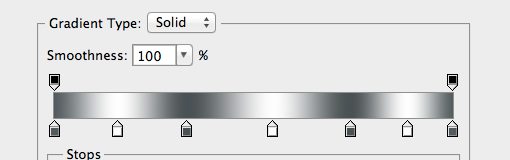
Next, add in a Gradient Overlay layer effect and build a custom gradient like the one below. It only uses two colors, these are just repeated so that you essentially have three white stripes.
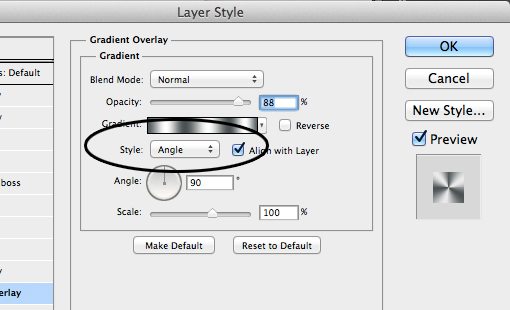
It won’t look like much at first, but if you switch your Gradient Style to “Angle”, you’ll immediately see the look you’re going for.
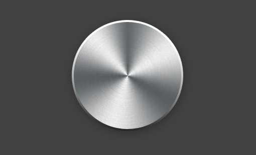
To finish it off, add a stroke set to gradient and a drop shadow. As an optional step, create a noise layer and apply a motion blur, then mask it to the shape of the knob and set it to Multiply. This will add a little bit of a textured, grooved look.
Curled Sticker
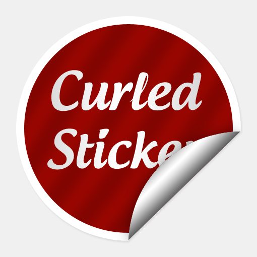
In our last design ideas post, we saw how to quickly and easily create a sticker effect on any object. Today we’re going to take that a little further and learn how to give the sticker a page curl so that it looks a bit more realistic.
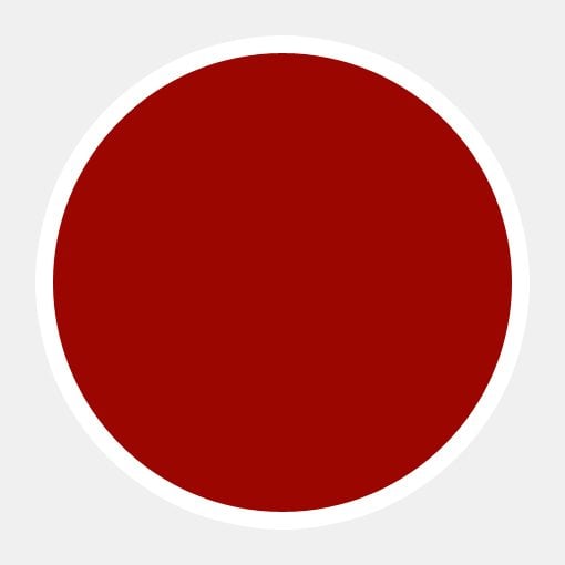
To start off, open Photoshop and draw a circle. Next, fill the circle with a bright color and add a white stroke.
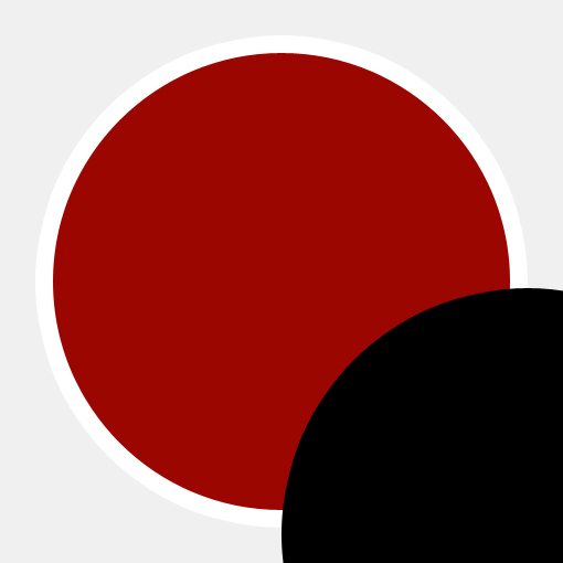
If you applied your stroke as a Layer Effect, merge the circle layer with an empty layer to rasterize the effect. Then, make a straight cut in the area that you want to be curled.

Now create another circle (I just duplicated the layer) and position it to just cover the clipped edges of the first circle.
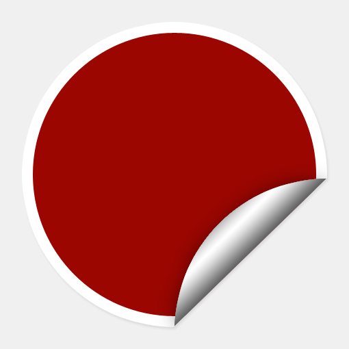
With the second circle layer selected, Command-click on the first circle’s layer preview to select it, then add a new mask to the second circle layer.

Select white for your foreground color and a dark gray for your background color and grab the Gradient Tool. With an active selection of your curl layer, stretch a Reflected Gradient over the curl.

To finish it off, add in some shadows, text and any other styling you think is relevant and you’ve got yourself a nice little sticker. Follow similar steps in Illustrator to make it vector!
Conclusion
Here at Design Shack we’d like to help keep your bag of tricks growing so be sure to check back often for more great ideas and quick tips.
Leave a comment below and let us know about any techniques you’ve seen around the web but aren’t quite sure how to replicate. We’ll take a look and see if we can help in the next design tricks post.