7 Tips for Creating a Website Header That Wows
A website header is often the first thing that a user sees. It can make or break the user experience, your branding, and much more!
To help retain users and keep them moving through the design, you need to create a website header that wows. And not just on the homepage. On every single page of the design. (Remember, a significant number of users don’t go to your homepage first.) Here’s how you do it.
1. Use a Stunning Image
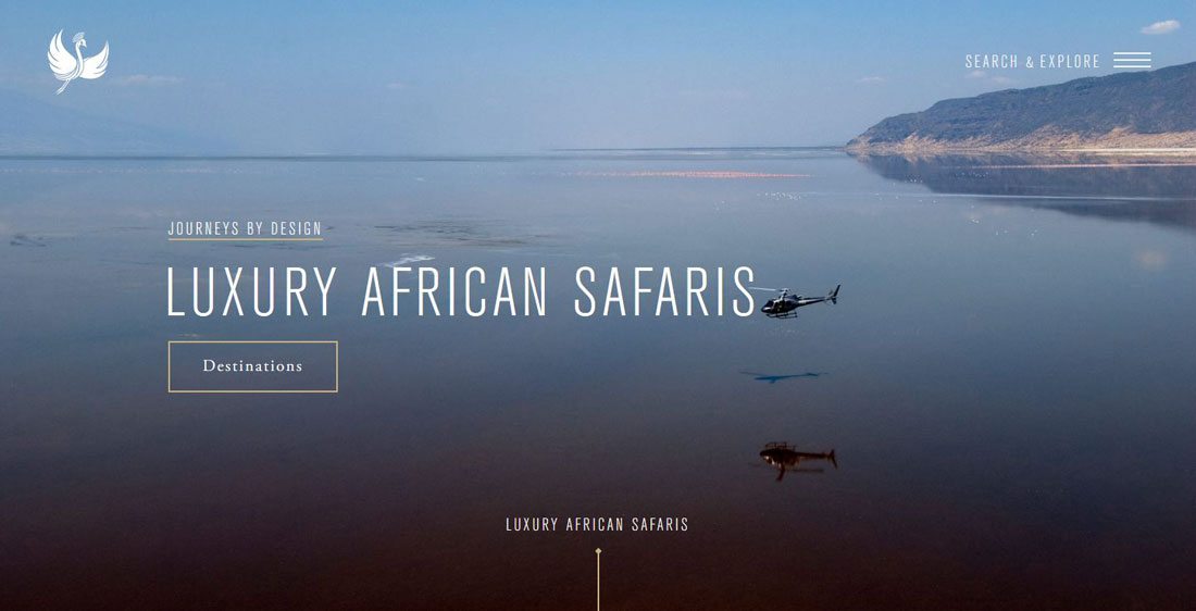
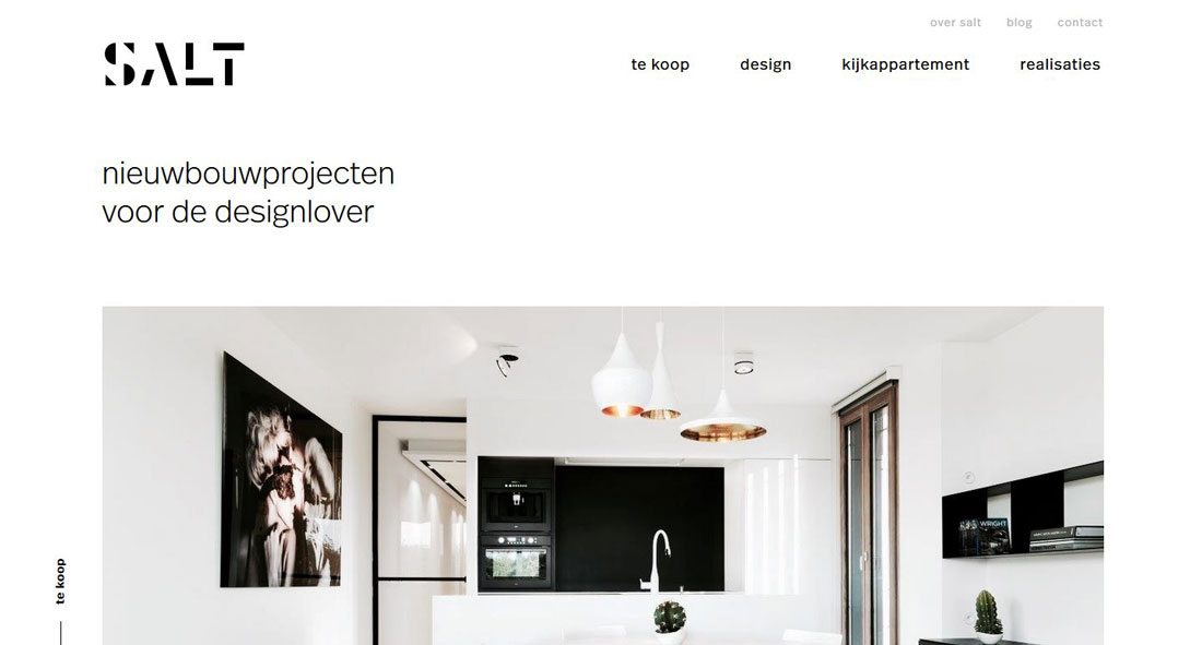
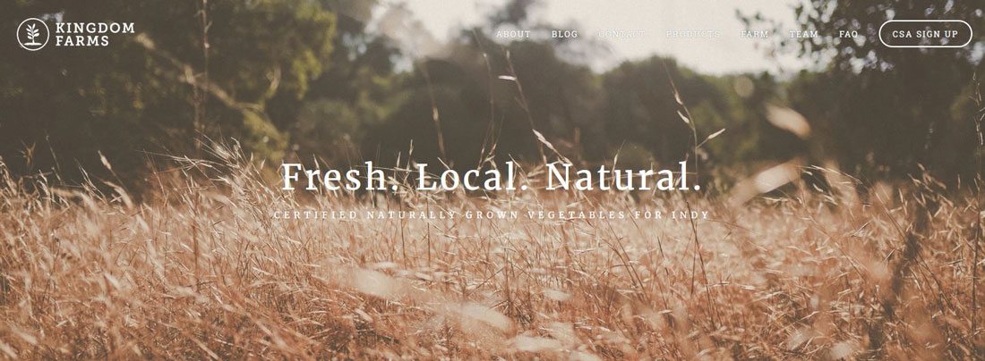
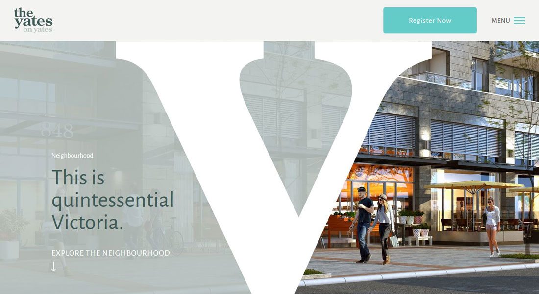
A great image always makes a stellar first impression. Whether you opt for a photo, video, animation or some other “art” element, every header should lead with imagery that users will want to look at.
The header image is more than just a pretty picture. It is the gateway to all the content on that page, and maybe even content deeper in the design.
An image alone is a great starting point, but you have to pair it with other elements to really make the most of content. Other elements that might appear in a header include:
- Text or headline
- Logo or brand identifier
- Button or call to action
- Navigational elements
- Search
Opt for images that are sharp, high resolution and provide plenty of contrast for other elements such as text or buttons. People love to see faces, so consider showing people using or interacting with your product or service if possible. Want to show off your latest portfolio project? Use a mockup template to make it more interesting and engaging.
2. Incorporate Navigation Elements
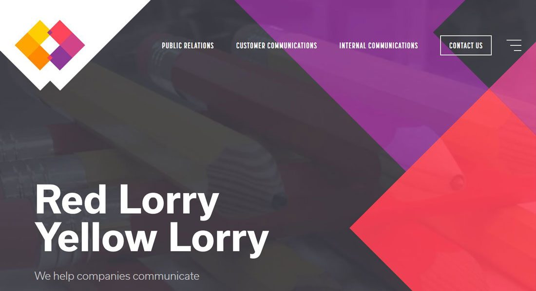
There’s no reason you have to think of the header and navigation as separate elements; they are often part of the same visual concept. Whether you love a full menu navigation or something that pops out from a hamburger icon, navigation elements should be part of the header design plan.
And while you are thinking about the header and nav, consider a sticky navigation pattern as well. Even if users get away from the main header – which can be a small as a navigation bar or as large as a full screen display – they can quickly get around the site design.
Navigation elements in the header will do something else that you might not expect. Because these are often smaller bits of text or icons, it can help establish hierarchy within the header, showing users how to interact with the design.
3. Create Distinct Messaging
Just popping a great image in the header is not enough. What does it say?
Consider how the message of the header communicates to users.
- Does it tell them what to do or what to expect from the content on the page?
- Do all the elements communicate a single and unified messages that’s easy to understand?
- Does it let users know what action to take on the page or where to click next?
Make sure to combine multiple elements to create an overall effect with a single message.
4. Try Oversized Typography
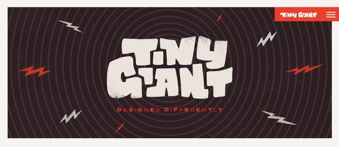
Oversized typography is a great way to add emphasis to a header. Even if the words are simple location identifiers, using bold lettering can help draw the eye to the top of the screen before the user begins reading other information.
While typography placements can vary, try to stick to two basic placements for typography in the header.
- Homepage option with more typography or more dramatic lettering or different type than on other pages.
- All other pages option with a simple type framework that is consistent on all interior pages.
5. Consider Reading Patterns
Reading on websites tends to follow three different patterns of eye movement, according to research by the Nielsen Norman Group. And all of those reading patterns are then adjusted to account for the task the user is focused on at the time of reading, which in simple terms is a grouping of related parts in the visual flow.
Both studies into how users look at and digest content are important because they can help you understand how and where to place elements in the design and particularly in the header.
Initially, think about the basic patterns:
- F-Pattern: Users read across the top, then halfway across the page and finally vertically down the left side in an F-shape.
- Gutenberg Diagram: There are four active zones for reading, starting with two horizontal stops across the top from left to right, then from the top right to bottom left and across the bottom. (Forms a z shape.)
- Z-Pattern: The eye moves back and forth from left to right and back from the top to bottom of the design forming multiple z-patterns.
Place elements – especially key elements – in the hottest zones in the common reading patterns for the strongest likelihood of user interaction. Then think about where the user is most likely to look next — for an action related to the content just digested.
6. Include a Clickable Element
Is your website header image interactive? Does it include clickable (or tappable) elements to encourage user engagement?
A header can be the perfect location for a call to action button or simple action such as an email address collection form. Don’t go overboard with elements to click because it can take away from the overall message, but a simple one-action element can be effective in this area of the design.
Not sure what element the header should include? Consider a desired action that is consistent throughout the design with a button that’s always available (much like navigation). A shopping cart button, account information access or a contact us button are great options to consider.
7. Use Simple Layers
How do you pull all of the elements mentioned above (or small groups of them together) in the header? The trick is simple layering. The best header – a header that wows users – looks simple. It follows the rules of design theory and uses one dominant element to entice users and supporting design techniques to help them meet actionable goals.
Layering objects is one way to achieve this.
Not only will simple layers help you create distinct spaces for each element, but it will also provide visual focus for the user. They will know where to start with the design and what elements deserve their attention and what elements can be skimmed over.
It doesn’t always happen successfully with a first attempt either. Multiple revisions and testing are often necessary to create a group of elements that work together effectively and wow users at the top of a page.
Conclusion
While creating a homepage header is something that is often at the forefront of the design process, working on headers for interior pages often gets lost in the process. The content on “inside” pages can be just as important as the homepage because many users will get to your website design thanks to search, not from typing in a URL and following the navigation links as envisioned by the design team.
Think about both header types independently and together to achieve design harmony, unity and a visual that wows users when they land on the page.