What’s Flat 2.0 and Why Should You Care?
Just when you thought you had flat design figured out, everyone has shifted to talking about Flat 2.0. If you never took the leap into designing a flat project, now is the time.
Flat 2.0 is easier to use because it combines the best of flat design with additional user interface cues to help you create website design that’s beautiful and functional. It’s also highly adaptable and works with almost any concept. Unlike some of the purest flat designed websites, Flat 2.0 combines elements of flat with subtle additions to enhance user-friendliness. Let’s take a look at a few examples!
Designers Love Flat
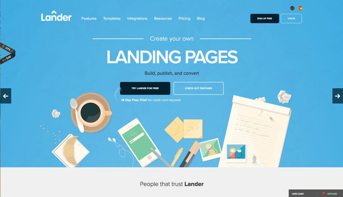
Admit it, flat design was all designers were talking about a couple of years ago. Love it or hate it, flat design picked up a lot of steam.
The design style, which features a streamlined aesthetic with no adornment from elements such as embossing or drop shadows or other three-dimensional style effects, was used in a number of high profile projects and simple designs alike. Flat design also lacked elements that were raised to signify clickability or hollow or sunken to show that elements needed an input. It was most notably adopted for Apple’s iOS 7, a dramatic turn from the skeuomorphism that users were accustomed to.
But it worked. Designers loved it. (Flat is a lot of fun to design.) Bright colors, simple typefaces and focus on absolute minimalism contributed to beautiful projects.
There was just one problem. It wasn’t intuitive enough for all users. Some argued that the design style was so flat that it could be discern what users were supposed to do and how the interface was supposed to work.
Enter Flat 2.0.
Users Need a Little More
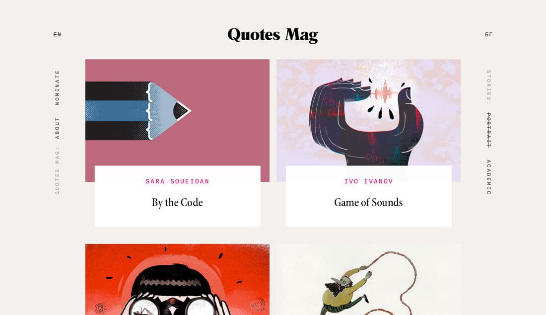
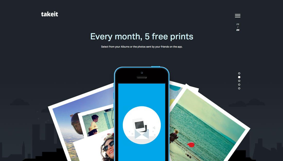
Flat 2.0 provides an allowance for subtle details and does not “outlaw” techniques – shadows, gradients, layering – that were not a part of flat design. The use of subtle features in combination with all the other elements of flat design has been called Flat 2.0 in many circles. (And just an evolution of the style in others.)
The term was first used by designer Ryan Allen in late 2014: “Flat 2.0 is an evolution, not a revolution. Where flat design was a radical departure from the rampant skeuomorphism of days gone by, Flat 2.0 is a playful branch off the flat tree. Flat design is the Christmas tree, Flat 2.0 is the ornaments and candy canes. And presents. No tinsel though, that stuff is a mess to clean up.”
Flat 2.0 allows designers, in essence, to break the hard rules associated with flat design.
- Highlights
- Gradient
- Multiple tints and color values
- Drop shadow
- Any color palette (not just super bright)
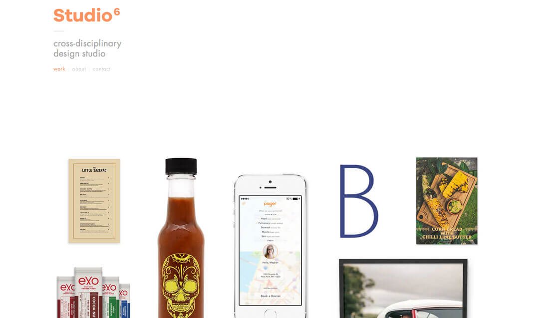
The other big change is the Flat 2.0 doesn’t live in a world where everything is a UI element or icon. Photos and video are a large part of Flat 2.0 interfaces. (Many early flat design purists thought these visual elements took away from the pure intent of the aesthetic.)
Flat 2.0 and subsequent iterations are the new talk of the design world, most notably because of the emerging popularity of the Material Design interface created by and adopted by Google and its Flat 2.0 aesthetic. The look is obviously flattened, but features the evolution of elements with layering as a key visual component as well as use of shadows.
Flat 2.0 Solves Some Problems

According to many, flat design had issues. The Nielsen Norman Group, which does research on user experience, notably criticized flat design. Some of these issues included:
- A lack of traditional (and important) signifiers, such as gradients, shadows and underlines that users understood what to do with
- An absence of familiar patterns for usability, such as using blue underlined text for links
- Change in contextual buttons and actions, such as placement of calls to action and lack of actionable copy in favor of fewer words
Flat 2.0 remedies many of these problems and gives designers more flexibility to design for usability. That was the thing that was missing with flat design. While the look was creative and cool, it was fashionable for designers, but not always meant for users.
Characteristics of Flat 2.0

Flat 2.0 is the seemingly perfect marriage between minimalism and skeuomorphism. It’s a highly usable style that is visually pleasing. Designers like it. Users like it. This is a trend that works.
Much of Flat 2.0 is rooted in design theory. (If you want to get back to basics and do something that works, theory is always a good place to start.)
Flat 2.0 uses a specific style to create hierarchy for a flow through the design. Color palettes are distinct and constructed with purpose. There is a focus on organization, spacing and clarity of elements. Every element in the design is supposed to be simple, but highly understandable.
That last bit is where Flat 2.0 succeeds. Designers can take the design right to the edge of skeuomorphism if they like and then back off one click. Flat 2.0 is rooted in usability. (This can’t be said enough because it is the essence of what makes a design work.)
Add all that to the idea that this style is highly flexible and customizable. It’s made for responsive and adaptive frameworks or Material interfaces. And every designer can mix and match styles and concepts to create something that’s completely one of a kind. (You’d be hard-pressed to find something more appealing than that.)
Conclusion
Flat 2.0 is just one more step forward in the evolution of this design style that’s rooted in the purest form of minimalism. What’s so appealing about Flat 2.0 (and flat design in general) is the innate fun factor that comes with it.
From bright colors to typography that demands to be read, flatter user interface elements give way to the parts of the design that users need to see first. Flat buttons and simple body copy styles give more room to images and calls to action. And that’s why Flat 2.0 is so important. It’s usable. It’s functional. And while it will continue to evolve, the idea behind it is here to stay.