10 Tips for Designing Logos That Don’t Suck
So you’re designing a logo. It sounds like an easy enough task, right? Draw a circle, type in the company name and you’re done (I’ve literally heard a designer suggest that very process). Unfortunately, if you’re really worth the money the client is paying you, there’s a lot more to it than that.
There are a million people in the logo design industry today dishing out crappy logos in bulk for crowdsourcing sites. How do you as a serious professional stand out from the crowd and produce quality logos that don’t suck? Read on to find out.
Are you in the middle of a logo design project? Don’t forget to check out our in-depth guide on how to design a logo!
Pro Tip: Logo Templates & Logo Makers
If you’re looking for a quick start with a logo design, experimenting with a logo template can be a great initial step. It can help give you a starting point for your logo design, on which you can build and adapt.
Envato Elements has a collection of over 6,000 logo templates that you can access for a low monthly price of $17 (as well as icons, photos, graphic templates, and more). Here are a few of our favorites!
![]()
You could also experiment using a logo maker tool—an online app that asks you a few questions about your business, and suggests logo ideas and concepts that fit your brand.
1. Use a Visual Double Entendre
Some of my favorite logos in the world utilize a technique that I like to call a visual double entendre, which is an overly fancy way to say that it has two pictures wrapped into one through clever interpretation of a concept or idea.
The WinePlace logo below is a perfect example.

This logo takes on the shape of a thumbtack, which suggests “location” or “place,” but it also clearly looks like an upside down wine glass. Logo designs that use this technique come off as clever and memorable. Viewers love the little mind game that you’re playing and are more prone to appreciate a design because of it.
In the past, we’ve put together a post of clever negative space logos like the one below. Check it out if you love this type of logo design as much as I do!

2. Color is Vitally Important
One of the most important considerations for logo design is the color palette. This is not a superficial decision, color carries meanings and communicates ideas.
Sometimes you’re pegged to the colors of a brand, but other times you’ll have the freedom to explore. I love the rich palette used in the Zion logo below.
The colors here grab you and pull you in, they bring life to the illustration and give further context to the shape of the landscape. That being said, remember that a good logo is versatile and will still function well in grayscale:
Beyond a grayscale version, I like to also provide clients with a true single color version, using only black and negative space. This would be a little tricky with the logo above, but definitely possible.
Always consider what it is that the logo will be used for and whether or not the various use cases require different versions.
3. Avoid the Cliché
Every few years or so, some new fads come along in logo design. I personally love to study design trends and you might even find me suggesting jumping onto a few bandwagons to keep up with the times, but with logos, I just hate it when a bunch of designers use the same idea over and over.
Should you know about the latest logo design trends and understand what’s good and bad about them? Absolutely. Should you follow them to the letter? Absolutely not.
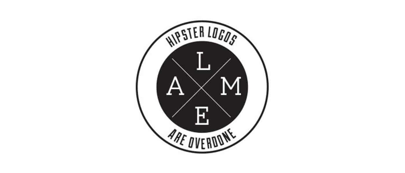
The basic archetype above is being used again and again in logo design right now and it’s getting old fast. Why not use a design that you actually thought up yourself rather than ripping off what everyone else is doing?
We have an entire article dedicated to showcasing logo design clichés, be sure to check it out to make sure you’re not guilty of uninspired logo design.
4. Make it Ownable
I don’t believe that “ownable” is a real word, but you nevertheless hear it quite a bit in marketing (marketers love to make up words). The concept is definitely an important one that ties closely to the previous tip.
Rather than following the herd and using a cliché design, you should instead strive for something that is uniquely recognizable. I’ve always appreciated the Evernote logo in this regard:
It’s really just an elephant head, which doesn’t sound like a very unique concept. However, the way it’s drawn with the curled trunk and page fold in the ear makes it instantly recognizable.
As you’re designing logos, consider whether or not your design is generic or unique. Is it likely that others will produce something similar? Remember, your first idea is typically your most generic (it’s also everyone else’s first idea). Try filling a notebook page or two with some rough sketches before choosing which ideas to pursue further.
5. Everybody Loves Custom Type
While we’re on the subject of being unique, there’s almost nothing that can give your logo a unique feel quite like some awesome custom lettering.
Too often we see logo design as simply a trip to the font menu to see which typeface makes the company name look best. If someone is paying you to “design” their logo, they probably expect you to put a little more effort into it.
Custom type helps to ensure that your unique logo will stay that way. Lowlife designers will rip off your work in a heartbeat if they discover which typeface you’re using, but it takes some real skill to mimic custom hand-drawn type!
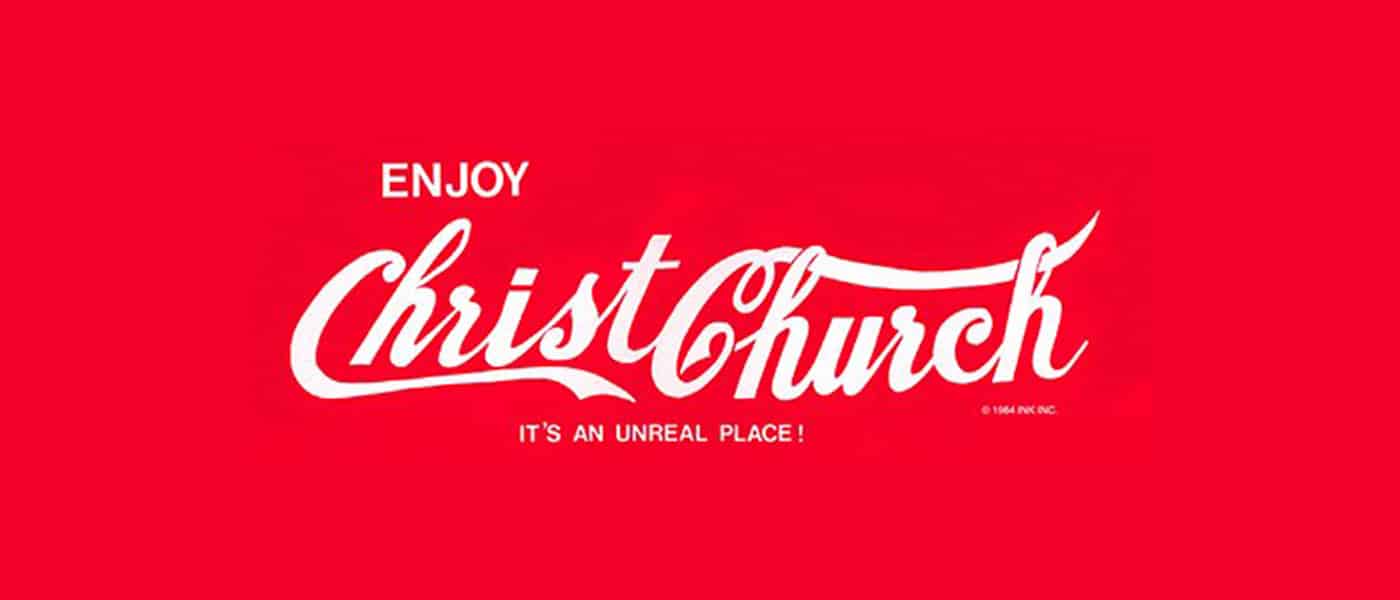
Keep in mind though that if your logo is famous enough, people will always try to rip it off. This certainly holds true for my favorite script logo:
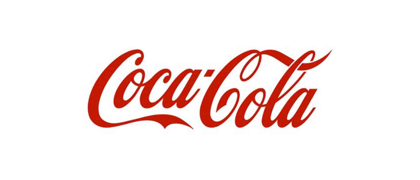
The awesome Coca-Cola script has been stolen countless times in awkward parodies throughout the last few decades.
6. Keep it Simple Stupid
Let’s face it, not everyone can bust out a beautiful, hand-drawn script on a whim. Just because you’re a designer doesn’t mean you’re an awesome illustrator or typographer (though it helps). If you fit this description, fear not, there’s nothing preventing you from making awesome logos.
In this situation, remember these four powerful words: keep it simple stupid! Simple but powerful logos permeate the business world and always prove to be the best icons for standing the test of time.
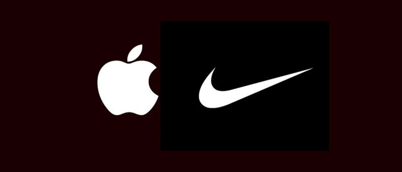
In considering how to construct one of these types of logos, let’s discuss the Apple logo. The silhouette of an apple is nothing special or memorable:
It’s that missing bite that takes it to the next level. It gives the logo character, makes it unique, and drives the meaning deeper (computers and bytes, get it?). Without the bite, the apple is boring, with it, the apple is suddenly iconic.
Always think about how you can go that extra mile and turn your boring logos into unmistakable brand marks.
7. Consider Proportion & Symmetry
Some people can get carried away with discussions of proportion and symmetry (see the new Pepsi logo pitch), but if we strip out the crazy, there’s still some important lessons here. Consider the new Twitter logo as an example:
Here circles aren’t used to convince you of some strange cosmic tale that makes no sense, they’re simply used as a guide to create a well balanced logo with consistent curves and arcs.
Despite the fact that the bite seems to violate the symmetry of the Apple logo above, if we dig deeper we can see that there was still a lot of through put into proportion and symmetry here (image source):
8. Think About Negative Space
Along the same vein as a double entendre is the age-old trick of utilizing the negative space in a logo in some clever way. The industry standard example of this technique is the FedEx logo and its hidden arrow.
Don’t see it yet? Keep looking, it’s there. That’s what I love about this logo, the use of negative space is so subtle. Most people in the U.S. see the FedEx logo daily or weekly for years as it drives by on the side of countless trucks and they never even notice the arrow.
Logopond is chock full of great logo designs that utilize negative space in a cool way. Check out the example below, which blends together the idea of bull horns and a wine glass.
9. Passive vs. Active
One interesting facet of logo design that I’ve been considering a lot lately is the concept of instilling motion or a sense of activity into a logo. This isn’t always appropriate (such as with the Apple logo), but sometimes it can really give a logo the boost it needs, both from a visual and conceptual standpoint.
As an example, let’s look again to the Twitter logo. Way back in the early days, the bird went from sitting perched and passive to becoming active and taking flight.
In the most recent iteration, they took this concept even further by pointing the bird in an upward direction to indicate that it’s climbing into the air rather than floating along the same old trajectory.
A sense of motion is especially important when it comes to logos with mascots. The image of the marlin below doesn’t depict the fish merely lying still, instead, it’s leaping into the air in a victorious pose.

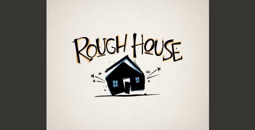
This concept even extends to typically inanimate objects. Consider how much better the logo below portrays the concept of “rough house” by instilling a sense of motion.
10. Know What it Means
Every good logo has a story. Far beyond simply a pretty sketch, strong logos are filled with meaning, both obvious and hidden. We discussed this in several cases above. The FedEx logo’s arrow indicates moving forward and making deliveries, the Apple logo has a “byte” missing, and the Twitter bird is flying in an upward trajectory.
Half the time I wonder if logo designers don’t come up with the meaning after the logo is already produced, but regardless, it’s great when you as a designer can show a client how much thought and reasoning went into the logo that you produced for them.
Clients might think that all they want is something fresh and cool, but if you instead provide a logo that ties into the company’s core values and mission, you’ll blow their minds and they’ll love you for it.
If you’re into hidden logo meanings, check out our post titled “Five Fascinating Things You Didn’t Know About Famous Car Logos.”
Do Your Logos Suck?
Now that you’ve read our tips for designing logos that don’t suck, leave a comment below and let us know what you think of your own work in this area.
Are you an awesome logo designer or is it something that you struggle with? Which of the tips above are useful to you and what tips can you offer to other designers?