15 in-Depth Examples of Addictive User Experience
Today we are going to examine 15 bits of user interface and experience design that really heighten the experience of using a site or application.
Use these website, iPhone and desktop application examples as inspiration for creating your own uniquely addicting user experiences.
Introduction
This post will serve as my own little interface hall of fame. It’s a complete hodgepodge of different types of interfaces and elements that I find useful and inspirational.
Each example is meant to cause you to think about new possibilities that you’ve never considered and to encourage you to always seek to maximize the value of the experience you’re providing to your users.
Side-Scrolling Parallax Effect
This little bit is purely visual superfluous flare, but it real enhances the experience of a side-scrolling site.
Parallax scrolling is an effect where the background is sliced up into different layers which move at different speeds during a scroll. The layers further back move slower than the layers up close and a 3D illusion is created.
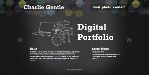
Charlie Gentle’s portfolio above is an excellent example of this effect. The website is divided into separate sections, accessible by clicking the back and forth buttons on the side of the screen.
As you click a button, the site smoothly scrolls to the next section, at which point the parallax effect kicks in with the bokeh at the top of the screen. It’s a simple trick that really makes the site come alive.
iPhone Pull Down to Refresh
Most social iPhone apps have some system for refreshing their stream of data. Some you shake, others you tap a button, but the method that really seems to make the most sense to me is “pull down to refresh.”

Apps like Gowalla, Foursquare and Tweetie have adopted this as the primary way to refresh. The reason this works so well is because of the directness of the interaction. You’re looking at and flicking through a list with your finger and when you want it to update, you shouldn’t have to leave that area.
Placing a button at any other location on the screen creates a disconnect and a break in the flow of user action. They must leave the list, interact with a separate UI piece and return to what they were doing. This way it’s all one action, localized in a single primary location.
The lesson here is to examine your own user interfaces for elements that unnecessarily break the flow of the user’s attention. Consider whether or not the interface could be improved by integrating any distant elements into the area that they are affecting.
Globally Accessible HUDs
Some of my favorite Mac applications are those that will quietly run in the background, but can pop up at a moment’s notice with a special keyboard shortcut, then disappear when you’re done with them.
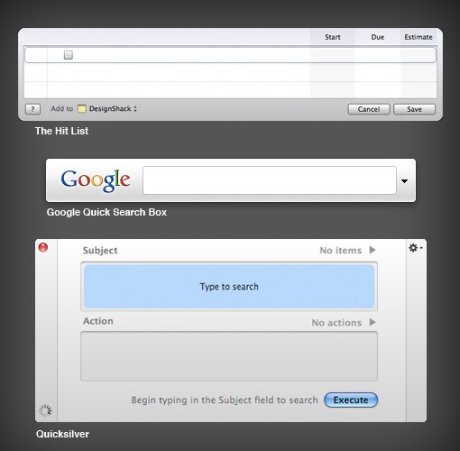
In the case of The Hit List, the heads up display (HUD) is not the main interface of the application but rather a scaled down piece of the app that is useful for jotting down items that pop into your head.
This kind of global (access from anywhere) functionality makes these seem less like applications and more like functions built directly into my operating system.
Consider how you can use HUDs in your own interfaces to extend the functionality of certain parts of your applications and websites.
Convertbot Circular Menus
Convertbot is one of those few examples of UI design that is arguably harder to use while simultaneously being much more enjoyable.
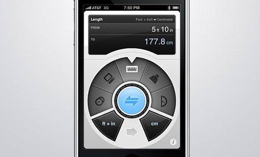
This iPhone app utilizes a strange but beautiful circular menu to convert basic units. There are plenty of apps in the iPhone app store that perform this task in a much more direct and easy to understand fashion, but they’re also not any fun to use.
With Converbot sitting on my iPod I constantly watch out for scenarios that merit me pulling the app out. The UI features slick animations, gorgeous colors and textures and smooth functionality that just makes it a joy to use.
This app proves that on rare occasions, giving users the opposite of what they expect can be just what the interface doctor ordered. Just make sure you’ve got the design skill to back it up as the guys at Tapbots obviously do.
SlideDeck
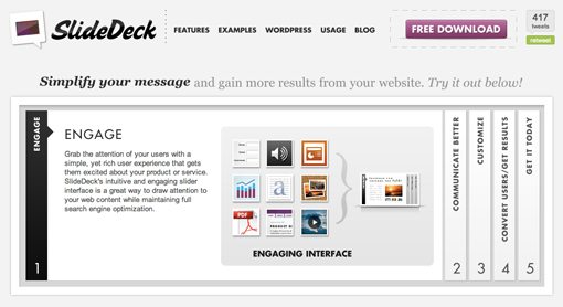
There is no shortage of jQuery sliders on the web, but there are a few that really stand out from the others as a useful and unique implementation. SlideDeck is one of these.
SlideDeck uses a neat accordion format to cram tons of information into an amazingly small, organized and fully-acessible space. The content is divided into sections which are then hidden in vertical bars that expand when clicked upon. As one section expands, the previously open section collapses in a nice, fluid animation.
The thing that makes it so great is how easy it is to get at just the right part of the slideshow you want to see. These types of sliders typically use tiny icons or dots to jump to specific pages, but this method is much more descriptive and obvious.
Strongbad Emails: Go Rando!
First off, if you don’t know who Strongbad is, shame on you. He’s by far the most popular character on the long-running internet cartoon starring Homestarrunner and his friends.
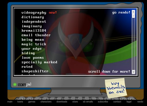
Each week Strongbad answers an email from a viewer and ultimate hilarity ensues. Past episodes are kept in one huge unwieldy list that you scroll through as Strongbad sings his latest song about scrolling.
Recently, the developers have added a “go rando” button. Clicking this little snippet of text could’ve just merely taken you to a random email, but that wasn’t good enough for Strongbad. Instead, clicking this button sets the entire list scrolling like Wheel of Fortune (complete with slowdown and stop) while Strongbad provides the hilarious sound effects.
Obviously, this is so completely amazing that you have to use it several times before you can consider yourself finished.
The point is, sometimes putting a bit of thought (and even comedy) into your smallest feature can transform that thing into everybody’s favorite feature on your site. Further, making your website simply a blast to use is a surefire way to gain and retain users.
Made By Tinder Color Picker
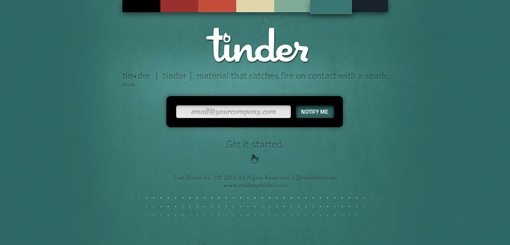
Tinder is something super secret that the Fuel Brand Network has been hiding up their sleeve. Though I have no idea what it is, I love the little teaser page that they’ve developed.
The little rectangles at the top of the screen provide you with seven different color schemes to view the site in. As you click on a color, the background changes and the content on the page updates to maximize contrast on the new background.
I’ve spent more time than I’ll admit on this site and toying with those neat little buttons. Hats off to the Fuel team for creating one of my favorite coming soon pages ever.
Pixelmator: Strings Attached
Pixelmator is an excellent and affordable image editing alternative to Photoshop. Though by no means as powerful, Pixelmator brings plenty of innovation to the table and fares better than any Photoshop competitor I’ve ever come across.
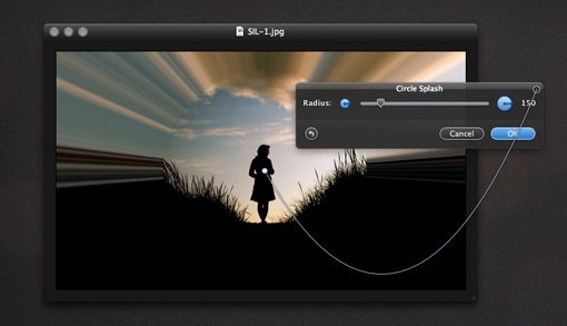
One of my favorite UI features in Pixelmator is these little hanging strings that pop up when you apply effects. In the case above you can drag the point to reposition the center of the effect being applied. The point is attached to this string that ties it to the filter window. As you move the point, the string bounces along for the ride with realistic physics.
I honestly don’t even see a need for these little strings to exist as it’s obvious that the window and the effect are related, but their presence serves as a nice visual reinforcement of this fact and makes applying filters just that much more fun.
Huge Hover Effects
Just about every website you visit has some sort of hover event applied to the links. Usually, this is something small and not too distracting; just enough to tell us that there is a link there.
Riot Industries rightfully decided that they needed to break this trend by giving the hover effect the majority of the space on the page and the link a small amount of space.
As you hover over the small vertical strip of thumbnails, the huge text to the right begins zooming up and down. It runs and hits the top of the screen, where it flickers to a new message corresponding to the icon you’re hovering over and then runs back down to stop next to that icon.
I’ve never seen another site with an effect quite like this one before and I really love the typography-centric functionality of it all.
Drag and Drop Online
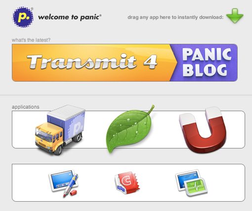
As an avid Mac user, I tend to think everything in life should work with “drag and drop” functionality. More and more lately, I’m seeing this idea mirrored in an online environment.
In the example above, clicking an icon will bring you to that application’s dedicated page. However, if you want to bypass this and download the application right away, you simply drag the app’s icon to the download button. Nifty no?
Another place you see great drag and drop functionality online is on the IconDock shopping cart. Here you just drag the icons you want to buy to the dock to hold them for purchase later.
Photoshop.com Photo Pile
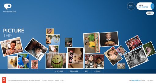
This is another example that’s really functionally useless but represents a nice added touch that will keep visitors interested for longer.
As the Photoshop.com page loads, a pile of polaroids is dropped onto the screen and goes bouncing off in all directions. The pile then becomes fully interactive. You can click and drag areas of the screen to toss photos wildly about and watch as they crash into others.
The physics seem to work quite well and the whole thing definitely adds some great interaction to the page.
Follow the Mouse
The site below is another that features a nice parallax effect, but this time I want to focus more on the way you interact with this scene.
As soon as you load this page you realize something weird is going on. As you move your cursor left and right, the background reacts as if you were moving your head. As the page pans to the side, more of the landscape is revealed.
Though it’s not appropriate on most sites, this unique method of looking around works really nice here and really adds to the 3D effect. I’ve even seen other sites that take this method even further by making it the primary way to navigate all the content on the page.
Dual Slider
This one is another jQuery slider that really stands out as a uniquely brilliant design.
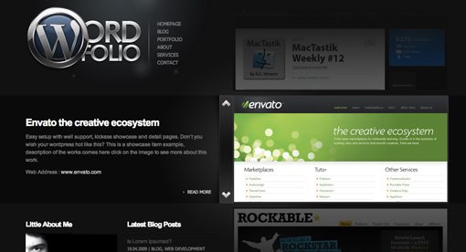
The template above features a sort of double image slider. The first slider contains images and the second contains descriptions of the image.
As the image slider moves vertically, the description slider scrolls horizontally. The resulting effect is similar to watching a complex machine; the two animations feel as if they are a single function.
It’s an outstanding way to showcase images and text that really left me stunned and wanting more.
Scrolling with Momentum
When I first got my hands on an iPhone a few years ago, I instantly fell in love with the idea of momentum-based user interaction. When I flicked my finger in Safari, there wasn’t a 1:1 ratio of movement, rather the device used my flick as if I were actually flicking a piece of paper that would build momentum, peak, and then slow down based on the force of my action.
Ever since then, I’ve wanted more technology to pick up this idea, especially OS X. Fortunately, Apple’s Magic Mouse brought about that very thing.
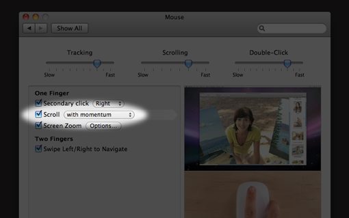
By turning on “scroll with momentum” you can mimic the iPhone scrolling functionality. However, flicking down on an iPhone makes the screen go down while flicking down on a Magic Mouse makes the screen go up. This makes sense because of the indirectness of the mouse, but I still wish you could change the mouse flick function to mirror the iPhone.
The lesson here is that anytime you can throw in a piece of reality into a simulated user experience, it increases the awe of the viewer and makes the whole thing seem that much more magical (look now I sound like an Apple employee).
Truly Minimal
Though I love beautifully complex interfaces, there are times when you just need to be productive with your thoughts and almost nothing else. Once in a while an interface comes along that really nails this idea, and I can’t think of a better one than WriteRoom for Mac.

Despite its appearance, WriteRoom is a pretty powerful text-editor packed full of features and customization options. It merely hides all of this beneath a beautifully simple interface that makes you feel like you’re typing in numbers in a hatch on LOST.
As crazy as it sounds, this is the type of user experience that I find most addicting. Something unique and immersive that almost takes you away to another time and place where everything falls away and you can focus entirely on the task at hand.
Conclusion
Well that’s my list of inspirational elements and interfaces. I hope it helps spark some great ideas in your head about how to further improve your own designs in both large and small ways.
Use the comments below to tell us about those little bits of UI that you think are really great and what you think of the examples above.
