Design a Vintage Typographic Wedding Invitation
Today we’re going to take a step back from the web to embark on a good old fashioned print design project. Wedding invitations have become a major target for home-grown design experiments so we’re going to dive into one and see what we can come up with.
We’ll use a major typography focus combined with some simple icons to give the finished product a sophisticated vintage appeal. We’ll also do the whole thing using just two spot colors.
Document Setup
The first thing that we need to do is set up a document. I’m going to use Adobe Illustrator for this project, but the process is extremely similar in InDesign so you should be able to follow along just fine if that’s the way you prefer to go.
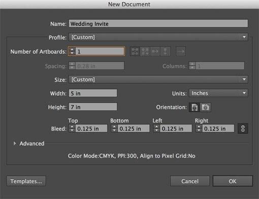
For the document size, let’s go with a basic five by seven with an eighth inch bleed all the way around. We’ll be using a solid white background so the bleed isn’t too crucial, but it’s a good practice to always make sure you set one up.
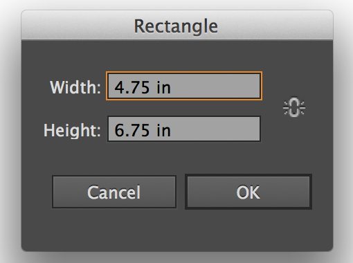
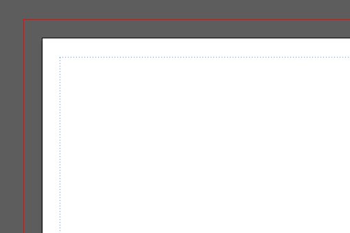
One more thing that I like to do is create a live area guide that serves as a basic visual representation of how close any artwork or type is allowed to come to the edge of the document. With print design you want to avoid awkward edge-hugging elements and be sure to have plenty of breathing room around the edge.
To do this, grab the Rectangle Tool and click once on your empty canvas. This should bring up a box that allows you to enter the dimensions of your shape, type in 4.75 inches for the width and 6.75 inches for the height.
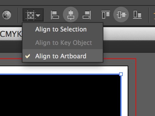
Once you have the big rectangle on the page, center it with the alignment tools along the top of your document. Make sure that “Align to Artboard” is selected, then align the box vertically and horizontally to the center.
Now we want to turn this box into a guide. To do this, you can either hit Command-5 or go to View>Guides>Make Guides.
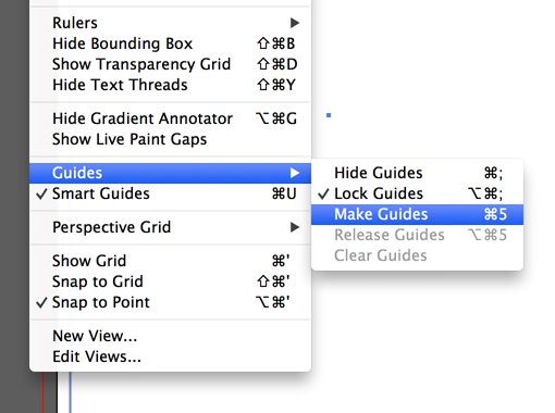
The edges of your document should now look something like the image below. By default, your guides will be set to a solid line but I like to change this to a dotted line in Illustrator’s Preferences. I also like to make sure the guides are locked with Command-Option-Semicolon.
Date Stamp
As I design something, I like to think about what information is going to be the most important. It strikes me that, for a wedding invitation, the date is one piece of information that viewers will immediately want to know. When they hang the invite on their refrigerator and refer back to it later, this is probably the information that they’ll be looking for.
As a result, we want to make this nice and prominent, so we’ll start here. Before we begin though, we’ll need a typeface. I need something strong and attractive that I can use throughout the design, given that it will be almost entirely comprised of type.
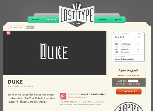
Since we’re going for a vintage look, I think that Duke from Lost Type is the perfect choice. Note that while you can technically get Lost Type fonts for free, it’s a good idea to leave a tip to show your appreciation to the designer.
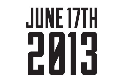
Once you’ve downloaded and installed the font, type out your date in nice, big letters as shown in the example below. Note that I’m using the “fill” variation of the font.
I want this to be even more eye-catching that it currently is, there’s going to be a lot of type on the page and this needs to stand out somehow. To accomplish this, let’s reverse it out on a black box.
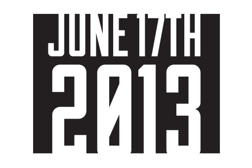
Notice how the type actually stretches outside of the bounds of the box, this is an important piece of the aesthetic so make sure you repeat it. For reference purpose, the box is about 2 x 1.5 inches.
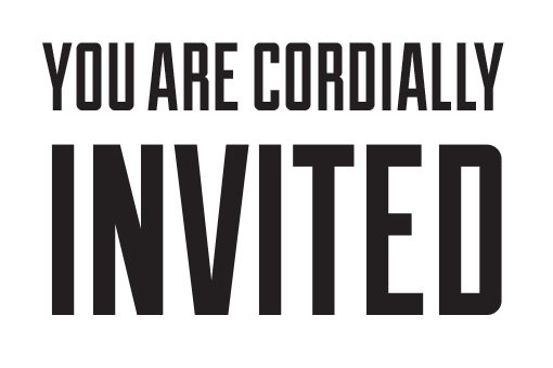
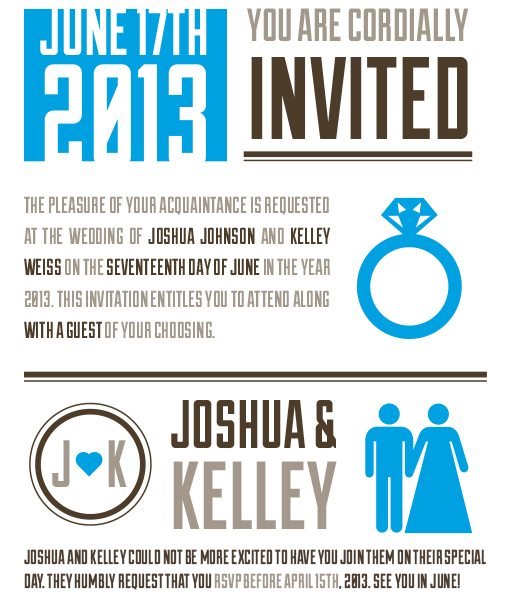
Headline
Now it’s time to whip up a headline. The technique that we’ll use for this is very similar to what we did for the date. Type out the words like in the example below, with the bottom word occupying the same amount of horizontal space as the top line.
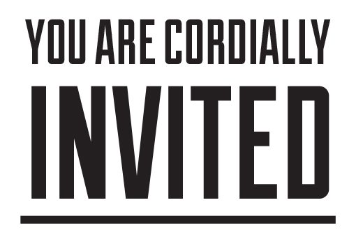
To add a little visual interest here, let’s toss in a thick underline. Draw a line under the text and give it a four point stroke.
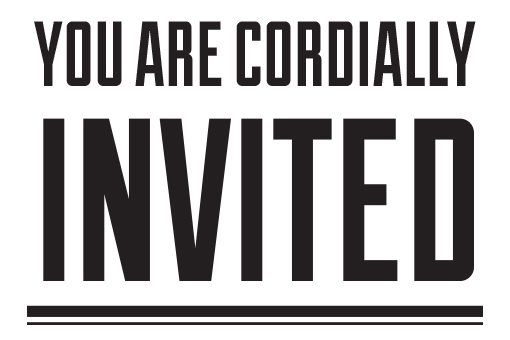
That’s nice, but it’s still a little plain. Let’s fancy it up with a second stroke. Toss another one on the bottom and set the stroke to a single point.
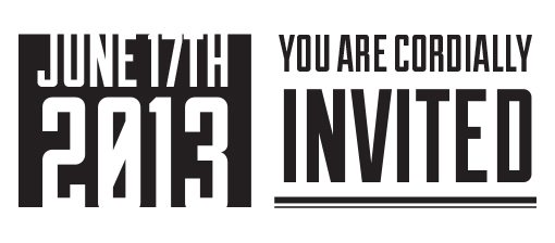
Slap that on the top of the document next to the date stamp. The top of your document should look like this:
Color
Now that we’ve got a few elements on the page, I’d like to start thinking about color. We could design the whole thing in black and white, then add in color, but I’m far too distracted for such discipline so let’s jump ahead and do it now.
Only Two Colors?
Always remember that the print world is drastically different than the web world. One of the things that you have to consider very carefully with print jobs is color and how it relates to cost.
Is it going to be a standard four color CMYK print? Or maybe you want to save some money and go with a single color. How about we split the difference and do a two color print? This is a big decision because we’re severely limiting our design possibilities. Going forward with a two color print means that we can have two colors and two colors only in our design. Nothing else!
In these cases, we typically turn to spot colors (). To access these in Illustrator, click the little drop down menu in the Swatches panel and go to Open Swatch Library > Color Books > PANTONE+ Solid Coated.
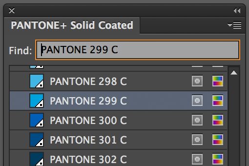
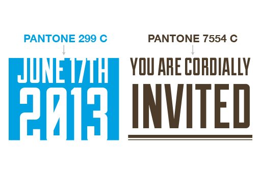
This should bring up a big grid of PANTONE spot colors. Switch to a list view and search for PANTONE 299 C and PANTONE 7554 C. These are the two colors that we’ll use throughout our design. Apply these to our existing elements like so:
Note: Spot colors are only relevant if you’re getting the item printed at a commercial printing facility that’s set up for such a process. Your home office inkjet printer is no good for this type of design, use CMYK instead.
Cheating with Two Color Design
Looking good so far, but I want to make things a little more interesting. There’s still not quite as much variation as I’d like there to be. To fix this, we need a third color. We can’t do this though because we’re using a two color print! Or can we?
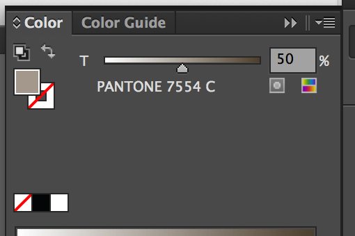
As you can see in the shot above, spot colors have a special color slider that allows you to change how the ink is applied. By varying the percentages, we can alter the appearance of the color without requiring a different color to be loaded into the press. Pretty cool!
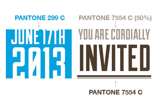
With this in mind, let’s redo our two chunks of elements. Chang the “You are cordially” line to 50% and leave “invited” at 100%.
Invite Paragraph
Moving right along, it’s time to toss in a paragraph that greets the receiver of the invitation with some details about what’s happening.
To do this, drop in a paragraph with a justified alignment and fill it with whatever text you need. Wedding invitation copy tends to be formal but feel free to be lighthearted, it’s your design!
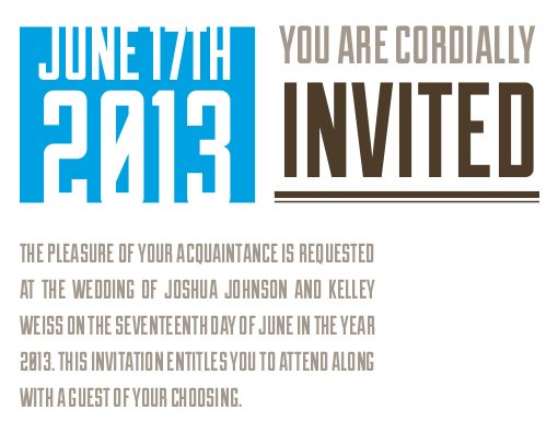
Given that we’ve made the choice to go with an all uppercase, sans-serif typeface, we have to keep in mind that readability is going to be an issue. All of the letters look the same and it’s easy to lose your place. To help this out, let’s highlight important pieces of the message with a color shift.
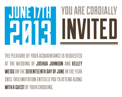
Now the most important information (names, date and guest option) stands out and can be easily located without headache-inducing browsing.
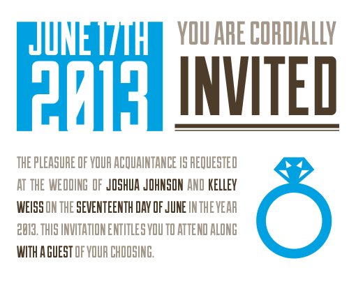
Ring Icon
All of this text is beginning to get a little monotonous. Let’s break it up with a nice big graphic. A photo would ruin the aesthetic that we have going and would be a little tricky to break down to two colors, so let’s go with a simple icon instead. It’ll match our style perfectly.
My first stop for simple icons for design projects is The Noun Project, which is loaded with completely free icons for almost everything you could want. The best part: you don’t have to download huge icon sets, just find the icon you want and download the individual SVG file.
After some browsing, I found the ring icon below, which is perfect for our invitation.
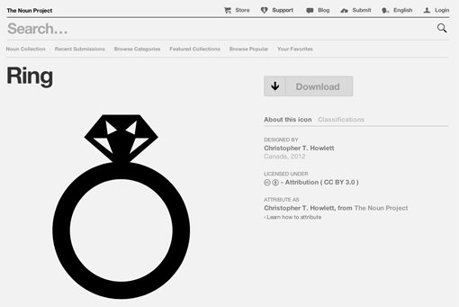
Let’s drop this in next to the paragraph (Illustrator handles SVG files just fine). Use the PANTONE 299 C color for the ring and scale it up so that it fits the space nicely.
Bride & Groom
Up to this point, we’ve placed a lot of emphasis on the event and not enough on the actual people. We want a nice big chunk of text that highlights the two lucky lovebirds. This ensures that, as soon as you look at the invite, you can see who is getting married.
Using the design style and processes that we’ve already established, this can go pretty quickly. I start by typing out the names and centering them, then flanking that headline with two other graphics.
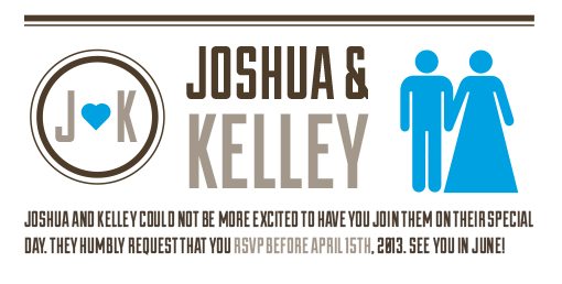
On the right, we’ll place a bride and groom icon (since we’re talking about the bride and groom here) and on the left we’ll make a custom graphic using the two stroke method that we’ve been implementing on the dividing lines and a heart icon.
We’ll throw all of this under the artwork that we developed before. From a practical standpoint, this is a good chance to encourage your guests to RSVP, so I threw in a paragraph about this as well.
When and Where?
We’re almost finished with this invitation, but there’s one incredibly important piece of information that we’ve left out: when and where is the ceremony?
It may seem strange to leave this vital information for last, but the bottom of the page is actually prime real estate for key information. Your eyes will almost always look at the top or bottom of the page for important data.
To tie this in with the date, which is at the top of the page, we’ll use one of our strongest design tools: repetition. Take the reversed style of the date at the top of the page and apply it here as well:
This is a very intentional step that visually ties the top and bottom of the invite together through similar visual cues. They’re the only places on the page that use this reverse style so you’ll get the impression that they’re related somehow even if you don’t consciously realize it.
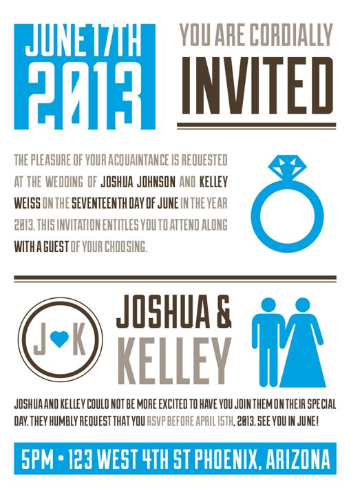
Download It!
To finish up, just go through and make sure that your alignments are looking nice. It’s easy to get sloppy as you’re making changes but you want the finished product to be perfect. If you’re too lazy to build your own, don’t worry, you can have mine!
Finished .ai and .eps files: Click here to download.
Conclusion
Today we used Adobe Illustrator to build a vintage typographic wedding invitation using two spot colors. The final result is quite stylish and is a great way to announce a wedding for you or a friend. Leave a comment below and let us know what you think!
If you’re in the market for some more wedding invitation inspiration, check out our collection of 50 Examples of Wonderfully Designed Wedding Invitations.