How to Design the Perfect Award or Certificate
Do you ever catch one of those oddball assignments in your design career? Creating a great award or certificate design is one of them. The piece seems like a small task, but has a long shelf life, and is of high value to the recipient, making it important to design well.
But how do you even design a good award? Where do you start? Here’s a primer that takes a look at a few of the most important things to consider with award and certificate design.
Thinking About Certificates or Awards
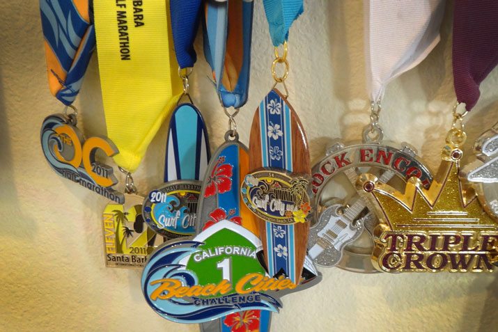
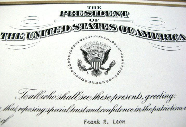
I think a lot about awards. As a runner, I have an entire collection of race bling. From medals to bibs, I collect these mementos of accomplishment. I also have a small collection of design awards and certificates from my days as a newspaper designer. Just looking at any of these items makes me feel good inside.
And I am not alone. Regardless of what you do, it is likely you have some sort of collection that showcases good things you have done.
Designing an award or certificate might be the last thing you plan to do as a designer today, but it could be a lasting an important bit or work. So when it comes to this kind of project, take care and treat it with the same level of detail, design prowess and passion you would anything else.
The major distinction when talking about awards or certificates for purposes of this article is physical. Certificates are printed, often on paper. Awards tend to be any other physical honor – a ribbon, medal or imprint of on a plaque or trophy. The terms are used pretty interchangeably in most settings, but here we are distinguishing between paper and non-paper items for ease of comprehension.
Key Information
Awards and certificates need to include some key information. The goal for either type of project – and often you will design an award and certificate to go together – is to create something that serves as a lasting memory for the recipient.
Therefore, key information is almost always a part of the design. Here are the main elements you should think about first.
For All Certificates or Awards
- Branding or insignia: Who is giving out the award?
- Accomplishment: What did the recipient do? (This might fall in line with branding for an event.)
- Date or timeline: What period is the award for?
- Original mark, seal or design element. What makes this award look different?
- Special touch or detail. Printing something special on the copy machine does not feel special and will not be received as such; make is special.
Certificates
- Signatures. Who is giving out the award? Have him or her sign it (not a photodopy.)
- Complete listing of what the honor is for. Many awards have a title such as “[Year] Certificate of Merit for [Insert Here].”
- Name of certificate honoree.
- Place of certificate, if applicable.
- Design detail that notes this certificate from others. Maybe each different award type has a specific border or is printed on a certain type of paper.
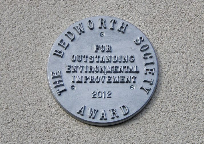
Physical Awards
- Special shape or form to represent achievement. (There is a reason that many bowling trophies come with a bowler on top.)
- Think about use. Is it an element that is designer to sit on a shelf, hang in a case or be used in some other way?
- Color. With physical printing of awards, color is an important factor and can make your award stand out. Link it to branding for maximum impact.
- Feel of importance. Just like with a printed certificate, the award should feel important. Physical items should come with a good weight and be made from good materials.
- Uniqueness of design from year to year. Consider a design tweak each year to make each award specific or select a physical design and do not alter it. Either option can add a certain feel and finesse to your award.
Design Flair
When it comes to design, awards and certificates come with the same design constraints as many other projects. One of the most important is tone. The award or certificate should carry the tone and feeling of the group presenting it.
Design elements should mirror other design work for the business.
- Serious or fun?
- Formal or casual?
- Organized or chaotic?
- Simple or ornate?
- Classic or creative?
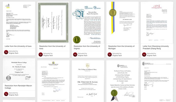
As with any project, the answers to these questions will help you make choices about typefaces, color and even production. The gallery of images shows how 40 different universities – each using different styles and tones – created the same document to honor a new university president at Virginia Tech. Resolutions varied from traditional, using large, ornate old-world style typefaces (University of Virginia) and seals to modern, bright and colorful documents (University of Maine) to designs that fell somewhere in the middle (Kansas State University). The gallery is an interesting look at how to do the same thing in a variety of ways.
Printing and Production
Printing and production is something designers often think about during the process of creating elements for a project, but it is not always the top consideration. But when designing and award or certificate, it is often the first thing to think about.
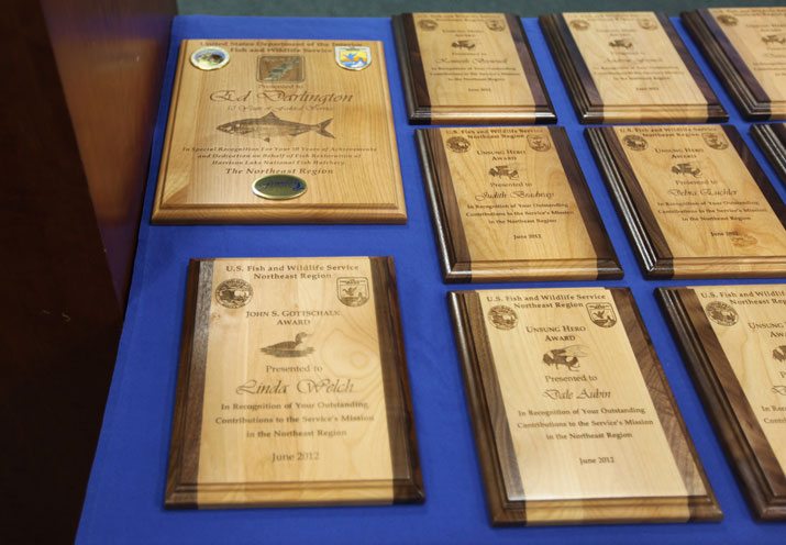
Certificates are often printed on a stock or color of paper that is not what is used for other projects. The paper may limit things like design because of color or print capability. Often certificates contain very little color – especially those that are formal in nature – and are printed on simple, heavy stock papers with embossing. The technique of foiling or embossing might be new; talk to the printer so that you know just what is needed to design for these specifications.
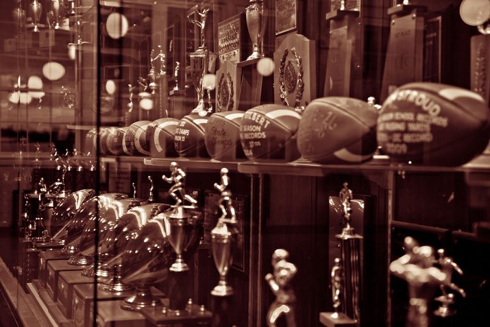
Awards need to have a unique flair and can be anything from a plaque to trophy to medal to well … anything. The key is quality production. You would not tape a sliver of paper on a trophy when you present it would you? The real key to production is high-quality materials. The other key factor with a physical award is how it relates to the honor bestowed.
The other important factor with awards and plaques in particular is where the item will be placed. Many of these types of awards are mounted on buildings or statues that might be subject to weather or outdoor elements. Always consider materials that can hold up to the environment where the award is likely to reside.
There is an almost limitless set of options when it comes to award types. (If you want a starting point, visit Ashworth Awards, which has been creating awards for more than 50 years, including medals for marquee events such as the Boston Marathon, Ironman World Championships and USA Figure Skating.
Conclusion
The whole idea behind an award or certificate is to make a memory. The design elements you choose – from detailed elements or embellishments to production – can set the tone for how an honor feels to the person receiving it. Design choices can make the honor seem important and distinguished – why many universities use serif and old-style typefaces on diplomas – to fun and creative.
Understand the goal of the award or certificate before you get started and try to match the tone to what the award-winner should feel. Treat this design project with extras care. Remember, you are creating something that an individual is likely to hold on to for a lifetime.
Image Sources: Terry Majamaki, Davidlohr Bueso, frankieleon, U.S. Fish and Wildlife Service and Foxcroft Academy.