How to Use Cool Color in Design Projects
Cool and warm colors. These descriptions are commonly used to describe hue choices in a variety of conversations – fashion, beauty, decorating and design. But while we commonly talk about warm and cool, do you really know what these terms mean and how to use the colors?
Today, we will look at using cool color in design projects and create a few color palettes with cool hues. (Also make sure to check out the recent Design Shack article featuring warm colors.)
What Are Cool Colors?
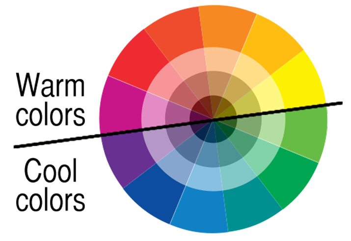

Cool colors occupy half of the color wheel opposite of warm colors. Cool colors include blues, greens and purples. These colors remind us of the sky, water, nature and space.
“Blue mountains are distant from us, and so cool colors seem to recede,” said German scholar and color theorist Johann Wolfgang von Goethe (1749-1832).
Where the exact division of warm or cool starts and stops on the color wheel is slightly debatable. But their connection to the color wheel is not. Color theorists believe that the evolution of these color temperatures is linked to the color wheel, according to “The Dimensions of Colour” by David Briggs. “The terms warm and cool can however play a useful role, as long as they are always used in a precise sense referring specifically to relative hue. In this clearly preferable sense, the terms provide a useful means for referring to relative positions and directions around the hue circle.”
The terminology has a lot to do with how people feel about and react to color. Unlike many color associations, which are based on UV and light waves, temperature is not. The coolness of a color directly relates to its position on the color wheel, with the coolest hue falling equidistant from the pure blue and green midpoints.
Meanings of Cool Colors

Cool colors are thought to be calming, relaxing and reserved. Cool colors are harmonious and trustworthy and can even be used as neutrals against other sharper colors choices.
Blue is the only primary color on the cool side of the color wheel, meaning every cool hue includes some variant of blue. Because of this, cool colors are often made by mixing a warm and cool hue. (Purple is the combination of blue and red, for example.)
Cool colors are often used by businesses because of this notion of harmony. The top color palette among financial institutions, for example, is blue to imply trust and reliability. Green is used as a connection to natural harmony as well.
A quick breakdown of cool color associations:
- Blues: Stability, loyalty, depth, truth, confidence
- Greens: Growth, harmony, fertility, freshness, safety
- Violets: Royalty, wealth, ambition, creativity, power
Cool Colors and Design Theory


Cool colors are said to recede or make things seem smaller or farther away than they really are. This color association and feeling relates to the relationship with light waves. Blue light waves, for example, are shorter than red ones.
A cool color will seem far from you. Warm colors, on the other hand, will seem closer.
“Cool color” is often misused in design settings. How often has someone said to make a color “cooler?” While many times this means darker or less saturated, making a color cooler would be to add more blue to the color mix.
In practical applications, gray can also often be considered a cool hue. While it is generally considered a neutral, when used with surrounding cool colors, it will absorb those color properties and temperature.
Using Cool Colors

Cool color palettes have wide and practical applications. They can be easy to look at and ease make reading easy. The quality of calmness and coolness can put the mind at ease and make looking at something using these hues easy.
Think about some of the common uses for blue – uniforms of police officers, a common color for business attire – it all creates an impression of calm and ease. Depending on saturation, cool colors can often have elements of neutrals. Very pale blues and greens, for example, are often used as background colors (thanks to their connection to the sky and ground) and can work with other cool or warm colors equally well.
This balance of color makes cool hue especially easy to use. The represent a sense of professionalism and don’t incite agitation or excitement in the way warm colors do.
They key to using cool colors is often in tints and saturation. By using multiple variants of similar hues, you can create a delightful palette with enough color balance to be somewhat intriguing and exciting without a sense of over-stimulation. Monotone palettes using blues, green or purples can have distinct and unique feels. Blues and greens also work nicely with neutrals, such as brown, tan or beige.
Consider the 80/20 rule when working with any type of color — 80 percent of the canvas is neutral and 20 percent of the design uses bold color. Use that same idea with a combination of cool and warm colors. To maintain the coolness of the palette, use 80 percent blues, green, violets and neutrals in color locations and 20 percent reds, yellows or oranges.
When it comes to practical application and color mixing, you can determine color coolness by numerical makeup. In digital projects, using RGB color, cool colors will have the highest blue values and lowest red values. In printed projects, using four-process CMYK color, cool colors will have the highest cyan or black values and low magenta or yellow percentages.
Cool Color Palettes
Now that you are ready to dive into a project using cool colors, how do you choose what to use? What hues will make the best impression? Where will the inspiration come from?
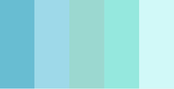
Just like with any other color palette, look to things around you as a source of inspiration. Nature, photos, a mood – all can be great sources of color inspiration. Here are five cool color palettes to get you started. (You can find each of these and hundreds more from Color Louvers.)
Baby Boy Blues
Cool Eve

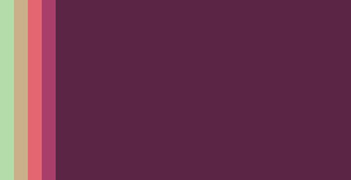
Raspberry Wine
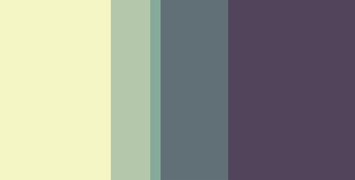
Cool Blue Reason

Cool Night Camping
Conclusion
Cool color schemes can be easy to use and simple to create. With colors that are harmonious in nature, it can be easier to develop a palette that works in a variety of projects.
Cool colors are among some of my favorites. I am a fan of the feeling they create and the association with cool temperatures is comforting. How do you use cool color in your projects? Share your ideas with in the comments.