Radiant Orchid Named Pantone Color of the Year: Now What?
Unless you have been hiding from the design community for the last few weeks, you know that Pantone released its annual color of the year: Radiant Orchid.
The reviews are mixed. But there really are a lot of ways to incorporate this color into design projects if you want to be on-trend, and enjoy the challenge of crafting a design around a specific color!
Radiant Orchid
Radiant Orchid is a regal and enigmatic purple that is derived from nature and a flower of the same name. The hue includes undertones with feminine associations – pink, purple and fuchsia – and is one of the warmer variants of purples on the color wheel.
“An enchanting harmony of fuchsia, purple and pink undertones, Radiant Orchid inspires confidence and emanates great joy, love and health. It is a captivating purple, one that draws you in with its beguiling charm,” Leatrice Eiseman, executive director of the Pantone Color Institute, said about the color selection.
Radiant Orchid, Pantone 18-3224, has already popped up in a variety of applications and was a popular color choice for spring fashion shows and is a color that can adapt and flatter in orchestra with other hues.
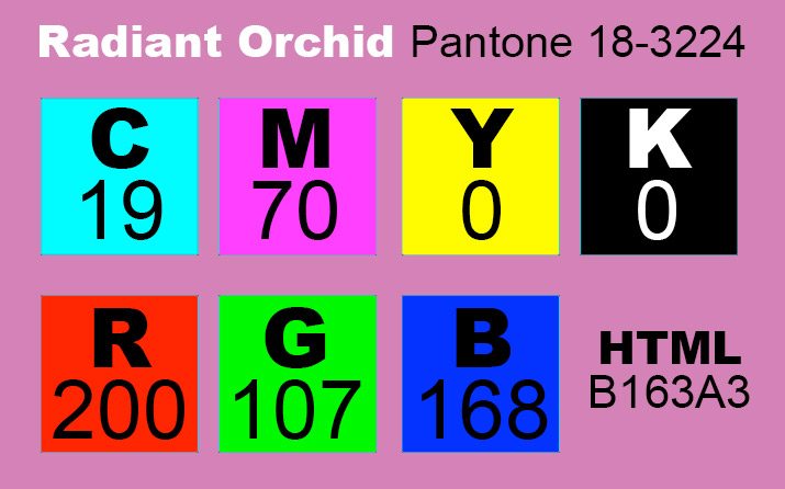
When it comes to using the color, matches are available if you aren’t a Pantone subscriber. The RGB color mix is R200, G107, B168; CMYK is C19, M70, Y0, K0; and the HTML value is B163A3.
Mixed Reviews
Not everyone is thrilled with Pantone’s choice for this year’s signature color.
“I’m really not sure how I feel about the color purple,” wrote CNN Apparently This Matters columnist Jarrett Bellini after the announcement. “It’s elegant and regal, but part of me also wants it to die in a ditch.”
But various interior designers, especially, have reported that they like the selection: “I love it. I love those obscure colors,” Trudy Mercy Brown told the Charleston Post and Courier. “I think it could be used anywhere. I would do an accent wall in it, but a lot of people are afraid of color.”
Personally, I like the color, but I am not sure it has enough wide range appeal to really take off. This is one of those colors that works beautifully as an accent, but will designers go all out with it?
Color Associations
Radiant Orchid is a color that falls on the opposite end of the spectrum – or color wheel, literally – of Pantone’s last color choice, Emerald.
Because of the different undertones of this color, it can take on a variety of associations. Be aware of how you use the hue and surrounding colors when it comes to considering varying color meanings.
With more pink comes associations with love and romance. The feminine color is also symbolic of caring, calmness and acceptance. The same association come with more lavender undertones as well.
A more purple or violet hue is considered regal or royal, noble and spiritual. Darker variances of radiant orchid may also seem mysterious, wise or honorable. But there are some less pleasant connotations as well: cruelty, arrogance and mourning.
Fuchsia, the color that is the backbone of Radiant Orchid, is also derived from plants. The color is named after a flower of the same color and name, similar to the orchid. (Fuschia Rose, Pantone 17-2031, was the color of the year in 2001.)
Radiant Orchid Color Palettes


While Radiant Orchid can be used as a dominant or accent color, the most common applications are likely to be as a complementary hue.
The color will pair well with natural colors such as browns, taupes, bronze and greens. It will also work in harmony with grays or blacks. To use Radiant Orchid in the most appealing way, consider going back to the color wheel.
A complementary color scheme using the pinkish-purple hue with the color opposite of it on the color wheel, which is in this instance is a green tone. By using several variances of each color, you can almost replicate the look of an actual orchid, with several purple hues in the flower and multiple greens in the plant leaves. This combination also meets the criteria for a color scheme based on nature. Because these color schemes overlap, the result is a harmonious pairing.
A split complementary color scheme could be an interesting one with this hue because you would use colors on either side of Radiant Orchid on the color wheel to create an palette. In this case you would likely end up with a combination that included a purplish color, red and blue.
A monochromatic color scheme, such as the one used in Pantone’s color release documentation, focuses on variances of the same hue. These color palettes always “match” can can create a distinct mood.
Looking for color palette inspiration? Add Radiant Orchid to Adobe Kuler and see some of the possibilities. Pantone also has a Radiant Orchid inspiration board on Pinterest.
Radiant Orchid Uses


In most practical applications, Radiant Orchid is best suited as a secondary or accent color. The color is strong and has strong associations, making it a hue that you must understand and be careful with in use. Longwave, from the Design Shack gallery, makes great use of the hue alongside others in a simple way.
That being said, Radiant Orchid can work as a primary or dominant color in a palette. Try to use the color in a simple way and with language that helps connect the color to the correct feel for the project. Ross School Photography, the Activity Report example and Silicon theme above are great uses of the hue as dominant color.
Famous Hues

- FedEx: Half of the company’s colored logo has an orchid look to it and the company uses the color in quite a bit of marketing (such as Google+).
- Yahoo: The logo for the famous web brand is a darker purple.
- NBC: One of the tail feathers of the television company’s well-known peacock is a variant of the hue.
- Imperial Bank: The international banker uses the bold color to establish as sense of regalness.
- Wine producers: Purples and pinkish hues are the dominant color in the wine business, from labeling to marketing.
- Scentsy: The logo for home fragrance products uses the color to appeal to its target audience, women.
- Royal Orchid Hotels: The India-based hotel chain uses the color to represent luxury.
- Barney: The child-friendly “purple dinosaur” is known all around the globe.
Conclusion
Radiant Orchid is a nice and eye-catching hue that has a variety of application and even more color associations. To get in on the trend, experiment with the color as an accent hue.
Consider adding a touch of orchid or purple to your next project and make sure to look through the Design Shack Gallery for inspiration (we’ve already grouped the similar colors together for you).
Do you plan to use Radiant Orchid this year? For what kind of project? We’d love for you to share your ideas with us in the comments.