10 Design Trends I Don’t Want to See in 2014
We talk a lot about emerging trends and how to make them work in a variety of design projects. But there are some design techniques that I am, quite frankly, sick of seeing. They are overused, overdone and just not effective anymore. (And if you use them, you risk having a design that looks like a lot of other stuff out there.)
Today, we’re going to take a look at 10 design trends that have outlasted their time. Do yourself a favor and really think about removing each of these tricks from your 2014 projects.
1. Long Shadows
Long shadows emerged from the top trend of 2013, flat design. While flat design is a pretty great concept and works in a variety of applications, long shadows fall short.
The result is a super simple object, button or text that looks over-designed. Long shadows also don’t translate well to projects that are not going to be viewed at a decent size and on a screen.
At small sizes, long shadows are difficult to see and can make type less sharp or readable. When it comes to printed projects, depending on the medium, long shadows just don’t register in a way that is effective. Consider newsprint, for example, after bleed and degradation in print quality, you might not even see the shadowed area at all.
2. Mirrored Objects

Apple has been the king of mirrored items for the better part of a decade. They were on your iPhone, iPad, iPod, Apple.com … but the ear of mirrored elements is over. (Even Apple mostly ditched the design technique late last year.)
Mirrored and reflective objects were a big part of the skeuomorphism movement, which has mostly run its course. And while Apple executed the technique well, more often than not mirrored objects were just flipped in other design projects. That’s not enough to make it look realistic and “uncheesy.”
3. Black Backgrounds
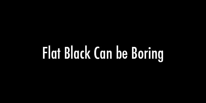
While dark colored backgrounds are nice, flat black backgrounds are pretty boring. If you are using R0 G0 B0 (or HEX #000000) for the web, this is for you. Where’s the texture or hit of color or life?
Consider a dark background with a touch of color instead. The color will appear deeper and has more visual interest. Another option, if you really want black, is to think about adding a hint of texture or a gradient to keep the background from being so flat.
Dark backgrounds are not a bad idea and they can work well in projects. But a flat black background can be boring and unlike printing where simple blacks can be best, richer blacks are idea for digital design projects.
4. Script Typefaces
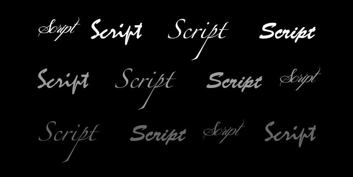
Scripts are hard to read. Scripts have been a little overused as well. Try something different.
Much of what we are seeing develop in design – web and print – is a strong emphasis on typography. While script typefaces can stand out, they are often not the ideal choice. There are plenty of other options with flair.
Look for a novelty typeface that with a little more distinction between letters. This typography choice will likely fit more universally at a variety of sizes and for different types of applications. If you have time, it might even be worth investing in a custom-design typeface if you are using it for a logo or brand identity piece.
5. Bland Colors
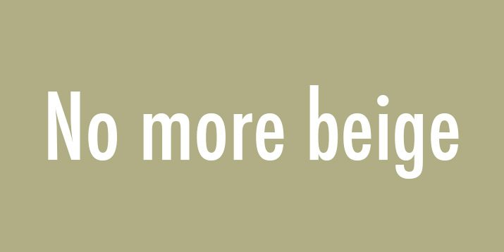
Color is going to be big in 2014, so forget all those muted beiges. Look for at least one bright or bold color for new projects.
Bland colors, while typically a safe choice, lack some of the personality and excitement of something bolder. But you don’t have to develop a red or fuchsia website. Ease into color with a simple accent hue that is super-saturated.
These bits of color can work in almost any design outline when they are used with purpose. Decide what color should do in your project and stick to the rules.
6. Default Drop Shadows
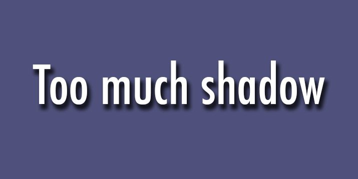
There are way too many of them in circulation. Heavy drop shadows that are too big, too dark and too much of the object they accompany. Why? Because some designers – you know who you are – are clicking the drop shadow button and not appropriately adjusting the specs.
Really the question you should ask is “Do I need a drop shadow at all?” Second, “Is the drop shadow all I see?” Often drop shadows are tricks that get added just because. So stop it.
Good drop shadows look natural. In fact, it’s likely that you won’t see the shadow at all unless you are looking for it. Good shadows mirror natural lighting and positioning. They can also be used to “lift” something off a background for additional contrast. But, again, you should not really see the shadow in this instance either.
7. Mobile-Only Websites
Dedicated mobile websites (those that often start with m.insertwebsitenamehere.com) should not be a part of your overall strategy anymore. Users prefer common and intuitive experiences rather than the stripped-down websites that were made to load fast on cellular connections.
Most smartphones and networks are powerful enough to handle your website. Opt for a responsive design so that users will get the same web experience no matter what device they use. A responsive website is also somewhat easier to manage – you will never forget an update from one site to the next – and I think it makes tracking analytics a little easier too.
8. Dumb QR Codes
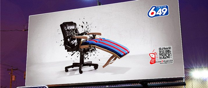
The argument about the usefulness and effectiveness rages on and regardless of which side you are on, it’s easy to agree that dumb QR code use and placement needs to stop.
- No more QR codes on websites. Use a link.
- No more tiny QR codes; phones can’t read them. Try to make sure codes are at least 1 inch square.
- No more “designed” QR codes. Simple really is better.
- No more QR codes on billboards. You must put a QR code in a place where it can actually be scanned if you want to see results.
9. Too Much Parallax
There is little question that parallax might really be the emerging trend of 2014. More web designers and developers are using this scrolling technique and the overall usage is getting better all the time. Just don’t overdo it.
Pick a single parallax action or trick and go with it. Multiple parallax actions are a no-no. They confuse users. They frustrate users. And then users will leave your site and it’s likely they won’t come back.
10. Super-Thin Type

While thin type has its place, it can be tricky. Super-thin type is difficult to read at a distance, in reverse color and at small sizes. It can also be troublesome for those that have less-than-perfect vision.
The lesson here? In most cases, it should be avoided. Even Apple backtracked on the use of Helvetica Neue Light for iOS 7 after various complaints in what some jokingly called “fontgate.” The software update was released using Helvetica Neue instead. Plus, OS includes an option for increasing text size and contrast.
Conclusion
Let’s all join together to make 2014 a year of good design trends and forget some of the bad things we learned and saw in 2013. The best design has purpose, is easy to use and read, and does not look overly designed.
Are there other design trends you really hope not to see this year? Share your design do’s and do not’s in the comments, or drop me a line at [email protected]. I’d love to hear from you.
Image Sources: Sean MacEntee and WhizFish.