15 Tips to Make Your Designs Feel More Human
What makes something on a screen or canvas feel real? The answer is simple. It’s human connection. People want to interact with and use designed elements that work in the physical world in a way that mimics reality.
It’s the case study for human-centered design and why it matters so much in every project every design takes on. This human connection is more than physical, it also creates an emotional bond between the user and the design. That’s where you begin to create things like loyalty to a brand and a connection to users that goes beyond the screen. Here are a few ways you can use design techniques and tools to help you get there.
1. Design Realistic Environments
Designing with a human feel starts with identifiable environments. This can break down in two ways – realistic and fantastic. The distinction should be clear to users.
Realistic designs focus on natural elements and actions that exist in reality. Don’t fake lighting or shadows in the design because it can cause a visual to feel somewhat jarring. Pay careful attention to details to ensure that design techniques match the design environment.
Fantastic design is not made to look real at all. It can be anything from a flat aesthetic or a design that is based completely in a fantasy world.
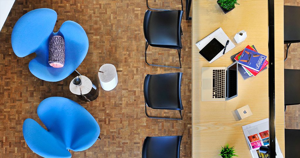
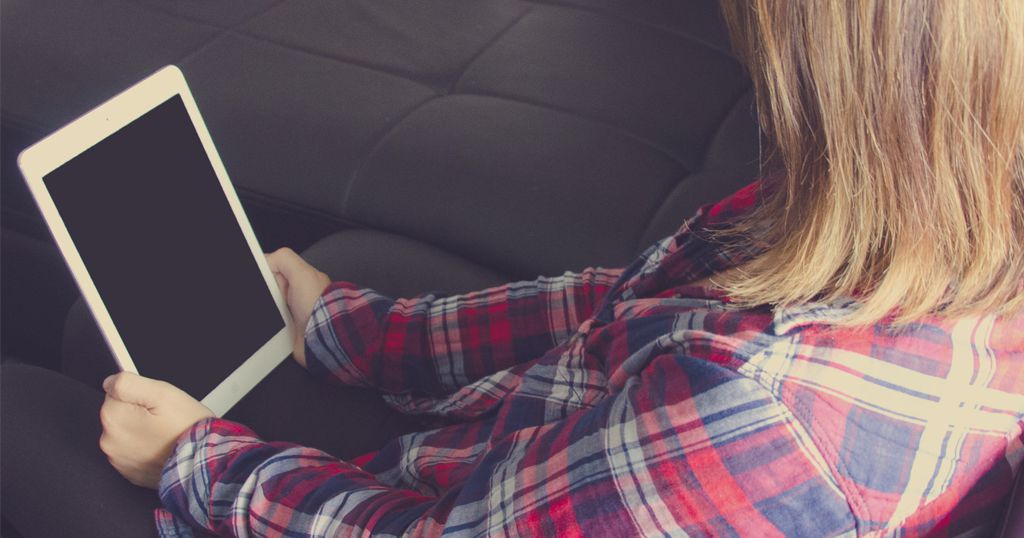
2. Hold and Touch the Design
How does the design feel when you touch it? Is it pleasant or uncomfortable? This applies to the design product itself as well as how easy it is to handle or use.
Mobile phones are a great example of thinking about designing something that you have to hold and touch. Where on the canvas are elements – such as buttons or the keyboard – located? Are they easy for all users to reach?
Take that one step further as well. Now put your hands on the phone in the locations where you need to tap to interact; can you see everything else on the screen that you need to? (If not, keep working on the design.) Ergonomics are a vital consideration.
3. Show, Don’t Tell
In this increasingly visual society, showing with design is growing in importance. Regardless of the project or medium, it should be easy for people to know exactly how to “read” and interact with the design.
Use big visuals that tell a story frame by frame. Consider direct communication in the human form and how much information we glean from body language; that same information is gathered from visuals.
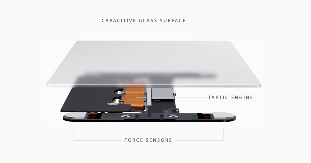
4. Involve the Senses
The world is not a silent, still place. When appropriate include sounds or vibrations into the framework of your design. This is becoming more commonplace with digital projects.
Human use all five senses all the time. Involve more of them when planning a design project. (I particularly like the idea of slight movements of vibrations for mobile phone design as a subtle way to engage the senses.)
5. Do the Unexpected
While many of the design tools you use when thinking about design that is more human are based in reality, sometimes it pays to try something completely unexpected. This can include anything from a design technique you did not plan to use to a pop of color (or lack of color) to a key interaction.
These design moments can make a project fun for users and encourage engagement.
6. Use Plenty of Color and Texture
Good design is just good design. This is true regardless of what type of project you are working on. Elements such as color and texture can be attention-grabbing tools that help engage a user with any project.
Use color and texture to help direct user focus and action. Think about how these elements play into or against the message of the design project. Natural-looking colors and textures often fall into the background; distinct colors and textures (think water) can make users feel a specific way about the design. Use these concepts to your advantage so that the visual look and feel connect to the emotional look and feel you are going for.
7. Make it Social
We’re not just talking about social media here. Create a design that is worthy of talking about and showing others. Make people want to share.
And as users are thinking about sharing, they want to share something that they feel like is theirs. Give users ownership of the design and projects so that they feel an attachment and want to promote the design to others.
8. Give Users Options
Options are another form of giving users ownership and control of the design. People like to feel like they are making choices, not just staring at a canvas.
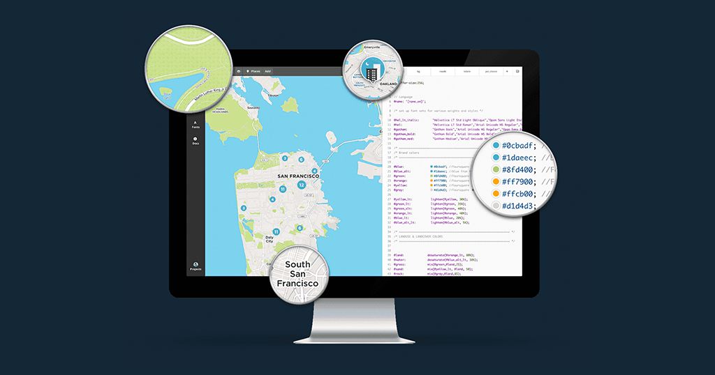
There are lots of ways to do this with design. A map, for example, allows you to move along a path from one point to another by choice; a mobile phone app may allow you to make choices about a specific path to take in playing a game. Either way, you are impacting the look of the design by making choices about what you plan to do next.
9. Design with White Space
Going back to the theory of good design … Space is always a great option. When comparing it to human interaction, think of it as personal space for your design elements. Each item needs to have room to be used without clutter and work without bumping into other elements.
Plenty of white space can have other benefits as well. Users will feel better about interacting with the design because it will appear bigger and easier to use. (White space is definitely your friend.)
10. Create Focus for Every Canvas
Start with an element in the design that is the focal point. Think of this as the eyes of the design. Where will users look first? Where will the eye contact be?
That focal point should then lead users through the rest of the canvas, element by element.
11. Experiment with Learning Styles
Not every user will receive your message in the same way. Think of all the different types of ways people around you communicate – even when they are saying the same thing. Use this to your design advantage.
Relay the same message in different ways in the design. Say it with images. Say it with words. Say it with video or sounds. The key is to repeat the message in as many different ways, for as many different types of communicators or learners out there, as you can.
12. Be Trendy and Modern
This might not sound like the advice you expect when we are talking about designing for human feel. But the aesthetics go a long way. Think of how you feel when you meet a person wearing modern, trendy clothing with a current hairstyle; now imagine that same person dressed in 1970s garb. You feel differently.
It’s the same for websites. Modern interfaces, colors and design feel more engaging and users want to interact with them. Have you ever heard anyone say “I want to go back to a green and black screen computer?”

13. Seek Familiarity
Actions and gestures in the design should be familiar. If in a mobile app, the common action is to swipe from right to left to advance, don’t make your user control do the opposite. Keep with consistent controls and actions so that users don’t struggle to understand how things work.
Then be familiar in motion and movements. Wheels should roll on the screen – rather than bounce – and every other common visual element should move or act just as it would in real life. (The one exception is if you are trying to create a scene that is not based in reality.)
14. Give the User Control of the Design
Let users make choices throughout their interactions with the design. (Life is filled with them, right?)
The user will appreciate and feel the design is theirs if he or she is allowed to determine outcomes along the way. These user controls can be things as simple as the color of the app, avatar in a game or volume of the sound playing in the background.
15. Think of an Interface as a Friend
The designed interface is your friend. You should like it and want to engage with it. You should feel like you give something to it, but get something in return as well. It should be something you want to keep coming back to.
This might sound a little silly, but a well-designed, human-feeling interface is like a digital friend for the user.
Conclusion
Designing with a human touch is an art that is ever-changing. The key to making any design feel more real and human correlates to the senses. Design something that engages all of the senses in ways that mimic how the common person acts and interacts.
Consider emotion as part of the human experience as well. You want the user to connect with the interface emotionally. Design for that. A human-based design combines everything we know about design theory and everything we feel as people to create projects that both look and feel like something others want to touch.