10 Unique + Innovative Website Layout Ideas
The idea has been floating around for a while – web design has a sameness that’s just kind of boring. Let’s dive into some unique and innovative website layouts that can break the mold!
Blame user patterns, too many projects for too few designers, or just the desire of clients to have their site looks like something they’ve already seen and understand. But all is not lost. Even though some people are snoozing at what’s out there, designers are still experimenting and having fun with website design.
Today, we’ll break the routine and dive into ten website designs that feature unique or innovative ideas. If nothing else, it should break you out of any creative rut you might be having.
Quick Note: Be sure to visit each of the websites to get a full picture of what they are doing. Interactive elements are tough to describe without truly experiencing them!
Divided Homepage
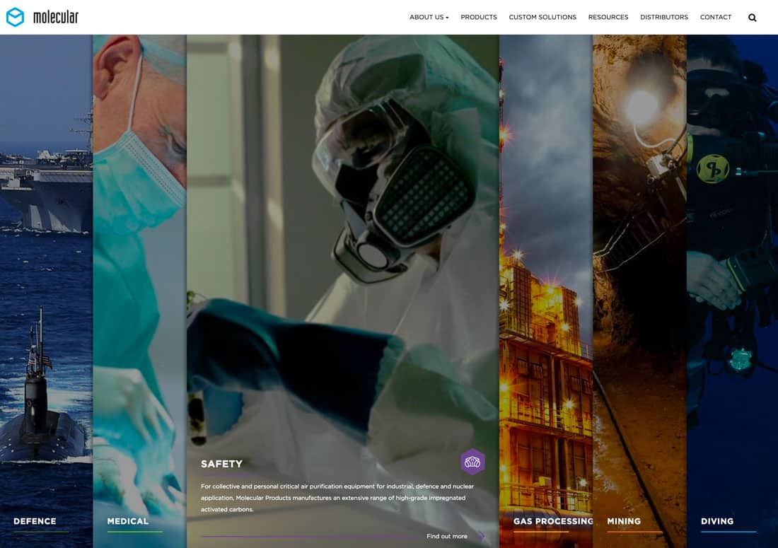
An overwhelming number of homepage designs feature a giant hero image or video and a couple of big words to draw users into the design.
But what if you have more than one story to tell?
Molecular flips that concept with a six-panel homepage. What makes it work is the innovative use of hover actions to open each panel to display more information, while shrinking the others. The design is engaging as well. When those still images are “opened” they convert to video elements. (That made me move through each one just to see what video was present.)
This design solution is a unique way to break up a lot of complicated information. It’s highly visual, leads the user to just what the need and isn’t overwhelming in the process.
Massive Card Deck
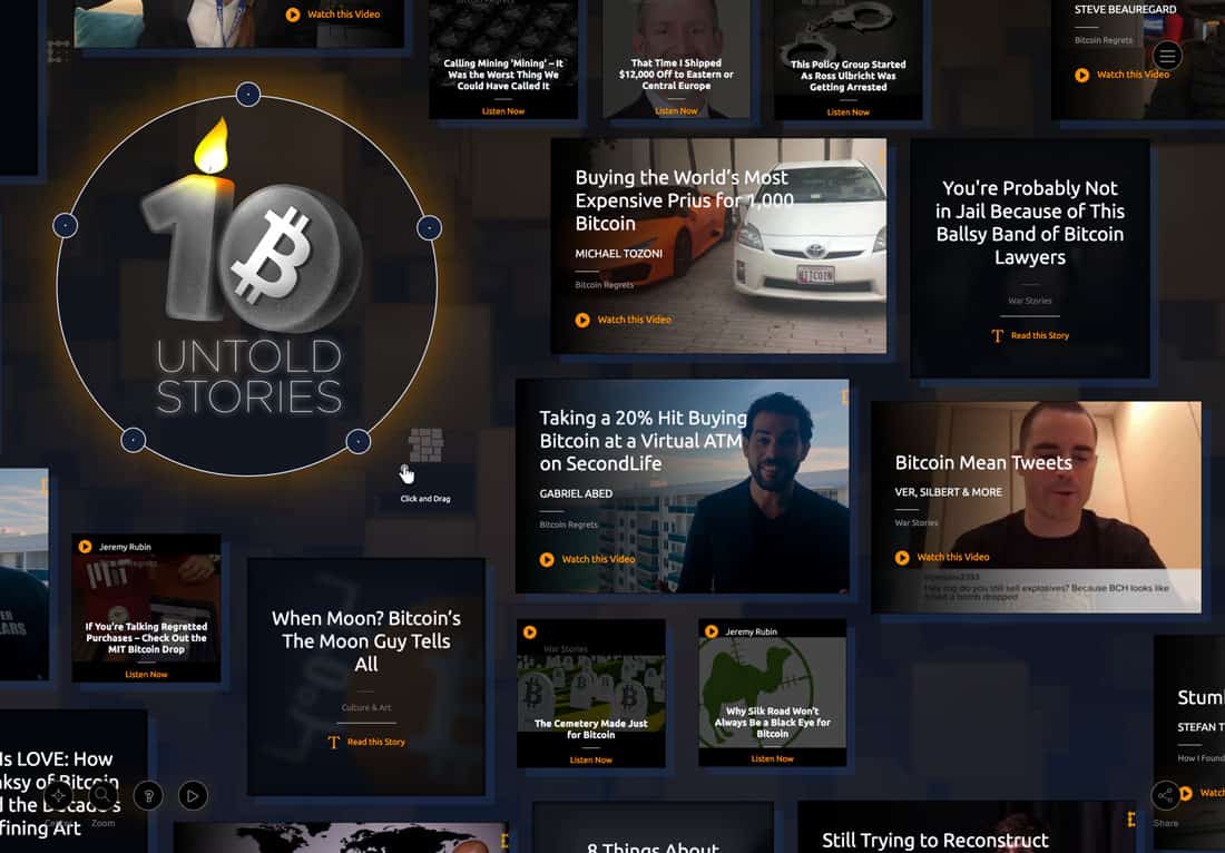
Card-style design patterns gained a lot of popularity for a while, faded somewhat and have been reinvented again. This history less of Bitcoin is a massive display of cards on a game-board style canvas.
There’s no navigation, no sound or looping video, just dozens of cards with headlines (some with photos) hoping that you’ll click.
For some, this treatment might seem a bit overwhelming. But what if that is the whole idea? The interactive canvas shows that a lot is happening with Bitcoin.
Then take note of all the tiny headlines. They feel a lot like social media clickbait with titles like “7 Best Bitcoin Explainer Videos” and “History of Bitcoin (As Told By Its 7 Most Iconic Memes).”
Even if you never click a single card, my guess is that you’ll find yourself investigating how this movement works, what the logic is behind the zoom and center toggles and if this nontraditional user pattern has a place in your projects.
Uber Minimalism
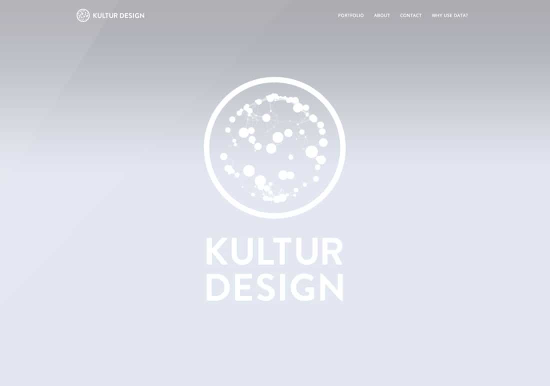
It’s just a big logo. There’s no color. Nothing to see.
But I’m intrigued anyway.
This website design takes minimalism to the extreme and still provides an interesting user experience. It might be the soft color palette or the globe-style animation, but the simplicity of the design makes me want to see the featured projects on this portfolio website.
Sometimes a lack of information can be the thing that piques our curiosity.
Break the Rules
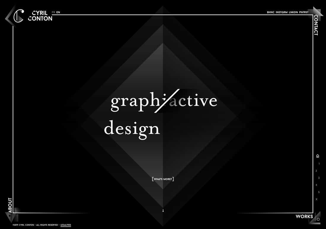
This website breaks more design rules that I can count. But I keep looking at it.
There are altered fonts, odd abbreviations of words, text overlapping odd areas, a lack of contrast in the background, over-the-top gradients, multiple animations moving at once and some tiny lettering.
But I keep looking at it.
My guess is that if you click through, you will too.
Common guidance says that if you want to break design rules to just break one; yet, here they all seem to be broken beautifully. This style of website design is a definite risk that’s most appropriate for a portfolio site or something that gives you more creative freedom.
Mix Old and New School
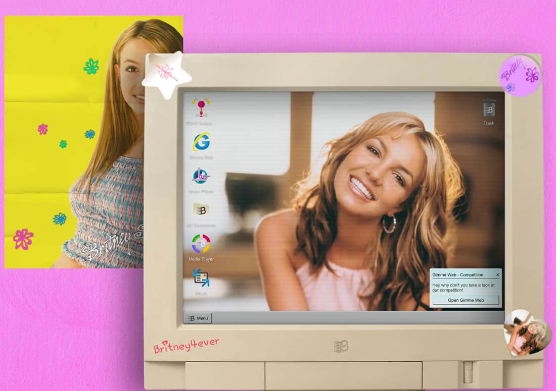
Yes, that’s Britney Spears circa 1999.
This website is a Spotify project that combines an old-school aesthetic but uses artificial learning and bots to help you find the right playlist.
While we can all agree that this design style is not what you would really focus on today – it’s so plain and boxy, right – its stands out because of that old-school feel. Why would new technology power games in this style?
That yin and yang effect is interesting and bold. It’s nostalgic and can tug at the fond memories of users. (The flip side is that anyone born after this era just won’t get it.)
Tile the Background
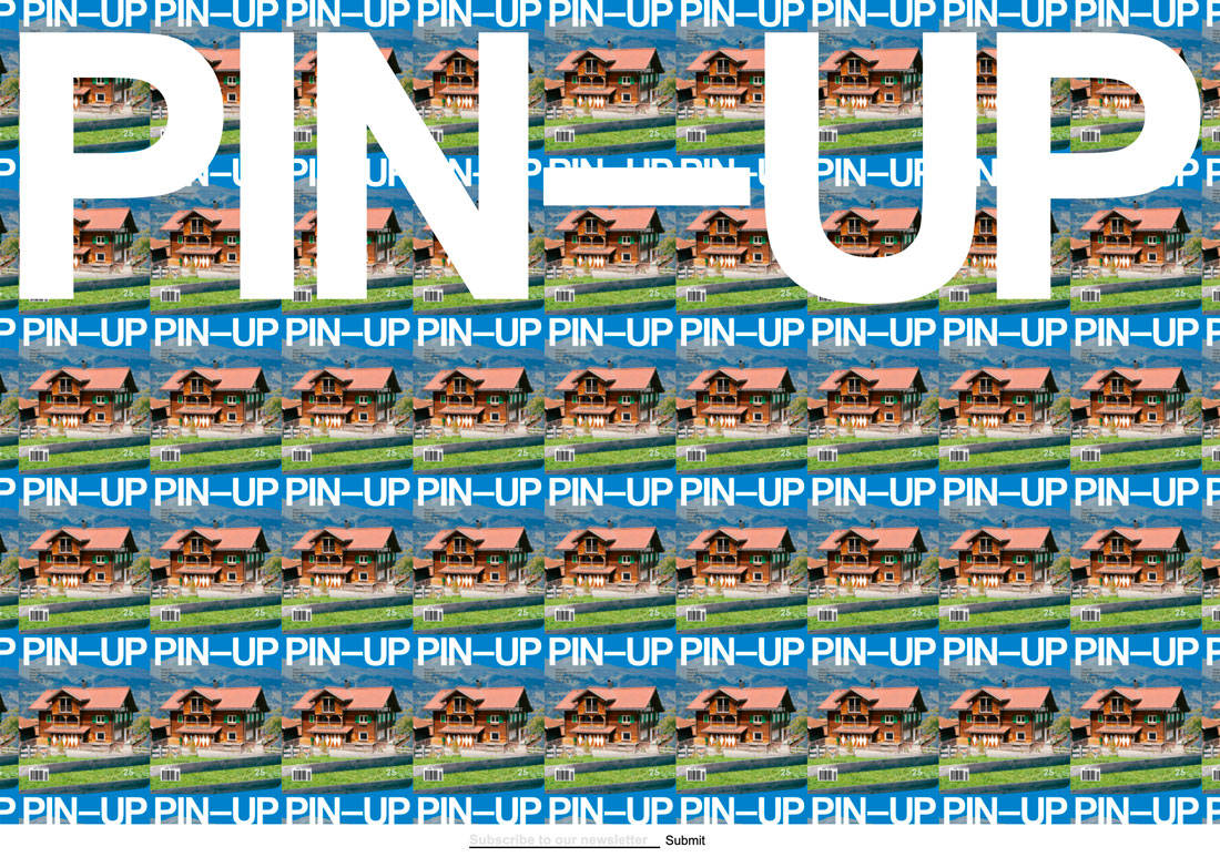
The design is bold and in-your-face. Pin-Up Magazine tiles it’s cover on the homepage. Scroll just a little and one bigger one pops up, just begging to be clicked.
The style of the website is quite brutalist but easy to read.
It’s hideous and I love it anyway.
This is one of those places when weighing the audience and goals of the design can lead you down an unexpected path. Think about these magazine covers; they aren’t that enticing on their own. But the overwhelming design brings focus. The lack of elements on the homepage almost forces the user to scroll (and navigation does pop in).
This design can be scaled back to backgrounds that are tiled and less “out there.” But it’s a good example of how not everything has to have that sameness. This one makes you look because it’s loud and daring.
Space and Asymmetry
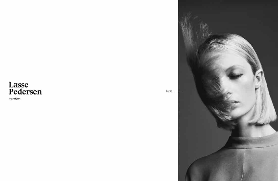
Break the grid or plan an asymmetrical grid.
The beautiful nothingness of Lasse Pedersen’s website is phenomenal.
Websites are always trying to sell with plenty of entry points into different bits of content. None of those exist here. Look at the screen or scroll. That’s it. Two choices. Plain and simple.
The risk here is that the thing users choose is to leave the design, but the flow across the screen with the simple instruction to scroll should be enough to draw at least one flick of the mouse.
What’s enticing about the simplicity of this design is that it doesn’t seem to ask much of the user. You can really look at the images and if you make it past the homepage there’s a small contact button if you want to know more.
Display a Full-Screen Photo
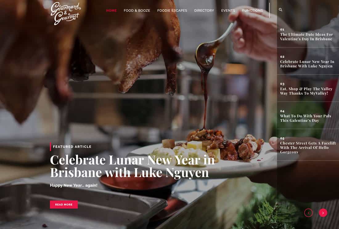
Most full-page hero images and videos are trapped between a light or dark header bar at the top of the screen with navigation elements and some type of separation to the next content element below.
Gourmand & Gourmet uses a full screen image without all the containerized elements surrounding it.
While the design feels big without the header in particular, it is a tricky configuration. Just think of how hard it can be to place text on different parts of an image, and now you have to do it with the display text as well as smaller navigation elements.
This type of website design takes the perfect set of images, but can provide a lot of visual value.
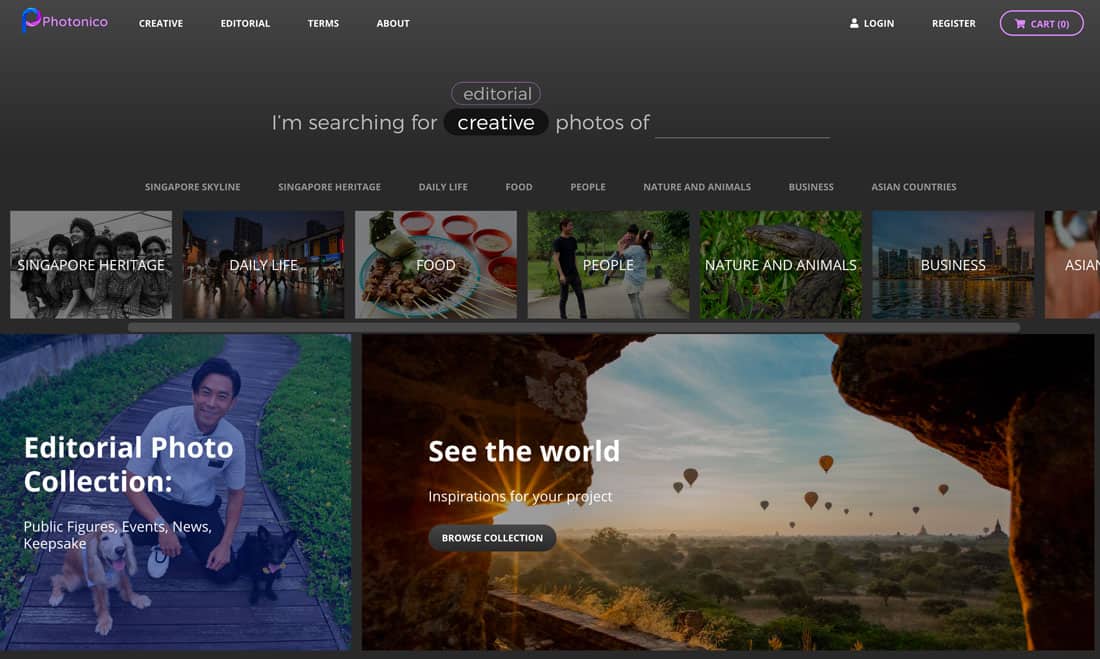
Flip the Photo Placements
One of the common themes among all of the unique and innovative website designs in this collection is that they present a new take on a common idea. Hopefully they are concepts and elements that you can use.
Photonico uses a simple design to showcase photos. The twist is that smaller images are on top as a form of navigation and big photos are below.
This creates a nice flow from top to bottom of the page. (Although I might like it even better if they got rid of the text navigation above the photo navigation.)
It goes to show that you don’t have to do the same thing to get the same result. Every element on the homepage is designed to take users deeper into the site.
The best part of this design might actually be the interaction that happens when you engage. Type in a search term and the screen shifts. It feels like a one page design thanks to nifty, quick animations, the simple dark background and static search bar.
Be Silly and Have Fun
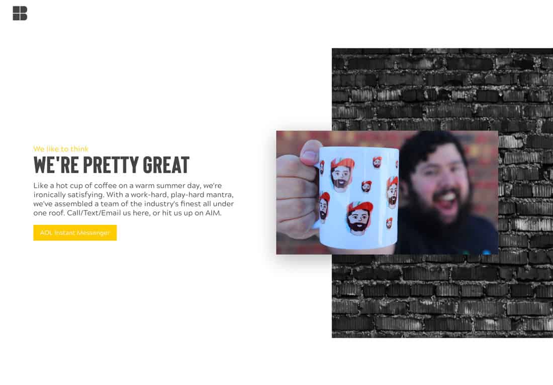
Design something happy and engaging. Beyond Theory does it with words, images and calls to action that are a bit unexpected – contact us on AOL (LOL).
Combine that with bright color and plenty of open space and the design is a pure delight.
It also uses an asymmetrical pattern and layered elements to create depth and interest.
Conclusion
Ready to get to work on something new and different? While there are pros and cons to all of the different website design ideas featured here, there’s something you can take away from each one.
The big idea is to just try. Not every design will yield great results every time, but there is value in daring to do something different.