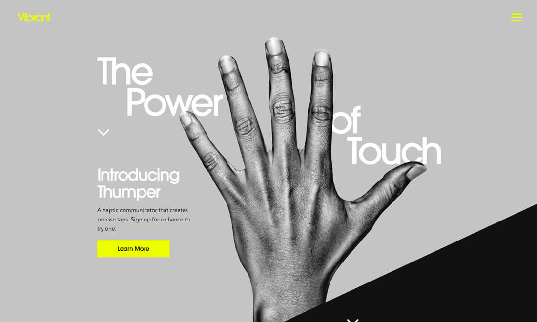
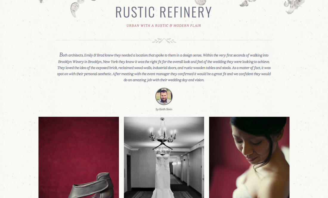
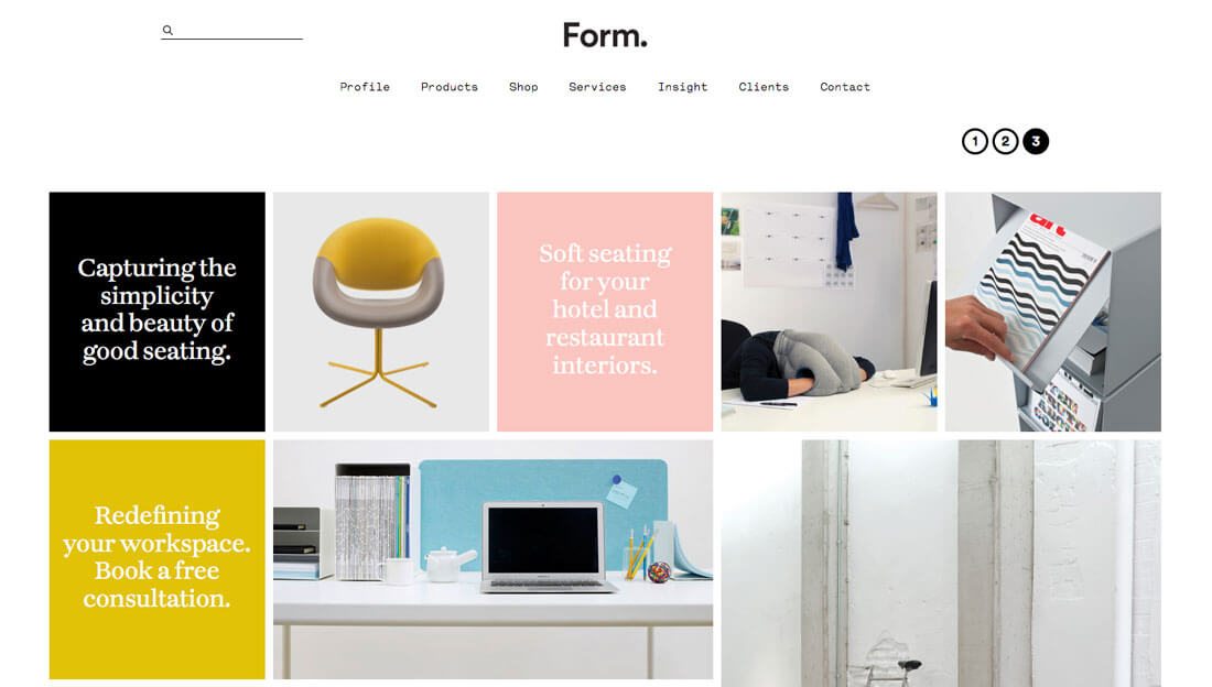
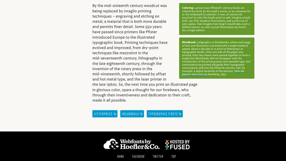
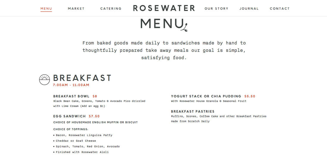
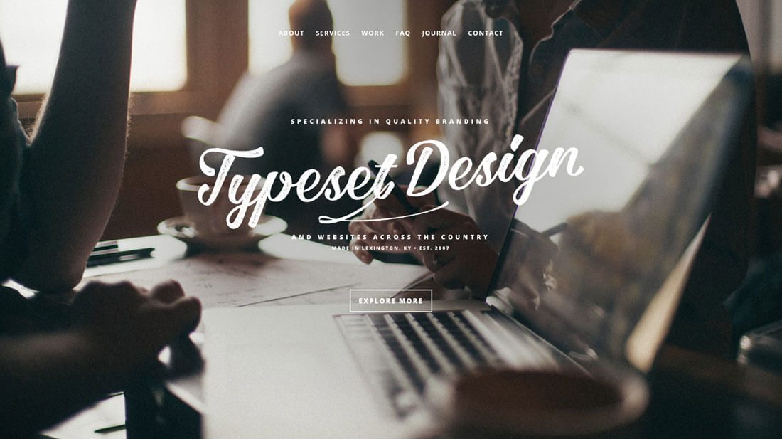
9 Tips for Better Typographic Hierarchy
Every project requires a system and hierarchy for text elements. Just think about all the small pieces of text that are used throughout a design – headlines, body copy, navigation elements, legal information, captions and so on.
But how do you create that hierarchy so that every text element flows smoothly to the next? Today, we’ll take you step-by-step through building a system of typography hierarchy that can be used for almost any design project. (And we are pairing the tips with beautiful examples of great typography to help you gather a bit of inspiration.)
1. Start with Comfortable Body Copy

While you may want to start with a cool headline treatment, the place to start is actually in the middle. Establish a comfortable typeface, size and spacing for the main body copy first.
This should make sense because this is the bulk of the text in the design. Whether you are building a website or brochure, this concept is the same. Ideal readability for body copy is somewhere between 50 and 60 characters per line (or column), according to the Baymard Institute. This guideline will help you set a scale for text that is readable and accounts for different kinds of typefaces (such as regular versus condensed versus slab).
2. Build a Scale
Once you know what the body copy will look like, you can set a scale around it for all the other text elements in the design. It can be easy to overlook certain text blocks; make a list of every different usage for text in your project.
- Body copy
- Headlines
- Subheadings
- Captions
- Block quotes
- Navigation elements
- Footer information
- Legal copy or disclaimers
Now create a scale that dictates typeface, size range and usage for each of these elements. (And build it into your CSS for websites or styles files for working documents.) There are a number of ways to create the scale, but percentage of size can be a good starting point. You can also establish a scale based on the math behind a baseline grid or visually.
Here’s a simple scale to start:
- Body copy size
- Headlines are body copy size times 220%
- Subheadings are body copy size times 150%
- Navigational elements are body copy size times 80%
- Footer/legal copy is body size times 80%
3. Think Biggest to Smallest, Top to Bottom
This rule is pretty simple: The biggest and most important text should be at the top and sizes should decrease as you read down the page or screen.
That’s not to say that you can’t break this rule every now and then with some design finesse, but it should always be the starting point for developing typographic hierarchy. (Who is really going to scroll to the end of a webpage for the headline and then back to the top to start reading?)
4. Establish Rules for Space
Just as important as the size of lettering is the space between and around it. Factors for determining space include leading (or line height), indents (or not), wraps and gutters and alignment.
Consider spacing proportions that mirror the scale used for sizing text. The size of the canvas is also pretty important here as well. Bigger canvases are readable with tighter spacing than small canvases. (That’s why many projects have much looser spacing specifications for devices such as mobile phones and tighter rules for desktops.)
Just like with typeface sizes, spacing rules should be set in advance for the entire design framework. Consistent, clean spacing is one of the small things that can make or break a design.
5. Set Rules for Bold and Italics
While bold and italics aren’t different type elements or sizes, usage is important. (Just image what the design will look like if every other word is bold.)
This makes guidelines for bold and italics especially important. Rather than looking at size or space though, the consideration is much more contextual. Usage specifications may state that only so many words or phrases (or specific words or phrases) can have this treatment. It’s a common mistake to overuse bold and italic; when it doubt, don’t use it.
6. Create a “Z”

The common reading pattern is in the shape of a Z. Whether you are designing for a language that reads left to right or right to left (flip the Z), users will read from one corner across the line to the end and then back to the starting corner and across the line in a repeating pattern.
Use this natural flow when placing text elements on the screen. This Z shape is why most brands place their logo in the top left corner. It is the first spot the eye lands when reading.
7. Consider Visual Weight
Size is not the only factor when it comes to how big a text element looks on the screen. Visual weight is just as important and can impact the way you create a typographic scale.
Typefaces will look bigger when:
- They include thick stroke weights
- They include flourishes or embellishments
- They are wide
- They are novelty base typefaces
- They have taller x-heights
- They are used as all caps
Typefaces will look smaller when:
- They are condensed
- They include light or thin stroke widths
- There is little contrast with the background
- They are used with lowercase letters
8. Create Accents

There are certain words that you’ll want to highlight that fall a little outside the normal typographic scale. Adding an accent to lettering can make it stand out without having to adjust the actual size or typeface.
Common accents include:
- Color
- Underline
- Highlight
- Text in a button or shape
- Simple animation
- Change in case from other type of same size
The nice thing about any accent within a type hierarchy is that it is an immediate attention-grabber. These elements should be used sparingly for the most impact and for key elements in the design.
9. Use the “Eye Test”
Finally, every rule has an exception (or two). That’s where the “eye test” comes in. Just look at the scale on the screen. How does the text look and feel to you? Is there a logical flow? It is easy to read?
If it feels off in any way, consider making adjustments to the scale. Depending on the typeface you use and other elements in the design – from pictures to color to contrast – the scale will require adjustment on your part. It’s only a starting point when you aren’t sure what you want to do.
And ask for other eyes as well. Create one or two versions with different hierarchies to see which version gets the best response. Design is a visual art, making the “eye test” an imprecise but fairly reliable option.
Conclusion
Once you set a typographic hierarchy for a project, the best thing you can do is document it. Establish the scale with CSS for websites or create styles files when working on printed projects.
For larger scale designs or branding, put the scale and specifications in writing in a style guide. Creating a type hierarchy requires a little work on the back end, but makes project completion quicker, easier, and not to mention more consistent, as you move forward with subsequent projects.