Data, Data, Data: How Do You Design It?
You are probably swimming in a sea of data. Analytics, reports, metrics and data-based facts are the new norm, and people can’t seem to get enough.
But how do you design with data? How do you take something that can be complex, requiring explanation, and break it down into something smaller and digestible without ruining the meaning of the information? It can be a tough task. Today, we’re going to look at different approaches to designing with data and hopefully provide some usable tips!
Why Work with Data, Anyway?
Good data is the foundation of good information. It’s the credible sourcing that helps you understand that something is as it seems to be.
In a world where more and more information being thrown at you constantly, using data in design projects is that extra bit of information that can set your project apart from the rest, establishing credibility and trustworthiness. Backing and supporting projects with data will help users understand a final product and also help you gain a better understanding of the work as well.
What’s nice about that last element is when you understand and design the data portion of a project, you will likely be better versed in every element of the information and related design. That comprehensive understanding will make you a better designer because the project will solve the problem it aims to, thanks to that knowledge.
Provide Information
The first step when thinking about designing data is how you are going to use it. What are you trying to accomplish?
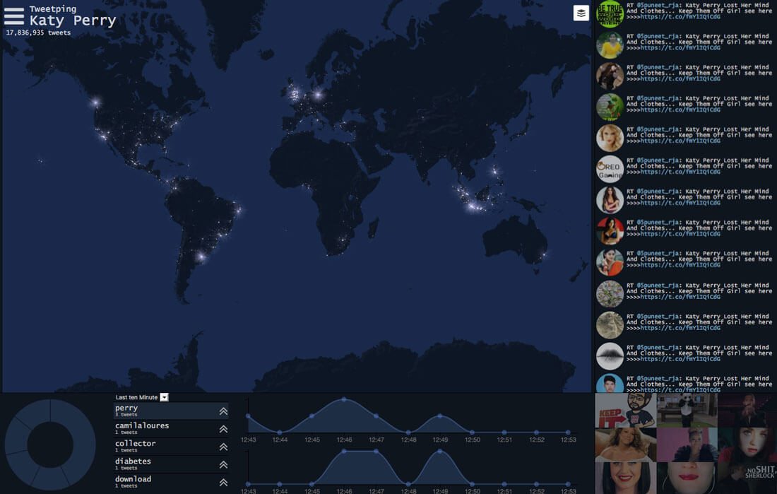
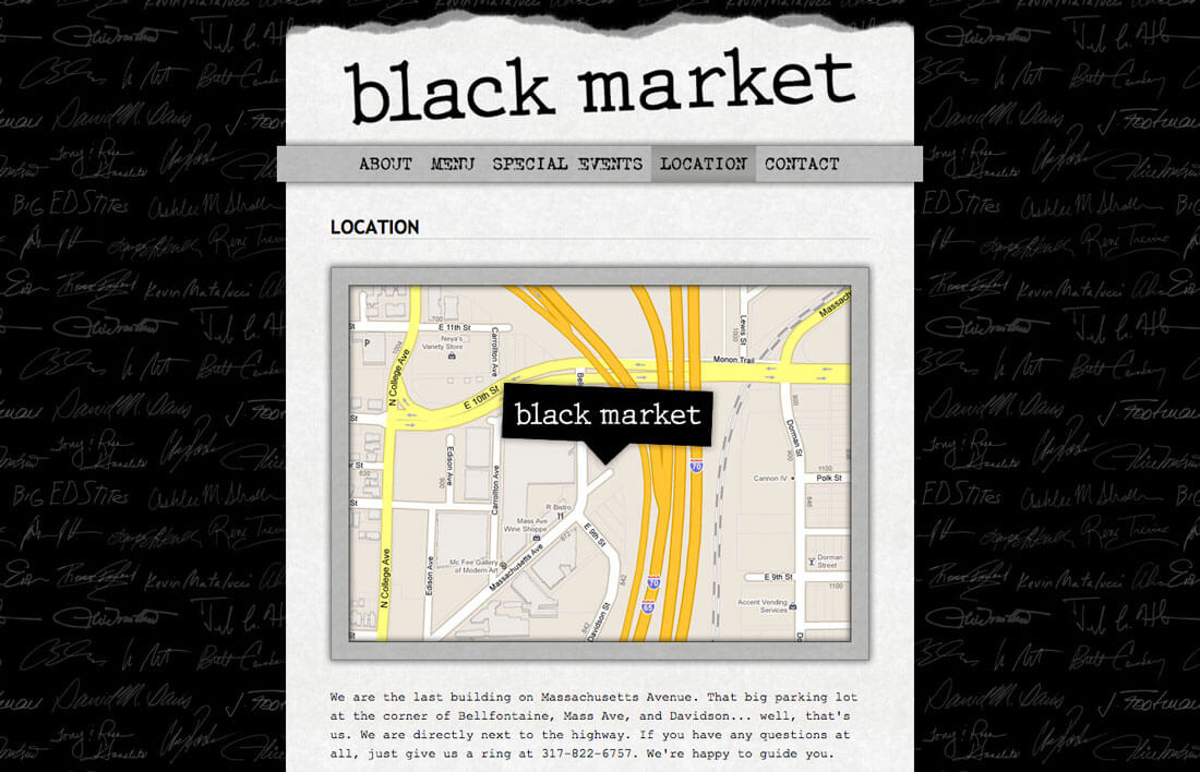
Data should support and provide additional context with other parts of the design story. Just tossing a map or numbers on the canvas without context is not helpful at all. You need to provide additional information and context.
So what do you write out and what do you visualize? You want to have a mix. Highlight key points with visualization. Determining whether to show or tell should be based on the easiest way to digest the information.
Let’s take a map for example. Explaining turn-by-turn directions from Point a to Point B can be cumbersome and hard to digest, but a map is much easier to follow and commonly understood. Even better would be an interactive map where the user can change routes if necessary and get that turn-by-turn information if wanted.
Organize It
Data must be organized to be effective. It has to flow in a logical and sensible manner so that users can understand the point you are trying to establish.
A timeline is the perfect way to illustrate this. This type of data visualization implies chronological flow (often from oldest to newest dates). The flow of information moves as events on the timeline actually happened. Users don’t have to think about this to understand it.
But what if the design looked and acted like a timeline, but the dates appeared in a jumbled order. It would likely befuddle users and likely cause them to leave the site and consider the design ineffective.
Decide What’s Important
This might be the most difficult part of data design: You can’t use it all.
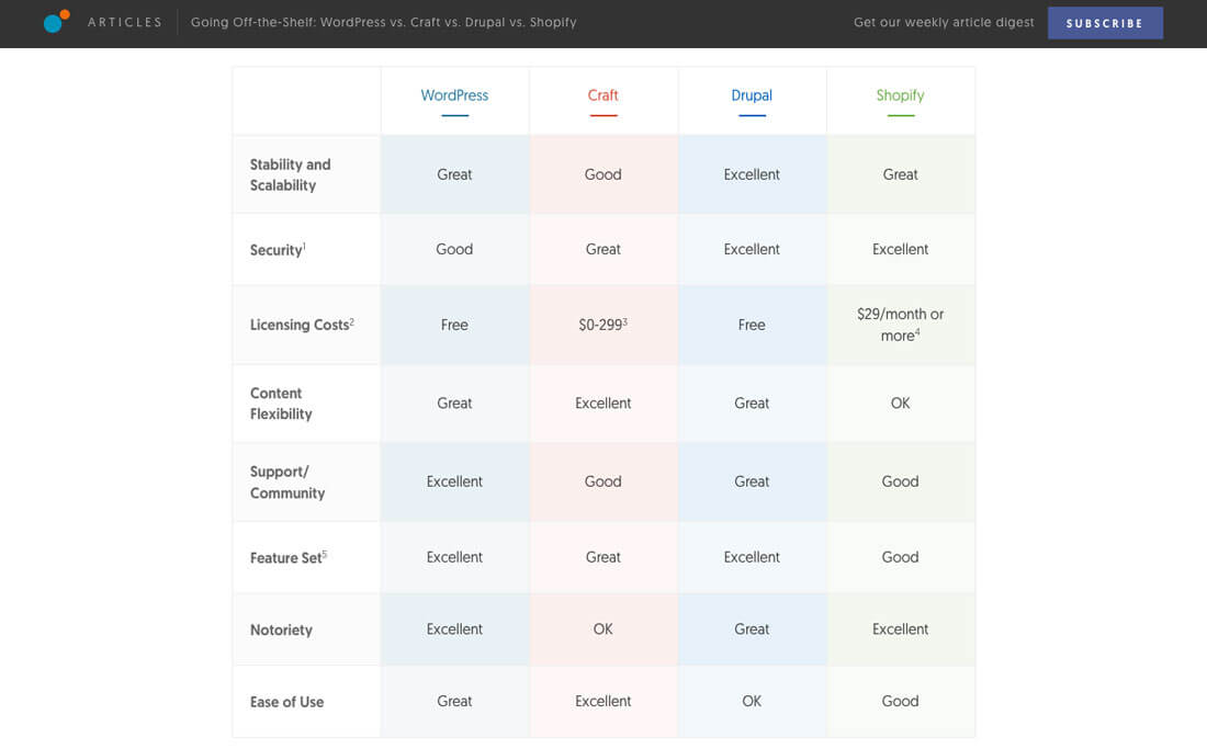
Most projects that come with data come with a lot of data. It’s your job to sort through it all, grab the key parts and incorporate them into the overall design. It’s your job to create that balance between not enough and too much information, so that the user has just what they need.
Learning to sort through a lot of information isn’t always easy and is often a team effort. Keep in mind the balancing act of visual data points and text points, and remember not to duplicate efforts unless it is necessary for understanding.
A chart is a great way to organize relevant information, particularly when it comes to making comparisons, such as the one above from the Viget blog.
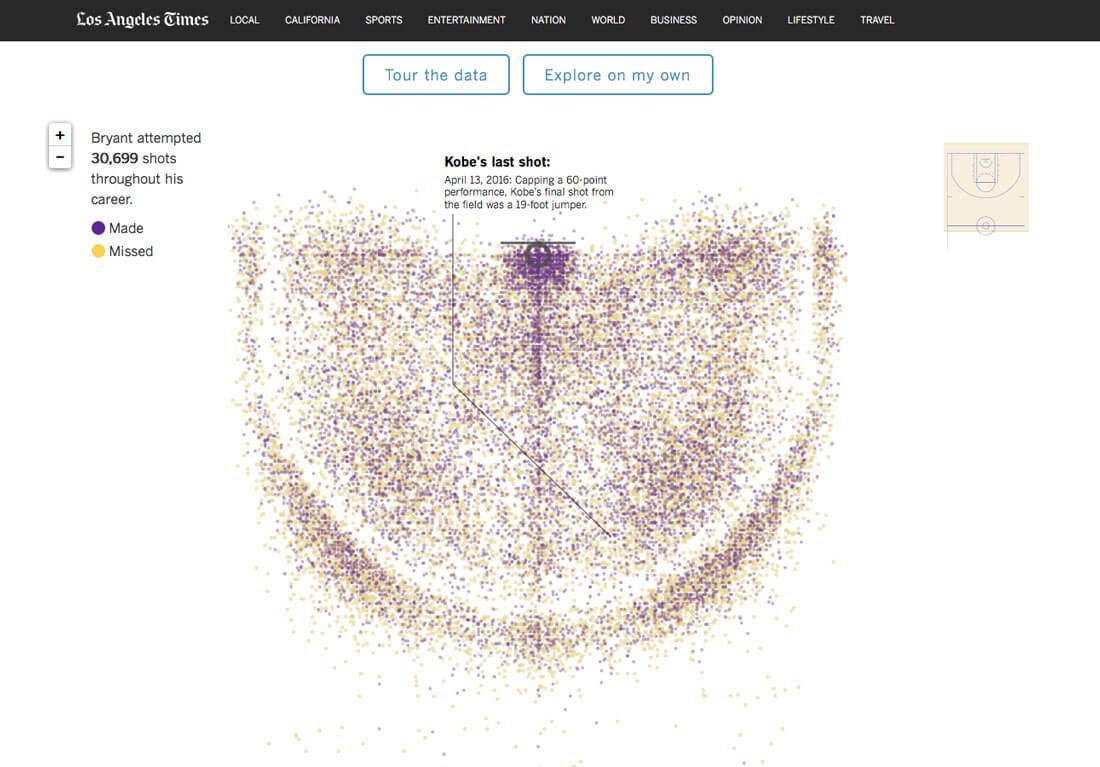
Think in Scale
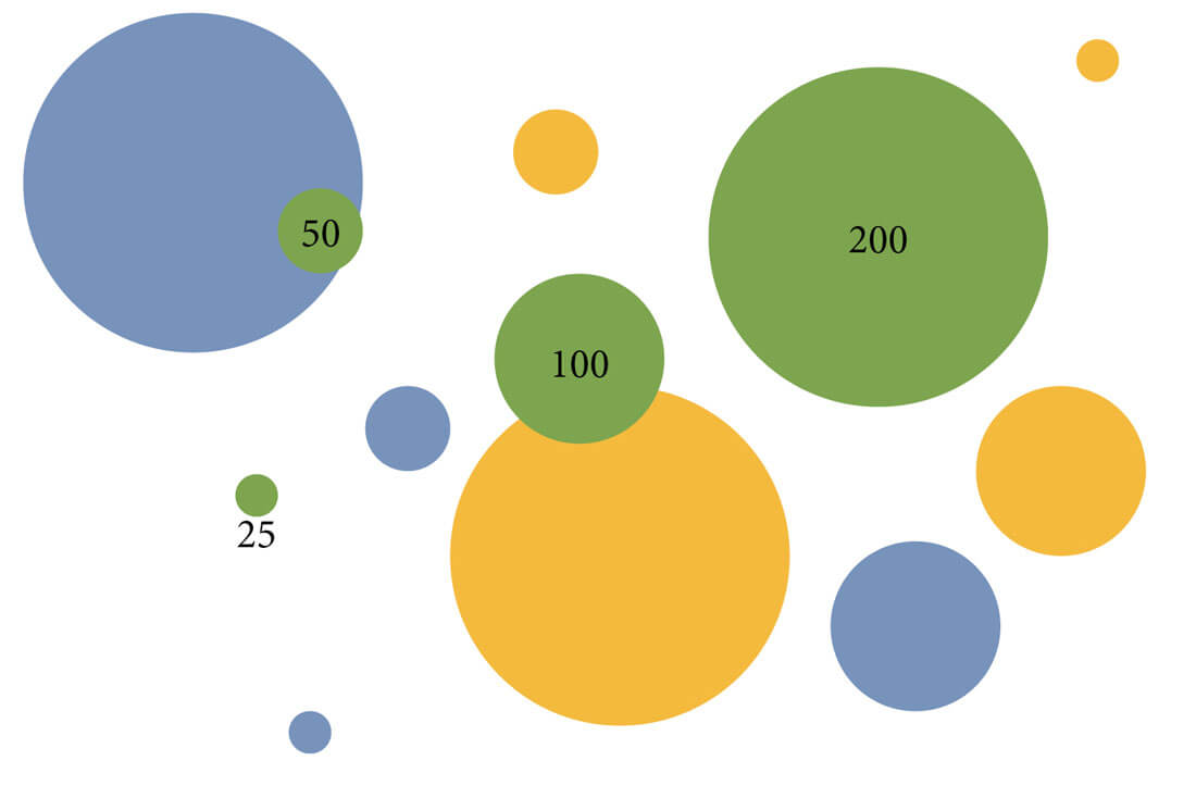
There’s more to a good chart of map than just making it pretty. Users should be able to look at it and get accurate information at a glance, which is why scale is so important.
Visualization points should relate to one another in a logical way.
Look at the elements above. Each “bubble” represents a number. The baseline number is 100. Notice how the 200 bubble is twice as big as 100 and the 25 bubble is just one quarter of the size? This scale provides visual context to the information so that users can actually see what they need to know.
Don’t Force the Visuals
Sometimes data can be too complex to visualize in a way that means anything. So don’t force it.
Just as commonly as numbers and facts lend themselves to charts, they do not. If that happens to you consider another path to helping users connect with the information. (My favorite trick these days is to pair a text element fact with an icon. The icon draws users in and the fact is plainly stated next to the visual element.)
10 Cool Data Visualization Tools
Building infographics from data points can be a time-consuming process. Depending on how you plan to use this visual data, an online tool might be the right solution. There are plenty of tools available to help you create data that users will want to look at.
Here’s a look at 10 cool tools that are completely free. (Coding knowledge varies from no-code-necessary to more advanced.)
- Tableau Public: Create visuals for almost any data type with this app-based tool
- Raw: The open source project allows you to create vector-based visuals using the D3.js library
- Timeline: Put your time-based information in an easy to read format right from a spreadsheet
- Infogr.am: Turn data into an interactive, responsive graphic based on templates
- Chart.js: Create line, bar, radar, polar area or pie and donut charts
- Google Charts: Gallery of tools to help you make the most of data in a pretty simple manner
- Leaflet: Open-source mapping tool that is interactive and mobile-friendly
- Dygraphs: Build charts with lots of data points or from complex spreadsheets
- SMILE Widgets: Another open-source project that will help you create anything from a webpage to a timeline to plotted data points
- Canva: Cool drag and drop infographics builder that doesn’t require coding knowledge
Conclusion
While too much data can be a bit overwhelming, it can be a good thing. Learn how to process and cull through this information and pair factual parts to projects to make the most of using supporting data to tell a more complete story.
Once you know what you are working with, visualize it. Whether you design the data elements yourself or use one of the great tools out there, informational data can impress users, add credibility to a project and enhance it aesthetically.