Design Trend: How to Create a Cool Split Screen Aesthetic
One screen divided in two. This might be one of the bigger design trends emerging right now. More and more websites are using design patterns that include two vertical or square panels placed side by side.
And it’s a nice aesthetic. The look is user friendly, can be adapted for a variety of needs, and helps guide navigation. It’s a trend that we are likely to see more of – and design – in the coming months. Today we are looking at a few great examples of split screen design with mini case studies and finding out how you can make the most of this design trend.
3 Cases for Split Screen Design
So why in the world would you want to split your design in half? If you just posed the question to me without seeing the results, I might have questioned it as well. But there is a pretty good case for trying a split screen concept.
- It’s a good choice for responsive frameworks. On bigger screens, the design is split but when it comes to smaller screens, the panels can be stacked.
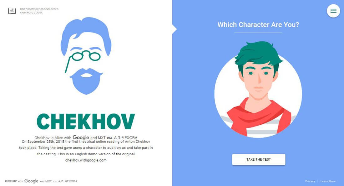
- It’s easy to work in animation and effects that encourage clicks. Look at the gamification model used for the “Chekhow is Alive” site above. The design begs you to click to find your character. (And it’s very hard not to get drawn in.)
- Two symmetrical panels make it easy to create a modular outline for the fill site design and organize content within the blocks. It’s almost an oversized extension of the card-style design patterns that have been growing in popularity.
Go Bold with Color and Typography
Color and typography are big trend drivers, thanks to an increased focus from flat and material design. Combine the two and you end up with a simple aesthetic that can be interesting and engaging.
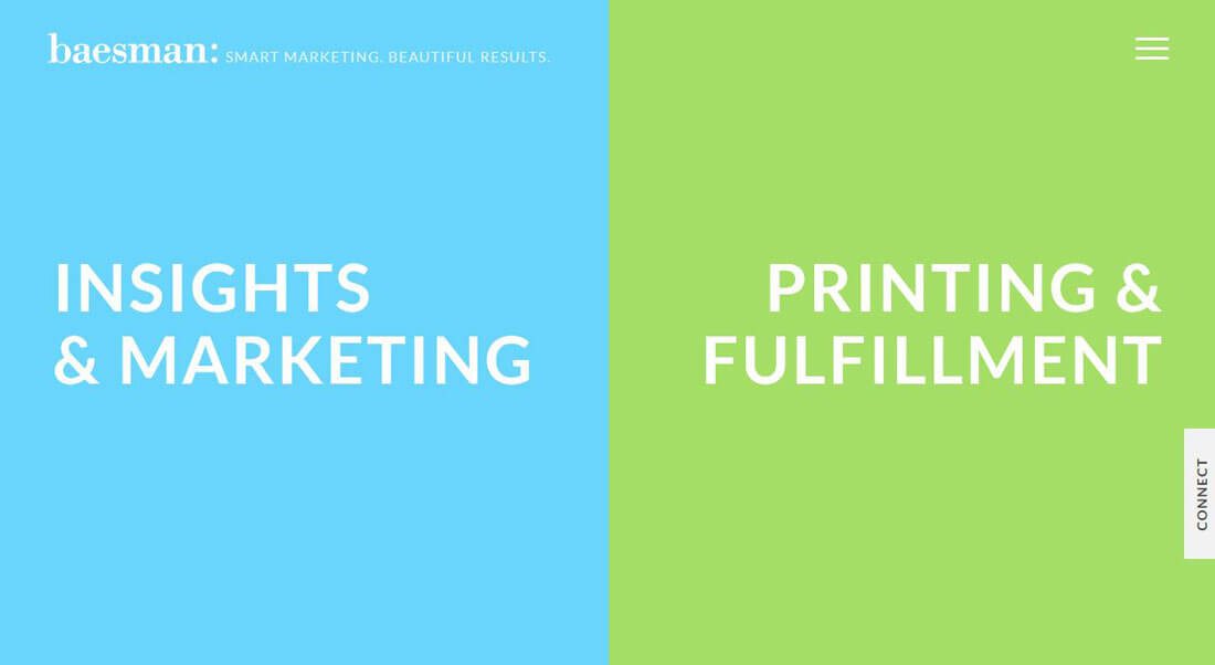
Baesman has done this masterfully with split screen design. Two bright, bold color panels are the first introduction for this user. Cool hover states “expand” the messaging on each panel almost begging users to click further. The typeface selection is simple, but has just enough of an edge to make you look.
Click through the site and it’s easy to see that this split-screen concept carries through to help create a sense of flow and organization. While the rest of the design is not as perfectly split as the home page, content is organized into panels throughout the design and the bright color carries through.
Create a Space for Messaging
A split screen is a great option to create a visual theme that can work with challenging content or images, or just if you want to create a bigger focal point for calls to action. The trick to making this work is plenty of space, clean typography and making sure the split style (in the case of the example here, a color overlay) compliments the imagery.
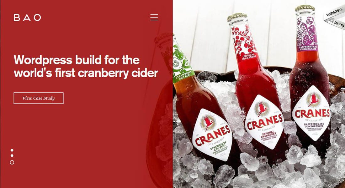
BAO uses a full-screen hero image behind a color block with text, navigation and a call to action. The design is interesting in a few ways because it breaks out of some of the patterns we are used to, but without being confusion. For example, the navigation (hamburger menu) is near the center of the screen and the hero image includes just a touch of animation with hover.
These things help draw users to the call to action on the left size of the screen. What’s especially nice about this design is that each screen takes on an almost homepage of its own feel, so that each different bit of content is weighted equally. (This type of treatment isn’t for every project but works especially well to showcase portfolio or client work.)
Focus on an Action
A split screen website design can also be reminiscent of print. This works particularly well with a minimalist framework that includes a distinct call to action for users.
In the case of Tree That Gives, the goal of the site is to encourage donations with the simple colored button in the bottom right panel. The image just serves as a landing point for users that get to the page, but all of the important content and information is in the other panel. (This half of the website could actually live alone in terms of content, but would not be near as interesting visually.)
Create “Cards”
Split screen design really is a pattern derived from the popularity of cards. Many of these sites include interactions that are contained within one side of the screen or the other, following the one container, one click philosophy that is characteristic of card-style interfaces.
Consider expanding the split-screen into multiple containers for even more potential touches from each user. Si le Soleil uses a split screen throughout the site; the big difference is that the left panel is one “card,” while the right panels contains a card pair. Simple hover effects clue the user in to the fact that each of these elements is clickable and will lead to another action. The design is clean, well-organized and designed to keep users clicking.
Change it Up
While many of the designs we’ve looked at so far have focused on a distinct left-right divide with a hard line between elements, that’s not always the case. A screen can be split visually using other elements as well.
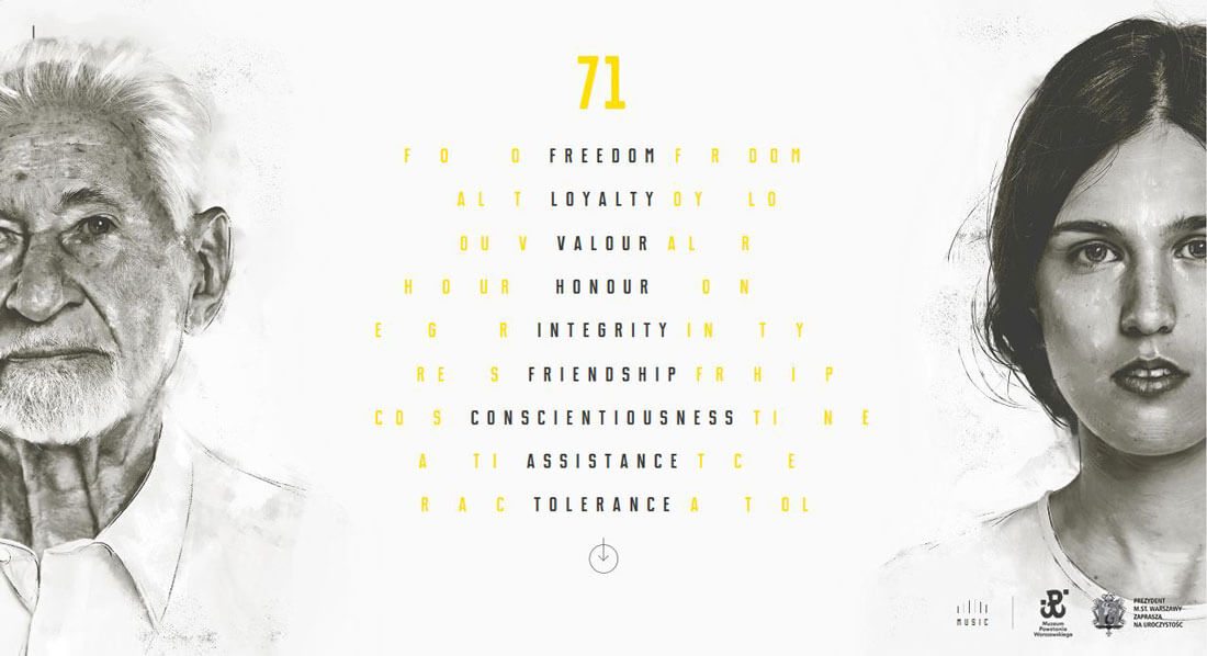
The site for Warsaw Rising does this with simplicity and beauty. A block of text is the dividing “line” between the panels. Each side features a face, cropped similarly on the screen and spaced to perfection. Scrolling changes the middle text without taking away the panel style. The almost reverse style of the split screen, black and white imagery and pops of yellow makes it stand out. The overall design is high drama without being difficult to navigate or take in.
Conclusion
Split screen design is something we are going to see a lot of in the coming months. The pattern is simple, usable and works for a number of different site types as we’ve examined here.
The trick to making it work – and not getting stuck in an “overused” design – is to add touches that make it your own. If you are big on color, use it; consider stacking elements or going just a touch off center. But most of all have fun!