Grid-First Design: How to Create Vertical Rhythm and Harmony
When you hear grid, what’s the first thing that comes to mind? For most designers, it is often a horizontal based concept with columns across the canvas. This is especially true when thinking about web and digital design projects.
But what about vertical grids? It is just as important to create flow up and down the page as well. And there are a number of ways to do this with grid systems.
The Ultimate Designer Toolkit: 2 Million+ Assets
Envato Elements gives you unlimited access to 2 million+ pro design resources, themes, templates, photos, graphics and more. Everything you'll ever need in your design resource toolkit.
Why Use a Vertical Grid?

If you aren’t already thinking about vertical grids in your design projects, you might be wondering why this is important. A vertical grid helps achieve vertical rhythm and harmony on the page.
The grid will help set and establish rules for the design, whether printed or digital. This structure makes the design easier for you to draw and provides guidelines for spacing, element placement and sizing of text and other objects on the canvas. A vertical grid also creates a rhythmic pattern and flow for a website as users scroll. (This can be especially important on smaller devices.)
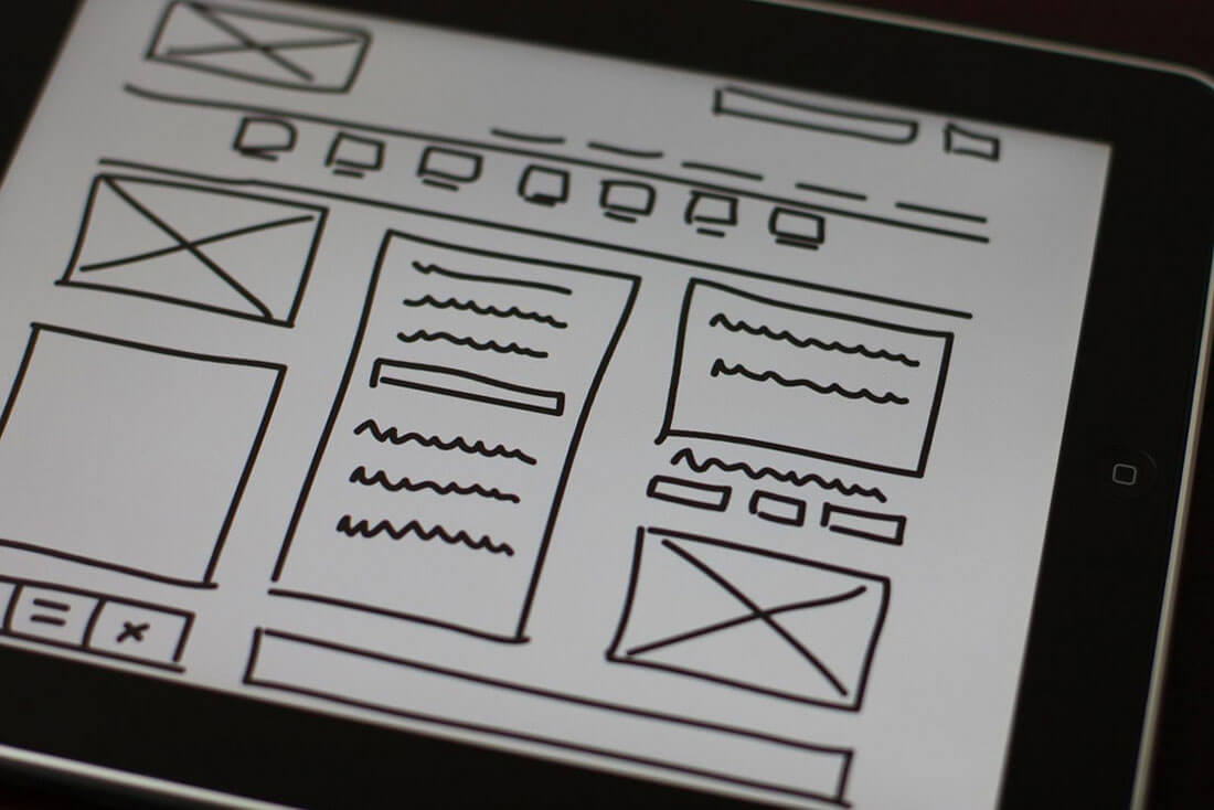
The overall effect is a design that if you sketch it out wireframe-style has a look with flow. Elements are spaced well, transitions are easy to see and understand and each different part of the design feels purposeful and part of the plan.
Just look at the wireframe above. You can draw lines across the sketch so that every element lines up on the same plane. This visual flow is exactly what you want to achieve.
Grids for Text

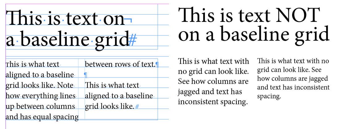
A vertical grid is especially important when it comes to text. It can be used in several ways to create flow in copy. It all comes down to your baseline grid.
The baseline grid is an imaginary set of equally spaced horizontal lines – think the ruled paper you used in grade school – that text aligns to. The bottom (baseline) of letters rest on these lines so that there is equal spacing between lines of text and that columns of text also line up with one another.
Here are a couple of applications:
- Create two columns and keep your type on the baseline.
- Use math to align all type, regardless of size to the baseline scale.
But how do you do it? It starts with a little “typography math.” (The concept is pretty much the same for print or digital projects.)
- Choose the font and size for body text.
- Set the gridlines or amount of spacing between lines of text.
- Use that same proportion for other spacing in the design.
- You can use multiples of the baseline grid for elements as well. So if your body text is 16 points, larger text can be size at two times the line height.
This baseline grid math does something else as well. It helps you create typography hierarchy because each new level of text is stacked in proportion to other levels of text.
Grids for Screens or Panels

Vertical grids are one of the essential tools in page-by-page design, such as websites with parallax scrolling features. Each page needs to be the same size and have the same feel so that each new page feels like a continuous part of the same story and aesthetic.
Most designers do this with color or a touch of animation to make screens “snap” in place with each scroll. When elements are aligned in perfect vertical orientation, each screen is viewable all at once and is not half on, half off the screen. This vertical grid creates proper harmony and contributes to proper readability and a more desirable user experience.
The framework for this style of design is dependent on good vertical flow. Elements need to be positioned in a similar fashion as the user scrolls. Type should fall in a similar column format and the size and spacing of lettering and elements should be consistent from screen to screen.
These small cues are the thread that keeps a user focused and creates visual understanding and flow from one chunk of information to the next.
Grids for Cards

Card-style design is one of the most popular and trend elements of the year and they work thanks to a vertical grid. The vertical grid helps you create a card that has a distinct feel, proper spacing and comfortable space for multiple elements in a single container.
Think about all the places to use a vertical grid with a card:
- Spacing between cards in a design. (One card per screen on mobile devices).
- Internal border spacing for the card between elements such as images, text or buttons.
- Sizing for each element.
- Text hierarchy and sizing.
Grids for E-Commerce

Vertical (and horizontal) grids are a popular option for e-commerce websites because of the distinct organizational flow. Items can be placed side-by-side so that users can compare and make choices before making a purchase.
Look closely and you’ll likely find that the rest of the website framework will also follow this same vertical rhythm. The subtle grid usage is comfortable and will make shoppers feel at ease, trust the design thanks to nice organization and hopefully make a purchase.
Grids for Overall Organization

Just because you are using a grid, you design does not have to have a masonry or grid-based look. Use the grid in multiple and halves to create interesting combinations of elements that fall in harmony.
And feel free to break the grid every once in a while. Sometimes you’ll end up in a situation where the grid multiple just don’t look right, particularly when it comes to type missing ascenders or descenders. It’s ok to fudge it a little then. Remember, even if you are using a grid and it looks funny, it will disrupt the harmony and flow. Make those visual corrections and adjustments as needed.
Conclusion
So why is vertical rhythm and a grid so important? When it comes to text, it helps keep a user from tiring while reading. For other elements it creates a distinct sense of harmony and flow.
People like organization by nature and want designs to be easy to understand at a glance. A good grid system can help you achieve that with ease. Once the grid is established, element placements, sizes and shapes are easier to imagine because you can fit them to the frame you have already sketched out.
Image Source: baldiri.


