How Does a User See Design?
There’s often a disconnect between the way a designer looks at a website or brochure or package and the way users see it. As a designer, you can appreciate trends and attention to typography and details in a way that the common user might not.
Users only know whether they understand something when they interact with it. The details of how that interaction happens or why it is pleasing are often lost. It’s a pretty harsh reality.
But there’s a nugget of wisdom in understanding that disconnect. If you think about what users are thinking, you will be a better designer. (Even if you don’t particularly like their thoughts on design.)
Typography is Good or Bad
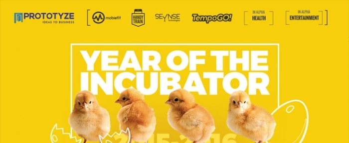
Designers love typography. Beautiful characters. Long swashes. Serifs with charm.
Sadly, many users don’t know Arial from Helvetica. (Nor do they care.) When it comes to type, users know one thing. Can they read it?
That doesn’t mean you can forget lettering in projects. It actually means quite the opposite. You need to pay even more attention to it. To keep users interested, every word, paragraph and headline must be perfectly readable. Users should not have to concentrate or think about the words to decipher them.
It’s your job to ensure that words are clear, spacing is adjusted properly and every bit of the message is on clear display.
Color Often Goes Unnoticed
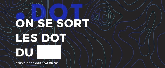
Users don’t pay as much attention to color as you might expect. While designers may ponder over the difference between periwinkle and coneflower for hours, the casual user will often see blue.
Now here’s the caveat: If a color changes dramatically, say from blue to yellow, users will notice. When it comes to color, big shifts in hue are what users tend to focus on.
The thing that’s difficult about color is perception. People bring so many different notions and ideas to color choices. Make sure you have a general idea of common color associations and pair color in a way that’s accessible to all – consider choices that are visible for those that don’t see color well – for the safest color combinations.
Buttons Need to Be Obvious

There was an almost fatal flaw in ghost button trend: Users did not see the button when interacting with the design. It almost seemed to fade into the background.
While this has shifted somewhat over time, and as ghost buttons became more popular, it was a real problem (and still can be in some instances). Super-trendy elements that look different from what users expect can lead to lost conversions.
Calls to action – forms, buttons, links – need to obvious and follow common user patterns for the most success. Users have short attention spans and won’t stick around to “learn” an unconventional design. Make it easy for them.
Minimalism is ‘Overrated’
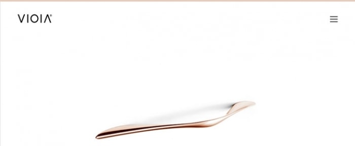
Admit it. Minimalism is one of your favorite go-to design options.
While some users appreciate this simple beauty, more often it feels stark to them. “Where is everything?” they might ask.
This can be a difficult hurdle to overcome. You’re likely to see this pushback in the early stages of design when working with clients that are always asking to put more “stuff” in the design – more photos, more color, more text.
Try to strike a balance with nice open spaces and clean lines that don’t feel cluttered. The end result might not be purely minimal, but will be more pleasing to the client and end user.
Big Images Take Up a Lot of Space
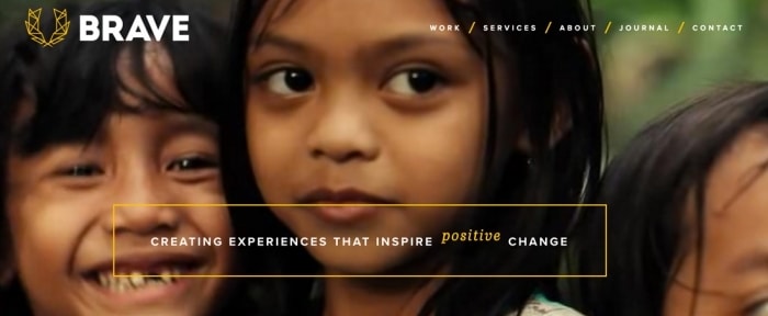
A large, interesting image will grab a user’s attention like few other things. But users don’t always agree with this statement.
This is one of those situations where the user doesn’t know what they don’t know. It’s hard to compare a design with small images versus oversized options. The difference in impact is often clear for someone with that design eye.
This is where you have to sell it to clients in the best interest of users. Go back to the theory that magazines and newspapers have used for years – tell users what is important. A big photo or video or illustration does that. A group of small elements often does not have the same lasting impression.
It’s your job to help figure out what that first impression is supposed to be with the design. What problem are you trying to solve? What does the user need to know right away? Therein lies the answer.
They Know Branding
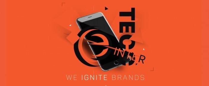
Everyday users know a lot more about branding than they are given credit for. A user will know of a brand changes color or if the font in the logo shifts. (They might not always be able to pinpoint what’s different, but will know something has changed.)
Any shift in an established brand identity can be jarring and confusing to users. That’s why it is so important to follow established rules for how to represent a brand visually. (If you are not working for a style guide, it is time to develop one now.)
It Either Works or Doesn’t
Have you started to pick up on a common theme in what users perceive when they look at a design?
It either works … or it doesn’t.
Users seldom understand why. Users seldom care why a design works or not. If it works, they continue to engage. When it doesn’t, they abandon the design and move on to something else.
It’s your job to be ahead of the user when it comes to what works or doesn’t. A good plan for user testing helps. More important are all of those design basics that you probably don’t think about. Design and color theory, user patterns, principles of typography and even speed and interaction design with websites and apps.
Conclusion
It’s a lot to think about. You only thought you had to design something that looks good to you, right?
The good thing that is that most clients often see the design like typical users. Many of these issues are at the root of conversations you are already having. Hopefully, now you can think about them a little differently and plan for what these users are thinking (and how to help improve the design so that it looks great to you … and them!)
Note: All of the images in this post are from the Design Shack Gallery. Think about how you saw the designs for the first time as a user with no background knowledge of the design, and make sure to visit the gallery for more inspiration.