How to Balance Text and Visual Content in Design
We’ve all heard the phrase “sex sells” but when it comes to design, what does the selling? Text or images? The reality is that both are essential parts of almost every design project. What makes the difference between a project that works and one that falls short is striking the right balance between the two.
While visuals are often processed faster, text can provide greater understanding. Creating balance between text and visual content is a combination of understanding your project and the best method of delivery for content, audience expectation, weighting of elements and delivery.
What’s the Goal of Your Design Project?
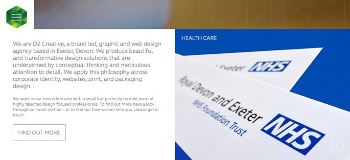
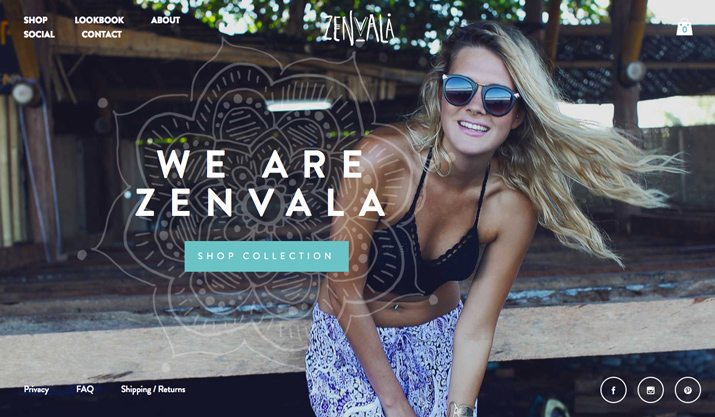
The beginning of every design project – regardless of all other factors – should start with a goal: What are you trying to accomplish with the design? Once you know what you want to achieve, determining a medium for this message is equally important.
Common types of design goals include creating brand awareness, education, sales, user interaction and engagement (such as surveys), loyalty or contact or call to action. While there are plenty of other goals, many come back to one or two of these basics.
How the design of a project progresses depends heavily goal and medium. It sets “rules” for the design such as size and shape and who will have access to it. These constraints will also help you determine how much room you have for content in total so you can then think about the division of text and visuals.
It is important to think about an overall goal and smaller goals for design projects. When planning a business card, for example, the project is simple and the main goal is contact. But you can expand the design by using both sides of a card. Similarly, website design projects may include multiple goals that vary from page to page, changing the text to visuals ratio with every click.
Type of Content
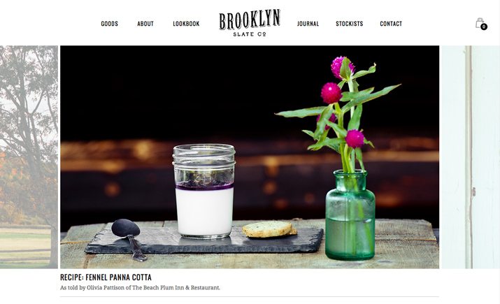
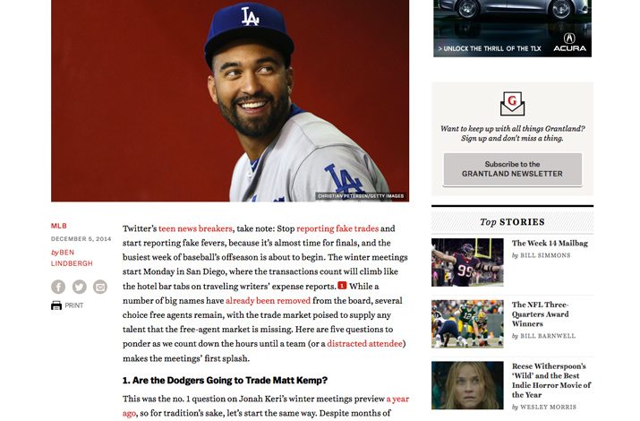
What kind of content are you working with? Seems like an easy question, but many designers know they don’t always have the answer. The main content type of a design can determine the balance between text and visuals.
Striking that balance can be a simple as looking at the content you expect to have and whether it tends to be more visually focused or needs text for contextual understanding.
Types of content that are more commonly visually represented include:
- Some blogs
- Commerce and sales
- Social media
- Ads for products
- Apps and website homepages
Types of content that are more commonly represented with text include:
- Books and e-books
- Some blogs
- Guides
- Whitepapers
- Instructions and manuals
Audience Expectation
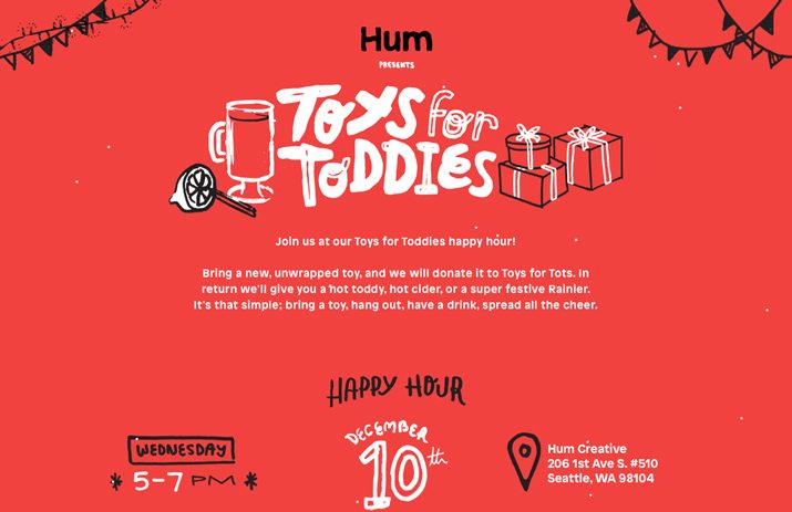
When it comes to putting visuals and text together, it is important to consider the expectation of your audience. A reader would not expect a picture book from a novelist, for example, and might be upset to find a new release with few words.
A variety of demographic factors come into play when looking at audience expectations, but chances are you know what is working and not working from past design experiences. Build on the successes.
Give Elements the Proper Weight
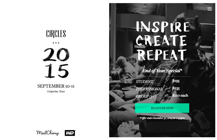
One way to think about the balance between text and visuals is using a simple scale. Put all the visual content on one side and text elements on the other. How does the scale sit?
Consider visual weight when looking at the scale. While there only may be a few words on a page or screen, the size, color and placement of these elements can give the text a hefty presence. Visual weight can play a role in how large (or small) images and text are in relationship to each other.
This visual weight can shift from page to page in a design. With that business card, the front may contain a large image while the back is all contact information. On a website, the landing page may contain a hero image and logo, while a secondary page (such as an “About Us” section) is nearly all text with a smaller image. While each “page” has a distinct weight for text or visual content, each of the overall projects has a balanced weight.
Delivery Method
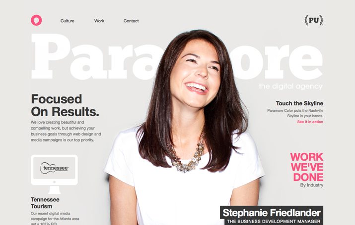
Another factor in creating balance between text and visuals is delivery method. Printed versus screen and large versus small create distinct balance challenges.
Printed projects tend to use more text in proportion to visuals. This concept flips though as the size of the medium increases. But like web-based projects, visuals are becoming more widely used as larger elements in projects.
On-screen projects tend to be more visual. Look at website homepages and apps as an example. The balance often shifts toward more text the deeper you go into the design. Primary or main pages oven have more visuals than interior and secondary screens.
Large- and small-size projects often rely heavily on text or visuals in an “extreme” way. The main factor here is readability. When it comes to something large – say the size of a billboard – there is not a lot of time to digest the information, so an image and only a word or two will likely be used. In terms of small sizes, many mobile phone apps use either an image or a block of text from screen to screen, giving users time to focus on one element at a time before moving to the next.
Looking for a ‘Magic Ratio’
If you are looking for a “magic ratio” to determine how much space to give to text or visual elements, you have come to the wrong place. There is no magic formula. There is only planning, process and design development.
But … there are some guidelines that can help you out.
- You will need text and visuals. Few projects are successful without both present.
- We are living in a highly visual time. Go big with visuals to grab attention.
- Most projects are going to include more of a visual content component than a text one. That’s OK. But it is OK if you have more text than images, too.
- Aim for 60 percent to 80 percent of the first impression design to include a visual. You have to grab your audience before enticing them to read. (Even books have pretty covers to draw readers in.)
- In terms of visual weight, visuals and text should feel somewhat equal across the scope of most projects.
- Make sure visuals and text work together. No amount of balance will matter if the elements live in conflict with each other.
5 Tips for Achieving Balance
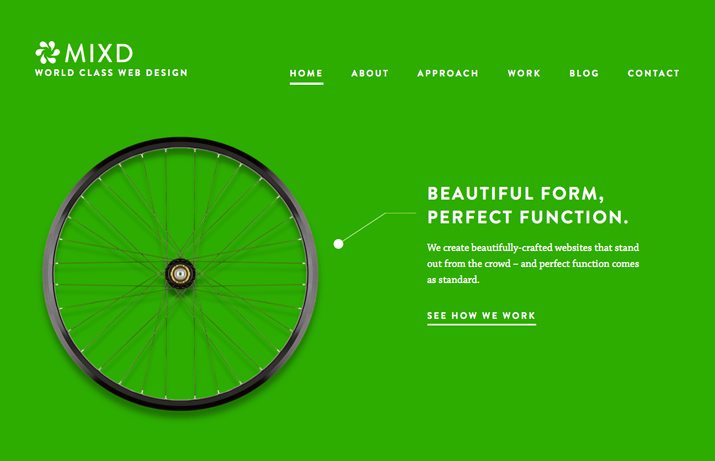
Now that you are thinking about what the right ratio is when it comes to balancing text and visuals, think about how you are going to achieve it. Even some of the best-designed design outlines will feel a little out of whack once elements are placed on the screen or page.
Here are a few tips to think about when it comes to creating balance.
- If you don’t need words, don’t use them.
- Present visual information, visually. Don’t describe things that you can show.
- Don’t use unnecessary words or repeating images.
- Make text visual or turn visuals into text if design feels lopsided.
- If you don’t know how much text you need, aim to an equal surface area for visuals and text to create an “obvious balance.”
Conclusion
While the trend toward image-heavy design projects has been heavily documented, text heavy design can be impactful as well. Let your content dictate the strategy of design projects.
Consider how things such as project goals, audience expectation, weighting of elements and delivery impact the use of visuals and text. Think about balance across an overall design project, while balancing the likely need for a highly visual first impression.