How to Design a Killer Annual Report
Regardless of when your company’s fiscal year ends, you probably want to start thinking about the dreaded annual report today. Yes, “dreaded.” But it does not have to be. While annual reports are often seen as a design drag, there are plenty of ways to turn this report into a fun and memorable design project. And with better design comes more reading and retention, two positives for your brand.
You need to start thinking about it now. Don’t wait until the report hits your desk to determine a design strategy. Start talking to your team about your story for the year and how to create an annual report that will get people talking.
Pick a Format

When many people hear “annual report” they immediately think of a 12- to 24-page booklet of information on glossy paper. They also think it requires a lot of reading.
Let’s decide right now that we are going to break that format. An annual report can be booklet-style, but it can also be a website or app or include print and digital formats. You might not be able to convince your CFO to eliminate all that text, but read it carefully so you can analyze and design it in a more visual and digestible way.
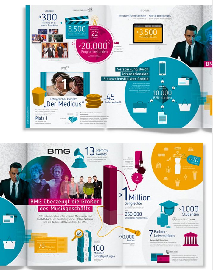
A table of numbers can be boring. But what of those numbers become the art on a specific page? The beauty of an annual report is that most are packed with so much information, there has to be something in there to grab on to and create a design from.
Start the conversation early about the annual report this year. Go to your team and brainstorm some ideas to make it more visual from the start. With content planning and direction, it will be easier to create a report that is informative and visually pleasing.
Tell a Story with Purpose
An annual report project starts like almost every other design challenge – with a story. What is the story your report should tell this year?
While your report will contain financial must-haves, consider this story along the way. Is it a story of change or success or learning experiences? How can this story impact or predict or make shareholders and employees think about the year to come?
Think of the annual report as a branding piece that helps “your people” better understand the company they are a part of.
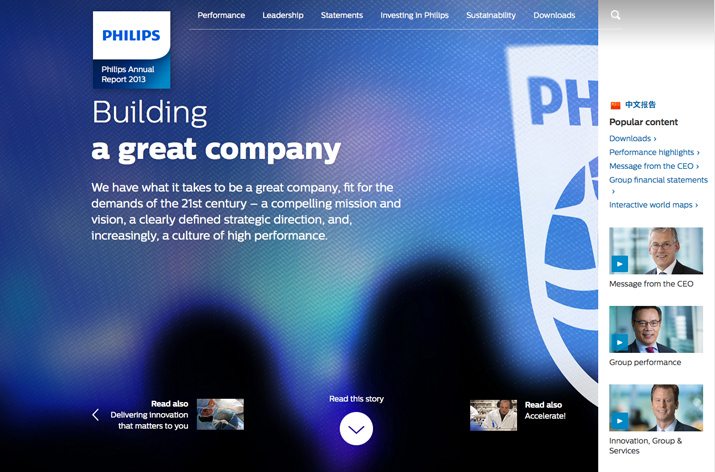
Phillips did just this with its annual report in 2013. Not only did the report include a year in review, it retold the story of the company’s history. (And even used language to support this, such as “Read this story.” The report is designed to be absolutely engaging and is a piece that contains information for people vested in the company and customers. The report is an engaging piece of brand-building that is phenomenally designed.
The other important consideration when it comes to telling your story is to maintain your brand and brand tone. Is your company generally serious or more light-hearted? Allow that voice to come through in the design of your company reports.
Make Data Visual
The infographic is one of the most valuable tools at your disposal when it comes to reports with plenty of numbers. Read through data and information and develop ways to showcase that data visual.
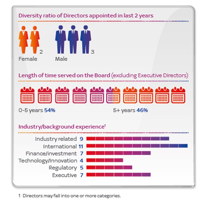
Create charts or graphs, brainstorm new ways to show the impact of data in the report. Take the infographic for board composition from the Sky entertainment company from its 2014 annual report. Instead writing out the numbers in paragraph format, icons were used to show demographic information about the board. This format is easier to understand and creates a visual element that draws the user into the information.
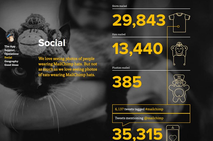
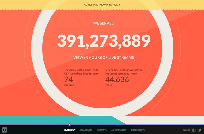
Mail Chimp also does an excellent job of making data visual. In 2012, the annual report produced scroll-sized data mixed with images, charts and simple messaging that told a story of scale and growth, and provided a ton of information that you wanted to learn about.
Go Bold With Typography
When you don’t have a lot of images to work with, bold typography can save a design project. Numbers are a great, and fun element to work with when it comes to creating bold character formations.
Consider ways to make characters the dominant focal point on each page or screen of the design. Consider how the letterforms contrast in the space around them. Is boldness set with color and scale – think in extremes here – or with an unusual treatment or typeface?
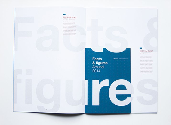
Consider the Amundi 2014 annual report design. Oversized lettering without a lot of contrast draws the eye quickly. Paired with a bright color option for the inset pages that contain must of the information in a pullout-style format. The boldness of typography is creative and functional.
Use Space Wisely

One of the design techniques that can most impact an annual report is space. With a document as information-packed as an annual report, information needs plenty of room to breathe.
Consider margins that are almost uncomfortably wide. (This will also give shareholders a place to make notes about the content.) Open up leading and text so that it does not feel so overwhelming on the canvas.
Look at the Uniqlo Annual Report Design: It contains a lot of text, but enough space to balance the words in a way that still feels easy to read. Create a weight balance between text and white space. I like to think of a minimum ratio of three parts filled space to one part white space, not including margins or edging. (Remember empty space tends to feel heavier than text.)
Think in Chunks
Every bit of information in you annual report should be linked and contained in a way that makes it easy to understand. Break down a complicated document such as an annual report into chunks of information (or chapters) that have a natural fit and flow.
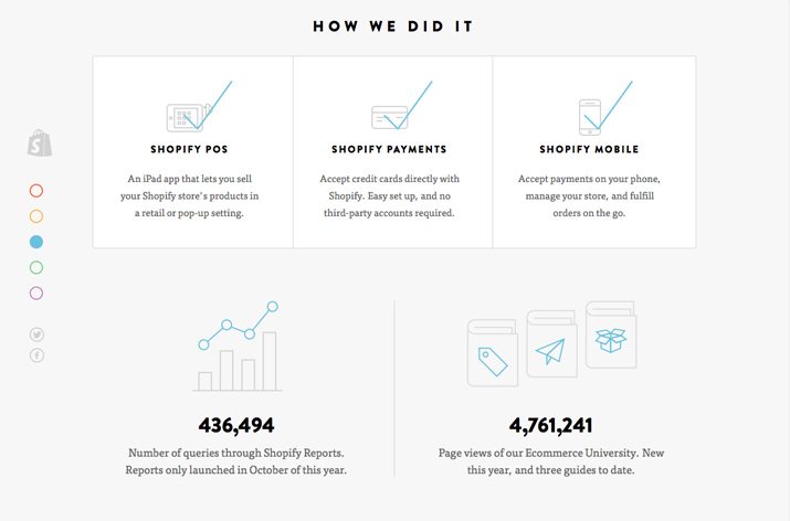
With print projects this works by designing on spreads or using a common color theme to connect pages. Ustream and Shopify both exemplify this method of thinking about information. With scrollable pages, color coded information and screens that don’t require you to read to the next page, every piece of information lives in a contained space. This makes every fact easier to digest and understand.
As you read through the screen (or pages in a booklet) it paints a picture. What’s nice about chunk-style thinking is that is creates distinct visual organization. For the user, it makes information easy to skim or move through without having to read line by line.
Focus on the Cover and ‘Front of the Book’
There is the reality that your boss is going to want a very traditional annual report: Text and simple tables. If this is the case, consider a design that focuses only on the “front of the book.”
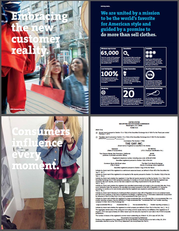
Design a stellar cover and a few intro pages that tell a story before you get into the numbers. Gap Inc. did this with its 2013 report, which starts with 19 chunk-style pages of information about the family of brands with images and bold text ahead of the nearly 100-page standard report.
The mix of design and function can appeal to companies that desire a more traditional format for corporate information. It also creates a format that can be used in a variety of ways such as using the opening pages for promotion and marketing as well, while leaving out the specific financials.
Conclusion
Now that you are thinking on a massive document scale, what ideas do you have for designing a killer annual report? Have you taken on a project like this in the past with success?
Let us, and our design community, know about some successes and failures you have had in designing annual reports. Have a good one? Share it with us in the comments so we can all feel a little more inspired moving into annual report design season.