How to Design a Tour Page: Examples and Best Practices
Tour pages are one of the most important components for websites advertising apps and/or services. The tour page is often where interested users will either make the firm decision to sign up or move on to something else.
Needless to say, there’s a lot of pressure as a designer to get this right! Fear not however, many talented designers have gone before you and we can learn a lot by looking at their examples. We’ll dive into tour pages from giants like Mozilla, 37Signals and Mint.com and see what common tricks they all use to win conversions.
It’s Harder Than It Looks
You’ve done it, you’ve wrangled that ever elusive home page click out of the user. They’re interested in your site and they want to learn more. You think you’re in the clear but a new challenge awaits. You now have one shot to convince them that you can make good on the promises of the home page, that your app does what you said it would and more in a way that is better than what everyone else is doing.
You’re designing a tour page. It’s a deceptively simple task. You’ll do well to not run through it half-heartedly but instead spend some solid time making it the best page you can. This is where potential users will really start to form judgments about your service and you don’t want to screw up that all important first impression. Let’s take a look at some live examples from designers that have gone before you to see what we can learn.
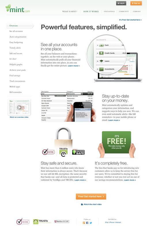
Mint.com
Mint is one of my favorite services on the web. Not only is it immensely helpful for tracking every cent you spend, it also happens to be super attractive from a design perspective. Since their designers are so talented, I figured they could probably teach us a thing or two about today’s topic. Here’s a snap of the tour page:
Content Organization
The first thing I notice about this page is that it has a ton of content. You don’t want to overload your visitors with information if you have a fairly straight forward service, but something financial like Mint raises a lot of red flags with people who’re rightfully cautious about giving a website access to their bank account. In light of this, Mint is very transparent about every aspect of the service before you sign up.
This is an important concept. If your service has any reasons that would give visitors pause when thinking about signing up, the tour page is your chance to address those issues in detail by being open, honest and reassuring about your product.
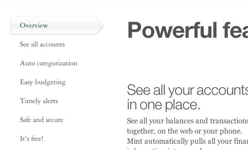
Another great thing that Mint gets right is the organization of the content into small, digestible and neatly organized chunks. Rather than tossing everything into one mile long page, they’ve implemented a sort of AJAX content switcher that updates the right column as you choose a topic.
Strong Content Presentation
Another thing that mint really nails is the presentation of their content. Take note of this because lots of people get it wrong: Short, simple and straightforward headlines coupled with clear, attractive screenshots and brief but descriptive supporting text. Here’s what that looks like in action:
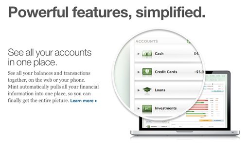
Notice the copy here, it’s brief and to the point while telling you what you need to know. Also check out how the screenshot is focusing in on the important part, this loupe trick is really common in web design right now.
Mint has another trick up its sleeve as well. When the screenshots may not be enough, they toss in some extra visual cues. In the screenshot below, the headline about a budget is reinforced by the instant read of a piggy bank with a belt around it to signify budgets:
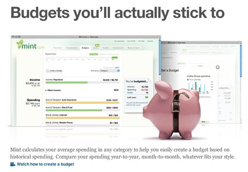
The screenshot could’ve done this itself, but the graphs are a little vague and were therefore not an instant read, the pig may be cheesy and predictable but it helps push this design right where it needs to be.
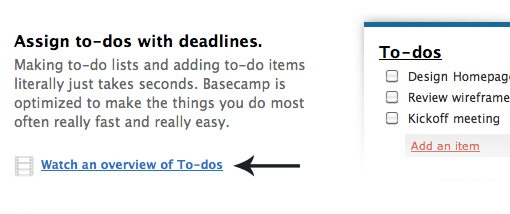
Basecamp
Let’s leave Mint behind and look at another well designed tour page. The folks at 37signals are known for their simple and clean design style that serves up just what you need and nothing more. Here’s a shot of the tour page for their Basecamp app.
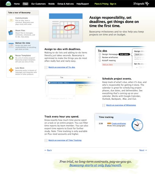
Different, But the Same
Notice two important aspects of this page in light of the previous example. First, the design style is very different from Mint’s. However, the pages are actually incredibly similar. Notice the brief chunks of content organized by a content switcher on the left, screenshots, strong headlines, extra visual cues to aid the screenshots, even the back and forth layout style is almost exactly what we saw on Mint.
This is a very important thing to learn as a designer: design patterns exist independently of design style. Mint has a very shiny, finished look with lots of gloss and reflection while Basecamp is very flat in its Google-like simplicity. This is merely the candy coating though, under this is the critical framework of a strong layout, which makes the content easier to take in.
Digging Deeper
Once you’ve checked out the overview for the Basecamp features, you have the opportunity to see them in action by clicking on the little video links scattered throughout the page. I’m a sucker for a good product video and I think these really help to keep your content brief and to the point while still offering the in-depth look that some visitors need.
Keep in mind that Basecamp prides itself on how simple and stripped down its feature set is, so if Basecamp isn’t too basic for product demonstration videos, neither is your site. Video screencasting apps are very affordable and easy to use so no matter what your budget is, it’s not hard to pull together some professional looking video tours.
Mozilla Rethinks the Tour Page
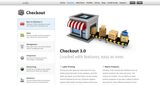
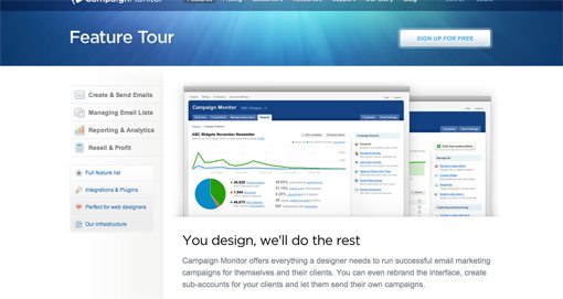
The basic format that we’ve seen for the last two tour pages is a fairly common one. You can see nearly identical tactics being used on dozens of web app sites. Check out the tour pages for Checkout App and Campaign Monitor and you’ll find that same left aligned content switcher being used in conjunction with brief lists of features coupled with screenshots and icons.
There’s a reason this format is so widely used: it works. Each of these pages is able to maintain its own unique identity while sharing tried and true techniques with its brethren. However, this doesn’t necessarily mean that the rules of the tour page are set in stone or that we’ve landed on the best possible solution for all sites.
One example of a company that often decides to think outside the box is Mozilla. Their talented design team decided to ditch the common tour page format and blaze their own trail. The result is a fun, interactive and incredibly straightforward overview of the browser:
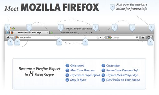
Here we see a screenshot of the browser with a bunch of markers placed all over it. The instructions are simple and can be read in a second: “Roll over the markers below for feature info.” Following this advice gives you a closer look at the important features.

I love how direct this method is, it explains the app’s features not through abstract generic icons and bloated paragraphs but with a simple screenshot that points out everything you need to know.
An Organized Mess
This method of marking up a screenshot makes for a fairly organic design. Rather than a predictable and logical flow, the markers are scattered all over the place. There’s a very subtle design trick though that helps you see order in the chaos, can you see it?
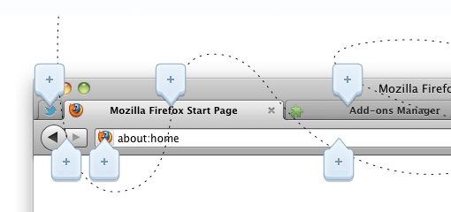
That little dotted path is one of those tiny design touches that can really pull a page together. Without it, there’s a mess of links, with it, there’s a clear progression to follow. Granted, you don’t have to follow it perfectly and I’d wager that few users ever do, however, it’s mere presence gives the page a slight but important usability boost while bringing in a semblance of order.
Show the Process
Our last tour page design trick that you should know comes from Big Cartel. Here’s a cropped shot of their tour page:
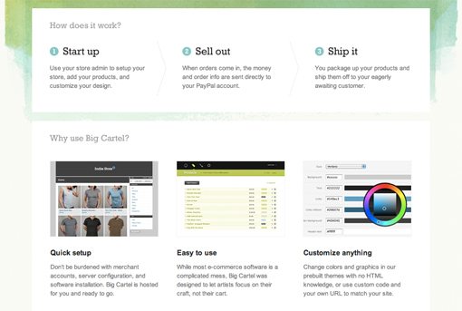
There’s something super simple but incredibly effective at the top of this page, a three step process. Sometimes a tour page needs to be more than a simple showcase of features. For instance, when you’re claiming that your service simplifies something complicated, such as setting up an online store, it’s critical that you illustrate how this works somehow.
Three is a magic number so when possible, try to break down processes to three nice and simple steps that anyone can grasp. This is all about making the user feel empowered, they need to look at this and say, “I can do this!”, especially if they’ve looked elsewhere and found only discouragingly complicated solutions.
Conclusion
The examples above each have their own unique lessons to teach us and together they paint a picture of some very common tour page design practices that you can implement in your upcoming projects.
As you embark on your tour page adventure, remember that the web gives you remarkable freedom to experiment to see what works best. Try coming up with a few different designs and then running some A/B testing to see which users respond to best.
If you’ve designed a tour page recently, leave a comment with a link below. What techniques did you employ to ensure success? Have you learned anything by experimenting with different layouts and designs?