How to Design a Captivating Web Questionnaire
We’ve all run across them – web questionnaires or surveys that were so simple and delightful that they were actually fun to fill out.
Sadly, that’s the exception to the rule. More often than, surveys are clunky and cumbersome.
You can design a captivating web questionnaire with the right thought process. It’s a mix of question planning with visual elements and cues to make the process user-friendly and somewhat seamless.
Here’s how you do it.
Nail Down the Questions
The most important element of questionnaire or survey design isn’t visual, it’s the questions.
Remember the three Cs: Clean, concise, and communicative. Keep these things in mind as you craft each question to ensure that the design works with questions to get results.
Clear questions are easy to understand and elicit a specific response.
Questions and the survey as a whole should be concise. Think of how many questionaries you landed on and saw the timeline showing 30 or 50 questions. Did you take the time to answer them? Survey length is a huge factor when it comes to completion rates. Question length is a key factor when it comes to reading and question comprehension.
Communicative surveys help you achieve a goal or find an outcome. Don’t ask questions that are irrelevant or stray from this mission.
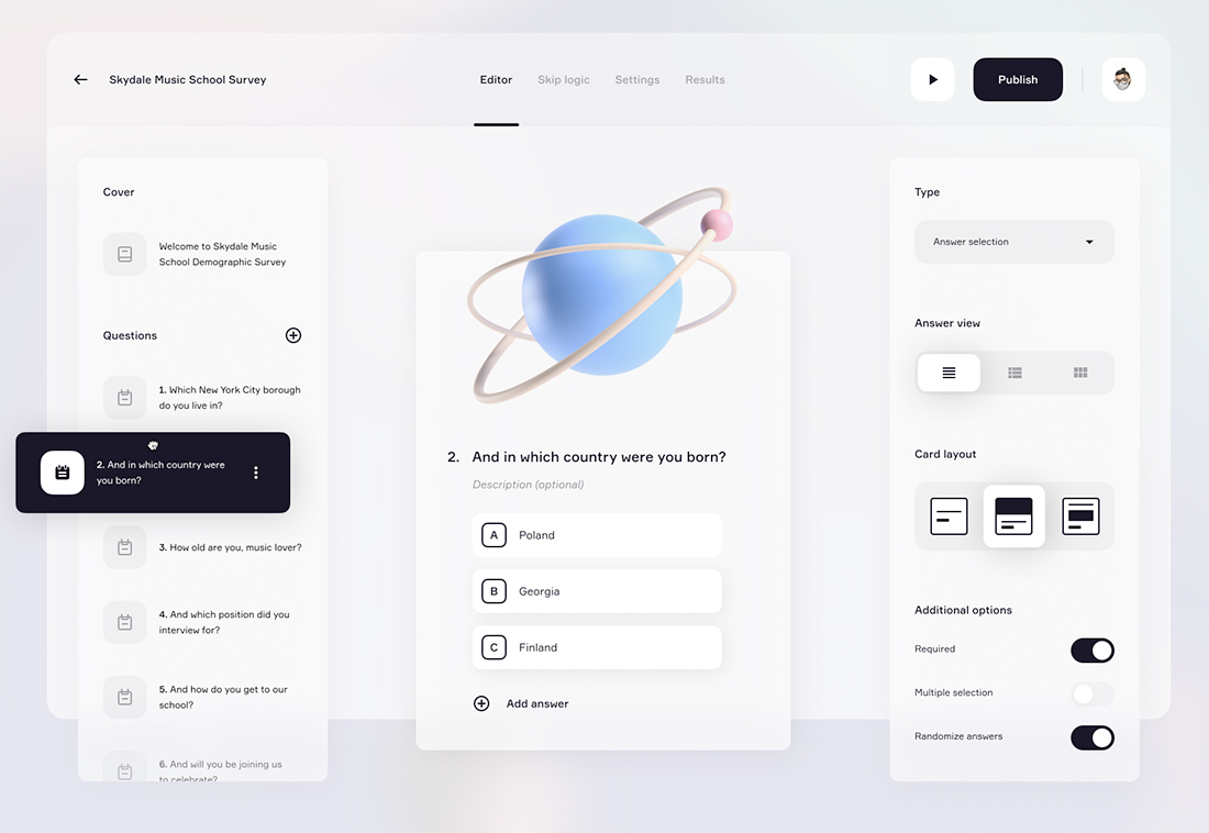
Make It Visual
All of the things that contribute to good design in other types of projects apply here.
That might seem pretty obvious, but think about it: How many poorly designed surveys have you run across? You want to use clean, clear, readable typography with adequate color contrast, and visual elements such as photos, illustrations, or video to guide the flow of the questionnaire.
If you are creating a question flow for an existing brand, use visual elements that connect the brand and survey, where appropriate.
A questionnaire can be a highly engaging and visual experience that fosters interactivity and engagement on your website. Think about it from this perspective to change the way you look at the design elements.
Use Gamification Techniques
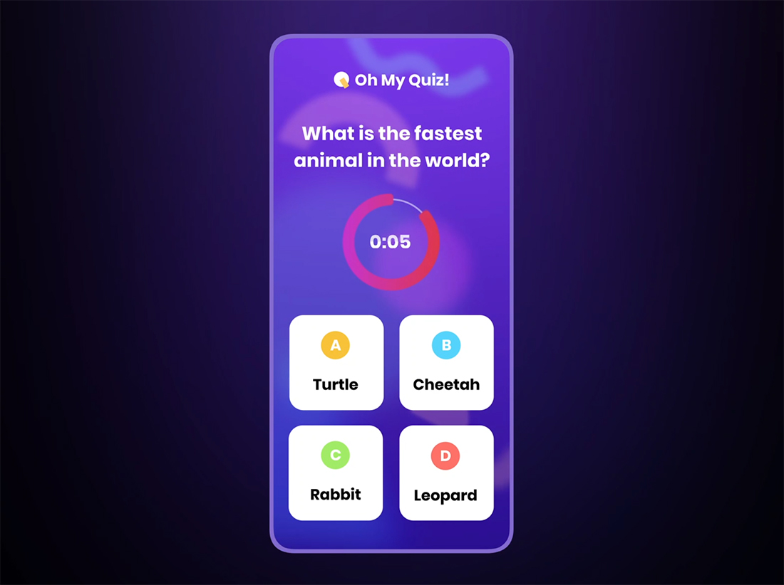
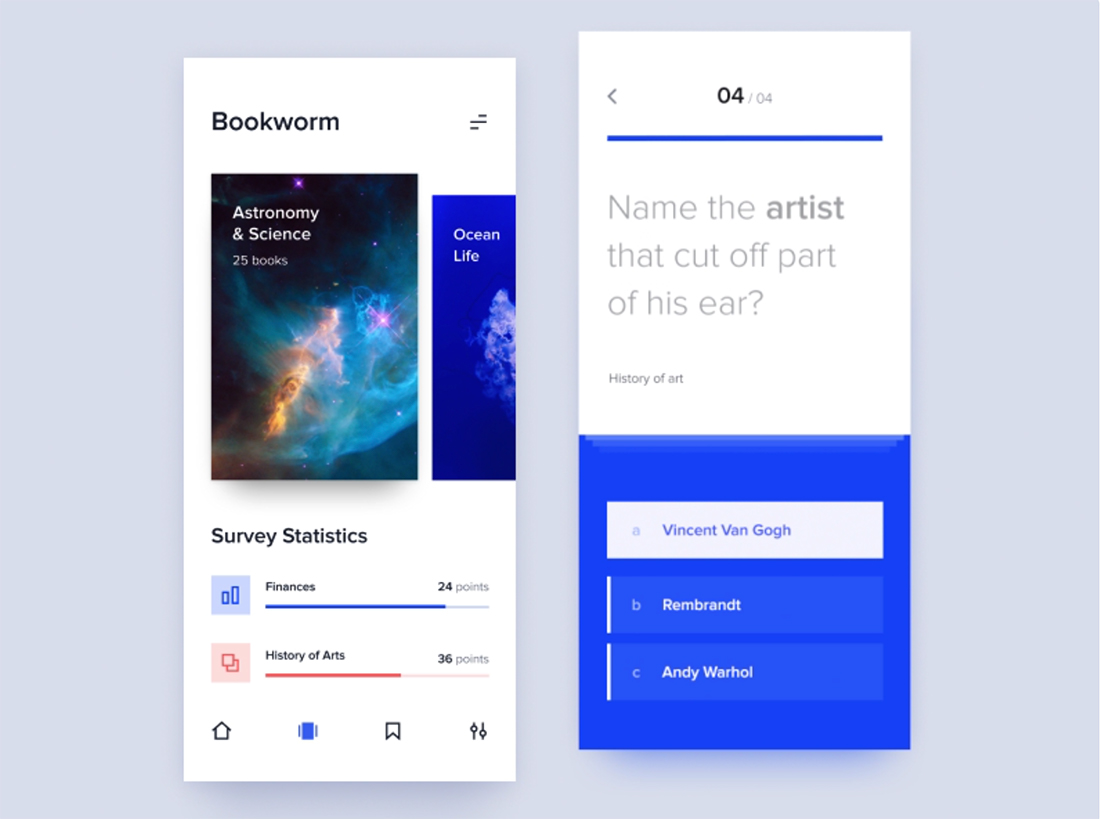
Users tend to love quizzes and hate surveys. The reality is they are basically the same thing until you think about the design.
Surveys bring to mind a long list of questions on a page. Quizzes fit in card-style blocks that move quickly between questions with a low cognitive load.
The key difference is the design technique. Quiz design is often more gamified and feels lighter and easier than a survey. This is true even if you use the same questions, changing only the format.
The challenge as a designer is that the quiz-style, more gamified approach is more design intensive. The reward for this effort is likely more responses and a deeper data trove.
Create a Landing Page
A big survey don’t is to just stick it somewhere randomly on your website. A do is to create a dedicated landing page for it.
This is a technique that’s becoming more popular thanks to a surge in onboarding surveys for online products and tutorials.
The value of a landing page is that you’ll have a dedicated URL for the survey, can design it without the clutter that might come from putting it on another page in your design template, and ability to create a dedicated user journey with this path.
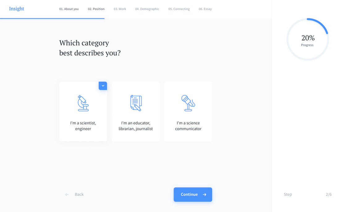
Load One Question at a Time
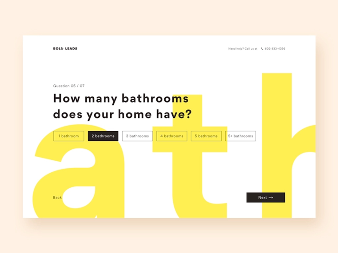
Building on that landing page theory for a moment is the idea that users only need to see one question at a time. Your landing page can take a few different forms – with scroll interactions for questions or even multiple pages within the landing page concept.
Regardless of how you design it, the important factor is to show one question at a time to facilitate user comprehension and make the questionnaire as easy to fill out as possible.
The motion or switch between questions further creates a sense of interactivity and can help keep people moving through the survey. Remember to include a timeline or progress element to help show success and let users know where they are in the process.
Use Relevant Visuals or Animation
The visuals you use in combination with a questionnaire are more than a way to bring people into it, they can also contribute to overall comprehension.
A series of images, illustrations, or animations can also help tell a story that creates greater engagement with the survey as a whole. Just be careful that your visual cues don’t lead users to select a certain answer. (You don’t want to skew your results!)
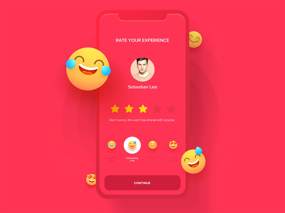
Consider Scales or Emoji Answers
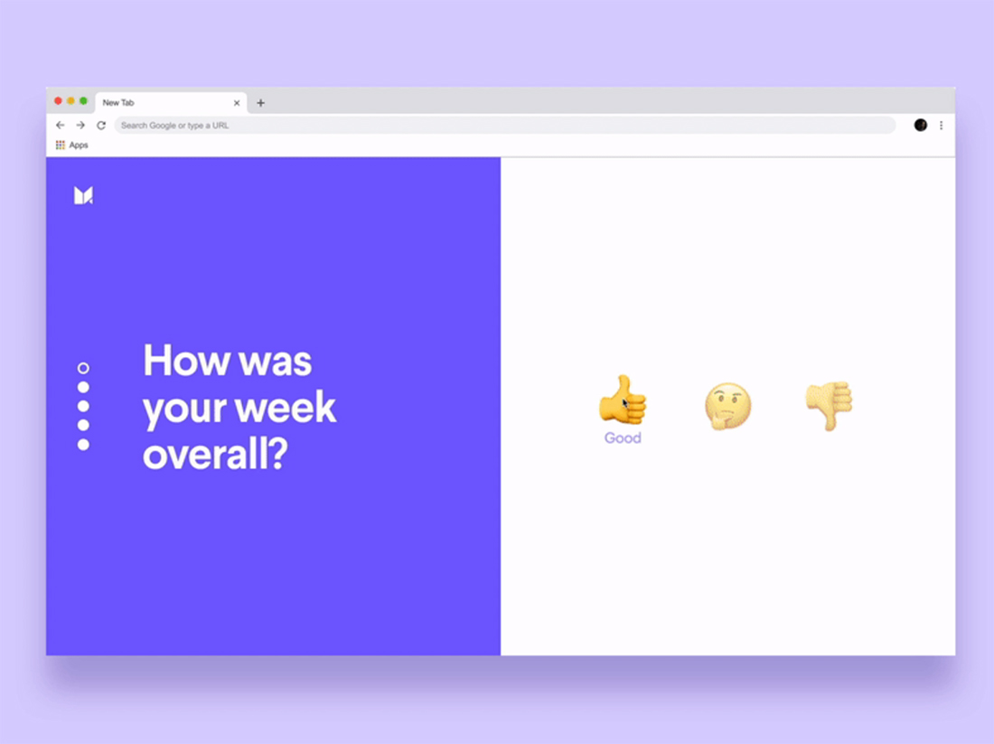
Scales, multiple choice, and even emojis for answers can add a little something extra that makes a survey a little more fun to engage with. The easier it is to answer, the more likely users will participate.
The same is true of more fun techniques.
Depending on the survey type, you may need to mix in some short-answer or open-ended questions but try to mix them with easier-to-answer options to keep users moving through the questionnaire.
By providing some visual options, the content can seem a little less heavy and intimidating. To maximize the impact of your survey, the design needs to encourage participation and completion.
Make It Mobile Friendly
This is another one of those no-brainer tips that has to be said because so many people are still missing the mark here: Surveys and questionnaires must be mobile-friendly.
Think of the missed opportunity if it is not. Enough said.
Close With a Thank You
Another element of survey design that’s important is the last impression. Finish with a thank you and delightful visual to leave a positive experience memory in the minds of users.
A positive final impression can be the determining factor when you ask for more information later. If users had a good experience, they are likely to engage again.
The thank you can also be a great place to hide an “insider’s easter egg” that further delights your core audience.
Conclusion
Questionnaire and survey design is one of those things that we often think of as more of a chore than fun design experiment. But with question processes becoming a more integral part of websites and product design, you are likely to have more of these projects.
You can craft a creative design that combines all of the good design elements that you use in other places and guides users through the survey process.