How to Design for Long-Form Content
Forget what you think about user attention spans. Long-form content can be a valuable part of your design strategy (and doesn’t have to be a boring block of ongoing text). Users love a good story and long-form content is a great way to create an immersive and engaging experience.
To keep users interested – and scrolling – you have to design interactions that are visually pleasing and create a consistent experience from the first glimpse to the final act. Here are a few ways to design long-form content that meets those goals with a few examples that are anything but boring.
Give It Plenty of Space
The trick to overwhelming content is space.
Let’s face it. Many users will be intimidated long-form content if it looks heavy. Incorporating plenty of whitespace in a way that makes content appear scannable will take the weight out of the design and make it appear more accessible.
Consider the following as places to increase the amount whitespace you commonly use in projects:
- Between the content and edge of the screen (for all device sizes)
- Between lines of text and between paragraphs
- Around photos and other visual elements
Use Animation with Purpose
When the scroll or content is long, users often need visual clues to aid in navigation. Consider using purposeful animations, such as arrows, buttons or parallax effects to encourage user action.
These small bits of animation won’t take away from the story, but can provide small bits of delight for the user during the reading and navigation process.
Video animation is another way to engage users. While incorporating too much video can break up the flow of long text, it can provide a great starting point or intermission in reading something exceptionally long.
Whether you opt to use videos ahead of text to provide an introduction or to break up long blocks, keep the message short. It needs to pertain to the content as well. Be wary of autoplay options deeper into the content because they can be distracting.
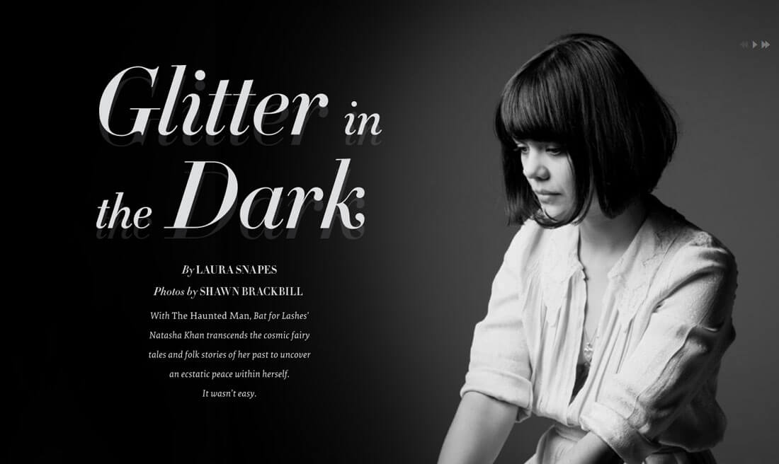
There are other creative ways to use animation as well. The parallax effects in “Glitter in the Dark” (above) are amazing and interesting. The subject of the story seems to dance with each scroll as the user moves through the text. The effect is simple, engaging and does not detract from the reading experience.
Incorporate Illustrations
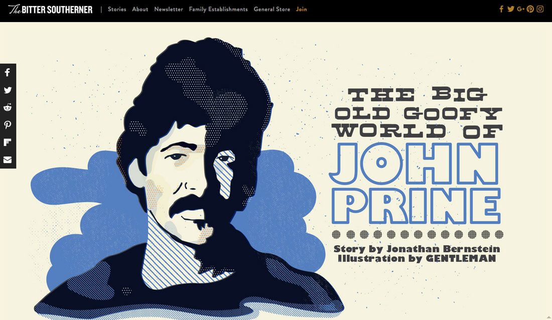
There’s just something about long-form content that seems to pair well with illustrations. If you are lucky enough to have a story and illustrator, use this to your advantage.
Illustrations scattered through the text can enhance a story and keep users engaged. Not only will they want to keep reading, but they will also want to see the illustrations as well. This technique can work particularly well with works of fiction or text that lacks another clear visual representation.
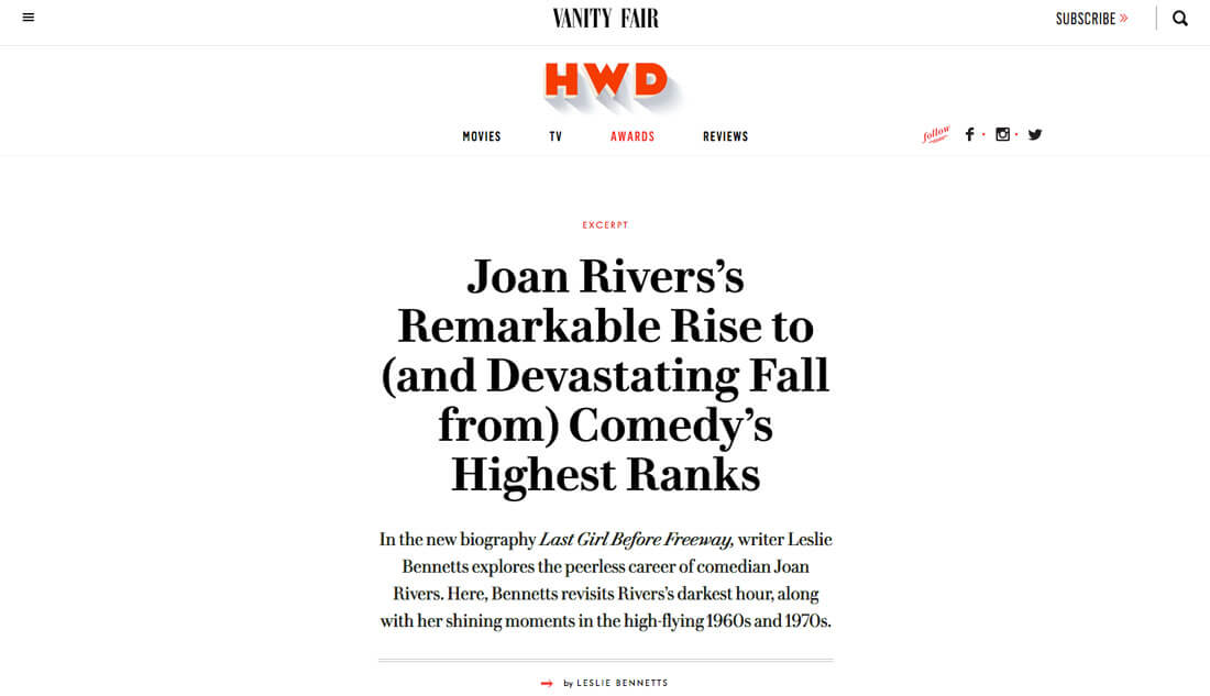
Strategically Place Images
Image placement is important. Some of the best long-form designs follow a common formula for image placements because the aesthetic is simple, flows well and provides good play for text and images.
- Big hero image.
- Intro text.
- Large image.
- Subheadline or big text.
- Main body text.
- Repeat steps 3 through 5 for each new content section or chapter.
Most images are scaled to fit in the center of the screen to avoid text wraps or odd reading patterns. This almost mimics the look of skipping to another page because each section of the content includes an image, headline and text. It creates a natural reading flow that works in the same way long-form content in a book or magazine would, providing a consistent and comfortable reading experience for users.
This design flow also works well regardless of device. Without wraps and odd text configurations, the design will provide a similar reading experience on a desktop, tablet or mobile device.
Break Up Text Monotony
Don’t be afraid to create a reading experience.
It is ok to design a long-form content website that is text heavy. You don’t have to add images or animated effects for every flick of the mouse. But you do have to use variations in typography to maintain flow and visual interest.
- Make sure to incorporate plenty of subheadlines throughout the copy. Make them big and easy to find. (Remember that users will scan the text.)
- Use bold, color and italics to make specific passages or words stand out.
- Incorporate pull-out quotes or information that’s particularly interesting to keep users reading.
Scrolling Should Be Intuitive
Users aren’t afraid to scroll, so don’t treat them like it’s a new concept. Ensure that scrolling actions are intuitive, particularly if you try something a little out of the ordinary.
Cool scrolling features such as parallax can enhance the long-form user experience. Just make sure users know what it expected of them if scroll actions are a little unconventional.
The scroll experience, particularly with long-form content, should be seamless and the user should never have to think about it in the course of navigating through information. The motion should be fluid, controlled and contribute to readability.
Provide Milestones
One of the best features of Medium is that every post comes with an average reading time. Polygon provides a progress bar on the left of the screen (above). Users have an idea of time investment before they ever start reading.
Small milestones with long-form content give users a sense of accomplishment as they move through the design. (It’s a lot like reading an actual book and seeing how far you’ve come.)
Other ways to include milestones include breaking the content into chapters or providing a fixed navigation progress bar. These tools can also help users skip sections (they will likely do it anyway), go back or stop and come back to where they left off. Each of these features can be a major contributor to user satisfaction and happiness.
Tell an Amazing Story
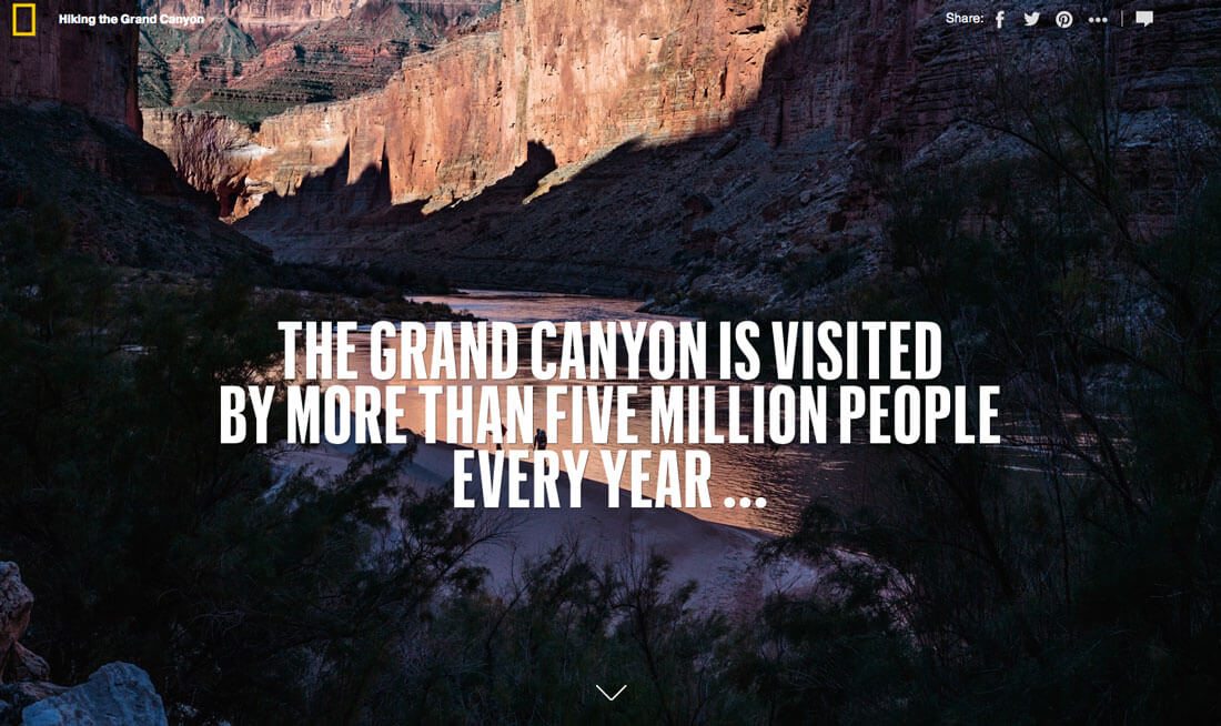
Good long-from content starts with an amazing story. If you have one to tell, then a long-form design might be the answer.
Don’t get locked into a text-only story. Tell your story in the way that is the best representation of the information. National Geographic’s “Hiking the Grand Canyon” (above) uses big photos and maps to tell its story and is worth a look.
Just don’t give users too much of a good thing. Even though a long-form website design can be engaging, hundreds of scrolls can be annoying. Even long-form should be designed within reason.
When your story is complete, stop. If you have additional content, put it on another page.
Conclusion
Long-form content can have benefits to your website beyond aesthetics and user delight. According to Small Business Trends, other benefits of long-form content include higher search rankings, more brand authority, greater credibility, more social media success, lower costs for inbound marketing, more backlinks and organic traffic, more sustainable content and greater value.
A long-form content design is something that’s definitely worth consideration. While it’s not for every project, long-form can be a good option for telling a specific story within your design, for journalism or storytelling platforms or just to provide a new way of presenting information to users.