How to Use Centered Alignments: Tips and Examples
Today we’re going to go back to basics with a “design 101” discussion on alignments. Centered alignments are an easy place to go wrong and if you don’t know how to wield them properly, the result is a very poorly structured page.
Join us as we take a look at why centered alignments tend to be weak, where you should avoid them and how you should be using them.
Centered Alignments
One of the first things that you’ll learn in any basic design layout class is that centered alignments are weak. Now, that’s a blanket statement that might immediately cause you to protest, but we’ll explore this more in-depth in a minute.
Centered alignments are by no means something only used by beginners and non-designers, but they do in fact tend to be the go-to option for these groups. The reason for this is complicated. For some reason, we instinctively feel that things should be centered. We know that design is about balance and centered alignments are nothing if not balanced, so they make sense. Secretaries, CEOs, teachers and all other manner of other professionals that dip their toe into design almost always run straight for centered alignments on any project.
In practice, centered alignments are often the source of trouble in a layout. Learning both how to identify and how to fix these problems is a major step in your early design education.
The Problem with Centered Alignments
It’s difficult to explain the faults of pure centered alignments with theory alone so let’s take a look at an example. Let’s say you’re making little flyers to hand out for an upcoming party. The result that a non-designer will come up with will almost always look something like this:
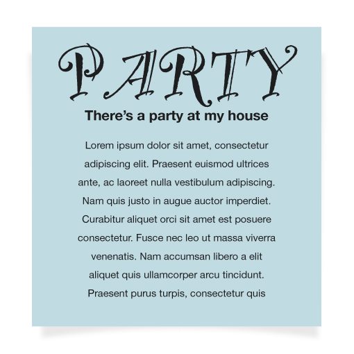
This isn’t a hideous flyer, in fact I’ve seen far worse in the real world. However, for a number of reasons, it’s definitely not what you would call a strong design. If you handed me the flyer design above and told me to improve it as much as possible in only three minutes while keeping the overall personality, this is what I would give back to you:
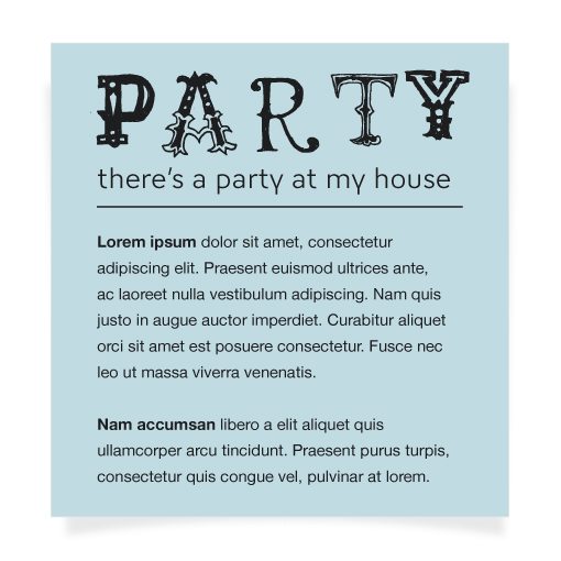
This design simply feels better, and not just because I refuse to ever use the “Party LET” typeface, especially when typing the word “party”. I also split up the content a little better added some emphasis points and, most importantly, changed to a left alignment.
Notice how the left alignment feels very anchored. The text on the page has a clear starting point and you can follow that hard edge all the way from top to bottom. Despite the fact that the first flyer feels “balanced”, it doesn’t feel anywhere near as structured.
When To Stay Away from Centered Alignments
All right, so you get the point: left alignments are good, centered alignments are bad, so what? The reality is a little more complicated than that. There’s nothing inherently bad about a centered alignment, you just have to know how to properly yield one if you’re going to implement it with any amount of success.
The first thing you need to learn is when not to implement a centered alignment. The answer here is pretty simple: when you have a lot of content.
As we saw in the last example, centered alignments are pretty poor for large blocks of text. The lack of a hard edge makes reading difficult and erratic. The same goes for relying on a centered layout for your page as a whole, most of the time, it’s simply not the best idea. The website wireframe below is quite problematic from a layout standpoint.
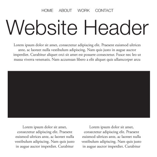
Now, don’t read that as advising against centering your content on the page. There’s a difference between building a website that uses a centered container and a website that uses a center alignment. You can easily have left or right aligned content that is still centered in the browser window using margin: 0 auto. That’s another conversation entirely.
Aesthetics
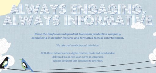
Also, don’t confuse this as a matter of aesthetics. As the page below shows, you can create beautiful sites that rely heavily on centered alignments.
It’s very important in any design to analyze your goals. If a significant degree of readability is one of them, and it often should be, then aesthetic appeal is often completely separate or even directly at odds with this goal. The trick is to find the balance between the two.
The end result is almost always going to be completely subjective. The designer above decided that this chunk of content was small enough to be center aligned. I may think it’s pushing the limit a little but that doesn’t mean I’m right and he/she is wrong, it just means we draw the line in different places.
How to Use Centered Alignments
Now, with all of that said, there is no reason that you should abandon using centered alignments altogether. To do so would be to remove a key element from your layout toolbox. Once again, you just have to know how to use the tool to be successful with it.
There are a million different ways to successfully implement a centered layout so don’t imagine that the following examples are exhaustive. However, they can serve as a way for you to start to get a feel for a solid layout versus a weak one.
Very Little Content
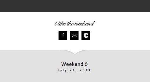
One of the first places you can start to think about implementing a completely centered layout is when you have very little content. Check out the example below.
This makes perfect sense, if the main problem with centered alignments is that they don’t hold up well with a lot of content, then they’ll likely be just fine if you only have a few items. In fact, they’re usually better under these circumstances. If you implemented a left alignment with the design above, the page would likely look very empty. However, with the current centered layout, it looks classy and well-spaced.
Selective Application
Avoiding centered layouts for anything but the simplest designs sounds like an awfully restrictive way to design, and it is. The key is to not avoid them all together but instead to apply them selectively within a greater design with a stronger alignment.
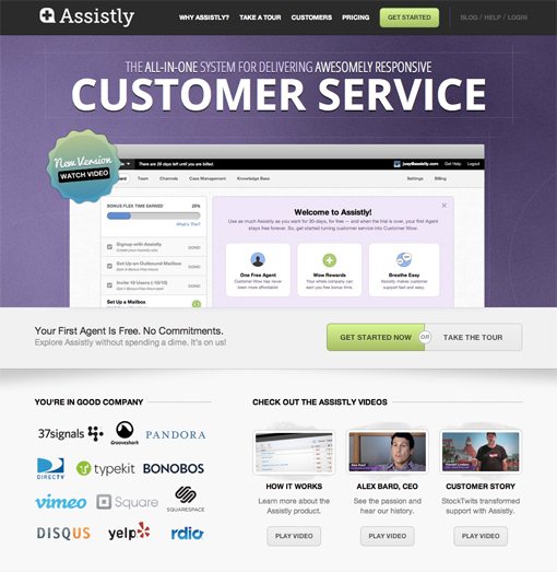
A beginner’s layout class might teach you to grab one alignment and stick to it, but as you improve you’ll find that mixing alignments is often a great way to add some variety to a design. As an example, check out the awesome page below from Assistly.com.
Here we see, on the whole, the layout contains fairly consistent left and right edges. However, there are very specific portions that revert to a centered alignment. The headline is the most natural and most popular place to attempt this. Large, centered headlines and subheads look great in justified layouts. Also notice the smaller areas like the three columns in the bottom left, another natural place for a centered alignment to be implemented. Once again, each of these blocks contains a fairly small amount of content so the result isn’t overwhelming.
Quick Tip: Wrap It Up
One of the simplest and most useful tricks for implementing centered text alignments within a larger layout is shown in the example below.
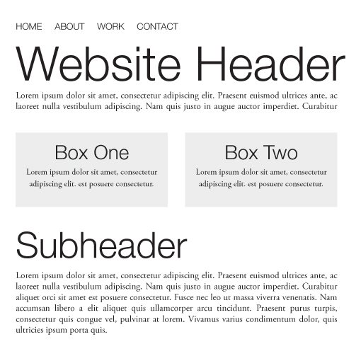
First, look at this page as a series of blocks. Notice that all of the have a fairly justified alignment. With the exception of the left-aligned navigation, there’s both a hard left and a hard right edge that defines the content. Now, within that framework I have a little more freedom to play around. Notice that “Box One” and “Box Two” actually contain centered content, but the containment devices keep them looking perfect within the overall layout.
Anytime you have some center-aligned content that just doesn’t feel like it’s working, try wrapping it in a box that conforms to the overall page layout to see if the design improves.
Conclusion
To sum up, centered alignments are weak, but not bad. There’s a very important distinction there that you really must grasp to be a good designer. “Weak” implies that they can easily be taken too far and are easy to abuse. However, you can and should be using centered alignments in your designs.
Make sure that, if your entire layout is built on a centered alignment, you have a very simple design with only a few items. Once you start adding big blocks of text and lots of images, the centered alignments starts looking messy. Also, try building a solid left, justified or even right alignment for your page as a whole, then experiment with selectively dropping in centered alignments in key areas such as headlines. Finally, as a quick trick when you’re in a jam, try wrapping center-aligned portions in a box that goes with the flow of the rest of the page.
