Mastering Multiple Photo Layouts
Working with multiple photos and images can be a tricky prospect. Done carefully, the use of multiple images can help create an effective and masterful design for both print and web design projects. Some of the best examples of design using multiple photos can be found in the websites of professional photographers.
Consider dominance, number of photos, color, grouping and image quality when working with a variety of photos. Look at details and consider the feel of a project to get the best results when using many images in your project.
Like the article? Be sure to subscribe to our RSS feed and follow us on Twitter to stay up on recent content.
Create Dominance
Your site should have an image, or collection of images, that is dominant and is the obvious big image on the site. Consider using a single photo that uses much of the space, vertically or horizontally that you are working with or work to combine images in such a way that they appear unified.
Single Photo
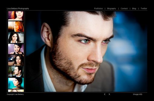
The easiest way to create dominance with images is to focus on a single image or photo. The image is displayed at large size with smaller photos used to accent the primary image. This is a popular concept and can work exceptionally well with a strong, large display photo and a grouping of smaller, tightly cropped images.
Dramatic Crop
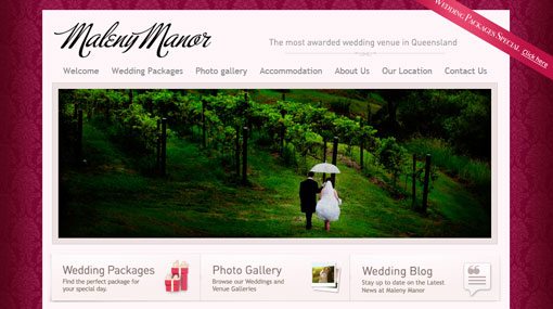
Another way to make a single photo stand out in a layout construction with multiple photos is to use dramatic cropping. Sometimes an unusual shape, such as an extreme horizontal or vertical image, is enough to draw you into an image first. Secondary images with more typical shapes are not the focus.
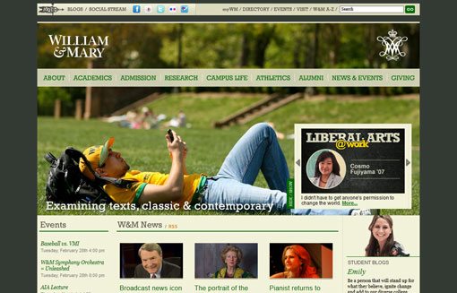
Each of these sites uses a strong horizontal image in different ways. Maleny Manor takes a direct approach with a strong crop that stretches the width of the page secondary images are small icons that direct you to other images. William & Mary’s website appears to use a strong crop as well but if you look closely the rest of the image is built into the banner. This trick crop also works to create a strong visual, which is complemented with smaller images that are cropped tightly.
Color
Using color, or not, can also add impact in multiple-photo layouts. Mixing photos that use full color with black and white or sepia tones can add contrast and emphasis to certain images. The odd image — color in a black and white scheme or vice versa — will immediately draw the most attention.
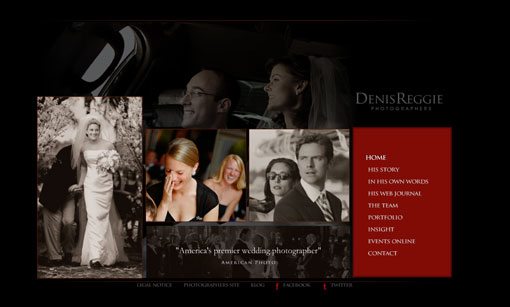
Denis Reggie Photography uses a scheme of black and white images with a rotating color image to guide you through the images on the page. Further, the main navigation tool on the page is in a static color block. Color is used to guide you through each of the images in sequence. Also note how the color image almost jumps off the page in relationship to the colorless images.
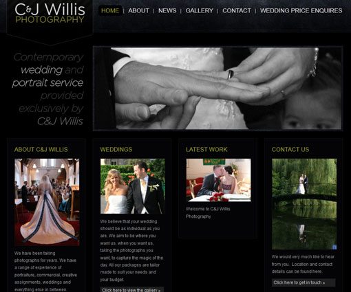
C&J Willis Photography uses a similar technique. By mixing black and white and color photographs, emphasis falls from the biggest image to the smaller images below. The color photos appear larger and more dominant and lead you to other points on the website, because the black and white image fades into the dark background.
Grouping of Images
Working with groups of images can also create a strong visual presentation. While some like the mirrored approach, with a group of images of identical shape and size, you can also play with groups of mismatched shapes and sizes.
Both approaches can work but require attention to detail. Proper alignment of photos is key when working with groupings. Make sure photos are sized identically when working with a row of like sizes and work with crops when using varying shapes so that images fit together in your space.
It is equally important that photos “stick together” when grouping images. Be aware that web images can “move” based on user browser settings. If your CSS does not accommodate grouping (or if that is something you are not ready to attempt), merge your images into a single file in photo editing software such as Adobe Photoshop and place the multi-photo file as one image. This ensures that your grouping of photos will appear as you intended. Also, remember to keep spacing and alignment in mind, so that images have a clean look.
Print vs. Web Considerations
The rules for working with multiple images cross the boundaries between print and web design. For each type of design project, focus on strong images, readability and details for the best results.
Size and Proportion


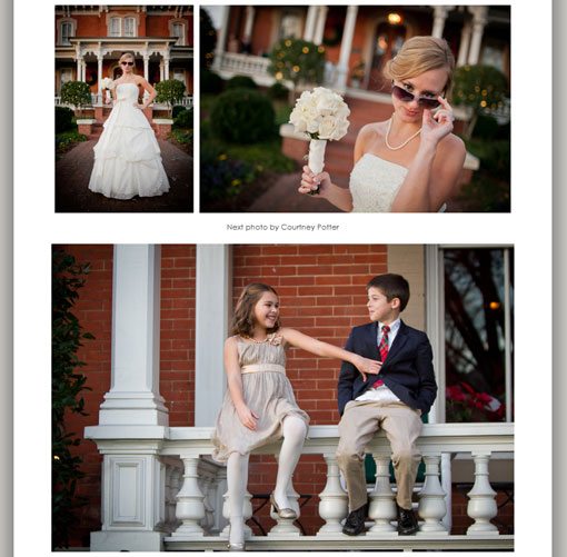
Too many small photos can be hard to understand and can confuse your audience. Consider the crop of each image and how it fills the frame. Wide angle photos do not work well at small sizes whereas photos that are cropped tightly hold up better when used small.
The key for both types of projects is proportion. Look at the faces above in the first row of photos. In the wide shot, the faces are almost indistinguishable and appear very small. But in the second row, each of the faces is clearly visible. The frames are identical in size in each row of photos and the photos contain the same images; the only change is to the crop of each. The tighter crops make the photos appear larger, although the frames are not.
You want each image to be readable at the size you display it. If you can’t tell what the image is or what is happening in a photo, reconsider the size of the image or experiment with an alternative crop.
Image Quality

A bad image used small or with text is still just a bad image. Toss it.
Make sure to use strong images at any size. Avoid images that are pixelated, are blurry, taken in poor lighting conditions or have obvious problems, such as a finger in the corner of the photo or have a lens flare.
Using even just one poor-quality image can impact your project, no matter how strong the overall design may be. Poor images lack professionalism and can cause a client to have a negative impression about your work. There is no fix for an image that lacks quality in resolution or composition.
Image Meaning
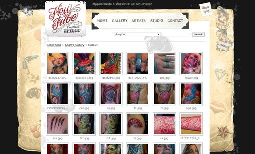
Also think of the message your image will convey. Make sure images are appropriate for your audience and “match” one another. For example, a website promoting a tattoo parlor such as the one above would not have the same effect if the background image featured clouds and bunnies.
Conclusion
Using multiple photos in design can be an effective tool to showcase great images. Be wary of poor images and select photos carefully. Make sure each image serves works for your project and don’t force using extra images if they are not available.
Consider how images will be viewed and take extra steps in web design to ensure grouping stay intact as you intended. Be mindful of the details in all multi-photo projects and double-check crops and image sizes so that groupings have consistent sizes and a clean look. Finally, play with different options such as identical crops and varying shapes and sizes to develop a design that best represents your project.
Image Sources: DeusXFlorida, kevin dooley, photoskate and Anthony van Dyck.