Negative Space: The Art of Letting Your Designs Breathe
Negative space is one of the most effective methods used in all forms of design to create focus and attention as well as bring things into perspective.
When used properly, negative space can help you create winning designs that are not only clear and simple but also more user-friendly.
The Google Search homepage is a popular example of effective use of negative space. For more than 25 years, Google maintained a simple design with nothing but its logo and a search bar surrounded by white space, while most of its competitors like Yahoo and Bing used cluttered designs filled with images and links.
This minimalist design helped more users navigate search engines at a time when the technology was new. And even today, it’s part of the reason why nearly 90% of people prefer Google over other search engines. Because it’s simple, clean, straight to the point, and simply gets the job done without unnecessary distractions.
Let’s explore and find out how you can use negative space in your design adventures.
Why Negative Space Matters
The popular phrase “silence speaks louder than words” is a great way to describe the purpose of using negative space in design. Contrary to popular belief, negative space is not about creating empty, low-effort designs. It’s about creating visual clarity!
You can see negative space in action everywhere you go. Great adverts, billboards, posters, and signage use negative space to grab your attention. The biggest brands like Nike, Apple, Coca-Cola, and BMW, have mastered the art of negative space to stand out in the overcrowded advertising space for many decades.
Negative space is arguably the most effective way to create hierarchy and highlight important elements. When you surround your most important objects in the design with empty space, it makes things much easier to help users prioritize attention and get your message across more easily.
It also takes a major role in minimalist designs as well as creating sophisticated designs that evoke emotions and connect with users on a much deeper level.
The Two Types of Negative Space
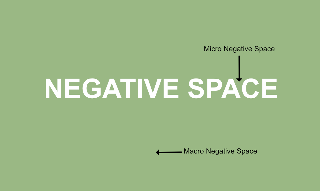
When talking about negative space in design, there are two main types of uses. The first and the most common is known as macro negative space. This is the use of large empty spaces in a design to bring focus and attention to elements.
The other is called micro negative space, which is the use of smaller spaces to create balance and clarity in designs. An example of micro negative space is the small spaces you see between text, also known as kerning.

Of course, there are other forms of negative space in design. Designers also use it to craft things with thought-provoking unique perspectives that make you think twice.
The Quiet Power of Negative Space
Negative space is not just about creating simple and minimalist designs. It can also be used to create balance and order in designs full of dense content.

You’ll see this in action on many user interface layouts and web app layouts that use negative space as a way to create a connection between the many elements on the surface and organize them all together in one place.
Especially when it comes to designing apps for smaller device screens, negative plays an important role in improving the user experience by bringing clarity and reducing clutter.

Take a signup form, for example. Without negative space, a form full of text and fields will overwhelm and confuse the users. It’s with the right balance of empty space you can create objects and content blocks that just work.
Whether it’s web design, mobile app design, logo design, illustrations, or photography, negative space is what brings more meaning and perspective to your work, “quietly”.
Examples of Negative Space in Design
There’s no better way to show the power of negative space than with some real-life examples. We’ll let these designs speak for themselves.
Impossible is Nothing – Adidas
Weapon of Mass Destrucshhhh – Apple
New Year – Nike
repEAT – McDonald’s
Grreat or Smol, save ’em all – World Animal Day
5 Tips for Mastering Negative Space
So, how should you use negative space in your designs? Following these simple tips will help you master the art of negative space.
1. Importance of Context
Some people believe that using lots of empty space in a design instantly makes it a masterpiece. It’s quite the contrary.
When using negative space, context is extremely important. Knowing the brand’s identity and history, target audience, and the message you’re trying to convey all play a role in the overall look of the design.
For some brands, it makes more sense to go for highly visual designs and some designs require more text to describe their purpose. Knowing how and when to use negative space is a skill you’ll have to master as a designer.
2. Use a Clear Focal Point
Finding the right balance of empty space to bring attention to your important elements stars with the main focal point of the design.
To make your title, logo, or call to action stand out, you need to find a clear focal point in the design. And then surround it with space to give it the spotlight.
3. Find the Right Balance
When working with a cluttered or overcrowded design, you can utilize negative space as a way to create balance.
To do this, you don’t start with the goal of creating negative space. Instead, start by removing the unnecessary text, icons, and elements from your design. Then you’ll see negative space form as a result of that.
Sometimes, it’s about finding the right balance between the content and negative space and not letting one dominate over the other.
4. Consistency is Key
Even something as good as negative space can lead to bad designs when used without purpose. If you overuse it, designs will feel empty. If you use less of it, designs will feel cluttered. Consistent spacing is key to creating visual harmony.
5. Find new Perspectives
Don’t think of negative space as a challenge. Use it as a way to be more creative and let your ideas run wild. Experiment with new ways to use negative ways to make people think and wonder. While also creating new perspectives for more unique designs.
In Conclusion
Negative space does wonders in various types of designs but it does it work quietly. But, as designers, it’s important not to let it go unnoticed. When you understand negative space well, you will see designs from an entirely new perspective.
