7 Tips for Better Responsive Photo Galleries
We all know and understand the importance of designing websites on a responsive platform, right? That applies to images and photo galleries as well.
There’s nothing worse than navigating to a beautiful website and seeing images that just don’t “lock” into place or size properly. It almost leaves you thinking that the designer forgot something, or missed a step.
Today, we’re going to look at seven things you can do in the design process to create better responsive photo galleries. (We’re not talking code here; these are design processes that can help you and the developer, whether they are one and the same or not.)
1. Consider Aspect Ratios
The desktop viewing experience can be quite different from that on a mobile device. But for most websites, the image placements are the same. Your job is to make sure the same message is communicated in both environments and that the image does not get lost on different screen sizes.
That’s where thinking about the aspect ratio – the relationship between the horizontal and vertical planes of the image – comes in.
Back to that desktop website, a cool super-thin horizontal photo might look amazing at the top of your website design. But what happens to that image on the smaller screen in a more square environment? Does the photo shrink to a size that’s hard to see? Or does half of the photo vanish?
That’s where aspect ratio comes in. By picking a horizontal-vertical relationship for photo sizes that is similar, less image content will be lost when switching devices. It’ll also make it easier for you to work with image placements and you won’t have to worry quite as much about uploading multiple sizes for different breakpoints.
2. Size and Scale Consistently
The care you take in cropping, sizing and uploading photos can impact your workflow quite dramatically.
How many of you just upload photos into the CMS and hope for the best? Yes is the wrong answer.
Each photo should be cropped and sized for the placement in the website design. This ensures that photos will look the way they are intended and you won’t end up with missing heads in the tops of photos or elements being left off one (or both) sides.
It takes a little more time on the back end of the project but is well worth the effort. (Particularly if you are working with sliders or galleries.)
3. Use a Slider or Gallery
Using a container for images such as a slider or gallery can help you better manage responsive images in your website design. Particularly if you are using a well-known and established third-party tool, most of the heavy lifting is done for you in ensuring these elements will work as intended.
Two of the previous tips remain vitally important even when using slider or gallery elements; aspect ratios and sizing and scaling concepts still apply.
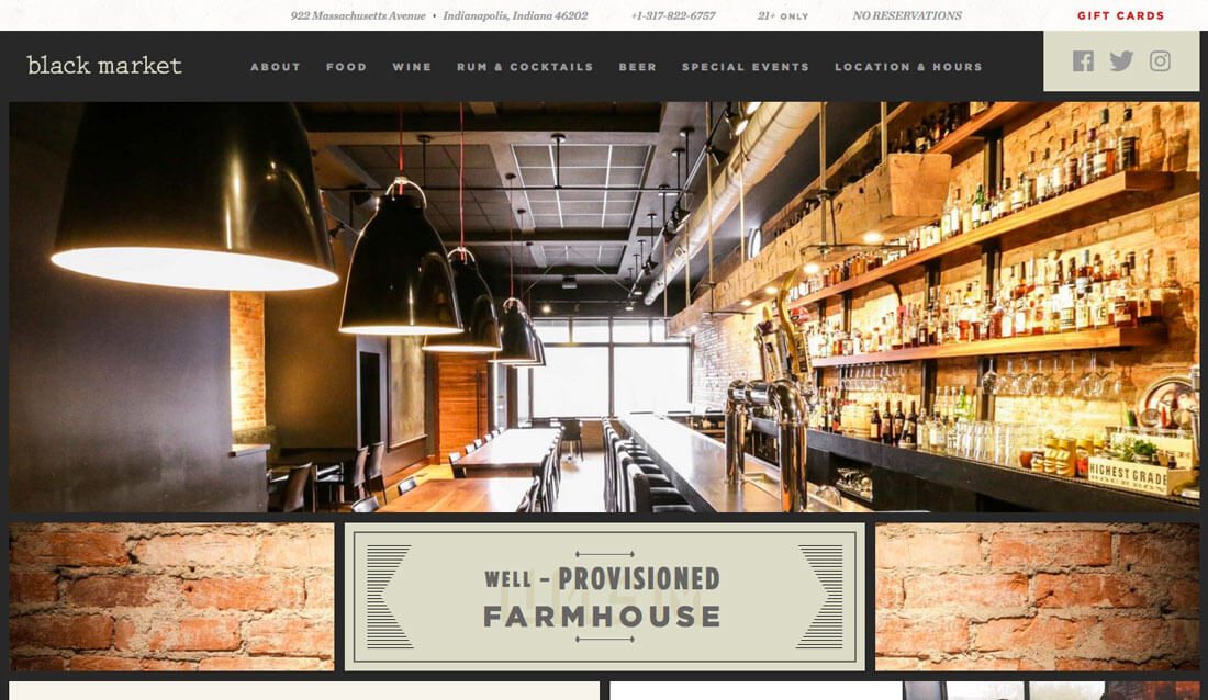
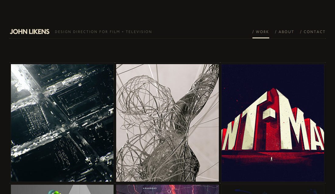
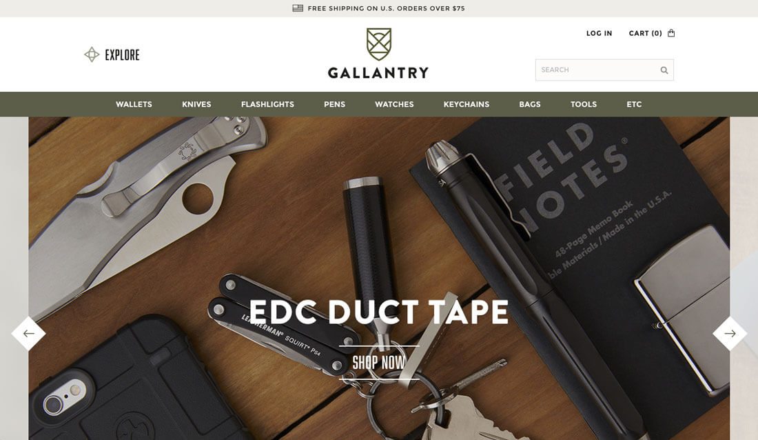
Not sure which option to use? Opt for a slider when you have a handful of great images that will work at larger sizes. It’s a popular option for the top or “hero” section of a webpage. Opt for a gallery when you have plenty of images that can render small with no readability issues. This works well for portfolios or websites with a lot of images to showcase.
4. Stay Away from Captions When Possible
Captions can be a great tool to add value to the information in an image, but can really get in the way of how the website works. Avoid them if you can or come up with an alternate solution that isn’t in the form of a traditional caption.
Large text blocks, such as captions, can render beautifully on large screens but present major issues in smaller environments. The resulting effect can be jarring and potentially cause users to abandon your site. (And with so much traffic coming from mobile for most websites, that could be disastrous.)
5. Be Careful When Mixing Video and Images

Let’s be clear: It is perfectly acceptable to have video and image elements on your website. It’s probably something you should do.
But don’t mix video and images in the same elements of the design, such as putting video and image elements in the same slider. Sometimes, you’ll get lucky and it will work like a charm. Other times, you will be left with blank boxes on certain devices that just look strange.
The best option is to give each different type of element its own space in the design. This applies to pretty much any design element, but particularly images and video.
6. Cut Unnecessary Elements
One of the biggest problems with sliders and galleries is that too often the designer puts too much junk inside the container. There are navigation arrows, navigation buttons, text, calls to action and the list goes on.
Generally, users understand how to interact with a slider. Unless you are doing something totally off the wall, you don’t need two layers of navigation that shows users what to do. A single row of buttons or arrows is plenty (if you need them at all).
Only include elements that users will need to interact with. If the purpose of an image gallery or slider is to get the user to click/tap a call to action, that should be the only option on the photo. Keep it simple. Don’t provide too many options. It can actually help your conversion rates.
7. Use Only High Quality Images
It almost goes without saying, but it still happens way too often. If you don’t have a stellar image, then don’t use an image at all. High-quality, high-resolution images are more important than ever. Users are not going to waste time looking at a website with pixelated or poor images (and they probably won’t trust you if the quality is subpar).
A large number of users are looking at your website design using devices with high-resolution screens; they expect top-notch visuals. You need to deliver.
Some image formats are changing to meet these high-resolution needs while delivering more compressed images. Verse yourself in formats — Google Developers is a great place to start — know what screen resolutions are most generally used and get in the habit of saving files in a way that can be best delivered to users.
Conclusion
We all want to create websites that users feel a need to interact with. Strong images are a key part of that equation. Equally important is having them render well regardless of device.
Plan for images spaces that will work on a variety of devices sizes when you are in the wireframing stages of a website design project. You might find that there’s some give and take, particularly in terms of image shape, but in the long run making those decisions early and creating that consistency will benefit your site design in the long run.