Practical Design Considerations for Responsive Sites
Responsive design is our current best solution to the phenomenon of the ubiquitous web. The Internet is being accessed by people everywhere on countless incredibly varying devices and responsive pages provide an easy and functional way to account for these differences.
Today we’re going to take a step back from discussions of media queries and technical jargon and focus on the core aspects of how responsive techniques affect your design process. What major points do you need to keep in mind when approaching a responsive web design project? Read on to find out.
Design is More Than CSS
There has been a lot of discussion lately regarding the techniques involved in responsive design from a technical standpoint: media queries, percent based widths, etc. However, once you master the CSS tricks for implementing a responsive design, you’re faced with a much bigger hurdle: the actual design.
It sounds like a daunting task doesn’t it? You’re setting out to create one cohesive, consistent experience that looks perfect on just about every screen size. It’s hard enough to pull off a professional design when you’re worrying about a single format, how much more difficult will it be for responsive design?
This is a key reason for the hesitance for many designers to adopt responsive design as a default practice. The most frequent objection I hear from both designers and their clients is that responsive design sounds like a fairly time intensive venture. Designers are forced with attempting to either justify a price hike or eat hours in the name of producing quality work.
Fortunately, from a CSS standpoint, projects like Skeleton really cut back on the coding time commitment. That doesn’t mean you’re off the hook though, as a designer you’ll still need to focus on creating a solid experience for every user and that means investing some serious thought into how the design process changes in light of this new methodology. Let’s take a look at a few of the primary considerations for you to keep in mind.
Photoshop Won’t Cut It
With responsive design, designing in the browser is no longer a fad, it’s a necessity. You can definitely spec out some ideas in Photoshop for how the site should look at different widths, and doing so might even provide richer end results, but the simple truth is that Photoshop can’t replicate the kind of dynamic effect that is indicative of responsive design.
When you’re talking about a single design that evolves with the browser window size, the best way to plan that out is to kick the tires and see it in action in the browser.
Don’t see this as a Photoshop bashing rant, you don’t have to and shouldn’t abandon using images, textures, etc. that were built in Photoshop, Fireworks or other graphics software. However, putting them together in a quick mockup is likely going to be best achieved through live browser implementations rather than static thumbnails.
Keep in mind that your mockups can still be low fidelity products, whether you want to start with a basic wireframe or a fairly finished looking design is completely up to you. The key here is that you have something live that allows you to test the various evolutions so you can solve problems as they arise rather than wasting valuable hours on a fundamentally flawed idea.
Dramatically Different
Sometimes scaling a design down is as simple as reflowing the items from multiple columns into a single stacked column. If your design is split up into nice little chunks, this may be the way to go.
However, remember that dramatically different devices can call for dramatically different designs. It’s often the case that a genuinely better solution can be delivered through a considerable change in how the page works. To see what I mean, consider the El Sendero del Cacao design below.

As you can see, the large and small versions of the design differ quite a bit. The key here is that they still look like two versions of the same site, meaning the brand consistency has stayed on point. The designer merely decided that the mobile version functioned better with considerably less visual flair than the full version.
Keep in mind that “different” doesn’t always mean a complete and utter stripping down. Your mobile version doesn’t have to be boring and predictable. The point here is not to strip everything away but to critically consider all the different key sizes that you’re targeting and how you might improve the experience for each by rethinking the fundamentals of the design.
What’s Absolutely Essential?
One of the major components of transitioning your design through various phases is to target the absolutely vital components of the design and give them the highest priority.
As we saw in the previous example, it’s definitely not always going to be the case that your mobile-friendly version will contain everything that your full-size desktop design will. The trick then is to consider everything that you and your client are planning on including and create a hierarchy of importance so that you can trim the unnecessary for the smaller versions.
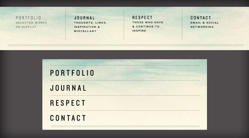
We see this principle at work in Stephen Carver’s site below.

Notice how the design has not only been reflowed but actually trimmed down for the mobile version. Some of the content was viewed as essential while other content is more of a “nice to have” when there is enough screen space available.
The most obvious example of this is in the navigation area. Notice how the larger version of the design contains little sub-headers for every navigation element. These help the user further understand the navigation scheme. On the small version however, these have been stripped out to save room.
While analyzing your design for essential elements, experimentation is the key. Try stripping out various components to judge whether or not the usability suffers. Note that these decisions must be made at every interval, not just the smallest and largest.
Touch ≠ Click

Another significant point to remember as the design scales is that the current state of computing is split into two different categories: touch based input devices and those that use a cursor. The safe assumption of course (for now) is that larger browser window sizes tend to correspond to desktop or notebook computers while smaller browser window sizes usually indicate a touch-based interface.
These are significantly different beasts and you’ll do well to remember that while structuring your designs because the direction this knowledge leads you in might be a little counterintuitive.
For instance, even though we tend to think of the mobile site as a scaled down version of the desktop site, it’s often the case that elements will actually increase in size due to the difference between touching and clicking. A navigation element that seems perfectly accessible with a mouse and cursor might be next to impossible to accurately target with the large, crude input device that is the human index finger.
The important thing to remember here is to test like crazy. It’s too easy to design on a desktop and then resize the browser window to take a peek at that mobile version. This simply doesn’t tell you the full story. You need to get your hands on the design at a smaller size before calling it good.
It’s All In the In Between
One crucially important thing to get in your head regarding responsive design is that it’s about more than screen sizes: it’s about browser window sizes. Just because someone has a 13-inch MacBook doesn’t mean their browser window is that size. It’s often the case that users open and use browser windows at far less than full screen.
The takeaway here is that you’re not off the hook after testing a few preset window sizes. Resize the browser window and watch how the design responds at each little step. The standard argument is that non-designer users never perform this action, and that’s correct, but they will use their browser windows in an endless array of unpredictable sizes and the beauty of responsive design is that you can fairly easily ensure that your design will look perfect in all of them.
Consider Going the Mobile First Route
Ultimately, how you plan out your responsive designs is up to you. However, there are plenty of strong arguments for joining the mobile-first crowd.
Starting with the mobile version helps ensure that you’re not simply serving up a crappy half-hearted version of your original design to your mobile users. It also ensures that you really think through the specifics of every little piece of content.
Above we stated that you need to comb through your design and target the absolutely essential elements, this is a far easier process if you actually start with only the bare essentials. With this technique you can proactively add to your design as the page size increases as opposed to cutting out as the page size decreases. This follows the concept of progressive enhancement, which starts with a solid functional base and offers improvement where possible.
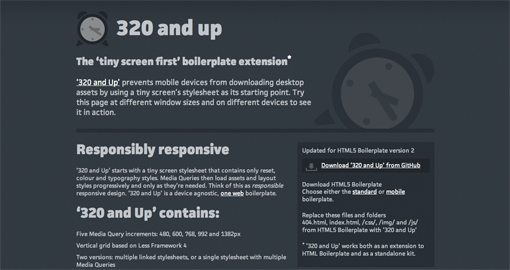
Another benefit of mobile first is that you can often avoid the loading of unnecessary elements on smaller devices that won’t use them. Projects like 320 and Up are aimed at helping you minimize the resources loaded by the small version of your design.
Conclusion
The point of this article was to get you to stop thinking about the backend portion of responsive design long enough to consider the ramifications of this technique on what the user sees. Far more important than media query syntax is the end result of how your design evolves from a visual and functional standpoint to meet the user’s needs.
Remember that you need to actively progress your design in the browser, not just in a static design application. You also need to establish a concrete hierarchy of the most important elements in the design to make sure those pieces of the puzzle are present and working perfectly for every window size. Finally, remember that mobile web design is much more than scaled down desktop web pages. Consider taking a mobile first route to help ensure that all users are receiving a rock solid experience.
Image Credits: Claudia Regina