Rethinking Table Design for Mobile
There might be a problem with that table on your website. It doesn’t look or function well on my phone. It sounds like a simple problem (that should have a simple solution), but might not be quite as simple as you’d think.
There are a variety of reasons that could contribute to this issue – lack of responsiveness, creating tables as images, odd data formatting that makes a mess – but there are also viable design solutions.
Let’s walk through ways to rethink table design so that your data and information looks just as amazing on a phone as it does on any other larger device.
Screen Width
If you create a website table and users can’t see all the columns on their phone without swiping left to right, is the content even there?
The reality is that content is unlikely to ever be seen, even if you allow for horizontal scrolling. In most cases, tables should fit within the available viewport. This is why designing responsive tables is so important.
But responsiveness is not the solution to overly wide tables because everything will shrink to an unreadable size unless there’s a logical way to stack content.
The better solution here is to think about what information is really important to show in a table and show only that data. While this is a best practice overall, it becomes vital on smaller screens. Large tables are clunky and hard to use. Only your most dedicated readers or followers will delve deep into this information.
Evaluate the data. Is a table really the best way to highlight information? Tables work best for information that needs to be grouped into logical, and organized boxes, that enhance readability.
Eliminate any information that isn’t essential to the table. Collapse rows and columns where you can. Look for repetitive elements or information and strip that out as well. (A common location for repetitive information is in labels and data itself, such as a label that indicates “dollars spent (in millions)” and data that reads “$2.6 million” (condense it to 2.6 or $2.6).
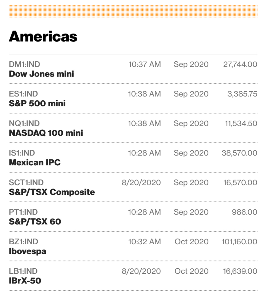
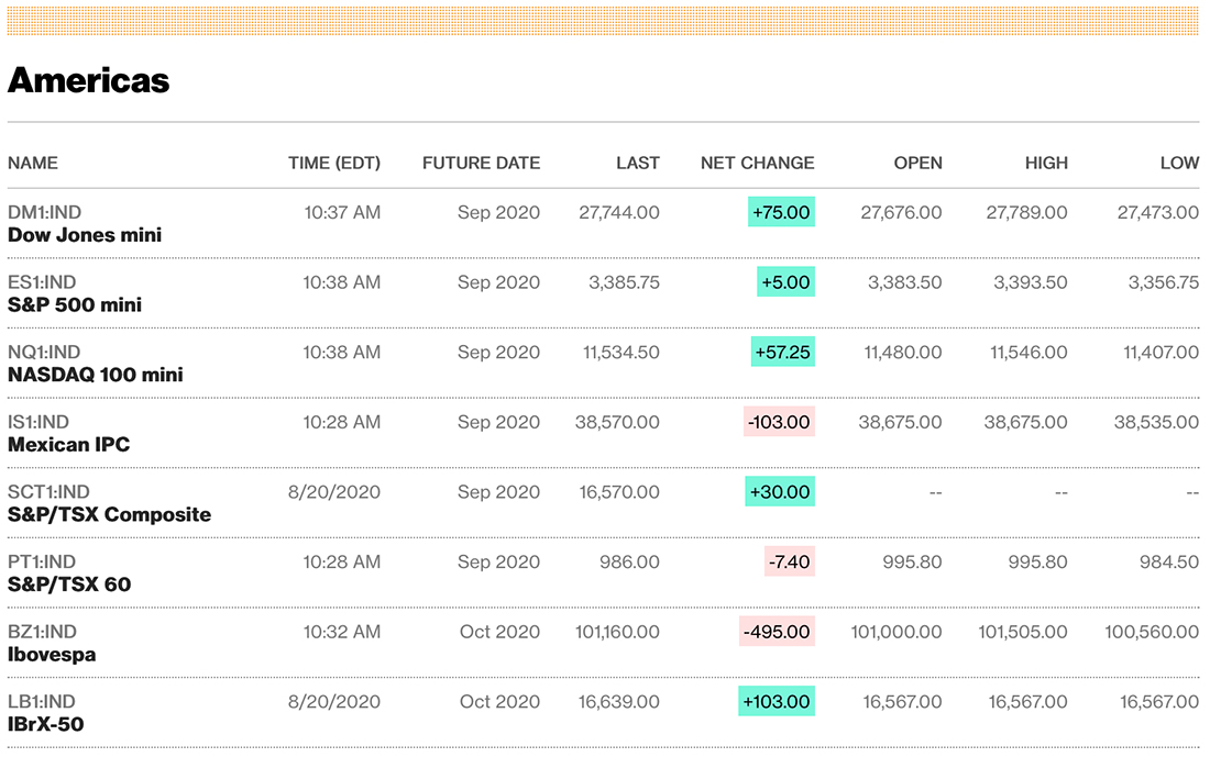
Note the way Bloomberg collapses stock information when users move from desktop to mobile (above). This practice shows an understanding of users and what information is required of mobile users with an understanding that some people might want more data on desktops.
Scrolling
Like with most other content on mobile, scrolling is perfectly acceptable … within reason. Don’t make users scroll too deep to get all of the information in a table.
There are a few of usability concerns that come up with long-scrolling tables:
- What happens with labels?
- It gets hard to compare information, impacting comprehension
- Click/tap elements can be inadvertently activated during scroll
If you need to use scrolling consider ways that make information easier to manage. Will users need to compare products, for example? Allow them to select items to compare and open them in a new table sans scroll.
Data Sorting
Here’s the real trick to managing complex data in a table for mobile devices – use smart sorting and filtering.
By allowing users to select what information is relevant to them with filters the table will shrink to a more manageable size. Allowing for additional data sorting then brings the most relevant information to the top of the table.
This practice works great for numerical or comparison data. It doesn’t work so well when you use tables for other types of information, such as addresses or dual column data tables.
Sorting and filtering make the most sense when there’s still a lot of information to manage even after you’ve conducted a hard edit.
Icons and Visual Elements
Make tables easier to digest and scan with visual elements. Use icons, color, and lines to help differentiate text elements and make things easy to understand at a glance.
Small icons can aid visual comprehension and make it easier for users to scan content.
Consider a table that lists contact information. Icons for a phone or email could provide a visual cue and serve as a tap element to call/text or email.
Denote yes and no selections with a check or x icon. It’s a lot quicker to scan and less wide than “yes” or “no” over and over again. When a visual makes more sense, go for it.
Color in tables can keep information organized. Consider shading every other column or row for readability. Use shading for the column or row that represents the way information should be read, such as a column that is best understood from top to bottom having shading in that manner; conversely, information that’s best understood by reading across the screen should use row shading. Consider bold text for elements that total or fully encompass a complete data set.
Finally, use lines (vertical or horizontal) to separate content elements. In most cases lines and shading run opposite of each other if used simultaneously (such as vertical shading and lines between columns).
Text and Abbreviations
You don’t have to spell everything out in a table. Using understandable abbreviations is an acceptable practice.
Would you rather use an abbreviation or make text tiny or have to eliminate more information? When appropriate, this option makes the most sense. The key here is that it has to make sense.
If an abbreviation changes the meaning of information or causes confusion, then it is not the right choice. Many units of measurement have common abbreviations, such as px for pixels.
When thinking about abbreviations, don’t discount icons or emojis. These common elements have a lot of meaning and can replace an entire word with one character.
Alignment
Alignment is another one of those small things that can make larger amounts of information easier to scan and read.
To make the most of readability, align text elements in the following ways:
- Rows should be top aligned vertically. Anything else creates a jagged reading experience across the screen.
- Text blocks that contain multiple words or phrases are often best left-aligned (except for languages that read right to left). Avoid justified text elements as well.
- Row labels should be left-aligned unless they are exceptionally short.
- Numbers often make the most sense right-aligned because you can visually see bigger numbers and it keeps elements such as commas and decimals in a row that aids scanning.
- Column labels can be left-aligned or center, but all labels should have the same alignment.
- Center content alignment only works for single words or short phrases; avoid centering with longer tet elements.
Conclusion
There’s no denying it – tables are tough. The determining factor as to whether a table will work well or not on mobile often comes down to the data you are trying to present.
Tables work well if the information can be contained and read on a single screen or with a scroll. Tables are hard to comprehend when they require moving back and forth, left to right, across the screen. That’s just not a good option for data and you might be better served to try a more narrative format.
But while table design can be challenging, it is fun as well. This organized manner of presenting information can help increase engagement and understanding when done well.