Single Page Website Design: 10 Tips + Ideas
Long live single page website design! There’s something almost magical about small-scale websites that fit on a single page. They can be graceful, easy to navigate and provide optimal user experiences in a contained space.
While there was a time when we shied away from single page websites, users are embracing them again (thank you, mobile!) and you should, too.
We’re looking at ten tips, ideas, examples, and suggestions to help spark inspiration for your next piece of web design work. It might be just the right time to keep it simple, and embrace a single-page strategy!
1. Think in “Pages”

When it comes to designing a single, scrolling website design think in “pages.”
Each scroll should provide a page-like experience that focuses on a single element. This creates a distinct sense of organization and flow for the website design.
Cote does this beautifully with “pages” that have alternating light and dark (or full photo) separations. The user knows visually while scrolling where one bit of content ends and the next begins.
2. Timeline Navigation for Longer Pages
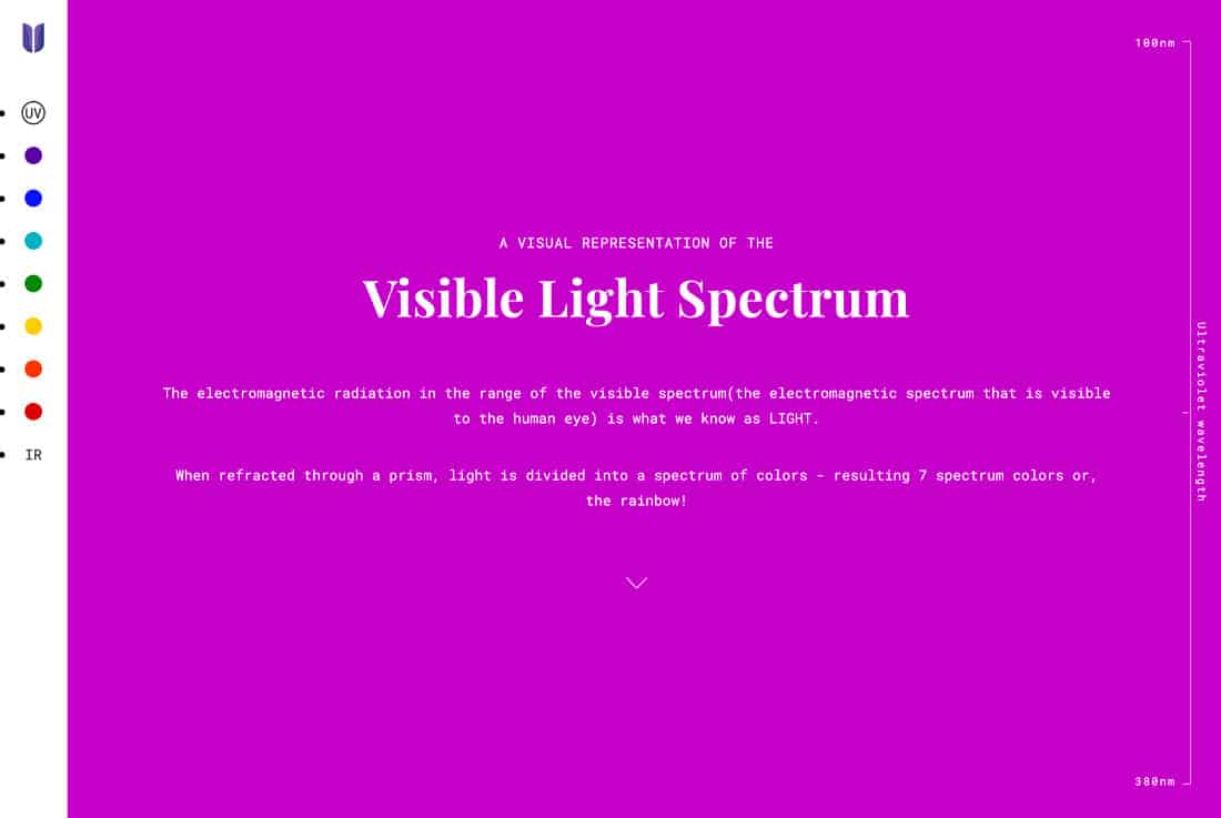
When it comes to one-page websites, they aren’t always light on content. Some of the best one-page designs are longer-scrolling, longer-format websites.
For these projects, consider timeline navigation so that users always know where they are in the content flow. It makes it easy to track where you are and how to get back if there’s content to re-examine.
UV Hero does a nice job of this with a highly visual timeline nav that shows each color on the visible light spectrum as it pertains to the content in the design. And the best part? You can click any color and jump right to that content.
3. On-Page Navigation
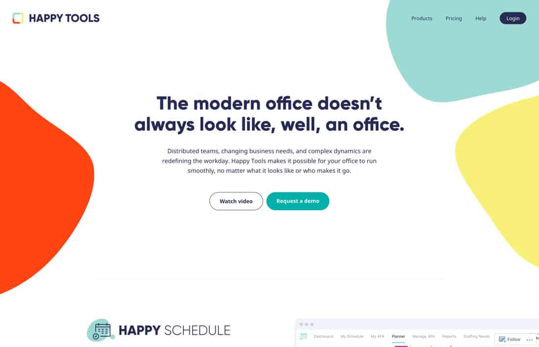
Single page websites don’t need to lack common user interface elements such as a menu, although many seem to.
You can still incorporate a traditional-looking menu (it can help user flow as well as search). The difference is that menu links jump to specific sections of the one-page design. For users that like to navigate in this manner, they won’t even know you’ve created this nifty trick.
Happy Tools looks like a multi-page site but it’s all contained on a single page. The menu works exceptionally well and gives users navigation choices.
4. Make It Highly Interactive
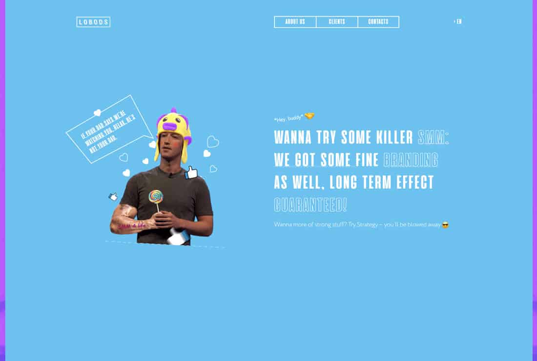
If you want users to keep scrolling, interactive elements can be the trick that encourages that action.
From video to parallax effects to touches of animation or gamification, interactivity can encourage greater movement and time on site. This is especially true with single page designs.
Lobods has a goofy style with plenty of interactivity. There are hover animations, slide- and pop-in elements and scrolling text. It all comes together in a way that helps users move through the content with ease. (Another bonus with this design? It includes plenty of space so that subtle movements and interactions are easier to see.)
5. All on One Screen
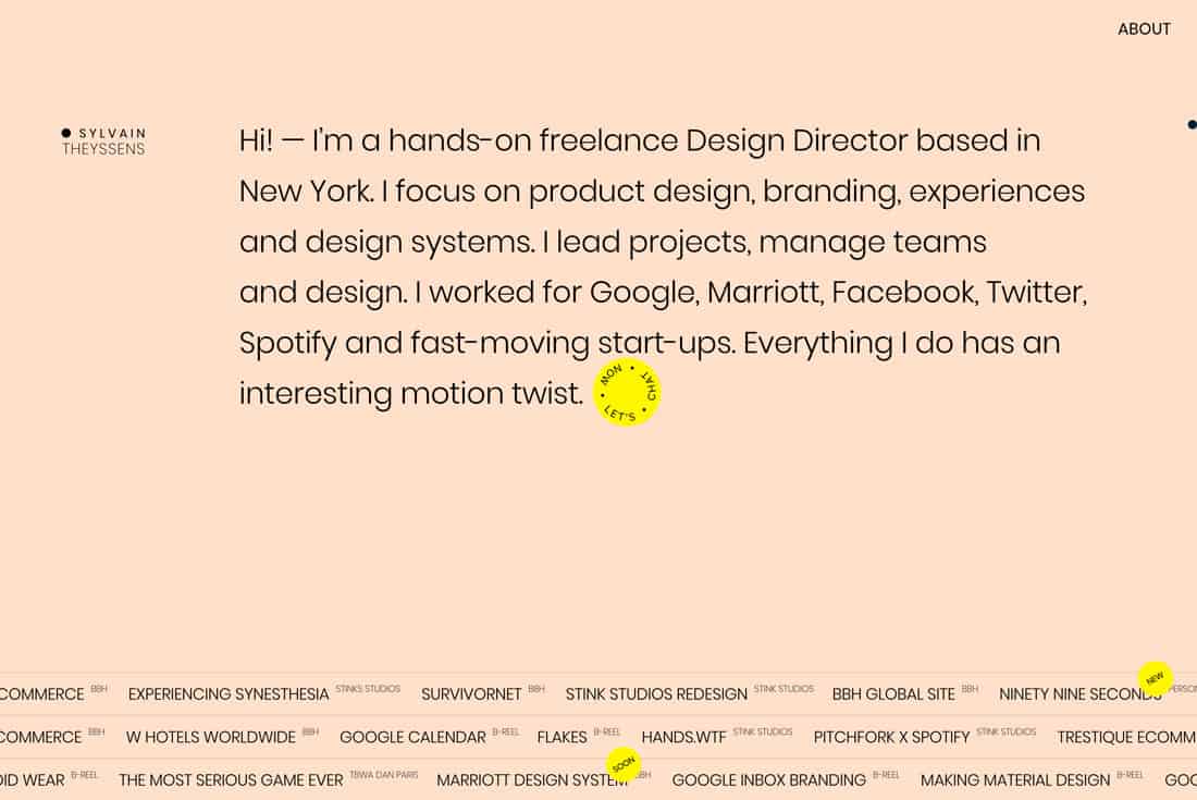
If you don’t have a lot of content, a one-page design that’s all on one screen can provide a nice user experience.
Treat this website design like a big navigational element with some information and then off-site or contact links. It can work well for coming soon designs or simple portfolio landing pages.
Sylvain Theyssens does this for their portfolio design. (It actually has two pages: A cute “screensaver style” animation that turns into the main design with a mouse movement.) The page is simple, informative and impressive. The one-screen design gives you everything you need to know without anything extra getting in the way.
6. Coming Soon Design
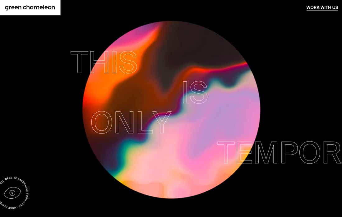
Speaking of coming soon websites, this is the perfect use for a single-page design.
In most instances, coming soon pages don’t have much content – maybe just a logo and intro or contact information. In most cases, this can fit well on one page and is an efficient use of user time until the main site goes live.
Green Chameleon does exactly this. The one=page design is especially nice because of the cool animation and interesting use of text. It creates a sense of anticipation and evokes curiosity – just the thing you’d hope for in a coming soon page.
7. Be a Little Funky
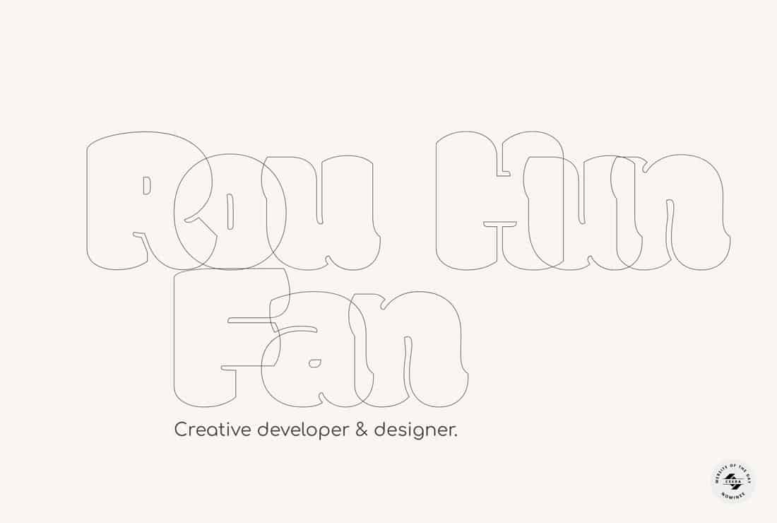
Single page websites can be an excellent playground if you want to try something a little bit different or funky. An unusual display works well with smaller designs because you don’t end up over-doing the “trick.”
Rou Hun Fan uses a specialty typeface and background grid to highlight his information, portfolio, and work. The creative display and minimal style are enough to encourage scrolling for a short time, perfect for a portfolio.
8. Give Users Something to Do
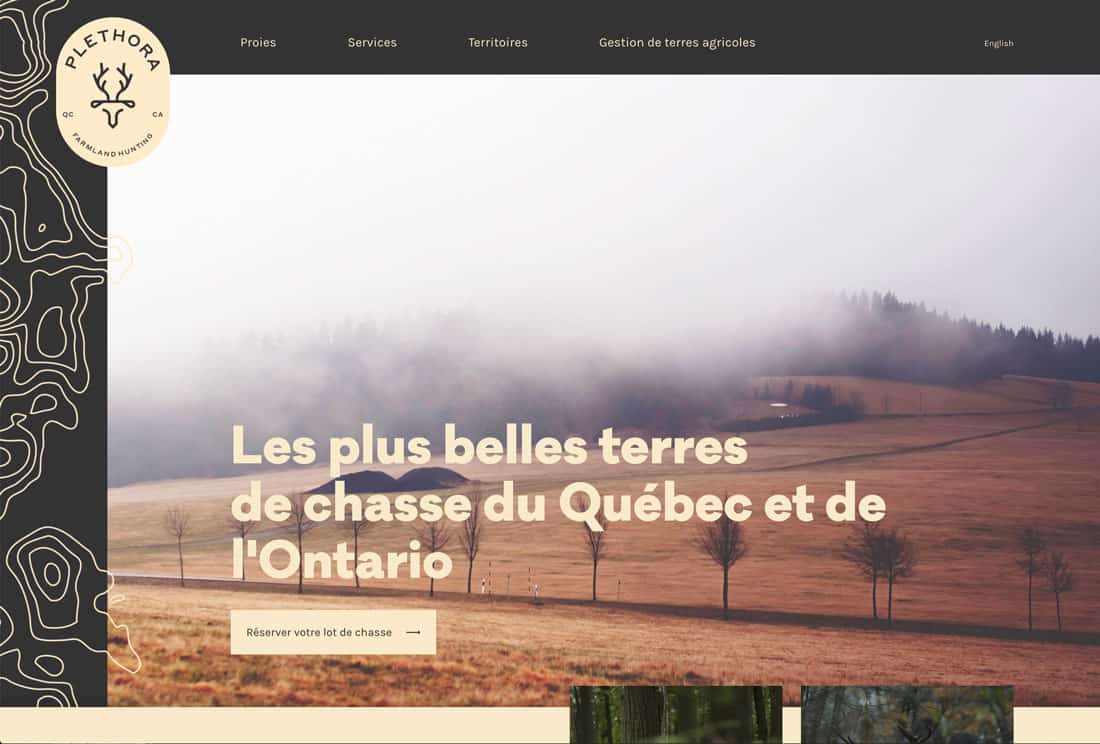
To keep engagement up and keep users interested in the design, give them plenty do to on a single page website.
One failure that many of these designs have is that they are just long scrolls of information. Break it up with clickable elements, calls to action and things to do. Not only will these elements help you figure out what users want from the design (and if they are meeting your intended goals) but will also help keep them interacting for longer periods of time.
Plethora breaks up a long page of scrolling with plenty of card-style buttons to reserve travel packages. Each of these click interactions is noted with an arrow to create a consistent user experience.
9. Keep it Organized
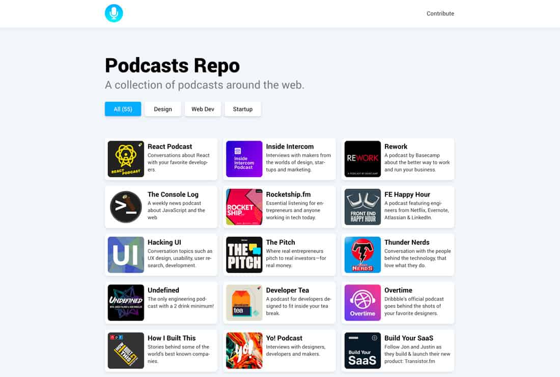
With all of a website’s content on a single page, it’s easy for the design to get out of hand. But it can also create an organized canvas for content.
When it comes to working with one page, a tight grid and uniform structure can be your best tools. Use them to keep content organized and grouped in a way that’s easy for users to navigate and understand.
Podcasts Repo does this well with a perfect grid of podcasts to choose from. The site is flexible enough with this grid and style to grow to as many content items as it needs without getting overwhelming.
10. Use Space Wisely
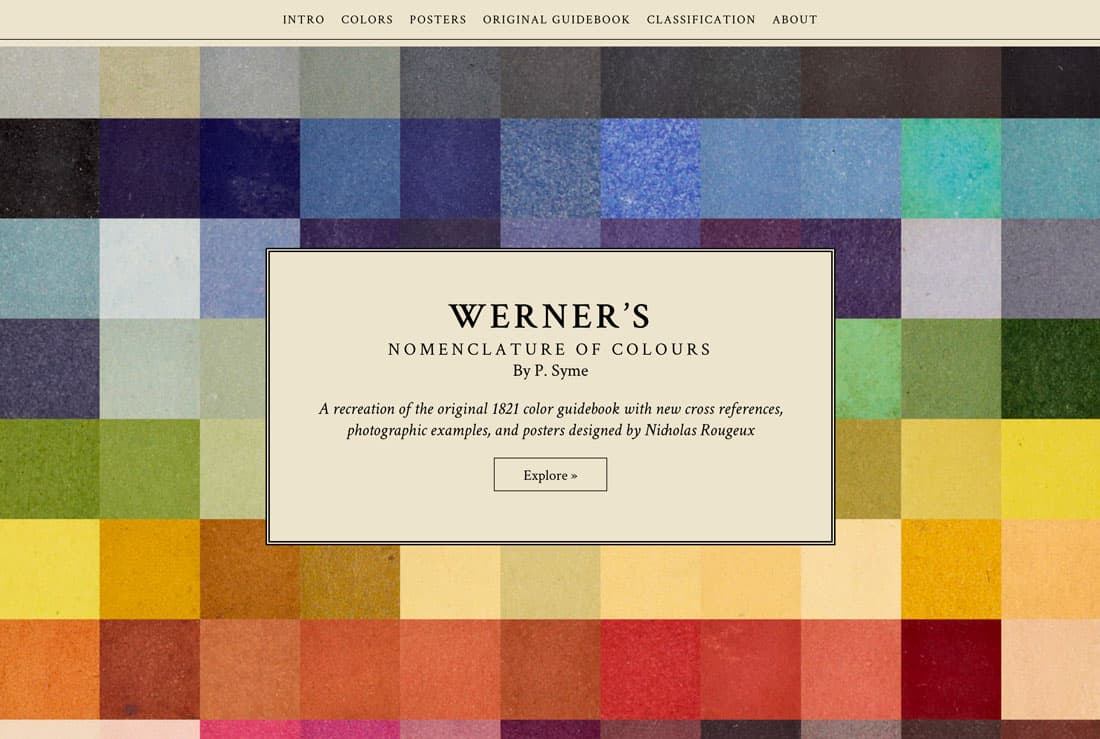
One of the most important design considerations for a longer-scrolling or one-page design is the use of space. Content needs to be spaced in such a way that content changes are clearly established, actions are identifiable, and everything is easy to read. (Remember, too much scrolling can start to cause some degree of eyestrain.)
Werner’s Nomenclature of Colours is a single page website with a lot of content. The site is actually a replica of a book from 1821. Space makes this design work.
Categories and subsections with a clear grid and plenty of white space enhance readability and scanning. There’s a lot here but it feels quite approachable thanks to the use of space throughout.
Conclusion
A single page website design can be just the thing you need to break up some of the heavier projects you’ve been working on. This style can work for anything from coming soon sites to portfolios. It’s appropriate for any website without tons of content.
Do you have any cool one-page website designs to show off? Let’s see them. Share them with us on Twitter. Tag @designshack and @carriecousins with a link to this post and we’ll retweet our favorites.