Understanding and Working With Aspect Ratio
Every image, every canvas, every frame has a shape. And often that shape is a rectangle. Even more common is a rectangle of a particular proportion based on medium.
From cameras to television to movies to computer screens, every medium has an almost distinct shape on to itself. That can be a challenge for designers, especially when you have to crop and convert content and information to fit a variety of mediums. Because of all these different shapes, understanding aspect ratios can help you easily move images and designs from one medium to another.
Aspect Ratio Defined
Simply, an aspect ratio is the proportional relationship between the width and height of a rectangle. When working with aspect ratios in most modern design projects, an aspect ratio will have a horizontal orientation, because most screens are wider than they are tall. (And we design on screens and often for screens.) But not every aspect ratio must have a larger width than height.
An aspect ratio is defined in a mathematical ratio, with two numbers separated by a colon.
- width:height
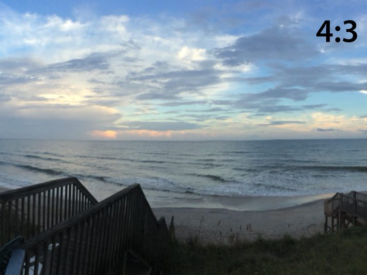
- So that, 4 inches wide by 3 inches high is 4:3
The aspect ratio though is not simply just a measurement of width and height. It is reduced to the smallest usable ratio (using math concepts from elementary school). So for a rectangle 12 inches wide by 9 inches high, the aspect ratio is also 4:3 (a common aspect ratio in still photography).
Aspect Ratio and Photos
One of the places it can be easiest to see and explain aspect ratios is in photography. Even your iPhone camera allows you to select a specific aspect ratio before you snap a photo, and then you can change the aspect ratio in cropping.
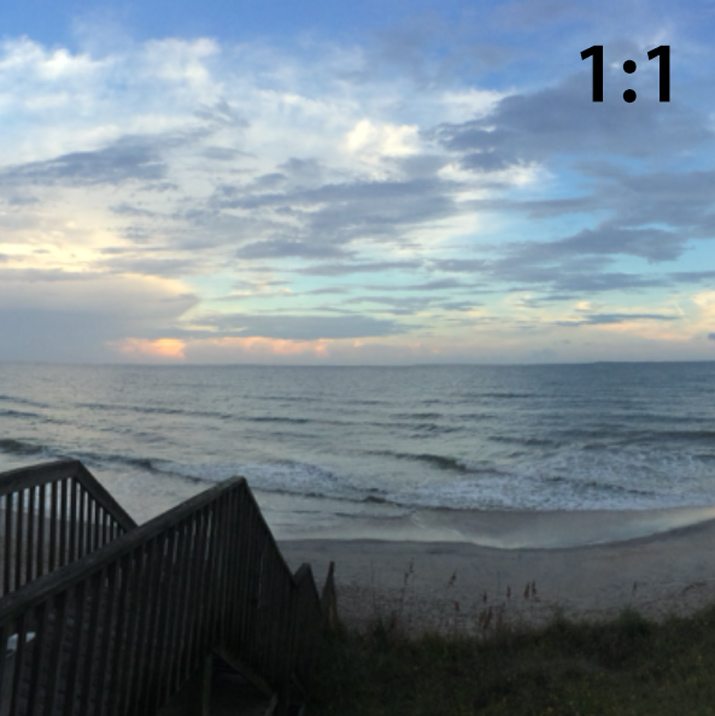
Aspect ratios in photography are often linked to how a photo will be used. The aspect ratio is determined by constraints of the medium. Posting photos to Instagram, for example, only allows images with a 1:1 ratio (square).
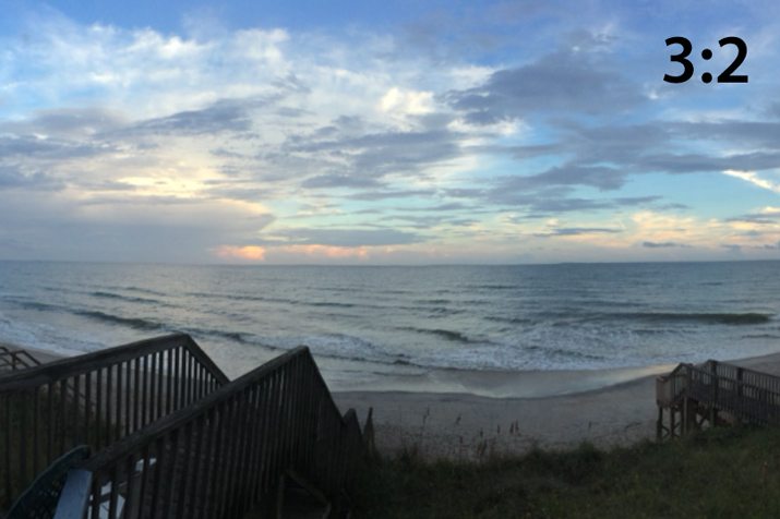
Traditionally, photographs were commonly taken with an aspect ratio of 3:2 because prints were made in sizes of 3 inches by 2 inches, 6 inches by 4 inches and so on. Traditionally, this common formula resulted in camera sensors and printing practices for photos that mesh, making it super easy for the average person to take and print images.
That is a little more complicated these days with more options for digital manipulation. But the concept still works and there are still a handful of sizes that are most commonly used. Outside of professional photographers, designers and artists, few people crop a photo to something other than one of the common aspect ratios.
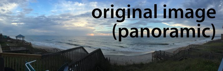
But why crop outside a common ratio at all? To create dramatic visual interest. Consider a panoramic image for a moment. It has a sense of drama and excitement a “normal” shape does not. Using a standard shape implies harmony and balance while a nonstandard shape can be dramatic and exciting.
Aspect Ratio and Video
Aspect ratios in video are very much like still photography. The shape is quite different for modern video screens, whereas historically still and moving images were based on similar aspect ratios.
Video screens fall into two pretty distinct categories in terms of aspect ratio: Cinema or movie screens and television or desktop computer screens. The shapes of these screens are beginning to get closer to the same aspect ratio with more at-home screens falling into the widescreen category, but there is still a significant difference between the two, which is why letterboxing is commonly used between the formats.
- Cinema screens are often 1.85:1 or 1.43:1 (IMAX)
- Television screens are often 4:3 or 1.33:1 (older format) or the newer more common widescreen proportion of 16:9 or 1.77:1.
In terms of the web, designing video for screen size varies widely, but frequently the 16:9 format is used. Another common option for web designers, unless using a full screen video, is to default to video using the 16:9 ratio because it is the standard used for most web-based players and apps, including YouTube.
Using a common aspect ratio makes it easy to move an element from place to place and between projects. A video cropped to the 16:9 ratio, for example, will play seamlessly on a television screen, computer screen (desktop or mobile) and in an online video player. This saves you time as because you won’t have to re-edit or crop the video for different formats or devices, or worry about parts of the image area that won’t get seen because of differences in screen size.
Aspect Ratio and Responsive Design
Aspect ratios also come into play when thinking about responsive design for websites. This is especially true if you want images and video to maintain a specific shape across multiple devices.
Maintaining a specific aspect ratio for images in the CSS ensures that the meaning of your content does not change because of an image being cropped. (Think of how different a photo feels if the full image is of two people with their arms around each other and in the cropped version you see only one person and part of the arms of the other. The photos have very different meanings.)
When working on responsive websites you have a few decisions to make about images, aspect ratio and how you want things to appear on various screens. Designers can resize each image by hand for different devices or use a little coding to do the trick. Craig Buckler has a great tutorial on exactly how to do this in “How to Maintain Image Aspect Ratios in Responsive Web Design.”
This is extra math can come into play as well. You will likely need to think of aspect ratios in terms of percents. Here are a few common conversions:
- 4:3 = 75%
- 3:2 = 66.66%
- 16:9 = 56.25%
- 8:5 = 62.5%
Making Life Easy
So why does all this matter? Why can’t we just crop images however we like and move on with our lives? You can, but understanding aspect ratios will make your life easier.
Think of how many projects include multiple designs on multiple canvases – business card design, postcard design, website design, poster design, video advertisement. If you are working within a common aspect ratio or designing elements using that scale, mixing and matching pieces is easy and you don’t have to reinvent the design for each new element.
Think of the time you can save.
Another time-saver? Try this aspect ratio calculator. It’s especially handy if you don’t feel good about doing calculations yourself.
Common Aspect Ratios
While aspect ratio standards do tend to change over time – just look at the dramatically different shape of TV screens from the 1950s and today – you can plan for some of the more common shapes and sizes.
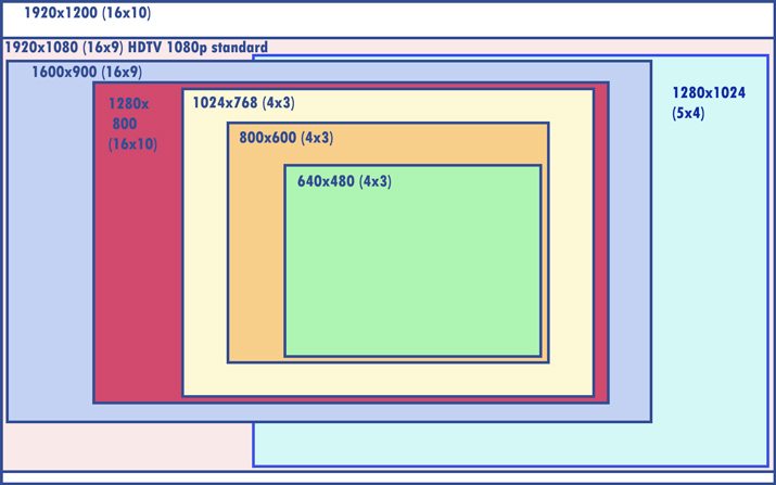
- 4:3 (1.33:1) – Old television and computer screen format (1024×768 pixels)
- 3:2 (1.5:1) – Common photo printing format, also used for postcards, business cards and standard mailings
- 1:1 – Square image standard (common in social media and website design)
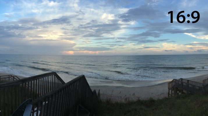
- 16:9 (1.77:1) – HD video standard, computer screen standard comes close but is imprecise (1366×768 pixels)
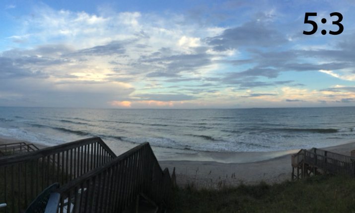
- 5:3 (1.66:1) – European widescreen standard
- 1.618:1 – Golden ratio
Conclusion
Understanding aspect ratios can save you time and rework as a designer. Consider all of the common applications of knowing a piece or work or project has the same proportion as something else. It can also help you understand where to crop and what parts of an image or project will have to be dropped or cut our based on medium.
While it may seem like a lot of math and calculating at the onset, many of the projects you work on are likely to use common aspect ratios. Use the checklist above to see what parts and complete designs you can mix and match.