15+ Creative Website Header Design Examples + Tips
The website header, also referred to as the above the fold section, is arguably the most important part of a website. Mainly because it’s the first part of the website visitors see when they arrive on the website.
When it comes to websites, first impressions matter a lot. And the header section plays a major role in it. In fact, according to a study, the majority of website visitors only stay about 15 seconds on a website before they leave.
The header design of your website will play a key role in whether you can convince a visitor to stay longer than 15 seconds.
With the right header design, you can influence visitors to keep browsing the website. You can also design a header in a way that persuades visitors into taking action as well.
To help you find inspiration and learn a few tricks about effective header design, we handpicked some of the best website header design examples for your inspiration. These designs will surely help you make your own headers stand out from the crowd.
5 Tips For Effective Website Header Design
Before we get to the examples, let’s find out about the key elements that make a website header more effective.
1. Use the Right Font
The title or headline takes the centerstage of a website header design. It’s what helps visitors understand what a website is all about. This means the title needs to be big, bold, and clearly visible.

With the right font, you can design the perfect header title that attracts attention. While using a bold sans-serif font is the go-to choice for headers, a serif font is more appropriate for some brands as well. Above all, make sure that your title, sub-headings, and text are clearly visible over the background.
2. Add an Illustration
Image and video backgrounds are still quite popular. But, the latest trend in website header design is using illustrations.
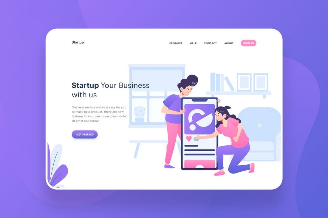
A great thing about using illustrations in header designs is that it allows you to add some personality to your website design. You can hand-craft an illustration that fits your business and branding. And then, use the same style of illustrations throughout the website design to create a smooth flowing user experience.
3. Create a Call-To-Action (CTA)
Of course, the call to action is the second most important element (first goes to the title) of the header design. With a CTA, you can persuade visitors to take action and signup for a service, search for items, subscribe to a newsletter, buy a product, and much more.

But, you need to be careful about the placement of the CTA. A good strategy to use is to A/B split test your header designs to find the perfect color combination and the right spot to place the CTA.
4. Choose a Matching Menu Style
Navigation links are also important but not necessarily need to be a part of your header design. You can design a header with a hidden navigation system that only appears visible when scrolling down. Or even hide the navigation in a hamburger menu.

It will depend on the goals you want to achieve with your website. A clearly visible navigation will help visitors view other pages on your website more quickly. If you want to avoid distracting visitors and encourage them to read more about a product, then consider hiding navigation.
5. Get Creative but Follow Standards
Designers are often encouraged to get creative when designing websites. But, always use standard design guidelines as well.
For example, you should use measurements when adding logos, buttons, and icons. And also follow basic web design guidelines to find the appropriate placements for each element. This helps create consistency across the website design.
Have a look at the example website headers below to see how it’s done.
PenzGidroMash

Believe it or not, this is a website for an industrial equipment manufacturing company in Russia. And it has one of the most creative website headers we’ve seen.
Even though most corporate websites usually go for old-school and classic website designs, this company’s modern design approach is refreshing.
Everything from its title, font choices, colors, and especially the use of images to create a 3D-like design makes this website header truly a lesson in effective web design.
Creative Dreams Design

This website header design is a great example of designs that say “more with less”. The ultra-minimalist look with a simple animated illustration helps this website accomplish an important goal— to show off creativity. And that’s exactly what a creative design agency website should aim for.
The simple call to action, adorable illustration, animations, and the colors on top of the clean white background gives this header the attention it deserves.
Digital Horizon
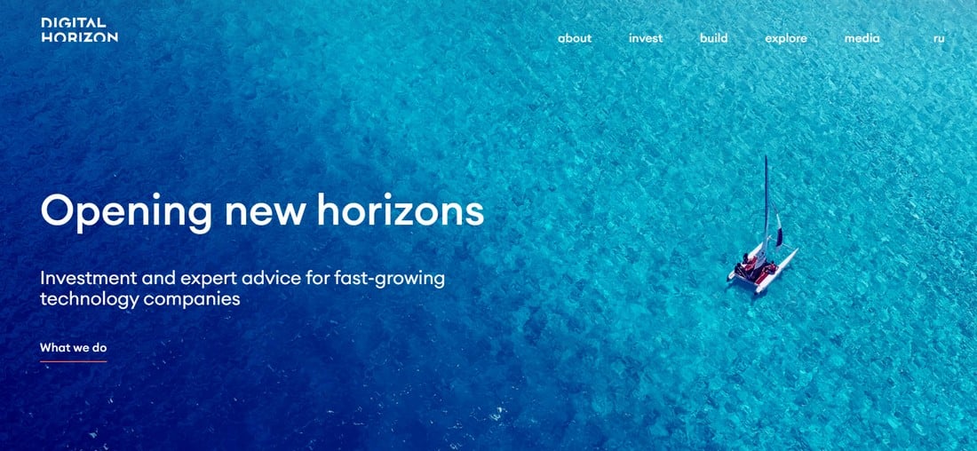
The website for the investment firm, Digital Horizon offers a great lesson in header background design. It gives a huge chunk of its header space for its animated background, which fits in perfectly with the company name and concept. And also highlights the headline and the call to action quite well.
Using image and animated backgrounds are still relevant. You just have to find the right way to marry the header design with the company branding.
Okb Interactive Studio
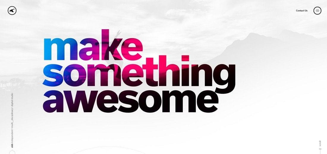
A bold header design needs a big bold title font. This experience design studio has found the perfect combination of the title font and the font size to create a truly memorable header design.
It’s not just about the size of the heading or the font choice. But also the way the text reveals parts of the background and hiding the menu, links, and even the company name to give the header its much-needed space is what makes this design remarkable.
IdeaBuddy
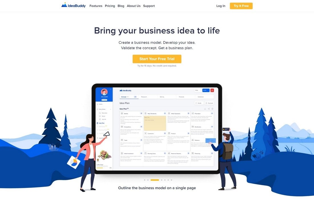
When it comes to designing headers for SaaS landing pages, sometimes it’s easier to just show what the app is capable of than just saying it. The idea validation app, IdeaBuddy used that simple approach to design a more effective header.
In addition to its creative use of illustrations on the header and throughout the website, it also uses screenshots of the app to showcase what the service offers.
Together For Animals

When designing websites and headers, incorporating design psychology is important. Especially when it comes to non-profit and charity websites, such strategies play a crucial role in evoking emotions.
The website for this animal charity website uses design psychology well by adding a single picture that touches the hearts and souls of the visitors.
Stuart
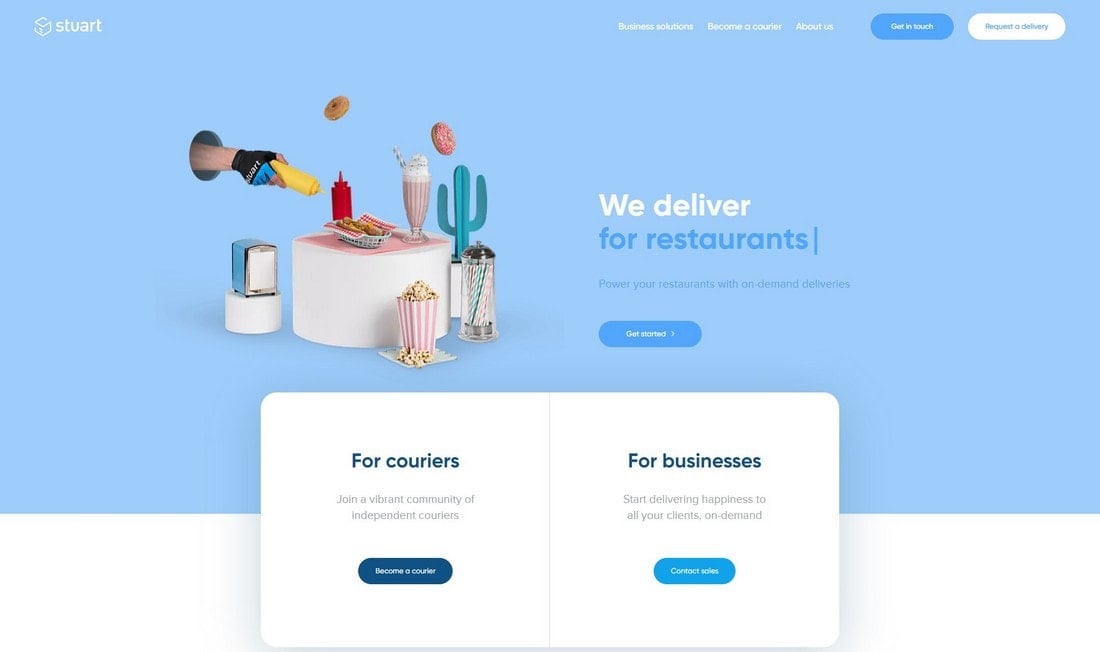
Using sliders is another popular concept used in website header designs. However, the old ways of using image sliders are slowly fading away from modern we designs. This delivery service website took the old slider concept to a new level.
It uses a perfect combination of high-quality images with transparent backgrounds, pastel colors, and animated headings to create a very entertaining header design with a content slider.
Handwrytten
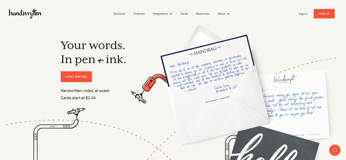
Handwrytten is a very unique service that offers to deliver your writings as hand-written notes. Designing a header for such a service is certainly a challenge. And they seem to have created the perfect design to showcase the company in an attractive way.
Featuring a real example of a hand-written note surrounded by creatively animated illustrations, the header perfectly captures the purpose and the goal of this service and the business.
Wild Side Design

This website header is another great example of using illustrations to tell a story. In this case, the header uses a hand-crafted drawing that visualizes the message of this business. Which is providing branding design for businesses to take them from ordinary companies to greatness.
It’s a lesson on how one unique illustration can add so much personality to a website header.
Stef Ivanov

The freelance designer Stef Ivanov’s portfolio website has one of the most unique header designs that makes it stand out. It’s not just the amazing sketch drawing of his photo or the buzzing bees around his head. But mainly because of how he uses all the elements, fonts, colors, and white space together to create a memorable experience.
Pragmatic Brains
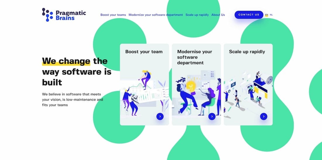
It’s difficult to sum up an entire company or showcase all the services of an agency on the limited space available on the header area. Somehow, the Pragmatic Brains website has managed to include all their consulting services on the header. Without cluttering the design.
At first glance, it looks like a regular website header with a bundle of illustrations. But, the magic happens when you hover over those card designs. They reveal details about each service the agency offers. Quite clever and effective header design.
AirPods Pro

We can’t ignore the brilliant website designs of Apple product pages, especially when creating a list of creative header designs. Over the years, Apple has mastered the art of capturing the attention of users with its incredibly simplistic website designs.
The header design for the AirPods Pro product website also features a radical design. It’s simple and allows users to quickly understand what the website is all about.
Pixelwithin
This website header design fits perfectly with the brand messaging of its web design agency. It uses a very simplified header without many colors, images, or text to showcase the power of minimalist and “uncomplicated” designs.
Sheetal Ice Cream
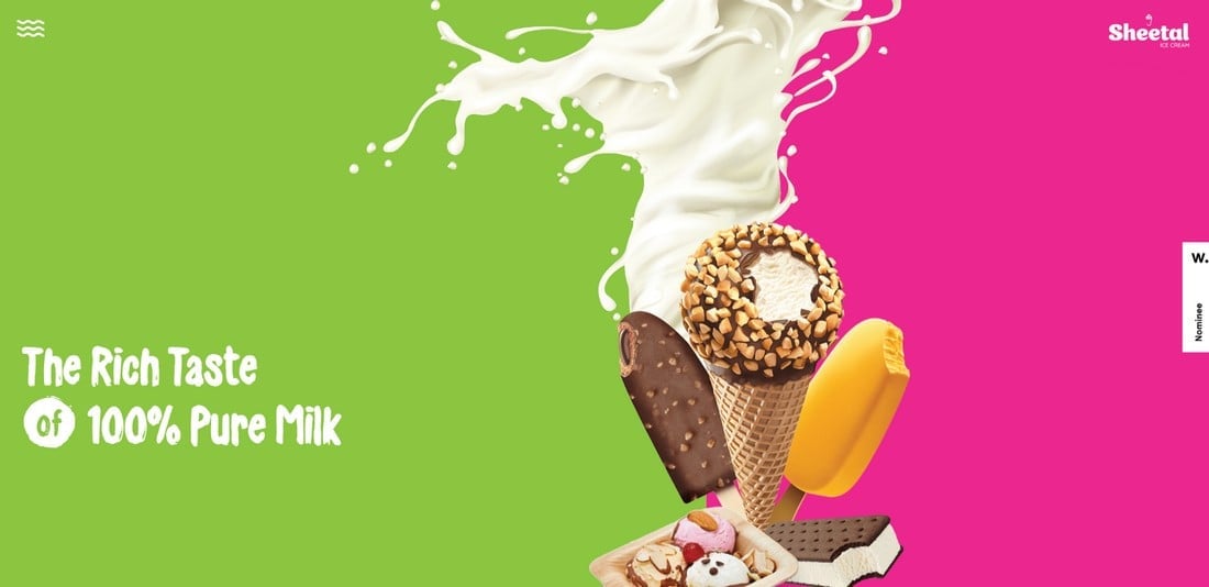
The website for this Indian ice cream company looks just as tasty as their products themselves. The header section of the website especially manages to effectively attract visitors with a clean layout with a colorful background that highlights just a single image of ice cream. No one would be able to resist scrolling down on this website, even if you’re lactose intolerant.
Courses Australia

One of the most effective header designs on our list belongs to an Australian website that works as a searchable directory of online courses provided by Australian colleges.
Its simple design that puts the search system on the center stage acts as an effective call to action. Followed by the index that allows users to explore courses in different topics, industry, and qualification levels.
These are just a few of the many amazing header designs we’ve seen. Keep exploring the web to find more amazing designs. Also, check out our website wireframing templates and Sketch website templates for more inspiration.