5 Website Layout Ideas That Never Get Old
There’s always that moment at the beginning of a website design project where you think “where do I start?” You’ll battle the desire to create something totally different and new versus something tested and reliable.
Realistically, there are a few layouts that just never get old. These patterns are generally accepted by users, easy to understand and provide a solid framework for pretty much any design and content type. Here, we’ll look at these five “timeless” website layouts and how to make the most of them for your next project.
1. Hero Image Stacked on Simple Grid
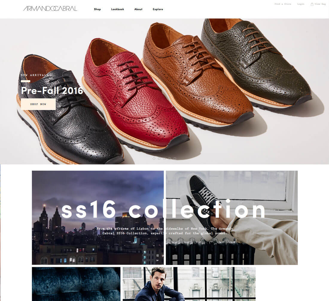
No matter the screen size, this format gives the user something to look at, scroll through and digest. While the actual specifications for this shape might changes based on device type or whether you prefer a full-width or shallow image, the sketch is roughly the same.
- Navigation
- Hero image with text overlay
- 2 to 4 columns with small information elements with or without icons
- Main body area
- Footer
The design is clean, provides a strong visual presence and tends to work well with responsive frameworks regardless of breakpoint. Some alternative applications of this format are to switch a static hero header for a slider or video header.
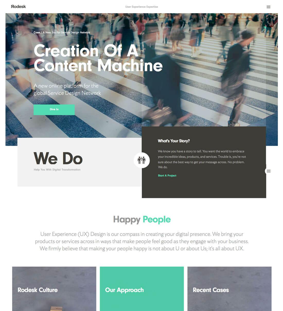
Why it works: Every element has a place and there is a logical flow to following the content. The main image is the first impression that should draw users into the design and secondary elements should make users want to click around.
Incorporate a trend: Add bright colored icons or boxes to the column-based informational elements, or use a flat style for the user interface elements throughout the design.
2. One Page, One Column
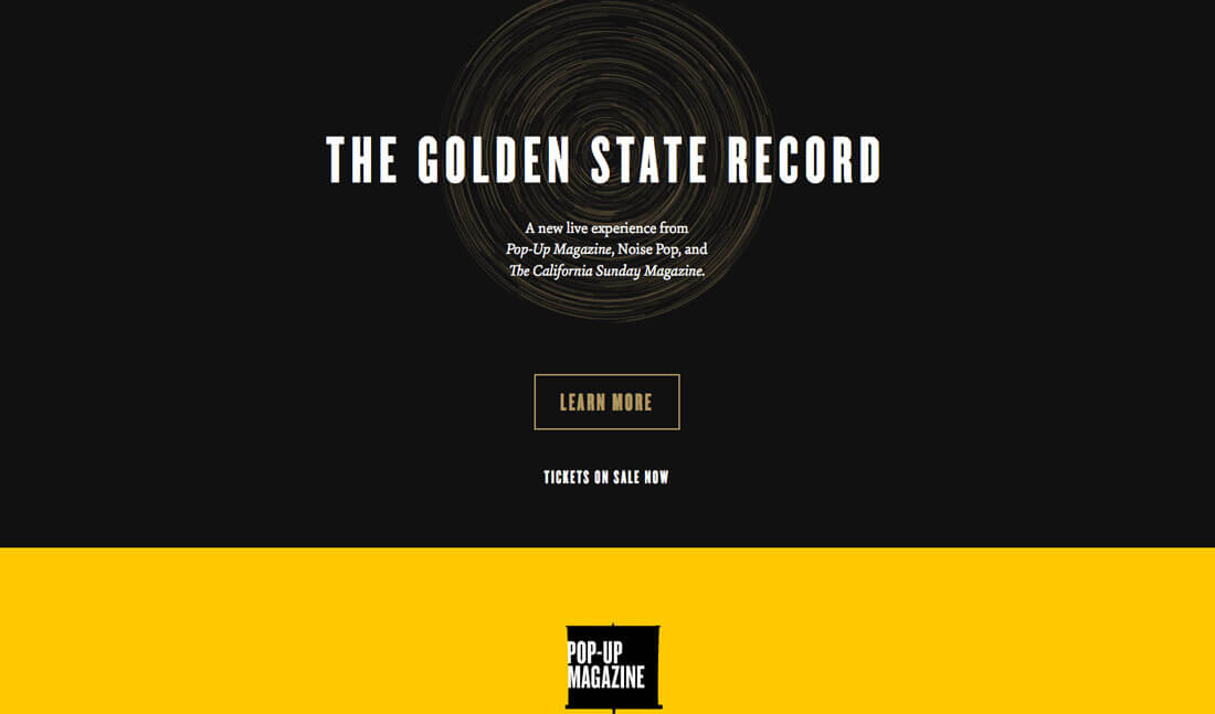
One page layouts are one of the best solutions for websites with minimal content and a single focus or message. When the message is simple, there’s not need to go crazy with the shape of the layout either. A one-column layout can be the perfect solution.
- Navigation
- Main body area with images and text
- Footer
When using this design pattern, space is a vital design element. Ensure that elements have plenty of room between them and consider using exaggerated spacing on the outside edges of the design. The risk with a one-page website is that it can feel cramped or disorganized if spacing is out of whack.
Why it works: The one-page formula is best-suited for small websites. It can make the lack of content on an introductory page or simple portfolio feel weightier than it is. The format also works well for simple blogs or content plans that stick to a single format.
Incorporate a trend: Add parallax scrolling to make the page feel more engaging as users scroll. These simple effects can make a simple one-page design feel deeper and more robust (and like it actually has multiple pages with each flick of the mouse).
3. Defined Grid
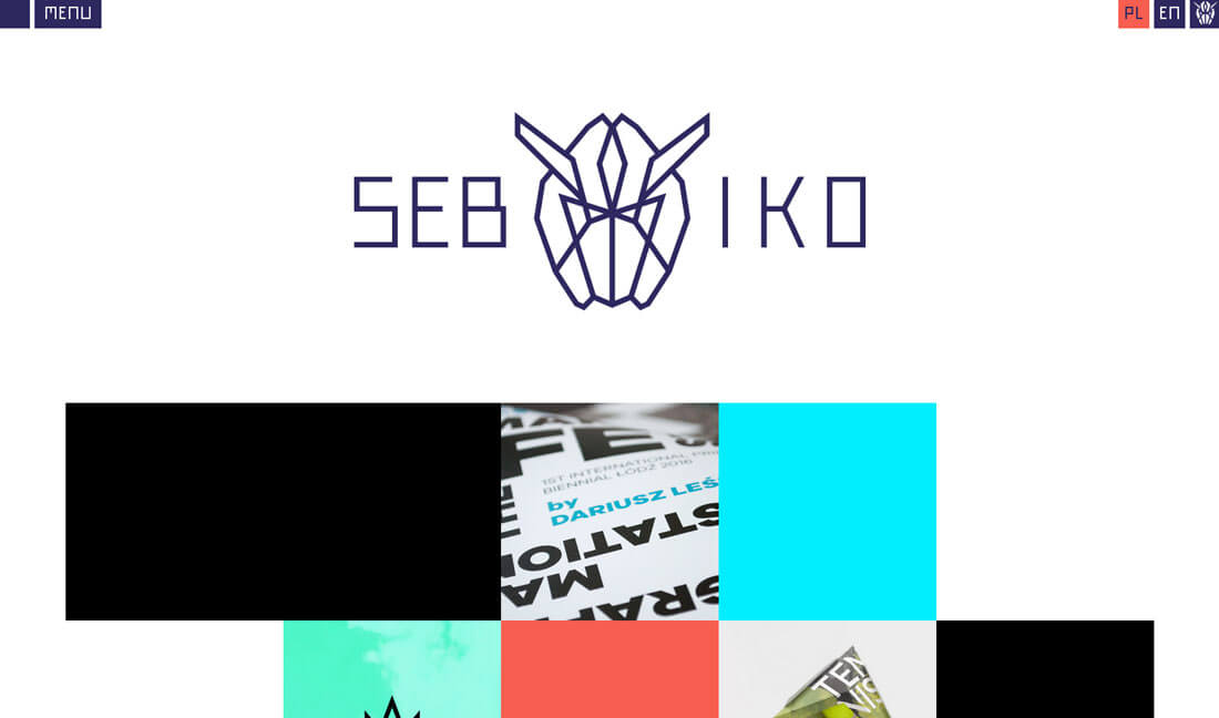
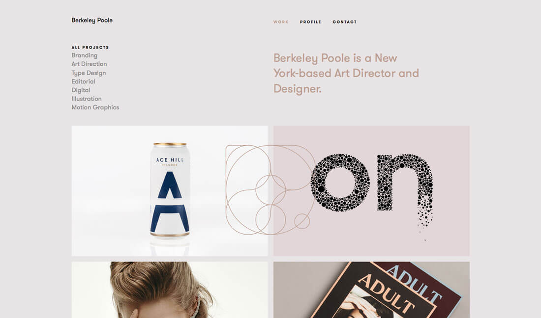
Neatly stacked rows and columns of content never goes out of style. Whether the grid is built with plenty of small pieces or just a four-by-four arrangement, a clean grid tells your user something about you from the start. This content is organized, managed well and ordered for you.
Grids are incredibly popular among designers for their own portfolio websites. What’s nice about an image grid is that you can showcase a lot of visual content without looking junky. This gallery effect can be quite impactful.
Grids can also come in the form of colored boxes or containers to organize text. Grid lines can be visible or invisible. There are so many options to choose from. Just remember to take particular care with the width and depth of columns and rows and spacing in between each. These little details can make or break the entire design.
Why it works: The organization a grid creates is hard to beat. A nice grid makes it easy for users to find and interact with content while creating visual harmony.
Incorporate a trend: Use simple bits of animation for a tiled grid so that a hover of click “flips” a grid block to show additional information. Want another option? Consider turning the grid into a card deck, featuring a Material Design style.
4. The Classic F-Pattern
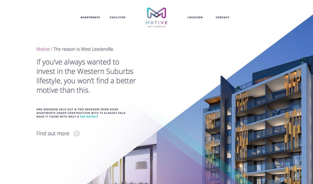
Research into the way people look at websites uncovered a particular flow known as the F-Pattern. The reading pattern showed that users start at the top of a website and read from left to right across the screen. Then they move down and read across again. Finally, they just skim to the bottom of the page in a straight line.
Designing content in this F-Pattern is a way to help put the content that matters most right where users are looking. This concept translates into a common design outline.
- Header and navigation
- Wide left-hand column as the main content area
- Thin right-hand column (sidebar) for links and related information that doesn’t go to the bottom of the page
- Footer
Why it works: People are creatures of habit, and this is a tested pattern that shows the way people think, look at and read websites. It’s comfortable and common, making it easy for users to understand and interact with.
Incorporate a trend: Flip the location of the sidebar or turn the sidebar into the navigation area, or use a hero image on top of the F-shaped pattern.
5. Minimal Layering
There’s just something about a great minimal design. The open space allows the user to feel at ease with a directed focus. Then there’s the juxtaposition of layers in that space, which are more complex and detailed.
It’s that combination of simple and interest that make this design style workable and moldable for a number of project types. It’s also something users are accustomed to thanks to common usage by Apple on their website.
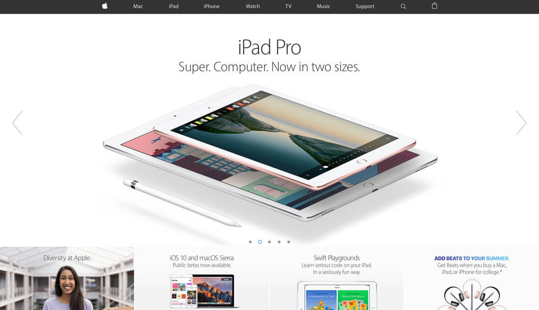
Why it works: Layering can draw the eye to exactly the location where it matters most in the design. Particularly in concert with a simple overall design, this is the element that begs users to take notice. Layering on a minimal outline is a great way to showcase or highlight a particular piece of content or call to action.
Incorporate a trend: Use subtle gradients or shadows to define elements in different layers. While these design techniques fell out of fashion for a while, creating barely-there differentiation is making a major comeback, thanks to Material Design and a refocusing on creating something tactile in the two-dimensional space.
Conclusion
When in doubt with any type of design, the best thing you can go is go back to the roots of design theory. Use classic ideas and principles to guide your decision-making.
In most cases, this will result in something that’s clean, easy to read and follows conventional style. Once you have that basic framework complete, then you can add a trendy element to keep the layout looking fresh. Using ones of this layout philosophy will help you create a website that will withstand the test of time better without looking dated. (Now that you are thinking about it, you’ll probably start to notice how many websites actually use one of these concepts.)