Use Gridpak to Roll Your Own Responsive Grid
I love finding free tools that are capable of making my job (and yours) just a little bit easier. The web developer community is positively overflowing with talented people who are more than willing to share their creations with the world while asking nothing in return.
Today we’re going to look at one such tool from Erskine Design called Gridpak. With it we can quickly and easily generate our own responsive grid for building web pages that work well on lots of different screen sizes. It’s a little tricky to implement though so we’ll help you figure out how to set up your styles after you grab the download.
This article is part of our series on “looking beyond desktop design”, brought to you in partnership with Heart Internet VPS.
Meet Gridpak
As I’m sure you know, there can be quite a bit of math involved in creating a simple, non-responsive grid and it becomes much more complex when you start altering that grid at various breakpoints. If you’re a designer who avoids math wherever possible, approaching such a project can be a pretty intimidating task.
Gridpak is a free web app that promises to take the pain out of creating your own responsive grid system. You neither have to conform to the rigid structure of a grid built by someone else or have to work too hard to create your own. In just a few clicks and drag actions, you’ll have an awesome responsive grid template that’s built to your specifications.
Though Gridpak is a breeze to use, it can be a bit confusing at first if you don’t know what you’re doing. When I first found the site, I clicked around for quite a while before I felt like I really had a handle on the process. I’ll walk you through how it all works so you can leverage this handy tool quickly and efficiently in your workflow.
The Controls
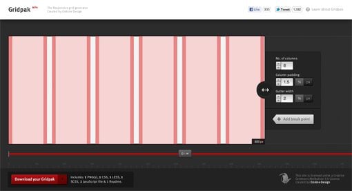
When you first load up the Gridpak page, you’ll see an image of a six column grid. To the right of the grid is a series of controls. Though this seems like a modest amount of settings, the level of customization available here is quite thorough.
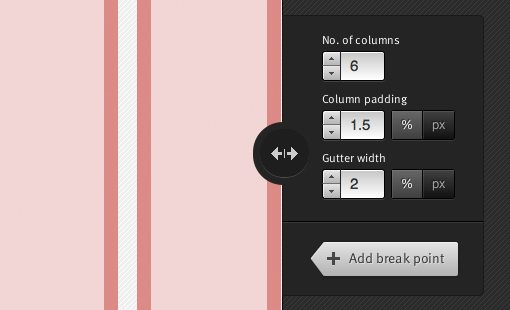
As you can see, you can quickly and easily set the number of columns as well as both the padding and gutter, either in percent or pixels. The little round button with the arrows basically represents your viewport. Drag it left and right to see how the grid would react to changing viewport sizes. There’s also a button to add a breakpoint, which we’ll go over next.
Breakpoint Indicator
Along the bottom of the UI is a pixel ruler as well as a little icon that indicates that the current default grid will be applied throughout the full continuum of viewport sizes, from zero up through infinity. This basically just means that there aren’t really any breakpoints added yet so the same grid applies to all sizes.

Adding Our First Breakpoint
Now, the entire point here is that you want the basic underlying framework for your site to change and evolve to different viewport sizes. The key to using this is to remember to think about your grid in terms of ranges, not just breakpoints. A given chunk of settings will have a range of possible viewport sizes where that grid will be active.
The typical use case is to set up one grid each for mobile, tablet and desktop sizes. Setting this up is easy, simply drag the slider to your target width, add a breakpoint, slide up to the next target size, add another breakpoint, etc.
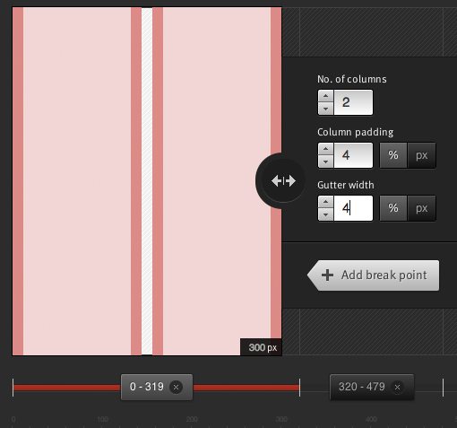
Here I put the slider at 320 pixels and added a breakpoint, then put it at 480px and added another breakpoint. As you drag the slider the grid will update based on the settings that you’ve applied. The ranges that you’ve set up are apparent at the bottom, with the current range highlighted in red.
The workflow here is a little wonky. The trick is to make sure you have the proper range selected. So when I want to adjust my settings for 0-319px, I add a breakpoint at 420px, then move my slider to the left a bit to make sure that range is active.
Moving On
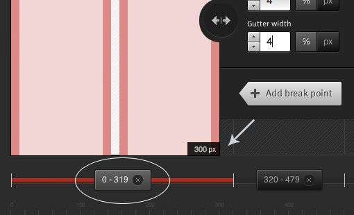
Once you have your grid figured out for the first range of widths, add another breakpoint, then move your slider back a bit and set the grid for that section.
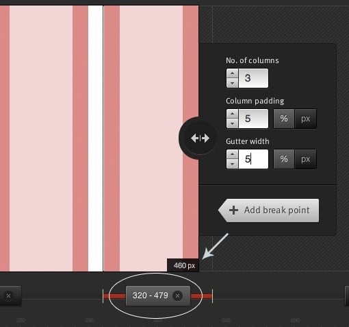
Here you can see that I’ve set a three column grid that will activate from 320-479px. Once this is set, if I move my slider back and forth, I can see the grid update live to the different viewport settings.
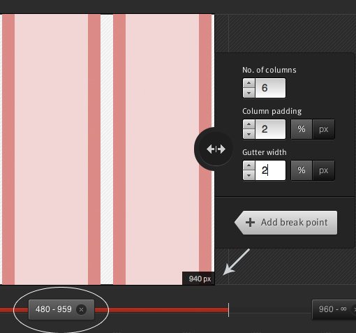
Finishing up, I’ll add in another grid that occupies the range from 480-959 and one last one that responds to anything at 960px or above.
The Download
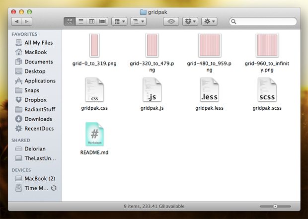
Once you’ve got your grids worked out, it’s time to download the files and get to work. The download is one of the most impressive aspects of the entire app. It’s really extensive and offers not only a CSS file, but also LESS and SCSS files in addition to grid PNGs for Photoshop and a JavaScript to overlay the grid on your live document.
The Gridpak About Page tells you all about each item included in the download so I will skip the redundancy and let you check it out there. What’s more important is how to implement the grid in your own work, and pulling that off probably isn’t as easy as you’re hoping it to be. Let’s dive in and see why.
Grid Complications
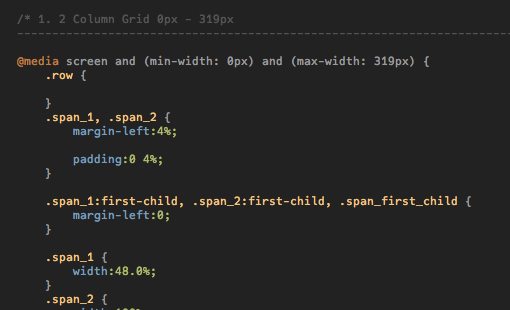
Now, the web UI makes it super easy to set up a good chunk of custom code that utilizes media queries. If we take a look at our CSS, LESS or SCSS, we can clearly see that the media queries were indeed generated.
Though much of the CSS work is done for you, you’re definitely not finished. Admittedly, it’s quite difficult to implement the grid in a useful way. The reason for this is of course that responsive design can be quite complicated, grid systems can be complicated, and when you throw the two together you get lots of complexity. If you’ve really got a handle on CSS, you should be able to figure it out but if you’re fairly new, you’re likely to run into lots of headaches. Consequently, I recommend that this shouldn’t be your first foray into responsive design.
How It Works
Since this can be pretty tricky, and there’s not a lot of documentation available, I’ll try to walk your through it. As with any CSS grid system, Gridpak will give you some prebuilt classes to apply to your content. However, the developer recommends that you use your own semantic classes instead and just use the prebuilt classes as a guide.
So let’s say you have a div containing three paragraphs of text. Which class should you put on it? This is tricky because you may want it to be span_one and one point and span_three at another point. Fortunately, we’ve already decided to use our own class names so it gets a bit easier.
If we want to call our section of paragraphs “features”, we add that class name to each of the paragraphs in our HTML then jump over to the CSS. Here we look first for generic container CSS and be sure to add our new class in to make sure it picks up those styles:
.span_1, .span_2, .span_3, .features, .span_4, .span_5, .span_6, .span_7, .span_8, .span_9, .features {
    border:0px solid rgba(0,0,0,0);
    float:left;
    -webkit-box-sizing:border-box;
    -moz-box-sizing:border-box;
    box-sizing:border-box;
    -moz-background-clip:padding-box !important;
    -webkit-background-clip:padding-box !important;
    background-clip:padding-box !important;
 }
Then you go into the specific media query and set the styles for your features class within that range. Once again, you’ll need to add the class to the preexisting generic classes:
@media screen and (min-width: 480px) and (max-width: 959px) {
    .row {

    }
    .span_1, .span_2, .span_3, .span_4, .span_5, .span_6, .features {
        margin-left:2%;
    	padding:0 2%;
    }

    .span_1:first-child, .span_2:first-child, .span_3:first-child, .span_4:first-child, .span_5:first-child, .span_6:first-child, .span_first_child, .features:first-child {
        margin-left:0;
    }

...
Next, you go in and add the class next to the specific span that you’re trying to match. At this viewport size, I want all three paragraphs to appear in a single row, so I add the features class in next to the span_2 class (it’s a six column grid here so three twos equals six).
.span_1 {
        width:15.0%;
    }
    .span_2, .features {
        width:32.0%;
    }
    .span_3 {
        width:49.0%;
    }
    .span_4 {
        width:66.0%;
    }
    .span_5 {
        width:83.0%;
    }
    .span_6 {
        width:100%;
    }
This will make is so that all three paragraphs appear in a single row. But what happens when we enter a different viewport? For instance, at the smallest size, maybe we want the paragraphs to be stacked on top of each other at 100% width. Once again, we go in and find the span that matches the width we’re going for, coincidentally span_2 again, and add in our .features class (don’t forget to add it to the generic classes as well).
.span_2, .features {
            width:100%;
}
You’ll also no doubt run into some margin issues as you do this (I sure did). This is because the margins reset only after each “row” div, but when each paragraph takes up 100% of the width, we need to kill the margins on all of them. Ultimately, expect plenty of tweaking to be necssary.
Also keep in mind that span_2 won’t always be the appropriate choice for this example. For instance, if our grid goes up to 12 columns at the full size, we’ll probably want to add the features class in next to the span_4 class, which will ensure that once again the three paragraphs will occupy the full width.
Is This Useful?
When I grabbed my first download I expected the implementation to be fairly effortless. However, it definitely took some time to wrap my head around making it work. Perhaps I’m overcomplicating it, but it seems like someone skilled enough to implement Gridpak is probably skilled enough to skip it altogether while someone who needs some help with responsive design might find the CSS to be a little to complicated in the end.
In all honesty, I’d love to see Gridpak rebuilt as a custom generator for the Skeleton Boilerplate, which has a responsive grid that is both more versatile and easier to implement.
However, that being said, I had a lot of fun playing with Gridpak and definitely see it as a solid way to start off a responsive project as long as you know what you’re doing. As I’ve stated before, I’m not the biggest fan of setting up media queries based specifically on popular screen sizes, but that’s an argument for a different day.
I’d love to hear your thoughts. Have you used Gridpak yet to actually build a web page? What did you think of it? Do you have a workflow that’s different and/or better than mine above? I’d love to hear it!